
TikTok Thumbnail Edits: Make Scroll-Stopping Covers with AI
Turn a video screenshot into a scroll-stopping TikTok cover in 5 minutes with AI. Background swaps, hook text, the export sizes TikTok actually uses, and the design moves that move the needle.

Growth Marketing
Table of Contents
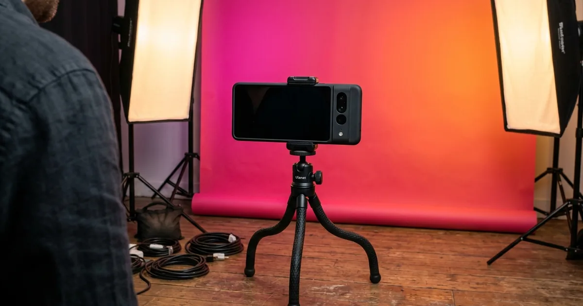
TikTok gives every video a small first window where the cover image, on-screen hook, and first half-second of motion decide whether viewers swipe past or stop. The thumbnail you set when you upload — or the auto-generated frame TikTok picks if you do not — is one of the few levers you control with certainty. A weak cover loses you views no matter how strong the rest of the video is. The difference between a forgettable thumbnail and a scroll-stopping one is rarely about expensive design tools. It's about three or four AI edits applied in the right order.
This walkthrough covers the exact thumbnail workflow most creators stumble into the long way: pick a strong frame, clean the background, swap to a high-contrast color, sharpen the subject, and overlay a hook. The whole thing takes about five minutes per video. You do not need Photoshop, you do not need a designer, and you do not need to redesign your channel. You just need to stop letting TikTok pick a frame for you.
If you batch-upload weekly content, the same workflow scales: prep a template thumbnail style once, then apply it to each new video. Consistent thumbnails compound. Mixed-style thumbnails fight each other in the profile grid and confuse the algorithm about what your channel actually is.
- TikTok covers display 9:16 in the feed and 1:1 on the profile grid — export two versions, not one.
- Background removal + high-contrast color is the single highest-leverage edit you can make to a cover.
- 3-6 word hook overlay in bold sans-serif with a black outline reads at every size; thin fonts disappear at thumbnail scale.
- AI enhancement should run once — heavy filtering reads as inauthentic and underperforms.
- Five minutes per cover; consistent style across uploads compounds in the profile grid.
Why TikTok thumbnails punch above their weight
TikTok is a video platform but it runs on still-image judgment calls. In the For You Page, viewers see a cover with a tiny play affordance and a few lines of caption text before the video auto-plays. On the profile grid — which most viewers visit before deciding to follow — the cover is the only thing they see. Search results, Discover, and shared links all surface the cover before the video itself. In all those surfaces, the thumbnail is the entire pitch.
Creators always undervalue this because TikTok is sold as a video-first platform. The platform's autoplay behavior makes the cover feel like a placeholder. The data on cover swaps says otherwise: same video, better cover, measurably higher watch-rate at the start. The audience is making a thumb-stop decision in fractions of a second. That decision uses the cover image as its primary input.
The good news: the bar to outperform the auto-picked frame TikTok defaults to is low. TikTok's auto-cover almost always picks an awkward mid-frame with motion blur, a half-blink, or a transitional moment. Any deliberate cover beats that. A deliberate cover with a clean background and a hook overlay beats it by a lot.
- Cover image is the primary input for the thumb-stop decision in the feed and on Discover.
- The profile grid is cover-only — your grid is your channel pitch.
- TikTok's auto-cover is reliably worse than any deliberate one; the bar to outperform is low.
Picking the right frame to start from
Most thumbnail workflows fail before any editing happens because the source frame is wrong. The best source frame has three properties: one clear subject (a face, a product, a single hand), bright even lighting on the subject. An expression or pose that telegraphs the video's content. Action shots and mid-blink frames make terrible covers no matter how much you edit them. The AI tools can clean a background, but they cannot fix a closed eye or a half-formed expression.
Scrub through the video and screenshot 5-10 candidate frames. Then look at them all together at thumbnail size — about 200×355 pixels in the TikTok feed. The frame that reads clearest at that size wins. Bigger isn't better; distinct at small size is what matters. If you're not sure, ask someone who hasn't seen the video which frame they'd watch.
If no frame in the video works, shoot a separate cover photo before or after recording the video itself. A clean still photo of you holding the prop, gesturing toward the hook, or making the expression of the punchline almost always outperforms an extracted video frame. This is what most creators with grids that look consistent are quietly doing.
- Pick frames with one clear subject, bright even lighting, and a telegraphic expression.
- Evaluate candidate frames at thumbnail size (~200×355), not full screen.
- Shoot dedicated cover photos when no video frame works — this is the secret behind consistent grids.
- Avoid action blur, mid-blink frames, and transitional moments at all costs.
The AI edit sequence: clean, swap, sharpen
The actual edit is three steps and runs in about three minutes per cover. Upload the chosen frame to Magic Eraser. First, brush over background distractions with the eraser tool. Phone cords, other people in the back, kitchen clutter, mirror reflections, anything that pulls the viewer's eye off the subject. The AI fills the cleaned regions with matching context, so you do not need to be precise. Broad strokes work fine.
Second, decide whether to keep the cleaned-up background or replace it fully. For maximum scroll-stop, run background removal to isolate the subject as a transparent PNG, then drop the cutout onto a saturated solid color or a high-contrast gradient. Hot pink, electric blue, lime green, and magenta-to-orange gradients tend to stand out more than neutral backgrounds on TikTok. The algorithm doesn't care about color, but human thumb-stop reflexes do. Saturated colors register as 'different' against the feed's mostly-neutral surrounding posts.
Third, run AI boost once. The pass sharpens the eyes, balances exposure, and brings up color saturation slightly. One pass is the rule — repeat passes start to read as filtered and TikTok viewers' filter-detection is very good. The goal is a polished natural look, not a smoothed plastic one.
- Eraser tool first for background distractions — broad strokes are fine.
- Background removal + saturated color is the scroll-stop move; neutral backgrounds underperform.
- AI enhancement runs once, not three times — filtered-looking covers underperform.
- Magenta-to-orange, hot pink, lime, electric blue — these tend to read faster than muted tones.
Designing the hook overlay text
The text on the thumbnail is the second-most-important element after the subject. Three to six words is the sweet spot. Long enough to telegraph the hook, short enough to read in half a second at thumbnail size. Use bold sans-serif fonts with high stroke weight (Inter Bold, Helvetica Bold, or any platform-native equivalent). Thin and light weights disappear when downscaled into the feed.
Color the text white with a 2-3 pixel black outline. The outline reads as decisive against any background and survives all the platform's thumbnail-scale compression and re-rendering. Yellow text with a thin red outline is the second-best option for hook-style content but reads more aggressively. Avoid gray text, text without an outline, and text in fancy script fonts.
Place the text on the upper third or lower third of the frame so it does not cover the subject's face. TikTok's caption and music chip overlays sit on the lower 20% of the cover in the feed. If you place hook text in the lower section, keep it above that 80% line. The upper third is the safer placement. Lower third is bolder but risks getting partially covered by the play-button or caption chip in some surfaces.
- 3-6 words, bold sans-serif, white with black outline.
- Upper third or lower third — never centered over the face.
- TikTok's caption chip eats the lower 20% in some surfaces; keep text above that line.
- Yellow-with-red-outline is a second-best alternative for high-energy content.
Exporting for the feed and the grid (they are different)
TikTok displays the cover in two different aspect ratios depending on where the viewer encounters the video. In the feed and on full-screen video pages, the cover is 9:16 (1080×1920). On the profile grid, the cover is cropped to 1:1 (1080×1080) and centered around the middle of the original 9:16. Most creators export only the 9:16 version and let TikTok crop. Produces awkward grid thumbnails with the hook text getting clipped on one or both sides.
Export two versions: a 1080×1920 9:16 with hook text positioned in the upper or lower third. A 1080×1080 1:1 with the subject and any text recomposed to fit the square. This sounds like extra work for one cover but it doubles the visible quality of every video in the feed and grid at once. For weekly creators, set up a template. Text position, gradient background, font — once, and the per-video work drops to about three minutes.
Save both versions as PNG or as high-quality JPEG (90-95%). TikTok re-compresses everything you upload, but starting with a clean high-quality source gives the platform less degradation to add to. Avoid heavy compression at the upload stage; the platform's own compression will already cost you 20-30% of your fidelity.
- 9:16 (1080×1920) for the feed; 1:1 (1080×1080) for the profile grid — export both, not one.
- TikTok auto-center crops the 9:16 into 1:1 and produces awkward grid covers — recompose manually.
- PNG or JPEG 90-95% upload quality; TikTok compresses again, so start clean.
- A reusable template drops the per-video work to about three minutes.
Building a consistent grid look
A grid where every cover uses a different color, different font. Different layout reads as scattered no matter how strong each individual video is. The first thing a potential follower does after watching one of your videos is check your profile, and the profile grid is cover-only. If the grid looks intentional — same background palette family, same text placement zone, same font — viewers infer a clear channel theme and convert to followers at higher rates.
Pick a 2-3 color palette and stick to it across covers. Use the same font and the same text size for the hook overlay. Vary the actual subject, expression, and hook content, but keep the visual frame constant. Many of the channels with the highest follower-to-view conversion rates are doing exactly this. It is rarely louder design that wins, it is consistent design.
Re-shoot covers for older videos that don't match the current template if they're still getting views. A consistent grid is worth more than perfect uniformity. You do not need to redo every old upload, but the most-recent 9-12 covers should match because that's what a profile visitor sees first.
- 2-3 color palette, same font, same text-placement zone across all covers.
- Vary subject and hook content; keep the visual frame constant.
- Re-shoot covers for the most-recent 9-12 videos to make the visible grid consistent.
- Consistent grids outperform mixed-style grids on follower-conversion rate.
How to do it
- 1
Screenshot the strongest single frame from your video
Scrub the video to the frame with the clearest face, brightest color, or biggest visual hook. TikTok favors thumbnails where the subject is distinct at small sizes. Pick a frame that reads as one thing in one second.
- 2
Remove background distractions in Magic Eraser
Upload the frame, brush over background clutter. Phone cords, other people, kitchen background, anything that pulls the eye away from the subject. The AI fills the cleaned regions with matching context.
- 3
Replace the background with high-contrast color
For maximum scroll-stop, run background removal and drop the cutout onto a saturated brand color or neon gradient. Hot pink, electric blue, lime green, and high-contrast magenta-to-orange gradients tend to stand out more than neutral backgrounds on TikTok.
- 4
Boost the subject with one pass of AI enhancement
Run AI enhancement once to sharpen the eyes, balance exposure, and pop the colors. Don't over-process — TikTok viewers spot heavy filtering instantly and it reads as inauthentic.
- 5
Add an oversized text overlay with the hook
Add 3-6 words of hook text in a bold sans-serif. Place it on the upper third or lower third of the frame so the face stays unobstructed. White text with a thin black outline reads at every size; thin lightweight fonts disappear at thumbnail scale.
- 6
Export at 1080×1920 for the cover, 1080×1080 for the profile grid
TikTok displays the cover in 9:16 within the feed and 1:1 on the profile grid. Export one 1080×1920 version with the hook text positioned for vertical. One 1080×1080 version with the subject centered for the grid crop.
Sources
- TikTok Creator Portal — Cover Images — TikTok
- Best Practices for Video Thumbnails — YouTube Help (reference for thumbnail design fundamentals applicable to TikTok)