
Podcast Cover Art with AI: A Product Marketing Playbook for Apple, Spotify, and Beyond
Podcast cover art is a 3000×3000 image displayed at 56-100px in feed — every podcaster's first product-marketing decision. The AI-powered workflow for cover art that survives the thumbnail crop, signals genre and brand in under a second, and refreshes per-season without a designer.

Product Marketing
Table of Contents
- Why cover art is the most-undervalued product-marketing surface in podcasting
- The 4 composition classes that work in feed (and how to pick yours)
- Build the master photo library: 30-45 minutes that powers the show's full visual lifetime
- The 3000×3000 export discipline and the 56-100px thumbnail test
- Per-season refresh: signaling 'actively produced' without re-shooting
- The supporting graphic set per episode (and why it matters for show growth)
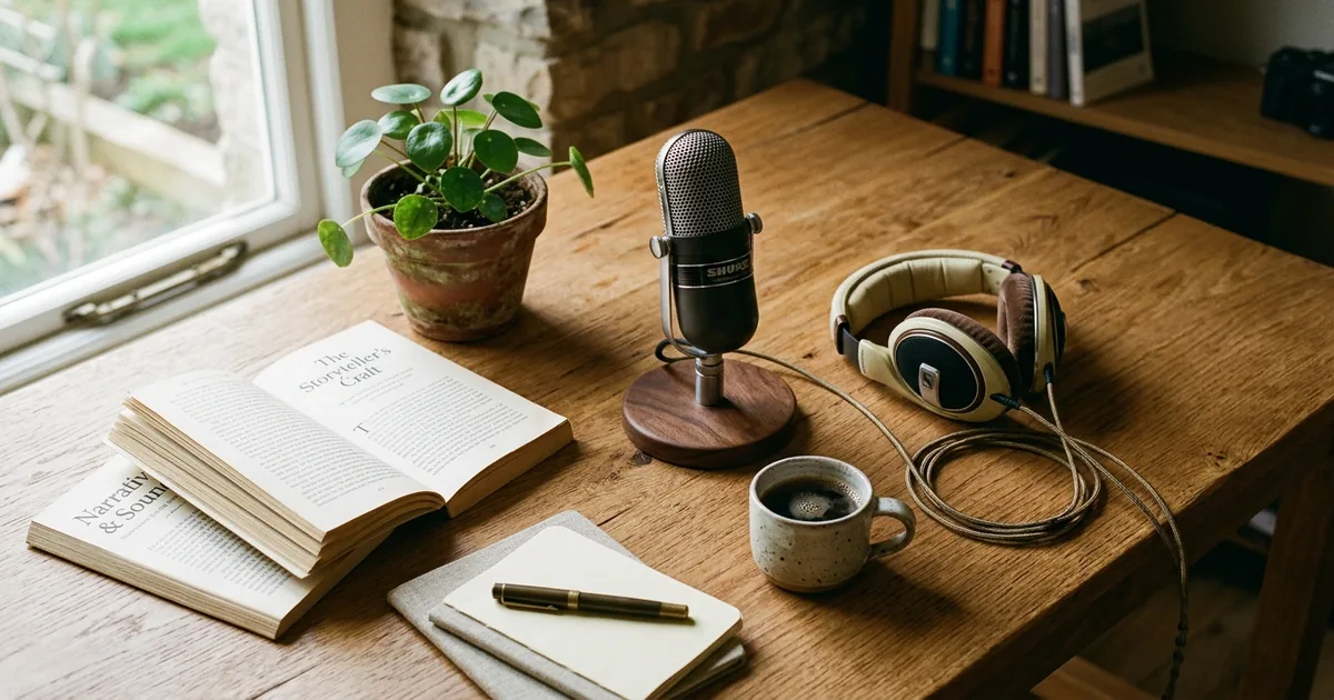
Podcast cover art is the most-viewed surface of every podcast brand — and the least-discussed deliverable in most podcast launches. Apple Podcasts and Spotify display the cover art at three rendering sizes (3000×3000 on the show landing page, 1024×1024 on tablet directories. 56-100px in the feed and search results where listeners actually decide whether to tap), and the 56-100px feed render is the decisive surface: a new listener spends 0.5-1.5 seconds scanning a search-results screen, and the cover art has to telegraph the show's genre and tone in that window. Cover art that doesn't read clearly at 56-100px loses tap-throughs at the entry funnel. Compounds across every episode and every recommendation impression for the show's full lifetime.
The product-marketing framing of podcast cover art is the framing most podcasters miss. The cover art is not decoration. It is the brand-positioning instrument that does the most repeated work across the most listener impressions. It has to perform that work at the smallest readable display size. Treating cover art as a creative-team afterthought ('we'll figure out the art after we record the first three episodes') is one of the most common product-marketing failures of new podcast launches. The art that gets made under that time pressure tends to be undifferentiated genre-default art that doesn't help listeners decide to tap.
This post is the AI-powered cover-art workflow for podcasters who want to ship cover art that does its product-marketing job. Survives the 56-100px feed render, signals genre and tone in under a second, supports per-season refreshes without re-shooting, and produces the full supporting graphic set per episode without 90-180 minutes of designer time. The workflow covers the 4 composition classes that work in feed, the master photo library structure that powers every derivative, the 3000×3000 export discipline. The per-season refresh cadence that keeps the show reading as actively produced.
- Apple/Spotify cover art renders at 3000×3000, 1024×1024, and 56-100px in feed. The 56-100px render is decisive: 0.5-1.5s of decision attention per impression.
- Most podcasters treat cover art as decoration. It's actually the brand-positioning instrument doing the most repeated work at the smallest readable size.
- 4 composition classes by genre: interview (single host portrait), narrative (mood scene + type), monologue (stylized object iconography), co-host (split portraits). Mismatched class kills tap-through.
- Master photo library = 30-45 min one-time investment producing 5-8 source photos. Powers every cover variation, social promo, per-season refresh, guest-episode graphic across the show's lifetime.
- 3000×3000 master: Background Eraser to brand color + AI Fill outpaint to square + AI Enhance for sharp 100px render + thumbnail-test by scaling mentally to 100×100.
- Typography survives feed render: 80-100pt sans-serif on 3000×3000 canvas, 3-5 word title, high-contrast color, reserve bottom 20% for platform UI.
- Per-season refresh: same master photo + different AI Filter grade + different background color + typography refresh. Signals 'actively produced' to algorithm and listener.
- Supporting graphic set per episode (4-8 surfaces): 1080×1080 IG square, 1080×1920 Stories/TikTok, 1920×1080 YouTube/audiogram, 1200×600 email, platform share cards. Batch via AI: 90-180min manually → 15-30min via AI.
- Multi-format shows (main + bonus + special series): same master library produces format-specific squares with brand continuity + format differentiation.
Why cover art is the most-undervalued product-marketing surface in podcasting
A podcast's cover art appears in every place a listener encounters the show. Apple Podcasts feed, Spotify search results, Overcast subscription list, Pocket Casts directory, YouTube companion uploads, embedded player widgets on the show's website, social media share cards when episodes get linked, and email newsletter thumbnails. Across these surfaces, the cover art is rendered at sizes ranging from 3000×3000 down to 56-100px. The 3000×3000 master gets viewed maybe a few hundred times per month on the show landing page. The 56-100px feed thumbnail gets viewed thousands of times per week across discovery impressions.
The decisive product-marketing moment for a podcast is the 0.5-1.5 second decision window where a new listener is scanning a search results screen, a curated category list, or a 'you might like' recommendation panel. The cover art is the only signal that has time to land. The title is partially legible at best, the description doesn't render at thumbnail size, and the listen-count and star rating are smaller signals that get processed second. Cover art that telegraphs genre and tone in that window converts impressions to taps. Cover art that doesn't loses impressions silently.
The reason most podcasters miss this framing is that the cover art conversation happens at the start of the launch, when the visual brief is the easiest thing to defer ('we'll figure out the art after we record the first three episodes'). Then the launch-date cover-art deliverable gets made under time pressure by someone who isn't trained in product positioning. The result is the predictable failure mode: undifferentiated genre-default art that doesn't help a new listener decide to tap.
- 3000×3000 master = few hundred views/month. 56-100px feed thumbnail = thousands of views/week. Optimize for the small render.
- Decisive product-marketing moment: 0.5-1.5s decision window in feed. Cover art is the only signal that lands in that window.
- Failure pattern: cover art deferred to end of launch → made under time pressure → undifferentiated genre-default result → lost tap-through.
The 4 composition classes that work in feed (and how to pick yours)
Across the top-200 podcast charts on Apple Podcasts and Spotify, cover art compositions cluster into four classes that map cleanly to show formats. Interview shows (talk shows, host-plus-guest formats, expertise interviews) tend to use a single distinct host portrait or face-illustration centered on a solid brand-color background. Instantly readable as 'a person talking to a person.' This composition class works because it gives the listener a face to attach the show's voice to, and faces survive the 56-100px crop better than almost any other composition because the visual system processes facial features at very small sizes.
Narrative shows (true crime, documentary, history, investigative journalism) tend to use mood scene-setting compositions with type-driven hierarchy. A moody object or location with the show title doing the visual work. The composition class works because narrative shows live on tone and the cover art needs to telegraph 'serious / immersive / mood' in under a second. Faces are usually wrong for this class because they signal 'interview show' to listeners scanning the feed.
Monologue shows (commentary, essay, single-host expertise, advice formats) tend to use stylized object compositions or single-element graphic marks. A microphone, a typewriter, a coffee cup, a book treated as iconography. The composition class works because monologue shows are inherently the host's voice and the cover art doesn't need to humanize a stranger. The icon does symbolic work that compounds with the show's branded title typography.
Co-host shows (buddy shows, sibling podcasts, paired-expertise shows) tend to use two-portrait split compositions or matched silhouette duos. The composition class works for the same reason interview class does. The listener gets faces to attach voices to — but the duo signal explicitly distinguishes the format from interview shows.
Picking the wrong composition class for your genre is the most common cover-art positioning mistake. True-crime shows with cheerful illustrated hosts read as comedy podcasts in feed. Commentary monologue shows with two portraits read as interviews. Comedy duos with moody mood covers read as narrative. The AI workflow makes it cheap to produce a strong example in each class from the same master library and select against the genre rather than committing blind.
- Interview class: single host portrait, brand-color background. Faces survive 56-100px crop better than other compositions.
- Narrative class: atmospheric scene + type-driven hierarchy. Faces are wrong here — they signal 'interview show' to feed-scanners.
- Monologue class: stylized object iconography (microphone / typewriter / coffee cup). Symbolic work compounds with branded title.
- Co-host class: two-portrait split or matched silhouette duos. Duo signal explicitly differentiates from interview.
- Mismatched class kills tap-through. AI workflow makes it cheap to test multiple classes from the same master library before committing.
Build the master photo library: 30-45 minutes that powers the show's full visual lifetime
Before opening any editor, run a single focused 30-45 minute photo session producing the master source library the cover art and all derivative assets will pull from. The library structure: 2-3 host headshots if your show uses host portraits (front-facing direct-gaze, three-quarter angle, casual smile if the show tone supports it), 2-3 stylized object compositions if your show uses iconography (the prop or symbol that signals your topic in different lighting and angle treatments). 1-2 mood scene shots if your show uses narrative imagery (the moody location or staged scene that telegraphs your show's tone).
Shoot in even natural window light against a clean wall. Background Eraser will handle background swaps to brand colors, Magic Eraser will handle distraction cleanup, AI Enhance will handle sharpening and upscaling. The source photos don't have to be studio-grade. They have to be sharp, well-focused, and shot at high enough resolution that AI Enhance has detail to work with (most modern phones at 4032×3024 are plenty).
The upfront investment math: 30-45 minutes of source photography produces the asset base for the show's full visual lifetime. From this library, the AI workflow produces the launch cover art (3000×3000 master + thumbnail-test refinement), per-season refreshes (4-8 variations per season change over the show's lifetime), guest-episode square graphics (1 per episode × 50-200 episodes), social-promo crops (3-5 per episode × 50-200 episodes). Email-newsletter inline imagery for the show's launch sequence and weekly publishing. Across a podcast's first 200 episodes, the master library often powers 800-1500 derivative graphic assets. Making the 30-45 minute source shoot the highest-ROI 45 minutes in the show's visual workflow.
- Library structure: 2-3 host headshots + 2-3 stylized object compositions + 1-2 atmospheric scene shots in one 30-45min session.
- Even natural window light, clean wall background, sharp focus, high resolution. Studio-grade not required — AI handles enhancement.
- Math: 30-45min source shoot → 800-1500 derivative graphic assets across the show's first 200 episodes.
- Highest-ROI 45 minutes in the show's visual workflow. Everything downstream pulls from this library.
The 3000×3000 export discipline and the 56-100px thumbnail test
Apple Podcasts and Spotify both require cover art at 3000×3000 minimum (Apple specifies 1400×1400 to 3000×3000 acceptable range. Spotify accepts 3000×3000 native. Both downsample to render sizes). Upload the highest-quality version — the platforms handle the downsampling and serve responsive thumbnails. Magic Eraser exports at full quality by default; keep that quality through the upload step.
The composition discipline that separates cover art that works from cover art that doesn't is the 56-100px thumbnail test. Before finalizing your 3000×3000 cover, mentally scale it down to 100×100. Or actually create a 100×100 export and look at it on your phone in a directory-list context. Three questions: (1) does the subject still read as the intended object (face / microphone / scene)? (2) does the genre signal still land in under a second? (3) is the title text identifiable as text-shape even though individual letters are illegible? If any of those three fail, recompose with more subject-centered framing, more aggressive contrast between subject and background. Larger / bolder title typography on the master.
The thumbnail test is the difference between cover art that performs at 3000×3000 (where the designer evaluated it) and cover art that performs at 56-100px (where listeners actually decide). Most cover art that looks impressive on a show landing page fails the thumbnail test because the designer evaluated at the large size and the small-size render lost the legibility.
- 3000×3000 master upload at full quality. Apple accepts 1400×1400-3000×3000; Spotify accepts 3000×3000. Platforms handle downsampling.
- Thumbnail test: scale mentally (or actually export) to 100×100. Three questions — subject readable, genre signal landing, title identifiable as text-shape.
- Cover art that fails the thumbnail test looked impressive at 3000×3000 but loses at the size listeners actually see. Recompose, don't ship.
Per-season refresh: signaling 'actively produced' without re-shooting
Podcasts that have run more than 2-3 seasons often need a cover-art refresh. Listener perception of 'is this show still being made' is materially shaped by whether the cover art has visibly aged out of the platform's current visual norms. The algorithm signals around 'fresh creative' favor shows with recently-updated cover art versus shows whose cover hasn't been touched in years.
The AI refresh workflow doesn't require re-shooting. Pull the same master photo from the original library. Apply a different AI Filter color-grade preset (warmer for a summer-themed season, cooler for winter, more saturated for an upbeat season, more muted for a serious season). Apply a different Background Eraser background color from the brand-consistent palette (rotate through 2-4 colors across seasons). Apply a small typography refresh (font weight adjustment, color update, season indicator if applicable). The result is a visually-distinct refreshed cover that reads as 'this show is still being produced and still cares about its display' to both the algorithm and the listener.
For multi-format shows (main feed + bonus episodes + special series), the same master library produces format-specific square graphics that maintain visual continuity while differentiating each format. Main feed uses the primary brand color. Bonus episodes use a secondary accent color. Special-series episodes use a distinct compositional treatment with the same master photo. This visual system makes the show's full content offering right away legible in the show's episode list and in directory listings.
- Refresh signal matters: listener perception of 'still being made' shaped by cover-art freshness; algorithm favors recently-updated creative.
- Workflow: same master + different AI Filter grade + different background color + small typography refresh. No re-shoot.
- Multi-format shows: main feed + bonus + special series each get format-specific square graphics with brand continuity + format differentiation.
The supporting graphic set per episode (and why it matters for show growth)
Cover art is the anchor of the show's visual brand. The supporting graphic set per episode is where the show's growth happens on social. A typical weekly-publishing podcast needs 4-8 supporting graphic surfaces per episode: per-episode square graphic featuring the guest or topic (1080×1080 for Instagram, 3000×3000 for Apple/Spotify episode-art override), vertical promo graphic for Instagram Stories and TikTok (1080×1920), horizontal audiogram cover for YouTube and embedded media players (1920×1080), email-newsletter inline hero (1200×600). Platform-specific share cards for Twitter/X (1200×675), LinkedIn (1200×627), and Pinterest pin (1000×1500).
Manually producing this set per episode is 90-180 minutes of designer time. Which is why most shows don't produce it at the cadence growth requires. The AI batch workflow compresses this to 15-30 minutes per episode: AI Fill outpaints the master library photo to each aspect ratio, Background Eraser preserves brand-color consistency across all surfaces, AI Filter applies the current season's color-grade preset. A consistent typography template overlays the episode title and guest name where applicable.
The growth lever: shows that produce the full supporting graphic set per episode and post carefully across surfaces (Instagram Reels with audiogram excerpt, LinkedIn for expertise/B2B shows, TikTok for narrative/comedy shows, Pinterest for evergreen episode topics) compound discovery beyond the podcast platform algorithms. Shows that don't produce the supporting set rely fully on the platform algorithms. Means slower growth even when the show's content is strong.
- Supporting set per episode (4-8 surfaces): 1080×1080 IG square / 1080×1920 Stories+TikTok / 1920×1080 YouTube+audiogram / 1200×600 email / X 1200×675 / LinkedIn 1200×627 / Pinterest 1000×1500.
- Manual production: 90-180 min/episode (most shows skip it). AI batch: 15-30 min/episode (sustainable at weekly cadence).
- Growth lever: full supporting set + strategic cross-platform posting compounds discovery beyond podcast platform algorithms.
Sources
- Apple Podcasts — Cover art specifications — Apple Podcasters
- Spotify for Podcasters — Cover art best practices — Spotify for Podcasters