
How to Create Pointillism Effect with AI — Magic Eraser
Step-by-step guide to converting photos into pointillist paintings using AI. Covers Seurat-style dot patterns, optical color mixing, dot density and size controls, Neo-Impressionist palette selection. Viewing-distance improvement for authentic divisionist artwork.

Product Marketing
Reviewed by Magic Eraser Editorial ·
Table of Contents
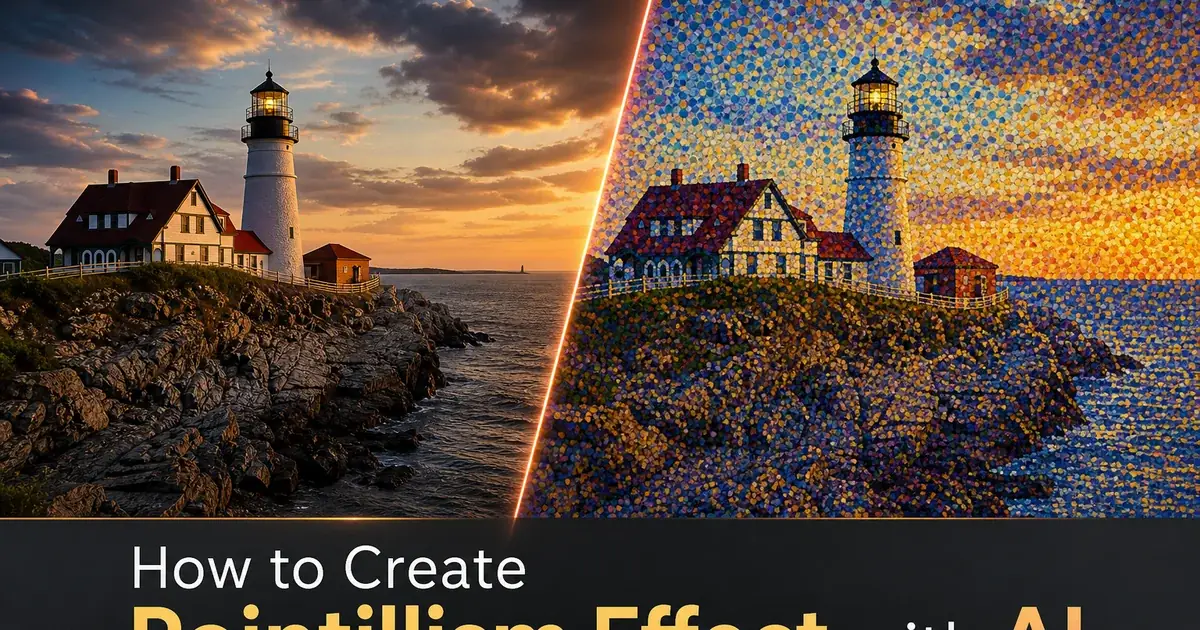
Pointillism emerged in 1886 when Georges Seurat exhibited A Sunday Afternoon on the Island of La Grande Jatte, a monumental painting composed fully of small dots of pure color applied in precise patterns. The technique was revolutionary because it rejected the traditional method of mixing pigments on the palette before applying them to the canvas. Instead, Seurat placed dots of unmixed spectral color side by side and relied on the viewer's eye to blend them optically at a distance. Orange was not mixed from red and yellow pigment. It was created by placing red dots next to yellow dots so closely that the eye perceives orange from a few feet away. This optical mixing produces a luminous, vibrant quality that premixed pigments cannot achieve because the individual color dots retain their full chromatic intensity rather than dulling through physical blending.
The challenge of creating pointillist artwork manually is extraordinary even by the standards of fine art. Seurat spent over two years on La Grande Jatte, placing millions of individual dots with meticulous attention to color relationships and density gradients. Each area of the painting required the artist to calculate which pure colors, placed in what proportions and at what spacing, would optically mix to produce the desired perceived color at viewing distance. Shadows required not just darker dots but matching color dots. Blue shadows in a sunlit orange landscape contain dots of blue, violet, and the matching orange to create the complex color interaction that makes impressionist shadows feel luminous rather than merely dark. This labor-intensive precision limited pointillism to a small number of dedicated practitioners despite the beauty of the results.
AI-powered pointillism effects analyze photograph color, composition. Spatial relationships to generate authentic dot patterns that follow the principles Seurat established. The AI determines which pure spectral colors must be juxtaposed to produce each area's target color through optical mixing, calculates the dot density needed to maintain subject legibility at the intended viewing distance. Varies dot placement organically to reflect the natural rhythm of hand-painted brushwork. This guide covers how to use Magic Eraser to transform any photograph into pointillist artwork with controls for dot size, density, color palette, placement pattern, and background treatment.
- Pointillism creates color through optical mixing. Adjacent dots of pure spectral color blend in the viewer's eye rather than being premixed, producing luminous vibrancy that physical blending cannot achieve.
- Dot density is the primary control balancing photographic detail against visible dot pattern — higher density creates smoother images while lower density produces more graphic abstract compositions.
- Neo-Impressionist palette restriction limits dots to pure spectral hues, forcing the AI to create intermediate colors through complementary dot juxtaposition rather than pre-blended color selection.
- Organic dot placement varies density based on image content, increasing dots in detailed areas and reducing them in uniform regions to mimic natural pointillist brushwork rhythm.
- Viewing distance fundamentally affects pointillist art — the same image reads as distinct colored dots up close and as a smooth coherent photograph from several feet away.
How AI replicates the science of optical color mixing
The scientific foundation of pointillism rests on the distinction between additive and subtractive color mixing. When pigments are physically mixed on a palette, each extra pigment absorbs more wavelengths of light, and the mixture becomes progressively duller. This is subtractive mixing, and it is why mixing all paint colors together produces muddy brown rather than white. When colored dots are placed side by side and viewed from enough distance, the eye receives the full intensity of light reflected from each dot and combines them neurologically. This is a form of additive mixing that preserves the brightness and chromatic intensity of each individual color. Seurat understood this principle from the color theory writings of Michel Eugene Chevreul and Ogden Rood. He exploited it systematically to create paintings with a luminous, shimmering quality that conventional technique could not achieve.
AI pointillism conversion replicates this optical mixing principle computationally. For each region of the photograph, the AI calculates which combination of pure spectral color dots, placed at what relative proportions, will produce the target perceived color when the dots are smaller than the viewer's visual acuity threshold at the intended viewing distance. A warm skin tone might be decomposed into dots of orange, yellow, pink. Touches of matching blue-violet for shadow areas. A forest green landscape becomes a tapestry of blue, yellow. Green dots in varying proportions, with warmer yellow-green in sunlit areas and cooler blue-green in shadows. The AI maintains the mathematical color relationships that produce correct optical mixing. The proportions of each dot color are precisely calculated to sum to the target color in the viewer's perception.
The luminous quality that distinguishes pointillism from simple pixelation comes from this optical mixing approach. A photograph converted to a grid of colored squares where each square is the average color of its region produces flat, lifeless results because each square contains only one color at its reduced intensity. The same photograph converted to pointillist dots where each region contains multiple pure colors that optically mix to the target color produces vibrant, luminous results because the viewer's eye receives full-intensity light from each dot. This difference is the entire aesthetic foundation of pointillism and the reason the technique has remained artistically strong for over a century.
- Subtractive mixing of physical pigments dulls colors progressively, while optical mixing of juxtaposed dots preserves the full chromatic intensity of each individual color.
- AI calculates the precise proportions of spectral color dots needed to optically mix to each target color at the intended viewing distance.
- Skin tones decompose into orange, yellow, pink, and complementary blue-violet dots — greens become tapestries of blue, yellow, and green at varying proportions.
- The luminous quality distinguishing pointillism from pixelation comes from multiple pure-color dots optically mixing rather than single averaged-color regions.
Controlling dot density and size for different artistic intentions
Dot density and size are the two parameters that most greatly affect both the aesthetic character and the practical legibility of a pointillist conversion. These parameters exist in a fundamental tension. Higher dot density preserves more photographic detail and allows the image to resolve into a distinct scene at shorter viewing distances, but it also makes the individual dots less visible and the pointillist technique less apparent. Lower density makes the dot pattern prominently visible and the artistic technique right away obvious. It reduces the photographic detail that makes the subject distinct. Finding the right balance for each image and each intended use is the core creative decision in pointillist conversion.
Seurat himself worked at what might be called medium density. His dots are clearly visible as individual marks when you stand close to his paintings, but they resolve into coherent images with distinct figures, landscape elements, and spatial depth at normal gallery viewing distance of three to six feet. This medium density is usually the best starting point for photographic conversion because it produces results that function as both abstract dot patterns at close range and representational images at distance. The AI's default density setting targets this Seurat-like balance, placing dots large enough to be one by one appreciable on screen while dense enough to form a legible image when the viewer is not examining individual dots.
Extreme density settings serve specific purposes. Very high density with tiny dots produces images that read as soft-focus photographs with a subtle luminous texture. The pointillist technique is present but understated, visible mainly as a slight shimmer in color transitions rather than as a visible dot pattern. This setting works well for portrait photography where subject recognizability is paramount and the pointillist effect serves as a subtle aesthetic boost rather than a bold stylistic change. Very low density with large dots produces greatly abstract compositions where dots become the primary visual element and the photographic subject serves as an underlying compositional framework. Suitable for bold graphic art, poster design, and decorative applications where the pattern itself is the point.
- Higher dot density preserves photographic detail and legibility but makes individual dots less visible — lower density emphasizes the artistic technique but reduces recognizability.
- Seurat's own medium density is the ideal starting point where dots are visible up close but resolve into coherent images at normal viewing distance.
- Very high density produces subtle luminous texture enhancement suitable for portraits where subject recognizability is the priority.
- Very low density creates bold abstract compositions where the dot pattern becomes the primary visual element, suitable for graphic art and decorative design.
Dot placement strategies and their effect on composition
The spatial arrangement of dots within a pointillist composition carries as much artistic information as the color of the dots themselves. Seurat and his Neo-Impressionist colleagues did not place dots randomly. They followed the contours of forms, aligned dots along directional lines to suggest movement and depth, and varied dot density to create emphasis and recession. The border between a figure and a background was defined not by a drawn line but by a shift in dot color and sometimes dot density, creating soft-edged boundaries that vibrate with color energy rather than the hard edges of conventional painting.
AI dot placement offers three primary strategies that produce distinctly different results. Grid-based placement arranges dots on a regular matrix, producing a mechanical precision that emphasizes the systematic, scientific aspect of pointillism. This ordered regularity creates a textile-like quality where the image has the look of a woven or printed fabric. Organic placement uses content-aware algorithms to vary dot spacing based on the image structure. Denser dots trace the contours of important features, sparser dots fill uniform background areas, and the overall pattern has the natural irregularity of hand-painted brushwork. Random placement with density modulation scatters dots without geometric ordering while still maintaining right density variation, producing the most painterly result that most closely mimics the spontaneous quality of working with a loaded brush.
Background treatment greatly affects how the dots read as a composition. Dots on a white background simulate the traditional approach of painting on primed white canvas. The white surface showing between dots adds brightness and contributes to the optical mixing as a neutral light element. A tinted background — warm cream, cool blue-gray, or natural canvas tone — adds an undertone that unifies the entire composition and reduces the visual starkness of isolated dots. A dark background creates a greatly different aesthetic where colored dots appear to glow with internal light against the dark field, producing images that feel illuminated from within rather than reflecting light from the surface. Each background choice at its core changes the mood and visual impact of the same dot pattern.
- Grid-based placement creates mechanical precision with a textile-like quality emphasizing pointillism's systematic scientific foundation.
- Organic placement varies density along contours and features, producing the natural irregularity that most closely mimics hand-painted Neo-Impressionist brushwork.
- White backgrounds add brightness through the visible canvas and contribute neutral light to the optical color mixing between dots.
- Dark backgrounds create a dramatic luminous effect where colored dots appear to glow with internal light, fundamentally changing the composition's mood.
Applications from gallery prints to digital media and textile design
Large-format gallery prints are the most natural showcase for pointillist photo conversions because the viewing-distance effect that defines the technique becomes a physical experience for the viewer. A three-by-four-foot pointillist print on fine art paper reveals different levels of the image as the viewer moves through the gallery space. From across the room, the image reads as a luminous, slightly soft photograph with rich color saturation. At mid-distance, the dot pattern becomes visible as a textural overlay that adds visual interest and artistic character. At close range, the individual dots reveal themselves as a complex tapestry of pure colors. The viewer sees that what appeared to be a uniform blue sky is actually a field of blue, violet, cyan, and touches of warm matching dots working together. This progressive revelation creates an engaging gallery experience that rewards close inspection.
Digital media applications benefit from pointillism's distinctive visual texture that is right away distinct even at small screen sizes. Social media posts with pointillist treatment stand out in feeds because the dot texture creates a visual pattern that is unlike standard photography, illustration, or graphic design. The effect scales well from large desktop displays to small mobile screens because the optical mixing principle works at any physical viewing size. The dots simply resolve at a different apparent viewing distance. Website hero images, email marketing headers, and digital advertising banners all benefit from the eye-catching quality of pointillist conversion, mainly for brands in art, culture, luxury, and lifestyle sectors where artistic sophistication aligns with brand identity.
Textile and surface design represents a growing application for pointillist photo effects because the dot pattern translates naturally to print-on-fabric and print-on-surface production methods. A landscape photograph converted to pointillist style becomes a fabric print design where the dots function both as an image and as a surface pattern. Wallpaper, upholstery fabric, scarves, and ceramic tile designs all benefit from pointillist conversion because the inherent pattern structure of the technique creates visual interest at every viewing scale. Reading as imagery from distance and as pattern up close. The color vibrancy of optically-mixed pointillist dots translates mainly well to textile production where rich, saturated color is a premium quality that consumers respond to.
- Gallery prints create a progressive viewing experience — coherent photograph from distance, visible dot texture at mid-range, complex color tapestry at close inspection.
- Social media and digital content benefit from pointillism's distinctive texture that stands out in feeds and scales well from desktop to mobile screens.
- Textile and surface design applications translate the dot pattern to fabric, wallpaper, and ceramic production where it functions as both imagery and surface pattern.
- The color vibrancy of optical mixing translates well to textile production where saturated, luminous color is a premium quality that drives consumer appeal.
How to do it
- 1
Upload the photo and evaluate its composition for pointillist conversion
Open your image in Magic Eraser and assess whether its composition will translate well to a pointillist style. Photographs with strong color contrasts, well-defined shapes. Clear spatial depth convert most successfully because pointillism relies on color contrast rather than line to define form. Landscapes with distinct sky, water, and land masses work excellently, as do portraits with clear lighting that separates the subject from the background. Avoid images where the subject depends on fine linear detail. Handwriting, thin architectural elements, or intricate patterns — because dots cannot render sharp lines without losing the pointillist aesthetic.
- 2
Select the dot density and size parameters for the target aesthetic
Configure the dot density which determines how many dots per unit area the AI places across the image. Higher density with smaller dots produces a more photographic result where the individual dots blend into smooth color at normal viewing distance, closely mimicking the technique of Seurat and Signac where tiny brushstrokes create optical color mixing. Lower density with larger dots produces a more graphic and abstract composition where individual dots remain clearly visible and the image reads as a pattern of colored circles. The dot size parameter works inversely with density. Smaller dots require higher density to maintain image legibility while larger dots can be spaced further apart.
- 3
Configure the color palette and optical mixing behavior
Choose between a full-spectrum palette that uses the complete range of dot colors for maximum photographic accuracy and a restricted Neo-Impressionist palette that limits dots to the spectral hues used by Seurat. Primarily pure spectral colors without pre-mixing. In the restricted palette mode, the AI creates intermediate colors through optical mixing by placing matching colored dots adjacent to each other rather than using a single blended color. Orange areas are rendered through interspersed red and yellow dots, greens through blue and yellow dots. Grays through matching pairs like blue and orange. This optical mixing is the defining trait of true pointillism and produces a luminous quality that pre-mixed colors cannot achieve.
- 4
Adjust dot placement patterns and background treatment
Select between uniform dot placement on a regular grid, organic placement that varies dot spacing based on image content. Random placement with controlled density variation. Organic placement produces the most natural-looking results because it increases dot density in detailed areas like facial features and reduces density in uniform areas like clear skies, mimicking how pointillist painters naturally placed more strokes where more visual information needed to be conveyed. Configure the background treatment — dots can be placed on a white canvas to simulate paper showing between strokes, on a tinted canvas that adds a warm or cool undertone, or on a dark background for a dramatic luminous effect where the colored dots glow against a dark field.
- 5
Export at appropriate resolution for the intended viewing distance
Export the pointillist image at a resolution matched to the intended viewing context. Pointillism is uniquely viewing-distance-dependent — the same image that appears as a field of distinct colored dots at close range resolves into a smooth coherent image when viewed from enough distance. For digital screens viewed at arm's length, export at standard screen resolution where dots are large enough to be one by one visible for aesthetic appreciation. For large prints intended for gallery viewing, export at high resolution so the dots resolve into a cohesive image at the typical three-to-six-foot gallery viewing distance while revealing their individual character when the viewer approaches. Include an optional painted canvas texture overlay for print outputs to simulate the physical surface of an oil painting.
Sources
- Neo-Impressionism and the Science of Color — The Metropolitan Museum of Art
- Computational Pointillism and Stippling Techniques — ACM SIGGRAPH
- Optical Color Mixing in Divisionist Painting — The Art Bulletin