
How to Create a Pencil Sketch Effect with AI — Magic Eraser
Convert photos into realistic pencil sketch drawings using AI style transfer. Step-by-step guide covering stroke styles, shading depth, paper textures, and professional graphite drawing effects.
SEO & Growth
Reviewed by Magic Eraser Editorial ·
Table of Contents
- How AI pencil sketch conversion works differently from traditional edge detection filters
- Choosing the right sketch style for your subject matter
- Controlling shading depth, contrast, and tonal range
- Paper texture simulation and its impact on sketch realism
- Creative applications: portraits, architecture, and mixed-media compositions
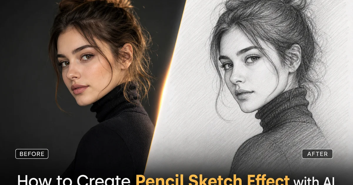
Pencil sketching is one of the oldest and most respected forms of visual art. The desire to transform photographs into drawings that look hand-rendered has existed since the earliest days of digital image editing. There is something compelling about reducing a full-color photograph to the key interplay of light and shadow expressed through graphite marks on paper. The abstraction strips away color, removes photographic detail, and forces the viewer to engage with the fundamental structure of the subject. A pencil sketch of a face reveals bone structure, a sketch of a building reveals geometric form. A sketch of a landscape reveals tonal composition in ways that the original photograph may not emphasize. This reductive quality is why pencil sketch effects remain among the most popular artistic filters across every photo editing platform.
Traditional methods for converting photos to pencil sketches in software have always suffered from a fundamental limitation: they operate on pixels rather than understanding subjects. A desaturation-and-edge-detection approach treats every pixel boundary the same regardless of whether it represents the contour of a face, the edge of a shadow, or noise in a dark area. The results look like processed photographs rather than drawings. The stroke direction is arbitrary, the shading is uniform, and the paper texture is applied as a flat overlay that bears no relationship to how real graphite interacts with paper grain. These technical artifacts right away reveal the digital origin to anyone who has seen an actual pencil drawing, undermining the artistic intent of the effect.
AI-powered pencil sketch conversion at its core changes this equation by understanding the semantic content of the image before applying any artistic change. The AI identifies faces, objects, textures, and spatial relationships, then generates pencil strokes that follow the natural contours of each element. Cross-hatching along the curve of a cheek, parallel lines along architectural edges, loose scribbling in foliage areas. The shading responds to the three-dimensional form of the subject rather than simply mapping brightness values to darkness levels. The paper texture interacts with the pencil marks the way real paper grain catches graphite particles at different pressures. This guide walks through using AI Filter and AI Enhance to create pencil sketches that could pass for hand-drawn artwork, covering stroke style selection, shading control, paper texture. The finishing touches that sell the illusion.
- AI analyzes the three-dimensional structure of the subject to generate pencil strokes that follow natural contours. Facial curves, architectural lines, fabric folds — rather than applying arbitrary directional marks.
- Multiple sketch styles simulate different pencil techniques including fine contour drawing, crosshatch shading, smooth tonal blending. Bold charcoal rendering, each suited to different subject matter.
- Paper texture simulation replicates how real graphite interacts with different paper grains — smooth Bristol for precision work, medium tooth for visible texture, rough stock for artistic character.
- Shading depth controls let you simulate the tonal range of any graphite grade from light HB sketching to deep 6B shadow rendering, matching the look of specific real-world pencil types.
- AI Enhance selectively sharpens key details like eyes, architectural features, and text after sketch conversion, ensuring critical elements remain legible within the artistic effect.
How AI pencil sketch conversion works differently from traditional edge detection filters
Traditional pencil sketch filters in photo editors follow a well-established algorithm: convert the image to grayscale, invert it, apply a Gaussian blur to the inverted copy, then blend the blurred inversion with the original using a color dodge blending mode. This produces white areas where the original is dark and dark lines where sharp edges exist, creating an approximation of a pencil drawing. The technique is computationally simple and produces instant results, but it has no understanding of what it is drawing. Every edge in the image — whether it is the contour of a jaw, the boundary of a shadow on a wall, or compression noise in a dark region — receives identical treatment. The resulting sketch has no artistic hierarchy, no variation in stroke weight based on importance. No directional intelligence in how lines are oriented.
AI pencil sketch conversion begins with semantic segmentation and depth estimation rather than pixel-level edge detection. The AI identifies distinct objects and surfaces in the scene, estimates their three-dimensional orientation relative to the viewer. Then generates pencil strokes that are informed by this understanding. Strokes on a cylindrical surface like an arm or a column curve to follow the form. Strokes on a flat wall run in consistent parallel lines. Strokes along the edge of an important subject are drawn with heavier weight than strokes along incidental background details, creating the same visual hierarchy that a trained artist instinctively applies when deciding where to press harder with the pencil. This subject-aware approach produces sketches that read as intentional drawings rather than processed photographs.
The difference becomes most apparent in areas of complex texture and subtle tonal variation. A traditional filter converts a section of tree foliage into a chaotic web of lines that traces every leaf edge, producing visual noise that no human artist would render. The AI recognizes foliage as a textural mass and represents it with loose, gestural scribbling that suggests leafy detail without exhaustively tracing it. Exactly as a skilled sketcher would handle the same subject. Similarly, skin in portraits receives smooth tonal gradients with minimal linework, hair gets flowing directional strokes that follow the direction of growth. Fabric shows strokes that trace fold lines and drape patterns. Each material receives the pencil treatment that an artist would choose for it. The AI understands what the material is.
- Traditional filters use desaturation and edge detection that treat all edges identically — jawlines, shadow boundaries, and noise artifacts all receive the same stroke weight and style.
- AI begins with semantic segmentation and depth estimation, generating strokes that follow three-dimensional surface contours rather than arbitrary pixel boundaries.
- Important subject edges receive heavier stroke weight while background details get lighter marks, creating the visual hierarchy that trained artists apply instinctively.
- Complex textures like foliage and fabric are represented with appropriate gestural techniques rather than exhaustive edge tracing, avoiding the visual noise of traditional filter approaches.
Choosing the right sketch style for your subject matter
Different pencil drawing techniques evolved over centuries to handle different subject matter. The AI sketch converter offers presets that simulate each major approach. Fine contour sketching uses thin, precise lines with minimal shading to define the outline and key internal features of a subject. It works beautifully for architectural drawings, product illustrations, and any subject where clean geometric form is the priority. The AI traces the primary contours with confident single-weight lines and adds only sparse interior detail, producing the kind of architectural rendering you might see in a designer's notebook. This style works best with subjects that have strong geometric structure and clear edge definition.
Crosshatch shading builds tonal values through overlapping sets of parallel lines drawn at different angles. Where two sets of lines cross, the overlap darkens the area, creating the illusion of steady tone through accumulated line density. The AI generates crosshatching that responds to surface curvature. Lines on a sphere curve gently while lines on a flat plane remain straight, and the angle between crossing sets varies to follow the geometry of the form. This technique is mainly effective for portraits and figurative work where the interplay of light and shadow across three-dimensional forms defines the character of the subject. It produces sketches with visible graphic energy because the individual strokes remain legible even in densely shaded areas.
Smooth tonal blending mimics the effect of using a blending stump or tortillon to smear graphite into steady gradients. This produces the most photorealistic pencil effect because it minimizes visible stroke marks in favor of soft transitions between light and dark. The AI applies smooth blending primarily in skin areas, sky regions. Smooth surfaces, while keeping visible linework along edges and in textured areas. This hybrid approach — blended tone with defined edges — matches how most portrait artists actually work, combining smooth rendering in cheeks and foreheads with decisive linework around eyes, lips, and hair. The result looks like a drawing by someone who has mastered both line control and tonal technique.
- Fine contour sketching uses thin precise lines with minimal shading — ideal for architecture, product illustration, and subjects with strong geometric form.
- Crosshatch shading builds tone through overlapping parallel line sets that follow surface curvature, producing visible graphic energy suited to portraits and figurative work.
- Smooth tonal blending simulates stump-blended graphite for continuous gradients, creating the most photorealistic pencil effect especially in skin and smooth surface areas.
- Hybrid approaches combining blended tone with defined edge linework match how professional portrait artists actually work, producing the most convincing hand-drawn appearance.
Controlling shading depth, contrast, and tonal range
The tonal range of a pencil sketch. How light the lightest areas appear and how dark the darkest areas get — is determined by the graphite grade and the pressure applied by the artist. AI Filter's shading depth control mimics this by letting you set the maximum darkness the simulated pencil can produce. At the lightest setting, the sketch resembles a quick early study done with a hard H-grade pencil. Delicate, airy, and with shadows that barely reach medium gray. At the deepest setting, it mimics a finished rendering done with soft 6B or 8B graphite. Rich, dramatic, and with shadows that approach near-black density. The sweet spot for most subjects falls somewhere in the middle, around HB to 2B equivalent. Provides enough tonal range to model three-dimensional form without the density overwhelming fine linework.
Contrast control works on its own from shading depth and determines how quickly the sketch transitions from light to dark. High contrast produces stark sketches with bright highlights and deep shadows that feel dramatic and punchy. Effective for moody portraits, high-contrast architecture, and subjects with strong directional lighting. Low contrast produces gentle sketches where tonal values compress into the middle range, creating a soft ethereal quality that works well for landscapes, still life subjects. Images where subtle tonal nuance is more important than drama. The AI maps the photograph's original tonal relationships to the sketch's compressed range, keeping relative brightness differences even when the absolute range is narrow.
Paper white keeping determines how much of the drawing remains untouched white paper. In real pencil drawing, the white of the paper serves as the brightest value in the tonal range. Artists carefully leave paper white in highlights, specular reflections, and areas they want to draw the viewer's attention. The AI replicates this by analyzing the image's highlight map and selectively withholding pencil marks from the brightest regions. Heavy paper white keeping produces sketches that feel light and open, as if the artist on purpose chose to leave most of the paper untouched. Minimal keeping produces dense, fully rendered sketches where pencil marks cover nearly every surface, creating a heavier and more labored drawing aesthetic.
- Shading depth simulates graphite grade from light H-series to deep 6B darkness — the HB to 2B range works best for most subjects, providing tonal range without overwhelming linework.
- Contrast control determines the transition speed between light and dark values — high contrast for dramatic subjects, low contrast for subtle ethereal effects.
- Paper white preservation strategically leaves the brightest areas untouched, replicating how real artists use blank paper as the lightest value in their tonal range.
- These three controls work together to simulate the full range of pencil drawing aesthetics, from quick preliminary studies to fully rendered presentation drawings.
Paper texture simulation and its impact on sketch realism
Paper texture is one of the most overlooked elements in digital pencil sketch effects. It is one of the most important factors in making a sketch look hand-drawn rather than digitally processed. When a real pencil moves across paper, the graphite particles deposit primarily on the raised portions of the paper grain, leaving the recessed valleys white. This creates the trait granular texture that is visible in every real pencil drawing. Mainly in lightly shaded areas where the pencil barely skims the surface. Without accurate paper texture simulation, a digital sketch looks unnervingly smooth and uniform in a way that right away triggers recognition of its artificial origin.
AI Filter offers three primary paper texture categories that correspond to real drawing surfaces. Smooth Bristol board produces minimal grain, allowing pencil lines to appear clean and precise. This is the surface expert illustrators choose for detailed technical drawings, clean portraits, and any work where precision matters more than texture. Medium-tooth drawing paper introduces visible grain that catches graphite particles unevenly, producing the classic pencil drawing look familiar from art school figure drawing sessions. Rough watercolor paper creates pronounced texture with deep valleys that resist graphite coverage, resulting in a speckled, textured look that adds major visual character and works well for loose, expressive sketches.
The paper texture interacts dynamically with the shading intensity. In heavily shaded areas where the simulated pencil presses hard, the graphite fills both peaks and valleys of the paper grain, producing solid dark coverage with minimal visible texture. In lightly shaded areas where the pencil barely touches the surface, only the paper peaks catch graphite while the valleys remain white, maximizing the visible grain pattern. This pressure-responsive texture interaction is key for realism because it matches the physics of real graphite-on-paper contact. The AI calculates texture visibility per pixel based on the local shading intensity, ensuring the paper grain appears naturally throughout the drawing rather than as a flat overlay applied uniformly across the entire image.
- Smooth Bristol board minimizes grain for precise technical drawings and detailed portrait work where clean lines matter more than textural character.
- Medium-tooth drawing paper produces the classic pencil sketch look with visible grain, replicating the surface most artists use for everyday drawing.
- Rough watercolor paper creates pronounced speckled texture ideal for loose expressive sketches where surface character adds artistic energy.
- Paper texture interacts dynamically with shading pressure — grain is most visible in light areas and fills in smoothly under heavy shading, matching real graphite physics.
Creative applications: portraits, architecture, and mixed-media compositions
Portrait pencil sketches generated by AI serve purposes that range from social media profile options to memorial artwork. Converting a photograph into a pencil portrait creates a version of the subject that feels more personal and artistic than the original photo. The abstraction of removing color and reducing detail to pencil strokes adds an interpretive quality that viewers associate with artistic skill and personal attention. Memorial portraits of loved ones, pet portraits for custom gifts. Stylized profile pictures that stand out from the uniform look of phone camera selfies are among the most common use cases. The AI's ability to handle facial features with right sensitivity. Soft tonal blending on skin, precise linework around eyes and lips, flowing directional strokes in hair — means these portraits look like they were drawn by a skilled artist rather than processed by a filter.
Architectural sketches transform building photographs into renderings that resemble the hand-drawn concept sketches architects produce during the design phase. Real estate marketers use this effect to give property listings a distinctive artistic quality that differentiates them from standard photography. Interior designers convert completed project photos into sketch versions that pair alongside their original concept drawings, showing the journey from idea to reality. The AI handles architectural subjects mainly well because buildings have clear geometric edges, strong perspective lines. Well-defined shadow patterns that translate directly into confident pencil strokes. The contour sketch preset excels here, producing clean architectural line drawings that emphasize structural form.
Mixed-media compositions combine the pencil sketch effect with selective color retention to create images where most of the scene is rendered as a graphite drawing while one element retains its original photographic color. A pencil sketch of a street scene with one red telephone booth in full color, a grayscale portrait with blue eyes rendered in vivid saturation, or an architectural sketch with a green garden in photographic detail. These compositions use the contrast between drawn and photographed elements to create striking focal points. AI Filter enables this by allowing you to mask specific regions that should retain their color while the rest of the image converts to pencil sketch, with the AI handling the transition zone between sketched and photographic regions so the boundary looks natural.
- Portrait sketches serve as memorial artwork, pet portraits, custom gifts, and distinctive social media profile pictures that feel more personal than standard photographs.
- Architectural sketches transform building photos into hand-drawn renderings used by real estate marketers and interior designers to add artistic differentiation.
- Mixed-media compositions selectively retain color in key elements while converting the rest to pencil sketch, creating striking focal points through the contrast of drawn and photographic regions.
- The AI handles transition zones between sketched and color-retained regions naturally, preventing hard mask boundaries that would reveal the digital compositing.
How to do it
- 1
Upload your photo and evaluate its suitability for pencil sketch conversion
Open your photograph in AI Filter and examine the image for strong tonal contrast and well-defined edges. Pencil sketch effects rely on clear distinctions between light and dark areas because graphite drawing is at its core a medium of value. There is no color, only the interplay of white paper and dark pencil marks. Portraits with directional lighting, architectural photos with strong geometric lines. Still life compositions with clear shadow patterns convert most convincingly. Low-contrast images, heavily textured backgrounds, and photos with flat even lighting tend to produce muddy sketches where important details disappear into uniform gray shading.
- 2
Select the pencil sketch style and configure stroke parameters
Choose from sketch presets that simulate different pencil techniques. Light contour sketching with fine lines, crosshatch shading with overlapping diagonal strokes, smooth tonal blending with gradient shading, or heavy charcoal-style rendering with bold dark marks. AI Filter analyzes the image content and suggests the most right style based on the subject matter: architectural images default to precise contour lines, portraits default to smooth tonal blending, and textured scenes default to crosshatching. Adjust the stroke weight slider to control how thick the simulated pencil lines appear, from delicate mechanical pencil fineness to bold carpenter pencil thickness.
- 3
Adjust shading depth and paper texture for realistic graphite appearance
Control the shading intensity to determine how dark the deepest shadows appear in the sketch. Real pencil drawings vary enormously in tonal range depending on the graphite grade used. An HB pencil produces light gray maximum darkness while a 6B pencil can approach near-black. The AI lets you simulate any point along this spectrum. Then select a paper texture that shows through the sketch: smooth Bristol board for clean precise lines, medium-tooth drawing paper for visible grain that catches graphite particles, or rough watercolor paper for a textured artistic feel. The paper texture is most visible in lightly shaded areas where the pencil barely touches the surface, allowing white paper to show through the strokes.
- 4
Use AI Enhance to sharpen key details and refine edge definition
After the initial sketch conversion, run AI Enhance on the result to sharpen the most important edges and ensure fine details remain legible. Eyes in portraits, window frames in architecture. Text on signs all benefit from selective sharpening that makes them pop against the surrounding pencil shading. The boost step also cleans up any areas where the sketch conversion produced muddy or indistinct marks, tightening the linework and improving the overall crispness of the drawing effect.
- 5
Export the final sketch and compare against traditional pencil drawing references
Save the finished sketch at full resolution and compare it side by side with photographs of real pencil drawings in the same style. Check that the stroke direction follows the contours of the subject. Pencil strokes on a face should follow the curvature of cheeks and jawline, not run in arbitrary directions. Verify that highlights are achieved through absence of marks rather than white coloring, that shadow buildup looks layered rather than uniformly dark. That the overall tonal range matches what a real pencil could produce. Adjust any settings that produce results outside the realistic range of graphite drawing.
Sources
- Image Style Transfer Using Convolutional Neural Networks — IEEE Conference on Computer Vision and Pattern Recognition
- Non-Photorealistic Rendering Techniques for Pencil Drawing Simulation — ACM SIGGRAPH
- Perceptual Losses for Real-Time Style Transfer and Super-Resolution — arXiv — European Conference on Computer Vision