
How to Create a Karatsu Pottery Effect with AI: Wabi-Sabi Ceramic Textures
Learn how to transform photos into Karatsu pottery-inspired artworks using AI. Step-by-step tutorial covering earth tone palettes, glaze textures, crackle patterns, and wabi-sabi aesthetics.
SEO & Growth
Reviewed by Magic Eraser Editorial ·
Table of Contents
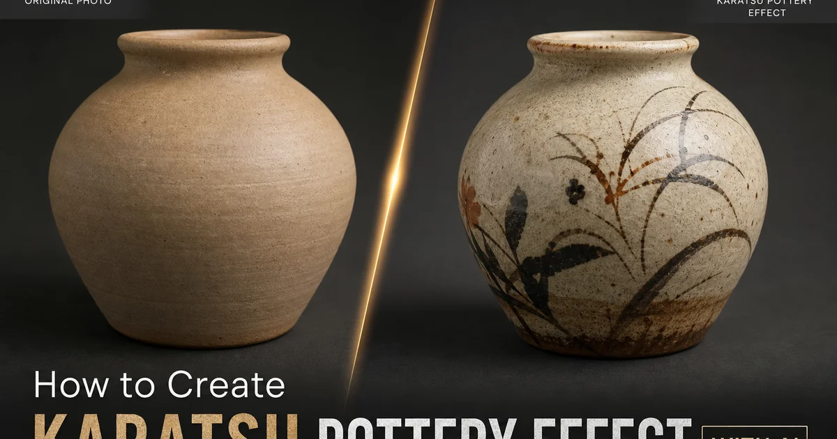
Karatsu pottery, one of Japan's oldest and most revered ceramic traditions, originated in the late sixteenth century on the island of Kyushu. Characterized by earthy iron-rich clay bodies, natural ash glazes, and a deliberate embrace of irregularity, Karatsu ware embodies the wabi-sabi philosophy. Finding beauty in imperfection, impermanence, and the marks of the maker's hand. Each piece tells a story through its glaze runs, kiln scars, and surface variations that no two firings can replicate. This aesthetic has found a passionate following among digital artists and photographers seeking to bring that same organic warmth and handmade character to their images.
Recreating the Karatsu pottery look in digital art in the past required extensive manual work in Photoshop. Layering multiple texture overlays, hand-painting glaze effects, adjusting color channels one by one, and blending crackle patterns at varying opacities. A skilled digital artist might spend hours on a single image, carefully balancing the warmth of the clay body against the translucency of the glaze while maintaining the irregularity that makes the effect feel authentic rather than mechanical. Getting the crackle pattern right alone could take dozens of iterations.
AI-powered photo editing tools have transformed this labor-intensive process into an accessible creative workflow. By analyzing the tonal structure and surface detail of your source image, AI can intelligently apply earth-tone color shifts, generate organic glaze textures that follow the natural contours of the composition. Produce crackle patterns that vary in density and direction just as they would on a real ceramic surface. The result captures the warmth and realism of Karatsu pottery without requiring years of experience in either ceramics or advanced digital manipulation.
- Transform any photograph into a Karatsu pottery-inspired artwork with warm earth tones, organic glazes, and authentic crackle patterns.
- AI-generated texture overlays follow the natural contours of your image rather than applying a flat uniform texture across the entire surface.
- Adjustable glaze intensity controls let you dial from a subtle ceramic warmth to a fully rendered pottery surface effect.
- The wabi-sabi aesthetic celebrates imperfection, making this effect forgiving and versatile across portraits, landscapes, and still life compositions.
- Export at full resolution for print-quality artwork or optimize for web display with preserved tonal gradations.
Understanding Karatsu pottery aesthetics for authentic digital effects
Karatsu pottery encompasses several distinct styles, each with unique visual traits that inform how the digital effect should be applied. E-Garatsu features painted decorations under an ash glaze, producing images where brushwork patterns show through a translucent surface layer. Madara-Garatsu is known for its speckled straw ash glaze that creates a mottled, organic surface pattern. Chosen-Garatsu combines two contrasting glazes — often a dark iron glaze and a white rice straw ash glaze — that interact unpredictably during firing to create dramatic surface tension and color boundaries.
The color palette of Karatsu ware is rooted in the geology of Kyushu. The local clay fires to warm browns and grays. The wood ash glazes produce colors ranging from pale straw yellow through olive green to deep amber. There are no bright or synthetic colors in authentic Karatsu pottery. Every hue is derived from natural materials interacting with fire. When translating this to a digital effect, the color change must strip away modern color vibrancy and replace it with this earth-derived palette without making the image look simply desaturated or muddy.
The texture of Karatsu pottery is equally important. The surfaces are never perfectly smooth. They carry the marks of the potter's fingers, the drag of the trimming tool, the grain of the clay body, and the movement of the glaze during firing. These micro-textures create a surface that interacts with light in complex ways, appearing matte in some areas and subtly glossy where glaze has pooled. Replicating this interplay of matte and gloss textures across a photograph is what separates a convincing Karatsu effect from a generic sepia filter.
- E-Garatsu, Madara-Garatsu, and Chosen-Garatsu each offer distinct visual reference points for different pottery effect variations.
- Authentic Karatsu color palettes derive entirely from natural materials — clay, wood ash, and iron — producing warm browns, olive greens, and straw yellows.
- Surface texture varies between matte clay areas and glossy glaze pools, creating complex light interaction across the ceramic surface.
- Digital effects must preserve this matte-gloss interplay rather than applying a uniform texture treatment to achieve authenticity.
Building the earth-tone foundation and glaze layers
The first step in creating a convincing Karatsu effect is establishing the color foundation. This goes beyond a simple warm color grade. The change needs to remap the entire tonal range of the image into the Karatsu palette. Shadows should shift toward warm charcoal rather than pure black. Midtones need to move into the ochre-to-amber range. Highlights should take on a cream or straw-yellow cast rather than remaining pure white. This full tonal remapping ensures that every element of the image feels like it exists on the same ceramic surface.
The glaze layer is where the effect gains its dimensional quality. Real Karatsu glazes are not uniform films. They flow like very slow liquids during firing, pooling in concavities and thinning over convex surfaces. AI texture generation can simulate this behavior by analyzing the luminance and edge structure of the image to determine where glaze would naturally accumulate. Darker recessed areas receive heavier glaze pooling with deeper color saturation. Raised edges and highlight areas show thinner glaze with more of the clay body visible beneath.
Blending the glaze layer requires careful opacity and blending mode selection. A multiply or soft-light blend at moderate opacity often produces the most realistic result, allowing the underlying image detail to show through the glaze texture while still conveying the dimensional quality of a ceramic surface. The goal is a layered effect where viewers can perceive both the photographic content and the pottery surface at once. The image should feel like it has been painted or printed onto a ceramic surface rather than simply filtered.
- Tonal remapping shifts the entire color range into the Karatsu palette — warm charcoal shadows, ochre midtones, and cream highlights.
- AI-generated glaze textures analyze luminance and edges to simulate how real glaze pools in recesses and thins over raised areas.
- Soft-light and multiply blending at moderate opacity lets photographic detail show through while conveying ceramic surface depth.
- The layered effect should make the image feel printed on ceramic, not simply passed through a color filter.
Adding authentic crackle patterns and final wabi-sabi touches
Crackle — known as kannyu in Japanese ceramics — is the network of fine lines that develops in a ceramic glaze as it cools and contracts at a different rate than the clay body beneath it. On Karatsu pottery, these crackle patterns range from barely visible hairline networks to bold, widely spaced crazing that becomes a defining visual feature. The pattern is never perfectly regular. It responds to the thickness of the glaze, the curvature of the surface, and the speed of cooling, producing organic variation that instantly signals handmade realism.
When applying crackle to a digital image, the pattern density should respond to the composition. Areas that correspond to thicker glaze. Often the darker, lower portions of the image — should have a denser crackle network with finer lines. Areas where the glaze would be thinner. Highlights and edges — should show wider, more widely spaced cracks or none at all. This variation prevents the crackle from looking like a flat overlay stamped across the entire image and instead makes it feel like a natural consequence of the ceramic surface.
The final wabi-sabi touches bring the effect to completion. This includes subtle edge darkening to simulate the kiln atmosphere effects on exposed clay at the rim, minor color variation that suggests the piece was fired in a wood-burning kiln where ash and flame created unpredictable surface patterns. A slight overall softening that mimics the way light scatters off a ceramic surface differently than off a photographic print. These finishing details are one by one subtle but collectively transform the effect from a texture overlay into a convincing ceramic artwork.
- Crackle density should vary across the image — denser in areas corresponding to thick glaze and sparser where glaze would be thin.
- Organic irregularity in the crackle line width and spacing is essential for avoiding a stamped-overlay appearance.
- Edge darkening simulates kiln atmosphere effects where exposed clay at the rim oxidizes and changes color during firing.
- Subtle overall softening mimics the way light scatters off ceramic surfaces differently than off smooth photographic prints.
How to do it
- 1
Select a photo with suitable surface texture and warm tones
Choose a photograph that has visible surface detail — portraits, still lifes, and architectural shots work well. Karatsu pottery is defined by earthy tones, subtle glaze variations. Organic irregularity, so images with warm color palettes and natural textures respond best to the effect. Avoid heavily processed or flat-colored images, as the pottery texture needs tonal variation to look convincing.
- 2
Apply the Karatsu-style warm earth tone base with AI Filter
Use AI Filter to shift the image color palette toward the trait Karatsu palette. Muted browns, warm grays, ochre, and soft cream tones. Reduce overall saturation slightly and push midtones toward amber. This base color change replicates the iron-rich clay body and natural ash glazes that define authentic Karatsu ware, giving your photo the foundational warmth of a wood-fired ceramic surface.
- 3
Add organic surface texture and glaze irregularities
Layer a ceramic surface texture overlay using AI Create to simulate the uneven glaze pooling, crawling, and pinholing trait of Karatsu pottery. Authentic Karatsu glazes are intentionally irregular. They pool thickly in recesses and thin out over ridges, creating a landscape of tonal variation across the surface. Adjust overlay opacity so the texture integrates naturally without overwhelming the underlying image content.
- 4
Introduce crackle patterns and wabi-sabi imperfections
Apply a fine crackle network across the image to emulate the crazing patterns found on aged Karatsu pottery. These crackle lines should be subtle and organic, not uniform. Thinner in some areas, wider in others, following the natural stress patterns of a ceramic glaze. This step is critical for realism because Karatsu ware celebrates imperfection as part of the wabi-sabi aesthetic that gives each piece its individual character.
- 5
Fine-tune contrast and export the finished ceramic effect
Use AI Enhance to adjust local contrast so the ceramic texture has depth. Glaze pools should appear slightly glossy while bare clay areas remain matte. Increase clarity in the midtones to bring out surface detail without sharpening to an artificial degree. Export at full resolution in PNG format to preserve the subtle tonal gradations of the pottery effect, or in WebP for optimized web display.
Sources
- Karatsu Ware: A Living Tradition of Japanese Ceramics — The Metropolitan Museum of Art
- Japanese Pottery and Porcelain: Techniques and Aesthetics — Japan Objects
- Wabi-Sabi and the Art of Imperfection in Japanese Ceramics — Encyclopaedia Britannica