
How to Create a Color Splash Effect with AI — Magic Eraser
Isolate a single color in any photo while converting the rest to black and white using AI selection. Step-by-step guide covering color detection, tonal mapping, edge refinement, and expert selective color effects.

Product Marketing
Reviewed by Magic Eraser Editorial ·
Table of Contents
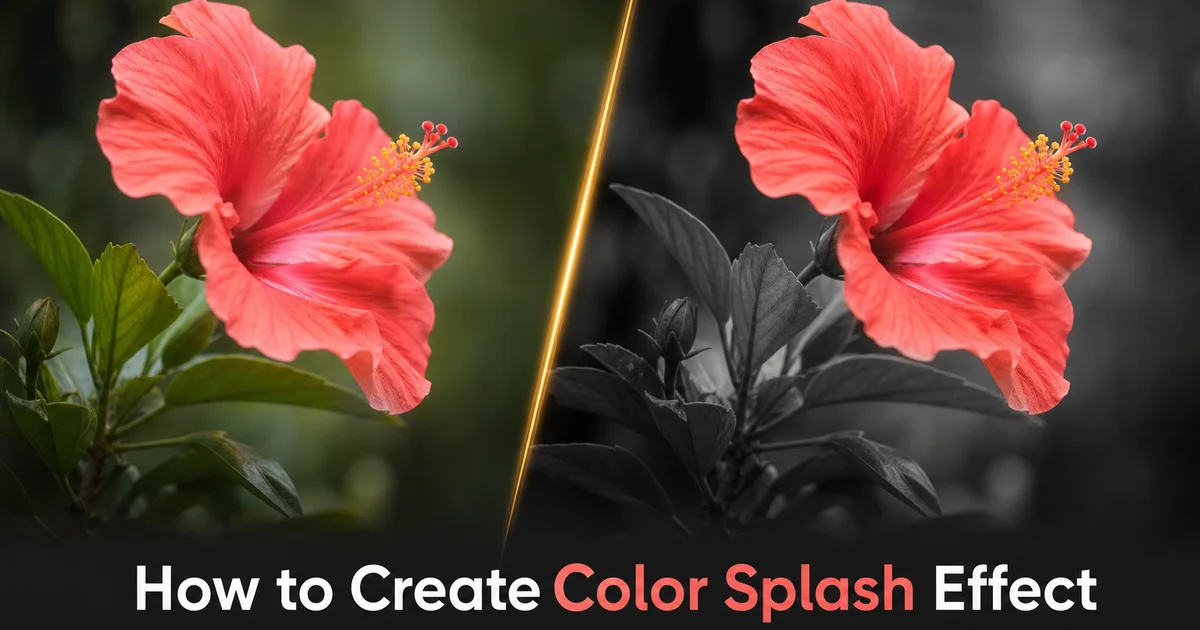
The color splash effect — where a single vivid color pops against an otherwise black-and-white image — is one of the most visually striking techniques in photography and graphic design. The technique works because of a fundamental principle of human visual perception: the eye is drawn to color contrast. When an entire scene is rendered in monochrome except for one element, that element commands attention with an intensity that no amount of compositional framing or lighting can match. A red umbrella on a gray rainy street, a yellow school bus in a desaturated cityscape, or blue eyes in a black-and-white portrait each creates an immediate focal point that viewers cannot ignore. Photographers, filmmakers, and advertisers have used this selective color isolation for decades to guide the viewer's eye exactly where they want it.
Creating a convincing color splash effect has historically been one of the more tedious editing tasks in photo software. The traditional workflow requires creating a precise mask around every instance of the target color in the image, then desaturating everything outside that mask. The difficulty lies in the masking: a red dress does not contain a single shade of red. It shifts through crimson in the shadows, scarlet in the midtones, and pink in the highlights, with reflected colors from the setting adding further complexity. Manually selecting all of these variations while excluding similarly colored elements elsewhere in the scene can take thirty minutes or more of careful brush work. Any inaccuracy produces visible artifacts where desaturated halos surround the colored object or stray colored pixels appear in the background.
AI-powered color splash tools eliminate this tedious manual masking by understanding both color and context at once. The AI does not simply threshold pixel hue values. It identifies the object that contains the target color, understands its three-dimensional form, and intelligently includes all the color variations across its surface while excluding similarly colored elements that belong to different objects. This means the red of a dress is preserved completely — including its shadowed folds, highlighted peaks, and reflected environmental tints — while a red fire hydrant in the background is correctly desaturated because the AI recognizes it as a separate object. This guide walks through using AI Filter and AI Enhance to create color splash images that look precise, intentional, and expert, whether for social media, marketing, or fine art photography.
- AI color detection identifies every tonal variation of a selected hue across the entire image — shadows, highlights, reflections, and environmental tints — without manual brushwork.
- Object-aware selection distinguishes between the target colored subject and similarly colored background elements, desaturating the fire hydrant while preserving the red dress.
- Intelligent tonal mapping converts the monochrome areas with proper luminance values rather than flat desaturation, producing a rich black-and-white backdrop that complements the color element.
- Sub-pixel edge refinement eliminates halo artifacts and color bleed at the boundary between the preserved color and the monochrome background.
- AI Enhance balances the final composition by adjusting monochrome contrast and color saturation to prevent the isolated hue from appearing unnaturally oversaturated against neutral surroundings.
Why AI color splash surpasses manual masking and simple hue thresholding
Simple hue thresholding — the method used by most traditional color splash tools — works by converting every pixel in the image to the HSL color model and desaturating any pixel whose hue falls outside a specified range. This approach treats every red pixel identically regardless of whether it belongs to the dress you want to highlight or the bricks in the background wall. The result requires extensive manual cleanup: painting out colored pixels that should be gray and painting in gray pixels that should be colored. Worse, hue thresholding struggles with the tonal extremes of the target color. Deep shadows on a red dress shift the hue toward brown or maroon and may fall outside the selected red range and get incorrectly desaturated. Bright highlights shift toward pink or white, creating a similar boundary problem. The user is forced to widen the hue tolerance to capture these variations, which then captures more unwanted background colors.
AI color splash replaces hue thresholding with semantic object detection combined with color analysis. When you tap the red dress, the AI identifies the entire dress as a single object using shape recognition, edge detection, and contextual analysis, then preserves all the colors within that object boundary, regardless of whether specific pixels technically fall outside a narrow hue range. The deep crimson shadow fold, the pale pink highlighted shoulder, and the warm orange reflection from a nearby wall are all preserved because they are all part of the dress, not because they all share the same hue value. Meanwhile, the red mailbox, the rusty pipe, and the warm-toned brick wall are all desaturated because the AI recognizes them as separate objects from the selected dress.
The practical difference is dramatic. A manual masking workflow for a color splash image of a woman in a red dress walking through a city scene might take twenty to forty minutes of careful brush work, with particular difficulty around the dress hem where it overlaps with similarly colored pavement reflections and the neckline where skin tones blend with dress color. The AI achieves a cleaner result in seconds because it processes the entire image holistically, understanding spatial relationships, object boundaries, and material properties that a pixel-level approach cannot detect. Edge transitions are smoother, tonal inclusion is more complete, and the boundary between color and monochrome follows the actual contour of the object rather than an irregular hue threshold boundary.
- Hue thresholding treats every pixel of a target color identically, requiring manual cleanup to include shadow variations and exclude similarly colored background objects.
- AI semantic detection identifies the colored object as a single entity and preserves all its tonal variations — shadows, highlights, and reflections — regardless of individual pixel hue values.
- Background objects with similar colors are correctly desaturated because the AI recognizes them as separate entities from the selected subject based on shape and spatial context.
- Edge transitions follow actual object contours rather than irregular hue threshold boundaries, producing cleaner professional results in seconds rather than minutes of manual brushwork.
Mastering tonal mapping for a rich monochrome backdrop
The black-and-white portion of a color splash image should not be an afterthought. It is half the composition, and its quality determines whether the final result looks expert or amateurish. Simple desaturation removes color information but preserves the original luminance values. Are calculated based on the RGB color model rather than human perception. A vibrant blue sky and a saturated green lawn may have similar RGB luminance values even though the human eye perceives the sky as greatly lighter than the grass. Simple desaturation renders them as similar gray tones, flattening the depth and contrast that made the original scene strong. The monochrome backdrop becomes a muddy, low-contrast surface that fails to support the vivid color element.
AI tonal mapping converts the non-selected areas using perceptual luminance calculations that match how the human visual system processes brightness. Blues are rendered darker than simple desaturation would produce, yellows are rendered lighter. Reds land in a middle range that preserves the tonal separation between different colored elements in the scene. This perceptual approach produces a monochrome backdrop that looks like it was shot on black-and-white film. With rich shadows, bright highlights, and a full tonal range from pure black to pure white. The AI also applies localized contrast adjustments, ensuring that areas adjacent to the color element have enough tonal contrast to make the color pop rather than blend into a similarly valued gray area.
You can further refine the monochrome character by choosing between different black-and-white conversion profiles. A neutral profile produces balanced tones that accurately represent the luminance of the original colors. A high-contrast profile expands the tonal range and deepens shadows for a dramatic noir-style backdrop. A warm profile adds a slight sepia tint to the monochrome areas, creating a vintage aesthetic that pairs beautifully with warm preserved colors like red and gold. A cool profile adds a subtle blue-gray tint that complements cool preserved colors like blue and teal. These profiles affect only the desaturated areas and do not alter the preserved color element, allowing you to style the backdrop on its own.
- Simple desaturation uses RGB luminance rather than perceptual brightness, producing muddy flat monochrome where different colored elements collapse into similar gray values.
- AI perceptual tonal mapping renders blues darker and yellows lighter to match human vision, producing monochrome with the full depth and contrast of dedicated black-and-white photography.
- Localized contrast near the color element ensures the vivid hue pops against its immediate surroundings rather than blending into a similarly valued gray area.
- Conversion profiles let you style the backdrop independently — neutral, high-contrast, warm sepia, or cool blue-gray — without altering the preserved color element.
Handling edge cases: transparent objects, reflections, and multi-instance colors
The most technically challenging color splash scenarios involve the target color appearing in forms that are not solid opaque objects. Transparent or translucent colored elements — a glass of red wine, sunlight filtering through a colored curtain, a colored neon sign reflected in a puddle — require the AI to preserve color in pixels that are partially transparent or that blend the target color with the underlying surface. The AI handles this by calculating per-pixel color contribution rather than applying a binary colored-or-not decision. A pixel that is fifty percent red wine and fifty percent the white tablecloth visible through the glass retains fifty percent of its red saturation while the tablecloth component desaturates, producing a natural semi-transparent look that maintains the illusion of looking through a colored translucent medium.
Reflections present a related challenge because the reflected color exists on a surface that is not the original colored object. A red car reflected in a rain-slicked street, red curtains mirrored in a window, or a red sunset reflected in water. In each case, the reflection carries the target color but belongs to a different physical surface. The AI lets you choose whether reflections of the target color should remain colored or desaturate along with the rest of the scene. Keeping reflections creates a more immersive effect where the color's influence on the scene is fully represented. Desaturating reflections creates a more surreal effect where color is confined strictly to the physical object. Both approaches are valid depending on the artistic intent.
Multi-instance scenarios occur when the target color appears in multiple separate objects. A field of red poppies, a city scene with multiple yellow taxis, or a marketplace with various blue fabrics. The AI detects all instances of the target color throughout the image and preserves them at once. It also gives you the option to selectively include or exclude specific instances. You might want only the nearest poppy in color while the rest fade to gray, or only one taxi in the foreground while background taxis desaturate. This selective multi-instance control transforms color splash from a simple color keeping technique into a compositional tool that directs the viewer's eye to specific elements within a complex scene.
- Transparent objects like wine glasses receive per-pixel color contribution calculations rather than binary decisions, preserving natural semi-transparency in the colored element.
- Reflections of the target color can be selectively preserved or desaturated. Preserved reflections create immersion while desaturated reflections create surreal confinement of color to the physical object.
- Multi-instance scenarios where the target color appears in multiple objects are detected automatically, with options to selectively include or exclude specific instances for compositional control.
- Each edge case uses the same AI object understanding that powers the primary selection, maintaining consistent edge quality and tonal accuracy across complex scenarios.
Creative and commercial applications of the color splash effect
Product photography is one of the highest-impact commercial applications of color splash because the technique right away solves the visual hierarchy problem that every product photo faces: making the product the undeniable focal point of the image. A color splash image of a red lipstick on a monochrome vanity table, a blue sneaker against a desaturated urban backdrop, or a gold watch on a black-and-white wrist ensures that the product is the first and only thing the viewer notices. E-commerce teams use this technique for hero banner images, email marketing headers, and social media ads where a single product needs to command attention within a crowded visual landscape. The effect is especially powerful for products whose color is a key selling point. Cosmetics, fashion accessories, automotive paint, and home decor items where the specific hue is part of the purchasing decision.
Real estate and travel photography benefit from color splash as a storytelling device that guides the viewer through a scene. A travel photo with only the turquoise ocean in color against a monochrome beach creates an emotional focus on the water that communicates tropical serenity more effectively than the full-color version. A real estate listing photo with only the front door in its distinctive red against a monochrome facade makes the entrance a welcoming focal point. Event photographers use color splash to isolate wedding colors — the bridal bouquet, the groomsmen's ties, and the table centerpieces — creating a cohesive visual theme across a gallery where the chosen color always appears against neutral backgrounds.
Social media content creators have made color splash one of the most shared visual effects because it performs exceptionally well at small sizes and during rapid scrolling. The bold contrast between a single vivid color and a monochrome frame can catch the eye faster than many full-color images in crowded feeds. The technique also adapts beautifully to brand identity: a business that uses a signature color can create a feed aesthetic where their brand color appears as the isolated element in every post. Red Coca-Cola cans, blue Tiffany boxes, green Starbucks cups — reinforcing brand recognition through consistent visual treatment.
- Product photography with color splash makes the product the undeniable focal point — especially effective for items where the specific color is a key selling point like cosmetics and fashion.
- Real estate and travel photography use color splash as a storytelling device, guiding the viewer's emotional focus to specific architectural features or natural elements.
- Event photographers isolate wedding or brand colors across entire galleries, creating a cohesive visual theme where the chosen hue appears consistently against monochrome backgrounds.
- Social media content benefits from color splash's bold contrast that catches the eye during rapid scrolling, with consistent brand color isolation reinforcing recognition across a content feed.
How to do it
- 1
Upload your photo and identify the color you want to isolate
Open your photograph in AI Filter and decide which single color should remain vivid while the rest of the image converts to black and white. The most effective color splash images feature a color that appears in a clearly defined subject. A red dress, a yellow taxi, blue flowers, or an orange umbrella. The AI performs best when the target color is distinct from its surroundings, meaning a red subject against a mostly green or neutral background will produce cleaner results than a red subject surrounded by similar warm tones like orange and magenta.
- 2
Use AI color detection to select the target hue range
Rather than manually masking the colored element, tap or click on the color you want to preserve and let the AI detect every pixel in the image that falls within that hue range. The AI groups not just the exact color you selected but also its natural variations. Shadows, highlights, reflections, and tonal shifts that occur across the surface of the colored object. Adjust the hue tolerance slider to widen or narrow the range: a tight tolerance isolates only the precise red of a dress while excluding the pinkish reflections on nearby skin. A wider tolerance captures the full spectrum from deep crimson shadows to bright scarlet highlights.
- 3
Convert the non-selected areas to black and white using AI tonal mapping
The AI converts everything outside the selected color range to monochrome using intelligent tonal mapping rather than simple desaturation. Simple desaturation can produce flat, muddy grayscale because it does not account for how different colors contribute to perceived brightness. The AI's tonal mapping assigns luminance values that preserve the depth and contrast of the original scene. Deep blues become rich dark grays, bright yellows become light silvery tones, and greens land in the right middle range. This ensures the black-and-white portion of the image looks like a properly converted monochrome photograph rather than a washed-out afterthought.
- 4
Refine the color boundary to eliminate halo artifacts and color bleed
Examine the edges where the preserved color meets the monochrome background. Common artifacts include thin halos of desaturated color at the boundary, stray colored pixels in the background where objects share the target hue. Desaturated patches within the colored subject where shadows shift the hue outside the selected range. Use the AI's edge refinement tool to tighten the mask boundary with sub-pixel precision. Manually include or exclude small regions that the automatic selection missed. The goal is a seamless transition where the color appears to exist naturally within the black-and-white scene rather than looking cut and pasted.
- 5
Apply AI Enhance to balance the final composition and export
Run AI Enhance on the finished image to ensure the monochrome areas have proper contrast and the colored elements have accurate saturation. Sometimes the isolated color can appear oversaturated against the neutral background because the absence of competing colors amplifies its visual intensity. A slight reduction in saturation often produces a more elegant result than leaving the color at full intensity. Export the final image and evaluate it at the size it will be displayed: color splash effects that look striking at full resolution may lose impact at thumbnail size if the colored element is too small relative to the frame.
Sources
- Color Psychology in Visual Communication and Marketing — Emerald Insight — Management Decision
- Selective Colorization Using Neural Networks — arXiv — IEEE Conference on Computer Vision
- The Role of Color Isolation in Visual Attention and Image Composition — Journal of Vision