
How to Create a Hasami Ware Effect with AI: Japanese Functional Porcelain Tutorial
Learn how to create authentic Hasami ware porcelain effects in photos using AI. Step-by-step tutorial covering clean geometric forms, minimal indigo decoration, and the functional simplicity that defines Nagasaki Prefecture's everyday porcelain tradition.

Product Marketing
Reviewed by Magic Eraser Editorial ·
Table of Contents
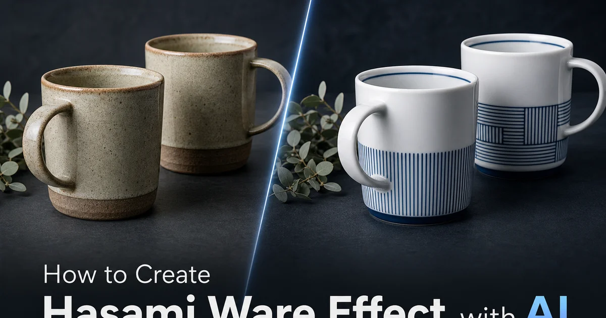
Hasami ware is Japan's most produced porcelain, originating in the town of Hasami in Nagasaki Prefecture on the island of Kyushu. Ceramic production began in the early seventeenth century alongside the more famous kilns of neighboring Arita. While Arita porcelain gained international fame through aristocratic patronage and European export markets, Hasami ware took a different path. It became Japan's everyday porcelain, the tableware that ordinary households used for daily meals. By the mid-Edo period, Hasami kilns were producing enormous quantities of functional ware shipped throughout Japan via the compra trading system. The town's focus on accessible, practical ceramics rather than luxury goods established a tradition that continues to define Hasami ware's identity four centuries later.
The visual language of Hasami ware, mainly in its modern expression, is built on functional minimalism. The porcelain body is clean white. Similar to Arita's kaolin-based material, since both traditions draw from the same regional clay deposits — but the forms focus on practical geometry over decorative complexity. Cups are cylindrical with comfortable proportions. Plates are flat with clean rims. Bowls have simple curves that stack efficiently. Decoration, when present, is restrained to the point of understatement: a single indigo blue line around a rim, a dipped glaze creating a two-tone effect, or a subtle stamped pattern that reveals itself only upon close inspection. This design philosophy — maximum function, minimum fuss — has made modern Hasami ware enormously popular in the modern Japanese lifestyle market and increasingly recognized internationally as an exemplar of Japanese functional design.
AI photo editing tools can now apply the distinctive Hasami ware aesthetic to ordinary photographs, transforming images into compositions that evoke the clean porcelain surfaces, geometric simplicity. Restrained minimal decoration of this everyday porcelain tradition. The AI emphasizes the underlying geometry of the source image while stripping away visual noise, shifts the palette to Hasami ware's signature white-and-indigo restraint. Applies the smooth but approachable surface quality of utility porcelain rather than display porcelain. The result connects photography to a ceramic tradition that finds beauty in functional simplicity. Objects designed to serve daily life with quiet, undemanding elegance.
- Transform photographs into Hasami ware compositions with clean porcelain surfaces, geometric simplicity, and minimal indigo-on-white decoration.
- Apply the functional porcelain surface quality — smooth and refined but sturdy and approachable, inviting daily handling rather than display-case distance.
- Convert palettes to Hasami ware's restrained color system — white porcelain body with minimal indigo accents, two-tone glazing, and subtle texture patterns.
- Emphasize underlying geometric form over surface decoration — clean lines, simple curves, and the interplay of glazed and unglazed surfaces.
- Export with tonal precision to preserve the specific white, indigo, and surface transitions that define Hasami ware's considered minimalism.
Understanding Hasami ware aesthetics and functional design philosophy
Hasami ware's modern aesthetic is inseparable from its historical identity as everyday tableware. While other Japanese ceramic traditions — Raku for tea ceremony, Kutani for aristocratic display, Nabeshima for feudal display — were developed for specific ceremonial or prestige contexts, Hasami ware was always made for the kitchen table. This origin profoundly shapes its design vocabulary: forms must be stackable because space is limited in Japanese kitchens, walls must be thick enough for daily dishwasher and microwave use, weights must be comfortable for repeated lifting during meals, and proportions must suit the specific foods and serving conventions of Japanese home cooking. Rice bowls at a specific diameter, soy sauce dishes at a specific depth, tea cups at a specific capacity. Beauty emerges from the perfection of these functional parameters rather than from decorative elaboration.
The minimal decoration trait of modern Hasami ware represents a deliberate design evolution rather than a lack of decorative capability. Historically, Hasami kilns produced blue-and-white ware with painted decoration similar to Arita's, and skilled painters were part of every workshop. The shift toward minimalism accelerated in the twentieth century as Hasami producers responded to modernist design sensibilities and the modern Japanese preference for tableware that complements food display rather than competing with it. A simple white plate with a single blue rim line provides a clean stage for the colors and textures of Japanese cuisine. An elaborately painted plate would fight with the visual display of the food. This philosophy — the vessel serves the content, not itself — is the core design principle that the digital Hasami effect must embody.
The relationship between Hasami ware and modern design culture has made it a touchstone for the modern Japanese aesthetic concept of yohaku no bi — the beauty of blank space. In Hasami ware, the undecorated white porcelain surface is not empty but is the primary visual element, with any decoration functioning as a punctuation mark rather than the main text. This inversion of the typical decoration-ground relationship. Where the ground dominates and decoration recedes — creates objects of quiet visual power that reward sustained attention. In the digital effect, this principle means that the white porcelain surface should occupy the majority of the composition, with any blue decoration or surface variation functioning as a minimal accent that structures the white space without filling it.
- Hasami ware's beauty emerges from perfecting functional parameters — stackability, durability, comfortable weight, and proportions suited to Japanese home cooking.
- The shift from painted decoration to minimalism reflects a design philosophy where the vessel serves the food presentation rather than competing with it.
- Yohaku no bi (beauty of blank space) inverts the decoration-ground relationship — white porcelain dominates, with any decoration functioning as minimal punctuation.
- Forms prioritize practical geometry — cylindrical cups, flat plates with clean rims, and simply curved bowls that stack efficiently in limited kitchen storage.
Applying the Hasami porcelain surface and minimal color treatment
The surface change for a Hasami ware effect differs at its core from display porcelain treatments because it must share function rather than preciousness. Display porcelain — thin-walled, translucent, with a brilliant glaze — signals fragility and value. You handle it carefully, display it in a cabinet, and bring it out only for special occasions. Hasami ware's surface shares the opposite: it invites you to pick it up, fill it, use it, and stack it in the dishwasher. The AI achieves this distinction through glaze character. A smooth, warm gloss with a slight softness rather than the cold, hard brilliance of display porcelain. The surface reflects light in a diffused, comfortable way rather than producing sharp specular highlights that signal preciousness and discourage handling.
The color application follows the principle of minimum effective decoration. The AI analyzes the source photograph's compositional structure and identifies the minimal amount of color intervention needed to create a distinct Hasami ware effect. This might be a single line of indigo at a structural boundary. Converting a compositional division in the source image into the visual equivalent of a rim line on a Hasami plate. Or it might be a two-tone split where one major area of the composition receives a full indigo dip treatment while the rest remains white porcelain. The restraint must be genuine: adding more decoration, even attractive decoration, would move the effect away from Hasami ware's identity toward a more generic blue-and-white ceramic treatment.
The transition zones between glazed and unglazed, between white and blue, between smooth and textured surfaces are where the Hasami ware effect achieves its distinctive character. On a real Hasami piece, a dipped indigo glaze creates a transition line where the blue fades gradually into the white body. Not a hard edge but a soft boundary that reveals the physics of liquid glaze flowing and stopping on the clay surface. Similarly, the transition from glazed interior to unglazed foot ring reveals the raw porcelain body. A slightly different white than the glazed surface, with a matte texture that contrasts with the surrounding gloss. These transition details are what make the effect read as a specific ceramic tradition rather than a flat color overlay. The AI must render them with the subtle physics-based quality of real glaze behavior.
- Functional porcelain surface communicates approachability rather than preciousness — warm, soft gloss with diffused reflections rather than cold specular brilliance.
- Minimum effective decoration — the AI applies the least amount of color intervention needed to create a recognizable Hasami ware effect, never more.
- Dipped-glaze transition lines are soft, physics-based boundaries where color fades gradually — not hard digital edges but natural glaze flow-and-stop behavior.
- Glazed-to-unglazed transitions reveal raw porcelain body with a different white and matte texture, providing the material authenticity of real ceramic surfaces.
The specific tones and material qualities of Hasami porcelain
The white of Hasami ware porcelain has a specific warmth that distinguishes it from the cool blue-white of high-end Arita display ware, despite both using similar kaolin-based clay bodies from the Hizen region. This warmth comes partly from the slightly thicker walls and partly from the glaze formulation. Hasami utility glazes are often adjusted for durability and thermal resistance rather than maximum transparency, and these adjustments introduce a subtle warmth to the overall surface tone. The white is clean and bright but not icy. It has the comfortable quality of a well-lit room rather than the dazzling quality of a spotlight. In the digital effect, this means the white areas should feel warm and inviting, calibrated to the specific tone of functional porcelain rather than defaulting to the cooler white of display pieces.
The indigo blue used in Hasami ware decoration occupies a middle ground between the refined cobalt blue of Arita painting and the deep, slightly rough blue of folk pottery traditions. It is painted with less precision than Arita's meticulous brushwork but more control than the free-spirited expression of folk ware. A practical, efficient painting style suited to production workshops where hundreds of pieces receive the same simple decoration in a day. The blue tone itself is clean and saturated. A true indigo rather than the gray-blue of diluted cobalt or the navy of heavily reduced firing — applied with consistent density across simple motifs. In the digital effect, this blue should feel confident and purposeful: not artistically expressive but not mechanically perfect, occupying the comfortable middle ground of skilled production craft.
Modern Hasami ware has increasingly explored the expressive potential of unglazed porcelain surfaces. The raw, matte body that is normally visible only on the foot ring of glazed pieces. Design-forward Hasami workshops expose larger areas of the porcelain body by leaving portions unglazed, creating contrast between the glossy glazed surface and the matte, slightly rough texture of raw fired porcelain. The raw porcelain has a warm, chalky white quality that absorbs light rather than reflecting it. Its tactile roughness provides a comfortable grip surface. In the digital effect, this glazed-versus-unglazed contrast is a powerful tool for creating the modern Hasami aesthetic. The AI can render portions of the composition with matte, light-absorbing surface quality against the surrounding gloss, adding material depth without adding color or decoration.
- Hasami white is warm and comfortable rather than icy — slightly warmer than display Arita ware due to thicker walls and durability-optimized glaze formulations.
- Indigo blue is confident and purposeful — cleaner than folk pottery but less meticulous than Arita, reflecting efficient production craft rather than artistic expression.
- Unglazed porcelain surfaces have a warm, chalky, matte quality that absorbs light — increasingly used in contemporary Hasami design for glazed-versus-unglazed contrast.
- The glazed-to-unglazed contrast adds material depth without additional color or decoration — aligning with Hasami ware's principle of minimum effective ornament.
Creative applications and export optimization for Hasami ware effects
The Hasami ware effect serves brands and content creators working with minimalist, functional, and modern Japanese design aesthetics. Lifestyle brands, kitchen and homeware companies, and food-focused content creators find the Hasami treatment mainly resonant because the tradition's identity is inseparable from daily domestic life. Meals, cooking, gathering, and the quiet rituals of home. The clean, undemanding quality of the Hasami aesthetic provides a visual framework that elevates everyday subjects without overdramatizing them: a cup of coffee, a plate of breakfast, a simple table setting gains the considered quality of Japanese functional design while remaining approachable and grounded in ordinary life.
For product photography and e-commerce, the Hasami ware effect creates a distinctive visual language that shares quality through restraint rather than elaboration. In markets saturated with visually loud, heavily filtered content, the clean white surfaces and minimal blue accents of the Hasami treatment stand out precisely because they do not try to stand out. They achieve attention through quietness rather than noise. This makes the effect mainly effective for brands whose identity centers on quality, simplicity, sustainability, or craft. Values that align naturally with the functional design philosophy that Hasami ware embodies. The effect also scales always across product lines, creating visual coherence from a single product shot to a full catalog layout.
Export settings for Hasami ware effects must preserve the precise tonal relationships that the minimal aesthetic depends upon. With little decoration to carry the visual identity, the specific white tone, the exact indigo value. The subtle glazed-versus-unglazed texture contrast must survive the export pipeline without alteration. PNG is preferred for any application requiring exact color. WebP at quality 88 or higher maintains the subtle surface transitions for web delivery. The most common export failure is the loss of the warm white tone. Compression or color management that shifts the functional warmth toward clinical white destroys the approachable quality that defines Hasami ware. Always verify that the exported white reads warm and inviting rather than sterile. That the minimal blue decoration retains its considered, purposeful presence rather than appearing arbitrary.
- Lifestyle, homeware, and food content gains the considered quality of Japanese functional design while remaining approachable and grounded in everyday domestic life.
- The clean, quiet Hasami aesthetic stands out in visually noisy content markets by achieving attention through restraint rather than elaboration.
- Visual coherence scales naturally from single product shots to full catalog layouts — the minimal palette and consistent surface quality provide built-in brand unity.
- Export must preserve warm white tone and subtle surface transitions — clinical white or lost texture destroys the approachable functional quality that defines the tradition.
How to do it
- 1
Select a source image with clean geometry and everyday subject matter
Hasami ware is defined by functional simplicity. Clean geometric forms, minimal decoration, and a design philosophy that serves daily life without demanding attention. Choose a source photograph with clear, simple forms that align with Hasami ware's modern aesthetic: architectural elements with clean lines, tabletop arrangements with geometric shapes, minimal landscapes, or portraits with restrained composition. Images with strong underlying geometry translate well because Hasami ware's modern identity emphasizes form over decoration, structure over ornamentation. Avoid busy, cluttered compositions — the beauty of Hasami ware lies in what it omits as much as what it includes.
- 2
Apply the porcelain surface treatment emphasizing functional simplicity
Open the image in AI Filter and select a porcelain surface preset calibrated for utility ware rather than display porcelain. The AI transforms the image surface to simulate Hasami ware's distinctive quality. A clean, smooth porcelain surface with a practical gloss that invites handling rather than discouraging it. Unlike the precious translucency of display porcelain, Hasami ware's surface shares durability and everyday function: slightly thicker walls, a sturdy feel. A glaze with a comfortable warmth rather than a cold, glassy brilliance. Adjust the surface treatment to emphasize this functional character — smooth but not precious, refined but not fragile.
- 3
Apply the characteristic Hasami color palette and minimal decoration
Convert the image palette to Hasami ware's signature color system. Modern Hasami ware is defined by its restrained palette. White porcelain body, indigo blue decoration, and increasingly the natural blue-gray of unglazed porcelain edges and the warm amber of wood-fired accents. The AI applies color in the Hasami manner: minimal, purposeful. Often limited to a single accent color against the white ground. Where traditional Arita decoration fills surfaces with painted motifs, Hasami ware may feature nothing more than a simple blue line, a dipped glaze creating a two-tone effect, or a subtle texture pattern. The restraint is the decoration.
- 4
Refine the balance between form and surface for modern Hasami aesthetics
Use AI Enhance to refine the relationship between the underlying geometric form and the surface treatment. Modern Hasami ware achieves its visual impact through the interplay of clean form and subtle surface variation. The way a glaze breaks slightly different over a sharp rim versus a curved wall, the contrast between a glossy interior and a matte exterior, or the visual weight of a simple color-blocked design where one half of the form is white and the other is indigo. Ensure the effect emphasizes these structural transitions rather than adding decorative elements that would contradict Hasami ware's key minimalism.
- 5
Export the finished Hasami ware image with clean tonal precision
Save in PNG format to preserve the clean tonal relationships and subtle surface variations that define the Hasami aesthetic. Because Hasami ware's visual impact depends on precision of form and restraint of color rather than decorative complexity, the export must maintain exact color values. The specific white of the porcelain, the specific indigo of any blue decoration, and the precise transitions between glazed and unglazed surfaces. For web use, WebP at quality 88 or higher maintains the tonal accuracy. For print applications, export at 300 DPI and verify that the white porcelain reads as clean and warm rather than sterile. That the minimal decoration retains its purposeful, considered quality rather than appearing sparse or accidentally unfinished.
Sources
- Hasami Ware: Four Centuries of Functional Porcelain from Nagasaki Prefecture — Hasami Ware Promotion Association
- The Evolution of Japanese Everyday Ceramics: From Compra to Contemporary Design — Japan House London
- Porcelain Body Composition and Glaze Interaction in Hizen Ware Production Sites — Journal of the Ceramic Society of Japan