
How to Create Duotone Effect with AI — Magic Eraser
Create striking duotone color effects on photos using AI-powered tonal mapping. Step-by-step guide covering color pair selection, brand applications, social media improvement, and batch processing for campaigns.

Product Marketing
Reviewed by Magic Eraser Editorial ·
Table of Contents
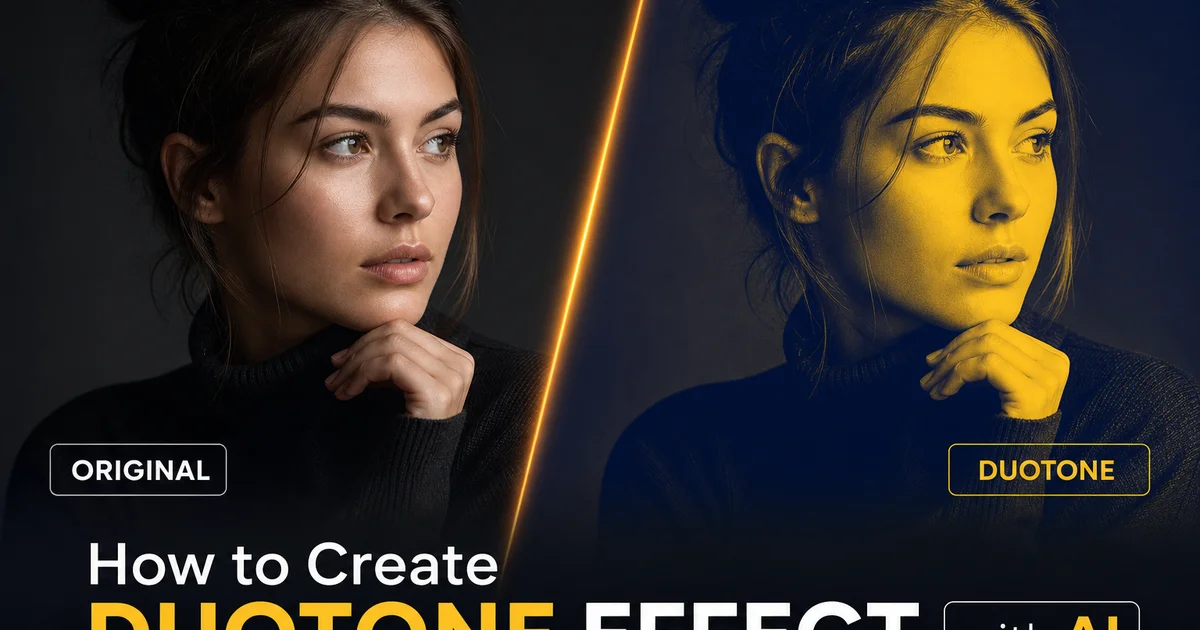
The duotone effect — replacing the full color spectrum of a photograph with just two colors mapped across the tonal range — has been a staple of graphic design since the lithographic print era. It has experienced a massive resurgence in digital branding over the past decade. Spotify popularized the modern duotone aesthetic with their bold artist imagery using vivid matching color pairs. Since then the technique has become a go-to visual treatment for tech companies, music brands, fashion labels, and social media campaigns that want to make an immediate, high-impact visual statement. The effect works because the extreme color simplification draws attention, creates instant brand recognition through consistent color use. Transforms ordinary photographs into graphic design elements that integrate seamlessly with typography and layout.
Creating convincing duotone effects in the past requires intermediate-to-advanced skills in Photoshop or similar tools. The process involves converting the image to grayscale, creating a gradient map with the two chosen colors, adjusting the tonal distribution to maintain detail and depth. Fine-tuning the result so it does not look like a simple color overlay. Simple one-click duotone filters available in consumer apps often produce flat, muddy results because they apply a uniform color wash rather than a true tonal mapping. The image looks tinted rather than designed, losing the depth and dimension that makes expert duotone work strong.
AI-powered duotone tools bridge this quality gap by analyzing the tonal structure of each image and applying intelligent color mapping that preserves three-dimensional depth, maintains texture detail. Distributes the two colors across the dynamic range in a way that looks intentional rather than accidental. AI Filter understands that skin should retain tonal variation even within a two-color palette, that architectural surfaces should maintain their texture and depth cues. That the transition between the shadow color and highlight color should follow the natural light direction in the scene. This guide covers the complete workflow for creating expert duotone effects using AI Filter, from color selection strategy through batch processing for consistent multi-image campaigns.
- AI tonal mapping preserves three-dimensional depth and texture detail that simple color overlay filters flatten, producing duotone results that look designed rather than tinted.
- Complementary color pairs like blue-orange and purple-yellow create maximum visual energy, while analogous pairs like blue-purple produce sophisticated, harmonious results.
- The tonal balance point controls where the shadow color hands off to the highlight color — shifting it five to ten percent creates noticeable mood differences.
- Brand applications should use the primary brand color as the shadow tone and a lighter accent as the highlight, building visual recognition across all duotone campaign materials.
- AI Filter supports batch processing to apply identical duotone settings across entire photo sets, ensuring visual consistency throughout multi-image campaigns.
Color theory for effective duotone pairs
The choice of two colors determines everything about the duotone result. Its mood, its energy level, its brand associations, and its effectiveness across different media. Matching color pairs, which sit opposite each other on the color wheel, produce the highest visual contrast and energy. Blue and orange is the most popular matching duotone pairing because it leverages the warm-cool contrast that the human eye is most sensitive to, creating images that feel at once warm and cool, energetic and balanced. Purple and yellow creates a regal, attention-grabbing combination. Teal and coral produces a fresh, modern feel that has become mainly associated with tech and lifestyle brands. These high-contrast pairings work well for social media, event marketing. Any context where the goal is to stop the viewer's scroll.
Analogous color pairs use colors that sit adjacent on the color wheel, producing harmonious, low-contrast results that feel cohesive and sophisticated rather than energetic. Deep blue and purple creates a moody, nightclub aesthetic. Dark red and warm orange evokes heat, passion, and intensity. Forest green and teal suggests nature, sustainability, and calm. These pairings work well for brand applications where sophistication and consistency matter more than attention-grabbing energy. Luxury brands, financial services, healthcare, and expert services often favor analogous duotone palettes because they share stability and taste rather than excitement.
For brand-specific applications, start with your primary brand color as the shadow tone because it occupies more visual area in the typical image and therefore dominates the viewer's color impression. Your highlight color should be lighter and complement the shadow color without competing with it. An accent color from your brand palette, a lighter tint of the primary, or a warm neutral like cream or gold all work well. Test your chosen pair against your brand's typography and design elements to ensure the duotone imagery integrates with existing visual assets rather than clashing with them. AI Filter's custom color picker accepts exact hex values. You can match your brand guidelines precisely rather than approximating from preset palettes.
- Complementary pairs like blue-orange and purple-yellow create maximum visual contrast and energy, ideal for social media and event marketing that needs to stop the scroll.
- Analogous pairs like blue-purple and green-teal produce sophisticated, harmonious results favored by luxury, financial, and professional service brands.
- Use your primary brand color as the shadow tone because it occupies more visual area and dominates the viewer's color impression of the image.
- AI Filter accepts exact hex values for custom color matching, ensuring duotone imagery aligns precisely with existing brand guidelines and visual assets.
How AI tonal mapping preserves depth and dimension
The critical difference between expert duotone and amateur duotone is whether the two-color image retains the three-dimensional quality of the original photograph. In a well-executed duotone, a portrait still shows the contours of the face, a building still shows the depth between its columns and facade. A landscape still shows the separation between foreground, midground, and horizon. In a poorly executed duotone, these depth cues disappear and the image looks like a flat, posterized graphic with two colors and no spatial information. The keeping of depth despite using only two colors is what separates the Spotify aesthetic from a cheap social media filter.
AI tonal mapping achieves this depth keeping by analyzing the original image's luminance structure before applying any color change. The AI identifies the key tonal relationships that share depth. The gradual darkening on the curved surface of a face, the shadow patterns that reveal architectural form, the mood perspective that separates landscape planes — and ensures these relationships survive the color mapping process. Rather than applying a simple linear gradient from shadow color to highlight color, the AI shapes the tonal curve to preserve the contrast ratios that share three-dimensional form, sometimes compressing the tonal range in less important areas to give more tonal space to the areas where depth information is concentrated.
Skin tones present a specific challenge in duotone because faces are the first place the viewer looks. Any flattening of facial structure is right away noticeable. AI Filter handles this by detecting faces in the image and applying a modified tonal curve to skin regions that preserves the subtle luminance variations across the nose bridge, cheekbones, jawline, and forehead that share facial structure. Without this face-aware processing, duotone portraits often look like flat graphics rather than photographs of real people. The difference is subtle when examined pixel-by-pixel but dramatic in overall impression. Face-aware duotone images look like expert design work while flat duotone images look like they were processed with a basic phone filter.
- Professional duotone retains three-dimensional depth cues — facial contours, architectural shadows, landscape planes — that cheap filters flatten into posterized graphics.
- AI analyzes the luminance structure before color mapping and shapes the tonal curve to preserve the contrast ratios that communicate depth and spatial form.
- Face detection applies a modified tonal curve to skin regions, preserving the subtle luminance variations across facial features that make portraits look three-dimensional.
- The tonal range is compressed in less important areas to give more space to regions where depth information is concentrated, maintaining the impression of real photography.
Duotone for social media and digital marketing campaigns
Social media is where duotone imagery has its greatest impact because the effect creates immediate visual consistency across a content feed while differentiating your brand's imagery from the full-color photographs that dominate most timelines. When a user scrolls through their Instagram or LinkedIn feed, a duotone image stands out precisely because it does not look like a regular photograph. The color simplification catches the eye and signals that this content was intentionally designed rather than casually posted. For brands running multi-post campaigns, applying the same duotone color pair to every image in the series creates a visual thread that ties the campaign together even when the individual posts appear days apart in the follower's feed.
Instagram carousels and Stories benefit mainly from duotone because the consistent color palette creates a cohesive viewing experience as the user swipes through multiple frames. A ten-slide carousel where each photo uses the same purple-and-gold duotone treatment feels like a unified display. The same ten photos in full color might feel like a disjointed collection. Twitter and LinkedIn header images and event banners are another high-impact application. The duotone effect makes text overlay highly readable because the limited color palette does not compete with typography the way busy full-color photographs do. For email marketing hero images, duotone reduces file size because the limited color information compresses more efficiently, improving load times on slow mobile connections.
Campaign consistency is the operational advantage of AI batch processing for duotone. Rather than manually processing each photo and hoping the color matching stays consistent across different images and different editing sessions, AI Filter applies mathematically identical color mapping to every image in a batch. The shadow color is the exact same hex value, the highlight color is the exact same hex value. The tonal distribution curve is identical across all images. This ensures that when the campaign images appear together on a landing page, in a slide deck, or in a print brochure, the color consistency is perfect rather than about close. For brands that invest major resources in visual identity, this precision matters.
- Duotone imagery stands out in social feeds because the color simplification signals intentional design, differentiating brand content from casual full-color photographs.
- Multi-post campaigns with consistent duotone color pairs create visual threads that tie content together even when posts appear days apart in follower feeds.
- Limited color palettes make text overlay highly readable and compress more efficiently for email marketing, improving load times on slow mobile connections.
- AI batch processing applies mathematically identical color mapping across entire photo sets, ensuring perfect visual consistency for landing pages, presentations, and print materials.
Advanced duotone variations: tritone, gradient maps, and split-tone
While classic duotone uses exactly two colors, several related techniques extend the concept for greater creative flexibility. Tritone adds a third color to the midtones, allowing more nuanced tonal rendering while maintaining the graphic simplicity of limited-palette design. A common tritone approach uses a dark shadow color, a vibrant midtone color, and a bright highlight color. For example, deep navy in the shadows, electric blue in the midtones, and warm white in the highlights. The extra midtone color gives the image more depth than a true duotone while still maintaining the designed, brand-consistent look that makes limited-palette imagery effective for marketing.
Gradient map variations allow the color transition to follow a custom curve rather than a linear shadow-to-highlight mapping. In a linear duotone, the color transition from shadow to highlight follows a straight line. Fifty percent gray gets an equal blend of both colors. A custom gradient map can shift the transition point, create multiple transitions, or add intermediate color stops that create more complex tonal rendering. AI Filter supports gradient map mode for users who want finer control over the color distribution. This is mainly useful when the default linear mapping makes midtones muddy or when the two chosen colors need to blend in a specific way to maintain readability.
Split-tone is the subtlest variation, applying one color to only the shadows and another to only the highlights while leaving the midtones in natural grayscale or lightly tinted. This produces images that retain more of their original photographic character while still having a distinctive color treatment. Split-toning is popular in portrait and wedding photography because it adds a mood. Warm highlights and cool shadows suggest golden hour, for example — without the complete color change of a full duotone. AI Filter offers split-tone presets that apply shadow and highlight coloring at controlled intensities, letting you dial in exactly how much color influence you want at each tonal extreme.
- Tritone adds a third color to the midtones, providing more depth than true duotone while maintaining the graphic simplicity of limited-palette brand imagery.
- Custom gradient maps shift the transition point between colors or add intermediate stops, solving muddy midtone blending that linear shadow-to-highlight mapping sometimes creates.
- Split-tone applies color to shadows and highlights only, leaving midtones in grayscale for a subtle mood treatment that retains more photographic character than full duotone.
- AI Filter supports all three variations with presets and custom controls, allowing creative professionals to choose the exact intensity and style that fits their project.
Print considerations and color space management for duotone
Duotone imagery originated in print production, where using two ink colors instead of four-color CMYK process reduced printing costs while adding more tonal richness than single-color printing. Understanding this print heritage is important for modern designers because duotone images created digitally in RGB color space often shift noticeably when converted to CMYK for print production. Vivid digital blues become muted, bright purples shift toward blue or magenta, and saturated teals lose their vibrancy. If your duotone images will be printed, always convert to CMYK and review the result before sending to press. The shift from screen to print can change the mood of your duotone greatly.
For projects that span both digital and print applications. A brand campaign that includes social media, a website, and printed brochures — create two versions of your duotone color pair. The digital version uses your exact brand hex colors in RGB for screen display. The print version uses CMYK equivalents that have been adjusted to produce the closest visual match to the digital version when printed. These are rarely the direct CMYK conversions of the RGB values. They usually need manual adjustment by a few percentage points in one or more CMYK channels to compensate for the gamut differences between screen and press output. AI Filter exports in both RGB and CMYK with user-defined profiles, making this cross-media workflow straightforward.
Paper stock also affects the final duotone look. Coated glossy paper produces more saturated, vivid duotone results with crisp tonal transitions. Uncoated matte paper absorbs more ink and produces softer, more muted results with slightly wider dot gain that can muddy the midtone transition between your two colors. Textured papers add a physical dimension to the duotone but can introduce visible halftone patterns in the gradient regions. For premium print applications, request a press proof on your actual paper stock before committing to a full print run. Adjust the duotone tonal curve if the midtone transition looks muddy or the color saturation is lower than expected on the chosen stock.
- RGB-to-CMYK conversion shifts duotone colors noticeably — vivid digital blues become muted and saturated teals lose vibrancy, so always review CMYK proofs before printing.
- Cross-media campaigns should maintain separate RGB and CMYK duotone color pairs, with CMYK values manually adjusted to match the digital version's visual appearance on press.
- Coated paper produces saturated, crisp duotone results while uncoated stock absorbs more ink, creating softer tones that may muddy the midtone color transition.
- Request a press proof on your actual paper stock for premium applications and adjust the tonal curve if midtone blending or saturation does not match the screen preview.
How to do it
- 1
Select a photo with strong tonal contrast and clear subject separation
Duotone effects map two colors across the tonal range of a photograph. One color replacing the shadows and another replacing the highlights, with the midtones receiving a blend of both. This means the effect works best on photos that already have strong contrast between light and dark areas. The two chosen colors need distinct tonal zones to occupy. Portraits with defined lighting, architecture with strong shadow patterns, landscapes with bright skies against dark ground. Product photos with clean backgrounds all produce excellent duotone results. Low-contrast, flat images tend to muddy the two colors together because there is not enough tonal separation to give each color its own visual space.
- 2
Choose a complementary or brand-aligned color pair
The two colors you select define the entire mood and visual impact of the duotone result. Matching color pairs — blue and orange, purple and yellow, teal and coral — create high-energy, visually striking images because the colors sit on opposite sides of the color wheel and create maximum contrast. Analogous pairs — blue and purple, orange and red, green and teal — produce harmonious, sophisticated results that feel cohesive rather than vibrant. For brand applications, use your primary brand color as the shadow tone and a lighter matching or accent color as the highlight tone. AI Filter provides preset color pairings optimized for different moods as well as a custom picker for exact brand color matching.
- 3
Apply the AI duotone mapping with intelligent tonal distribution
Upload your photo to AI Filter and select the duotone effect mode. Unlike simple color overlay tools that apply a flat tint, AI Filter performs intelligent tonal mapping that preserves the depth and dimension of the original photograph. The AI analyzes the image's tonal structure and distributes the two colors across the full dynamic range. Pure shadow color in the darkest areas, pure highlight color in the brightest, and a calculated blend through the midtones that maintains the impression of three-dimensional form. Skin tones, fabric textures, and architectural details remain visible as tonal variations within the two-color palette rather than being flattened into solid color blocks.
- 4
Adjust the tonal balance point between your two colors
The balance point determines where in the tonal range the transition from the shadow color to the highlight color occurs. Shifting the balance point toward the highlights means the shadow color dominates more of the image, creating a darker, moodier result. Shifting it toward the shadows means the highlight color takes over more of the midtones, producing a lighter, airier look. For most duotone applications, a slightly shadow-biased balance works best because the shadow color often carries the brand identity and the viewer reads the highlight color as accent illumination. Experiment with small adjustments — five to ten percent shifts in the balance point produce noticeable differences in the overall mood.
- 5
Export at the correct resolution and format for your intended platform
Duotone images are commonly used across multiple marketing channels, and each has different needs. Social media posts and website headers need RGB color space at seventy-two DPI. Print materials need CMYK conversion at three hundred DPI. Some duotone color combinations shift noticeably during the RGB-to-CMYK conversion, so always check a print proof. Email marketing images should be compressed to under two hundred kilobytes for fast loading. For consistency across a campaign, process the entire photo batch with the same color pair and balance settings to ensure that every image in the series shares the same visual language. AI Filter supports batch processing to apply identical duotone settings across multiple images at once.
Sources
- The Art of Duotone: From Print to Digital Design — Smashing Magazine
- Color Theory and Two-Tone Design in Modern Branding — Interaction Design Foundation
- AI-Powered Color Grading and Tonal Mapping Techniques — arXiv