
How to Create a Shibuichi Patina Effect with AI Photo Editing
Transform photos into Japanese shibuichi metalwork art using AI style transfer. Step-by-step guide covering silver-copper alloy grain, rokusho patination, color chemistry, and traditional surface treatment effects.
SEO & Growth
Reviewed by Magic Eraser Editorial ·
Table of Contents
- How AI shibuichi conversion works: alloy grain simulation and chemical patina modeling
- Alloy ratio presets: high-silver, balanced, and high-copper shibuichi traditions
- Surface finishing techniques: polish, stone, and hammer texture interactions with patina
- Creative applications: jewelry design, art metalwork, and luxury product visualization
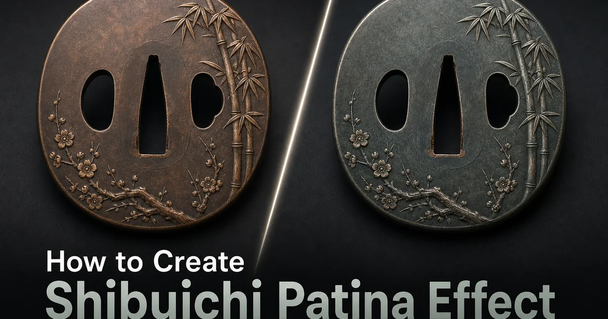
Shibuichi is a traditional Japanese silver-copper alloy whose name literally means 'one-fourth'. Referring to the classic formulation of one part silver to three parts copper, though the ratio varies widely depending on the desired color and the metalsmith's intent. What makes shibuichi exceptional among decorative metals is its extraordinary responsiveness to chemical patination. Where most metals develop a single patina color, shibuichi can be coaxed through a spectrum of surface colors. Cool silvery grey, warm golden brown, rich chocolate, deep violet, steel blue, and near-black — by varying the alloy ratio, surface preparation, and patina chemistry. This chromatic versatility made shibuichi one of the most prized alloys in the Japanese metalworking tradition, used extensively for sword fittings, decorative panels, and art metalwork where color was integral to the design.
Creating shibuichi effects digitally has in the past required expert knowledge of both metallurgy and image processing. The artist needs to understand which alloy ratios produce which color ranges, how different patina chemicals interact with the silver and copper phases at the grain boundary level, and how to simulate the alloy's characteristic crystalline grain structure that gives the surface its distinctive visual texture. In Photoshop, this means layering multiple color gradients, adding noise patterns that simulate grain, and carefully blending metallurgical textures. A process that takes hours per image and still struggles to achieve the nuanced, organic surface quality of real patinated shibuichi.
AI-powered shibuichi conversion brings metallurgical intelligence to this transformation by modeling how the alloy's two-phase structure — islands of silver-rich and copper-rich crystal — responds to chemical treatment. The AI generates grain structures matched to the selected alloy ratio, applies patina colors that follow the alloy's actual chemical behavior, and produces surface textures that reflect the finishing techniques used by Japanese metalworkers. This guide walks through using AI Filter and AI Enhance to create shibuichi effects that capture the chromatic depth and material sophistication of one of metalworking's most refined alloy traditions.
- AI generates metallurgically accurate grain structures that reflect the silver-copper crystal phase separation characteristic of shibuichi alloys at different ratios.
- Multiple alloy presets cover the full shibuichi spectrum from high-silver cool grey-violet through balanced warm brown-purple to high-copper deep chocolate-blue-black.
- Patina chemistry profiles simulate rokusho green, niage brown, and combined treatments that produce the alloy's characteristic multi-chromatic surface transformations.
- Surface texture controls simulate mirror polish, stone finish, and hammered textures that interact with patina unevenly for organic, handmade character.
- AI Enhance refines crystalline grain visibility and smooths patina gradients to achieve the nuanced surface quality that distinguishes genuine shibuichi from tinted metal.
How AI shibuichi conversion works: alloy grain simulation and chemical patina modeling
The visual character of shibuichi is at its core determined by its microstructure. The pattern of silver-rich and copper-rich crystal phases that form when the molten alloy solidifies and is then worked through cycles of hammering and annealing. In a high-silver alloy, the silver phase dominates and the copper appears as dispersed islands within a silver matrix, producing a fine, fairly uniform grain with a cool overall tone. In a high-copper alloy, the relationship inverts and the copper matrix dominates with silver islands, producing a warmer, more textured grain. The AI generates these phase structures computationally, creating grain patterns that accurately reflect the selected alloy ratio and produce the correct visual texture at the microscopic level.
Chemical patination is the second critical component. Traditional Japanese patina formulations — rokusho (a verdigris-based solution), niage (a copper sulfate solution). Various proprietary mixtures — react differently with the silver and copper phases of the alloy. Rokusho darkens the copper phase more than the silver, creating a surface where silver-rich crystal faces remain lighter and copper-rich regions turn darker, producing the characteristic mottled color that makes shibuichi so visually complex. The AI models this differential reactivity, applying patina color based on the grain structure so that the resulting surface displays the same phase-dependent color variation seen in chemically patinated real shibuichi.
The combination of accurate grain structure and chemically-modeled patination is what separates AI shibuichi conversion from simple color tinting or texture overlay. A photograph tinted in shibuichi's color range without grain structure looks like colored photography. A photograph with added metal noise but uniform color looks like textured photography. Only when the grain pattern drives the color distribution — lighter color on silver-phase faces, darker color on copper-phase regions — does the surface read as a genuine mixed-metal alloy with chemical patina. This metallurgical accuracy is the foundation of convincing shibuichi rendering.
- Silver-rich and copper-rich crystal phase patterns are generated computationally to match the selected alloy ratio, producing accurate micro-texture at the grain level.
- Rokusho and niage patina formulations react differently with silver and copper phases, darkening copper regions more to create characteristic mottled polychromatic surfaces.
- Differential phase reactivity means patina color distribution follows grain structure rather than image tones, producing metallurgically authentic color variation.
- The grain-drives-color principle separates convincing shibuichi rendering from simple color tinting or texture overlay applied uniformly across the image.
Alloy ratio presets: high-silver, balanced, and high-copper shibuichi traditions
High-silver shibuichi, with silver content of 50% to 75%, was historically favored for refined, elegant metalwork where subtlety of color mattered more than dramatic visual impact. The cool grey-to-violet patina range of high-silver shibuichi gives surfaces a quiet, sophisticated character that Japanese aesthetics associate with shibui. Understated beauty that reveals itself slowly through attentive looking. Sword fittings in high-silver shibuichi were considered appropriate for accomplished swordsmen of refined taste. Decorative objects in this alloy range convey a sense of restraint and cultural knowledge. The AI's high-silver preset produces surfaces dominated by cool grey with violet and blue undertones that emerge gradually across the tonal range of the image.
Balanced shibuichi at roughly equal silver and copper content develops the widest range of patina colors from a single treatment because neither metal phase dominates the surface. The grain structure shows a roughly equal distribution of silver-rich and copper-rich faces. The differential patina reactivity creates maximum color contrast between adjacent grain regions. This produces the most visually complex surfaces. Areas of warm brown next to cool grey, touches of violet adjacent to golden bronze — that shimmer with chromatic variety when the light changes. Balanced shibuichi was popular for tsuba (sword guards) and decorative panels where the surface itself was intended as the primary visual interest rather than any carved or inlaid design.
High-copper shibuichi, with copper content of 70% or more and just enough silver to prevent the alloy from patinating like pure copper, develops rich, deep colors. Chocolate brown, deep blue-black, and warm dark bronze — that provide bold visual weight. The copper phase dominates the grain structure, with small silver islands creating subtle bright accents within the darker surface. This alloy range was used for bold sculptural metalwork, large decorative panels, and functional objects where the surface needed to read at distance. The AI's high-copper preset produces surfaces dominated by warm dark tones with just enough silver-phase variation to prevent the surface from reading as monochromatic bronze.
- High-silver shibuichi (50-75% silver) produces cool grey-to-violet patinas associated with shibui aesthetics — understated elegance that reveals chromatic subtlety gradually.
- Balanced shibuichi creates maximum color contrast between grain phases, producing surfaces that shimmer with warm brown, cool grey, violet, and golden bronze simultaneously.
- High-copper shibuichi (70%+ copper) develops rich chocolate, blue-black, and dark bronze tones with subtle silver-phase bright accents for bold visual weight at distance.
- Each preset generates alloy-appropriate grain structures and applies patina chemistry that matches the selected composition's actual chemical behavior.
Surface finishing techniques: polish, stone, and hammer texture interactions with patina
The surface finish applied before patination greatly affects the final look of shibuichi because the physical surface texture interacts with the chemical treatment at every scale. Mirror-polished shibuichi receives patina evenly across its surface, producing smooth color gradients and clear grain definition where the silver and copper phases display their different colors with crisp boundaries. This finish maximizes the chromatic complexity of the alloy because every grain face is equally exposed to the patina chemistry and develops its trait color without interference from surface topography. Mirror-polished shibuichi was used for the most refined metalwork where the viewer was expected to examine the surface at close range.
Stone-finished shibuichi — abraded with progressively finer stones to create a matte surface with directional scratch marks — receives patina unevenly because the patina chemistry pools in surface scratches and develops more intensely in those micro-channels. This creates a surface with overall directional texture that interacts with the grain-level color variation, producing a complex visual field where the eye perceives both the macro-texture of the stone finish and the micro-texture of the alloy grain at once. The AI mimics this interaction by layering directional surface marks over the grain-level patina color, creating surfaces that display the characteristically active quality of hand-finished Japanese metalwork.
Hammered shibuichi displays the most dramatic texture-patina interaction because the hammer marks create visible depressions and raised ridges that catch patina chemicals differently. The walls of hammer marks develop deeper color than the peaks. The uneven surface reflects light from multiple angles at once, creating a surface that appears to change color as the viewing angle shifts. This kinetic quality — metal that seems alive and responsive to light — is one of the most valued traits of Japanese art metalwork. The AI renders hammer texture with the right scale and depth, then applies differential patina density based on the surface topography, producing results that capture the light-responsive quality of real hammered and patinated shibuichi.
- Mirror polish receives patina evenly, maximizing grain-level chromatic complexity with crisp phase boundaries for close-examination refined metalwork.
- Stone finish creates directional micro-channels that pool patina chemistry, producing layered visual complexity from both macro-texture scratch marks and micro-texture grain color.
- Hammered texture develops deeper patina in depressions than on peaks, creating surfaces that appear to shift color as viewing angle changes.
- Each finishing technique interacts with the alloy's two-phase grain structure differently, producing distinct aesthetic characters from the same base alloy composition.
Creative applications: jewelry design, art metalwork, and luxury product visualization
Modern jewelry designers use shibuichi effects to visualize how proposed designs would appear in this historically challenging alloy before committing to the costly and technically demanding process of sourcing, alloying, forming, and patinating the actual metal. A photograph of a ring form, pendant blank, or bracelet can be converted to shibuichi at different alloy ratios and patina treatments, showing the client a realistic preview of how the piece would look in high-silver violet, balanced polychrome, or high-copper dark bronze. This visualization capability is especially valuable for custom commission work where the client needs to make alloy and finish decisions before the metalsmith begins fabrication.
Art metalwork and sculptural applications benefit from shibuichi rendering because the alloy's polychromatic surface is inherently photogenic and communicates material sophistication at a glance. A portrait rendered as shibuichi patina becomes a striking art piece where the face emerges from the metal's grain structure, the skin tones mapped to warm copper-phase patina and the shadows to cooler silver-phase regions. Landscape photographs rendered as shibuichi produce surfaces where the color variation follows both the natural contours of the terrain and the crystalline structure of the alloy, creating a double reading that rewards sustained attention. These rendered images work as gallery prints, mainly on metal substrates where the physical material reinforces the metalwork illusion.
Luxury product brands leverage the shibuichi aesthetic to share Japanese craft heritage and material connoisseurship. The alloy's association with refined taste and its untranslatable aesthetic vocabulary. Shibui, wabi-sabi, mono no aware — carry cultural weight that resonates with premium brand positioning. Product photographs rendered as shibuichi patina transform consumer objects into artifacts that appear hand-crafted by master metalworkers, suitable for campaign imagery, packaging design, and experiential retail settings where visual materials need to project depth, knowledge, and artisanal realism. The effect is especially strong for watches, writing instruments, audio equipment, and spirits brands targeting culturally sophisticated audiences.
- Jewelry designers preview custom commissions in different alloy ratios and patina treatments before committing to costly shibuichi fabrication and chemical processing.
- Art metalwork applications map portrait skin tones to copper-phase patina and shadows to silver-phase regions, creating portraits that emerge from crystalline grain structure.
- Gallery prints on metal substrates reinforce the shibuichi illusion, producing wall art where physical material and rendered surface treatment work together.
- Luxury brands leverage shibuichi's association with Japanese craft heritage and untranslatable aesthetic concepts for premium product campaigns targeting culturally sophisticated audiences.
How to do it
- 1
Upload your image and assess it for shibuichi patina conversion
Open your photograph in AI Filter and evaluate how its tonal range maps to the shibuichi color palette. Shibuichi is a silver-copper alloy that produces a remarkable range of surface colors through chemical patination. From silvery grey through warm brown to deep violet and steel blue depending on the silver-to-copper ratio and the patina formula. Images with strong tonal variety and clear subject definition translate most well because the AI maps different tonal zones to different patina colors within the shibuichi spectrum.
- 2
Select the alloy ratio and patina chemistry profile
Choose from shibuichi presets that simulate different alloy compositions and patination treatments. High-silver shibuichi (75% silver, 25% copper) produces cool grey-to-violet patinas favored for sword fittings and elegant decorative objects. Balanced shibuichi (50/50) yields a warm brown-to-purple range popular for tsuba and menuki. High-copper shibuichi (25% silver, 75% copper) develops rich chocolate browns and deep blue-blacks used for bold sculptural metalwork. Each preset also includes its characteristic patina chemistry — rokusho green, niage brown, or combined treatments.
- 3
Adjust patina depth, surface texture, and color transition behavior
Control how deeply the patina color develops across the image surface. Light patina produces a delicate wash of color over the visible metal grain. Deep patina creates rich, saturated surfaces where the underlying alloy texture is fully transformed by the chemical treatment. Surface texture settings simulate different finishing techniques. Mirror polish that shows crisp color reflections, stone finish with visible abrasion marks, and hammered texture with tool marks that catch patina unevenly for a more organic, handmade character.
- 4
Use AI Enhance to refine surface grain and patina gradients
After the initial shibuichi conversion, run AI Enhance to sharpen the metal grain structure and smooth the patina color gradients. Authentic shibuichi displays a fine crystalline grain where silver and copper phases create a subtle surface texture visible under close examination. This micro-structure is one of the alloy's defining aesthetic features and distinguishes it from uniform colored metals. The boost step also ensures that patina color transitions are smooth and natural rather than banded or posterized.
- 5
Export and compare against authenticated shibuichi reference pieces
Save the finished shibuichi patina effect at full resolution and compare it with photographs of authentic shibuichi metalwork from Japanese sword fitting collections and modern art metalwork. Verify that the alloy grain structure is visible and natural, that patina colors fall within the genuine shibuichi spectrum rather than appearing artificially saturated. That the overall surface reads as chemically patinated metal rather than digitally tinted photography. Adjust alloy ratio and patina depth until the result achieves material conviction.
Sources
- Japanese Patination of Mixed-Metal Alloys — The Metropolitan Museum of Art
- Shibuichi: The Art of Japanese Colored Metal Alloys — Ganoksin — Jewelry Making Community
- Color on Metal: Historical and Contemporary Surface Treatments — Brynmorgen Press