
How to Create a Double Exposure Effect with AI — Magic Eraser
Learn how to create stunning double exposure and multiple exposure composite images with AI blending tools. Step-by-step guide covering portrait silhouettes, texture selection, blending modes, and color grading.

Product Marketing
Reviewed by Magic Eraser Editorial ·
Table of Contents
- The visual science behind why double exposure images work
- Selecting and preparing source images for maximum impact
- Blending techniques and opacity management for professional results
- Color grading strategies for cohesive double exposure compositions
- Creative variations and commercial applications of double exposure
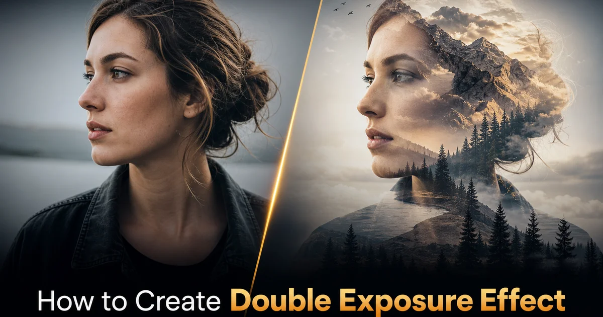
Double exposure is a photographic technique that originated in the film era when photographers would intentionally expose the same frame of film twice, overlaying two different scenes into a single image. The results ranged from accidental ghost images — the bane of photographers who forgot to advance their film — to intentional artistic compositions where a portrait silhouette filled with a landscape became a visual metaphor for the connection between person and place. In the digital era, the accidental version disappeared because sensors reset between shots. The artistic version thrived through Photoshop compositing. The technique became a signature style in editorial photography, album artwork, movie posters, and brand campaigns because it shares complex ideas. Identity, memory, duality, belonging — in a single striking image that would take paragraphs of text to express in words.
Creating a convincing double exposure in traditional photo editing software requires advanced masking skills, an intuitive understanding of blending modes, and significant time spent fine-tuning opacity gradients to achieve the right balance between the two source images. The process often involves isolating the subject from the base image with a precise mask, placing the secondary image within that mask, setting the blending mode to screen or lighten, then spending twenty to forty minutes adjusting opacity zones so that key facial features remain visible while the secondary texture fills the surrounding areas. Getting the edges right — where the silhouette dissolves into the background — is mainly time-consuming and is where most amateur attempts fail, producing harsh cutouts rather than the ethereal fade that defines expert double exposure work.
AI-powered compositing tools compress this workflow from an hour of skilled manual work to minutes of guided creation. The AI understands facial geometry and knows which features to preserve for recognition, can automatically feather silhouette edges to produce smooth dissolutions, handles blending mode mathematics with scene awareness rather than uniform application, and can suggest matching texture placements that align secondary image details with primary subject features. This guide walks through the complete workflow for creating expert double exposure effects using Magic Eraser, from source image selection and preparation through blending, opacity refinement, and final color grading. The techniques apply equally to portrait double exposures, architectural composites, product photography, and abstract artistic experimentation.
- Double exposure composites overlay two images. Often a portrait silhouette and a texture or landscape — to create visual metaphors that share complex ideas about identity, memory, and connection in a single frame.
- The technique requires precise masking, blending mode selection (screen or lighten), and opacity gradient control to balance visibility of both source images without either completely dominating.
- AI compositing understands facial geometry and automatically preserves recognition features (eyes, lips, contour lines) while allowing secondary textures to fill peripheral areas like hair and cheeks.
- Source image selection is critical: the base image needs a strong, clean silhouette outline, and the secondary image needs a good distribution of light and dark values for textural richness.
- Final color grading unifies the two source palettes. Duotone effects and selective desaturation produce the cohesive, editorial look that distinguishes expert double exposures from amateur overlays.
The visual science behind why double exposure images work
Double exposure works as a visual technique because it exploits the human brain's simultaneous capacity for pattern recognition and gestalt completion. When a viewer sees a portrait silhouette filled with a forest, the brain processes both the human form and the natural landscape at once, creating an automatic association between the two subjects. This is not a learned convention. It is a consequence of how the visual cortex processes overlapping patterns in the same spatial region. The brain cannot help but seek a narrative connection: the person is connected to nature, the person's thoughts are filled with the forest, the person is dissolving into the landscape. This automatic meaning-making is what gives double exposure its storytelling power and why it has remained popular across a century of photography despite being technically simple to describe.
The luminance interaction between the two images is what determines the success of the blend. In screen blending mode, the mathematical operation at each pixel is: result = 1 - (1 - base) * (1 - blend). In practical terms, this means that bright areas of either image dominate and dark areas become transparent. This is why dark portrait silhouettes filled with bright, detailed textures produce the classic double exposure look. The dark areas of the portrait allow the texture to show through, while bright areas of the portrait (skin highlights, light-colored clothing) push through and remain visible. Understanding this luminance interaction guides source image selection: you want a base image with a strong range from very dark (where texture fills) to very bright (where the portrait pushes through). A secondary image with enough brightness variation to create interesting detail within the dark regions of the base.
Edge treatment is the third technical factor that separates expert double exposure from amateur overlay. A hard mask boundary — where the portrait ends abruptly and the secondary texture begins — produces a collage effect rather than a double exposure effect. The authentic double exposure look requires a gradual dissolution at the edges. The portrait fades into the background over a transition zone of ten to thirty pixels (at standard print resolution). In film double exposure, this fade happened naturally because the film grain at the edges of a subject received partial exposure from both images, creating a soft transition. Digital compositing must simulate this fade explicitly through feathered masks. AI tools handle automatically by detecting the subject boundary and applying physically plausible falloff gradients.
- Double exposure exploits the brain's simultaneous pattern recognition — overlapping a portrait with a landscape forces automatic narrative association between the two subjects.
- Screen blending mode makes dark areas transparent and preserves bright areas, which is why dark silhouettes filled with detailed bright textures produce the classic double exposure aesthetic.
- Edge dissolution over a ten to thirty pixel gradient creates the ethereal fade that distinguishes authentic double exposure from hard-cut collage, and AI tools apply this feathering automatically.
- Source image selection should prioritize strong luminance contrast in the base and good tonal distribution in the secondary to ensure rich texture detail fills the silhouette regions.
Selecting and preparing source images for maximum impact
The base image — often a portrait — needs a strong, distinct silhouette because the entire effect depends on the viewer right away identifying the human form even as it is partially dissolved into the secondary texture. Side profiles are the most popular choice because the nose, lips, chin, and forehead create a distinctive, unambiguous outline that remains readable even at low opacity. Three-quarter views work well when the subject has strong bone structure and defined facial contours. Straight-on portraits can work but require more careful opacity management because the symmetrical face shape is less distinctive as a silhouette. The subject should be photographed or placed against a contrasting background. Dark subject on light background is the traditional approach because the dark areas of the subject are where the secondary texture becomes most visible in screen blending.
The secondary image should be chosen for both its visual texture quality and its thematic resonance with the base portrait. Forests are the most overused choice (which does not make them wrong. They work because dense foliage provides rich midtone detail that fills silhouettes beautifully), but consider options: ocean surfaces with wave patterns, mountain ranges with dramatic cloud formations, night cityscapes with bokeh light patterns, satellite imagery of coastlines or river deltas, macro photography of flowers or crystal formations, or abstract textures like smoke, ink in water, or crumpled metallic surfaces. The secondary image should have detail across the full tonal range but be mainly rich in the midtone region because midtones occupy the largest area of most portrait silhouettes. Avoid secondary images that are mostly white (the silhouette disappears) or mostly black (no visible texture fills the shape).
Preparation of both images before blending greatly affects the final quality. For the base portrait, use Background Eraser to cleanly separate the subject from the original background. The cleaner this separation, the smoother the final edges will be. For the secondary image, adjust the overall brightness so the image is roughly centered in the histogram. Not too dark, not too bright. Crop or reposition the secondary image so its most interesting features will align with the most prominent features of the base portrait when overlaid. If you are filling a side-profile portrait with a forest, position the densest canopy where the hair will be and a clearing or horizon where the face will be, creating a natural density gradient that enhances the effect rather than competing with it.
- Side-profile portraits produce the most recognizable and dramatic silhouettes because the nose, lips, chin, and forehead create a distinctive outline readable at any opacity level.
- Secondary images need rich midtone detail — forests, cityscapes, ocean surfaces, abstract textures — because midtones occupy the largest area of the portrait silhouette after blending.
- Clean subject separation with Background Eraser is a prerequisite: imperfect masking produces fringe artifacts in the final composite that are very difficult to clean afterward.
- Pre-align the secondary image so its most interesting regions (dense foliage, bright lights, detailed textures) correspond to the most prominent areas of the portrait silhouette.
Blending techniques and opacity management for professional results
The core blending operation uses screen mode. Expert double exposures rarely use a single blending mode uniformly across the entire image. The typical approach is to use screen mode as the foundation, then layer extra blending operations to refine specific areas. Multiply mode in selected regions can darken the secondary texture where you want the portrait features to push through more strongly. Useful for bringing out eye detail and lip definition. Overlay mode in transitional areas adds contrast that helps the two images interact with more visual energy than screen mode alone. AI Create can apply these blending mode combinations automatically based on its understanding of facial feature locations, producing a multi-mode blend that would require manual masking for each mode zone in traditional software.
Opacity management is where the double exposure transforms from a simple overlay into an artistic composition. The goal is creating a visual hierarchy where certain elements draw the eye and others recede. Eyes are almost universally the primary focal point in portrait double exposures and should be the most visible facial feature. Often at seventy to ninety percent base portrait opacity so the eye detail reads clearly through any overlaid texture. The nose bridge and lip contours should be at fifty to seventy percent opacity, providing secondary structural information that helps the brain confirm the facial form. Hair, forehead, and neck can dissolve to twenty to forty percent portrait opacity, allowing the secondary texture to dominate and creating the ethereal quality that defines the style. AI tools generate these opacity gradients automatically from their understanding of facial feature salience.
The background treatment — the area outside the portrait silhouette — offers several creative options. The classic look places the portrait silhouette on a white or very light background, with the secondary texture visible only within the silhouette boundary. An alternative approach extends the secondary texture beyond the silhouette at reduced opacity, creating a soft halo where the landscape fades into the surrounding space. A third option places the entire composition on a solid dark background with the secondary texture illuminating the silhouette from within. Each approach creates a different mood: white backgrounds feel clean and editorial, halo extensions feel dreamlike and immersive. Dark backgrounds feel dramatic and introspective. The choice should match the intended use. Editorial campaigns favor the clean white approach, while album art and movie posters often use dark backgrounds for dramatic impact.
- Expert double exposures combine multiple blending modes: screen as the foundation, multiply for facial feature emphasis. Overlay for transitional contrast — AI applies these per-zone automatically.
- Opacity hierarchy preserves recognition: eyes at seventy to ninety percent portrait visibility, nose and lips at fifty to seventy percent, hair and peripherals dissolving to twenty to forty percent.
- Background treatment defines mood: white backgrounds for clean editorial feel, halo extensions for dreamlike immersion, dark backgrounds for dramatic and introspective impact.
- AI opacity gradient generation uses facial feature salience mapping to automatically determine which regions should show more portrait and which should show more secondary texture.
Color grading strategies for cohesive double exposure compositions
Two source images almost always have different color palettes. A warm-toned portrait and a cool-toned forest, an indoor headshot and an outdoor cityscape — and the ungraded blend looks disjointed because the color dissonance tells the viewer's brain that these images do not belong together. Color grading is what unifies the composition and makes it look intentional. The most effective approach for double exposure is to simplify the color palette using a duotone or split-toning technique that maps the combined image's tonal range to two or three deliberate colors. Teal and orange is the most popular film-inspired pairing because it creates warm skin tones in the highlights while pushing shadows and midtones toward cool matching tones. Blue and gold, purple and peach, and red-orange and deep blue are other pairings that work well for portraits.
Desaturation is a powerful tool in double exposure color grading because it reduces the visual complexity that can make blended images feel chaotic. Pulling overall saturation down by twenty to forty percent and then selectively re-saturating one or two key color ranges creates a controlled palette that lets the compositional interplay between the two images take center stage. For example, desaturate the entire composition globally, then re-saturate only the green channel to bring back the forest texture detail, or re-saturate only the warm tones to let skin highlights glow. This selective color approach is common in high-end fashion and editorial double exposure work because it produces a sophisticated, curated look rather than the overwhelming color chaos of a fully saturated blend.
Contrast adjustment in the grading stage affects how the two images interact visually. Increasing contrast in the blended areas makes the boundaries between the two images more defined and dramatic. Decreasing contrast creates a softer, more integrated blend where the two images seem to melt into each other. The right choice depends on the intended effect: high contrast works for bold editorial and advertising compositions where you want the contrast to be striking and immediate. Low contrast works for dreamy, mood pieces where you want the viewer to gradually discover the second image within the first. Add a final vignette to concentrate attention on the center of the composition and prevent the eye from wandering to the edges where masking transitions may be weakest.
- Duotone or split-tone grading maps the combined tonal range to two or three deliberate colors, unifying source images that originally had different palettes into a cohesive composition.
- Twenty to forty percent global desaturation followed by selective re-saturation of one or two channels reduces visual chaos and creates a sophisticated, controlled palette for the blended result.
- Contrast choice determines blend character: high contrast for bold, striking editorial juxtapositions; low contrast for dreamy, atmospheric compositions where images melt together.
- A final vignette draws attention to the composition center and masks any edge transition weaknesses in the silhouette boundary treatment.
Creative variations and commercial applications of double exposure
Beyond the classic portrait-plus-landscape formula, double exposure techniques can be applied to virtually any combination of images for different creative and commercial purposes. Architecture double exposures overlay building facades with natural textures. A modern glass skyscraper filled with cloud patterns, or a classical stone building filled with autumn foliage — to create images that comment on the relationship between built and natural settings. Product double exposures fill the outline of a product with imagery that shares its brand story. A coffee bag silhouette filled with a sunrise over a mountain plantation, or a perfume bottle filled with a blooming flower field. These commercial applications are effective because the double exposure instantly shares the brand narrative without requiring the viewer to read any text.
Multiple exposure composites — using three or more images — extend the technique for more complex visual storytelling. A portrait might be layered with both a cityscape and a constellation map to suggest a person at the intersection of urban life and cosmic wonder. A product might combine its silhouette with ingredient imagery and a lifestyle scene to tell a complete brand story in one frame. The technical challenge with multiple exposures increases because each extra layer dilutes the visibility of every other layer, requiring more careful opacity management and possibly different blending modes for each layer. AI compositing tools handle this complexity well because they can balance multiple layers at once rather than requiring the editor to adjust each pair of layers on its own.
Motion and animation bring double exposure into video and social media formats. A cinemagraph-style double exposure holds the portrait still while the secondary texture animates. Waves lapping within a face silhouette, clouds drifting through a building outline, stars twinkling inside a product shape. These animated double exposures are highly effective for social media content because the subtle motion draws attention in a feed without the jarring energy of full video. They also work well as website hero elements, email header graphics, and display visuals. Creating them requires generating a still double exposure base and then animating only the secondary texture layer. AI tools can help by separating the blend layers for independent manipulation.
- Architecture double exposures overlay building silhouettes with natural textures to comment on the relationship between built and natural settings. Effective for real estate and design marketing.
- Product double exposures fill item outlines with brand-story imagery (origins, ingredients, lifestyle scenes), communicating narratives instantly without requiring text explanation.
- Multiple exposure composites using three or more images tell more complex stories but require careful opacity balancing. AI handles multi-layer compositing more efficiently than manual per-pair adjustment.
- Animated double exposures (cinemagraph style) with a still portrait and moving secondary texture create attention-grabbing social media content, website heroes, and email headers.
How to do it
- 1
Select a portrait or silhouette as your primary base image
The base image defines the shape container for the double exposure effect. Strong silhouettes with clear outlines work best because the secondary texture fills the shape and any ambiguity in the boundary weakens the visual impact. Side-profile portraits are the most popular choice because the nose, lips, chin, and forehead create a distinct and dramatic outline, but full-face portraits, figure silhouettes, and even architectural outlines work well. The base image should have a clean, high-contrast edge between the subject and the background. If the background is busy, use Background Eraser to isolate the subject onto a transparent or solid-color background before proceeding. Dark subjects on light backgrounds and light subjects on dark backgrounds both work but produce different aesthetic results.
- 2
Choose a complementary texture or landscape for the secondary fill image
The secondary image provides the texture, pattern, or scene that fills the silhouette of the base image. Forests, cityscapes, galaxies, ocean surfaces, floral patterns, and abstract textures are classic choices because their organic complexity creates visual richness inside the portrait outline. The secondary image should have a good distribution of tonal values, with areas of light and dark that will map interestingly onto the features of the base portrait. Avoid secondary images that are uniformly bright or uniformly dark, as these produce flat results with no visible texture. Consider the thematic connection between the two images: a portrait filled with a forest suggests a connection to nature; one filled with a cityscape suggests urban identity.
- 3
Use AI Create to blend the two images with screen or lighten compositing
Upload both images to Magic Eraser and use AI Create to composite them. The core technique is blending the secondary image within the boundary of the primary subject using a screen blending mode, which preserves the lighter values from both images and drops out dark areas. Position the secondary image so its most interesting details align with the most prominent features of the base portrait. Place a dense tree canopy where the hair falls, align a horizon line with the eye level, or position a spiral galaxy at the center of the face. AI Create handles the blending mathematics and edge transitions automatically, producing smooth gradients where the secondary texture fades into the silhouette rather than hard cutoffs that look pasted.
- 4
Refine the blend by adjusting opacity zones and revealing key facial features
A successful double exposure is not a uniform blend. Certain areas should show more of the base portrait and others should show more of the secondary texture. The eyes, lips, and facial contour lines should remain partially visible to maintain human recognition. The forehead, cheeks, and hair can dissolve more completely into the secondary image. Use AI Filter to create opacity masks that vary across the composition, revealing the base portrait at roughly seventy to eighty percent in the eye and mouth regions while allowing the secondary image to dominate at eighty to ninety percent in the hair and peripheral areas. This selective opacity is what gives expert double exposures their distinctive quality. The viewer sees both images at once without either one completely obscuring the other.
- 5
Color grade and finalize the composition for a cohesive look
The two source images likely have different color palettes. The final double exposure needs a unified color grade to look intentional rather than like two random photos layered together. Apply AI Filter to shift both image layers toward a common palette. Duotone effects using matching colors like teal and orange work especially well for double exposures because they simplify the color scheme and add a stylized editorial feel. Reduce overall saturation slightly and increase contrast in the blended areas to make the texture details pop. Add a subtle vignette to draw the eye toward the center of the composition. Finally, use Magic Eraser to clean any edge artifacts where the silhouette boundary shows a fringe or halo from imperfect masking.
Sources
- Computational Photography: Methods and Applications — CRC Press / ACM Digital Library
- Image Blending Techniques: A Survey of Alpha Compositing and Beyond — IEEE Computer Graphics and Applications
- Neural Style Transfer and Artistic Image Manipulation — arXiv