AIでハーフトーン効果を作成する方法:写真にコミック風ドットパターン — Magic Eraser
AIツールを使って写真にハーフトーンドット効果を作成する方法を学びます。肖像画や商品写真を、調整可能なドットパターン、色、密度でコミック風やビンテージ新聞印刷に変身させます。
Product Marketing
レビュー担当 Magic Eraser Editorial ·
ハーフトーンはグラフィックデザインで最も特徴的な視覚効果の一つです。そのルーツは機械印刷の最初期、一世紀以上も前にまでさかのぼります。この技法は、写真の連続した階調をサイズの異なるドットのパターンに分解することで機能します。暗い領域には大きなドット、ハイライトには小さなドット、純白にはドットなし。通常の距離から見ると、目はこれらのドットを再び滑らかなグラデーションへと溶け込ませます。間近で見るとドットのパターンそのものが視覚的な質感になります。これはコミック、新聞写真、ポップアートにあの独特な印刷の見た目を与えたのと同じ原理です。
説得力のあるハーフトーン効果を手作業で作るには、スクリーン角度、ドット周波数、色分解に関する高度な技術知識が必要です。従来の印刷ワークフローでは、製版技術者が連続階調の画像を特定のライン・パー・インチ密度のハーフトーンスクリーンに変換し、CMYKチャンネル全体でモアレやドットゲインを慎重に管理していました。デジタルツールはこの一部を簡略化しましたが、ほとんどのフォトエディターは依然としてスクリーン角度と周波数を手動で設定する必要があります。専門知識がなければ一貫性のない結果になります。
AI搭載のハーフトーンツールは、技術的な複雑さを自動的に処理しながら、視覚的な仕上がりに対する創造的なコントロールをあなたに与えます。AIは画像の階調域を分析し、エッジと被写体を識別します。重要な領域のディテールを保持しつつ、より広い階調域では力強いグラフィック効果を生み出すドットパターンを生成します。本ガイドでは、ソーシャルメディアのグラフィック、ポスターデザイン、グッズ、デジタルアート作品に使えるハーフトーン効果を作るための完全なワークフローを解説します。
- AIハーフトーンフィルターは階調域とエッジのディテールを分析し、被写体の明瞭さを保つドットパターンを生成します。
- クラシックな白黒ハーフトーンは、単色のドットマトリックスでビンテージ新聞印刷を模倣します。
- CMYK色分解は、重ね合わせた色付きドットパターンでコミックのポップアート効果を作り出します。
- ドット密度とサイズのコントロールにより、繊細な質感と大胆なグラフィック効果の間を調整できます。
- この効果は肖像画、商品写真、ストリート写真、タイポグラフィデザインにわたって機能します。
ハーフトーン印刷の仕組みとその特徴的な見た目の理由
ハーフトーンのプロセスは、機械印刷における根本的な問題を解決するため1880年代に発明されました。印刷機はインクを乗せるか乗せないかしかできず、ページ上の各点でインク量を変えることができませんでした。連続階調の写真には、インクの有無という二値プロセスでは直接再現できない何千もの段階的な階調の移り変わりが含まれています。ハーフトーンスクリーンはこれを、各ドットのサイズがその位置の元の階調の暗さに対応するドットパターンへとグラデーションを変換することで解決しました。大きなドットはより多くの紙をインクで覆い暗く見え、小さなドットはより多くの白い余白を残し明るく見えます。
この機械的な制約は美的な特徴となりました。コミック、新聞、シルクスクリーンのポスター、ポップアートはすべて、ハーフトーンのドットパターンを視覚的アイデンティティの要素として受け継ぎました。ロイ・リキテンスタインはハーフトーンのドットそのものをファインアートの主題とし、コミックのドットをキャンバスサイズの絵画にまで拡大することでキャリア全体を築きました。ベンデイドットのパターンは大胆でグラフィックなビジュアルストーリーテリングの代名詞となりました。デジタル印刷がハーフトーンスクリーンの技術的必要性を取り除いてから数十年経った今でも、ドットパターンはグラフィックデザインで最も人気のあるスタイル効果の一つであり続けています。
その仕組みを理解すると、AIツールでより良いハーフトーン効果を作れるようになります。ドットサイズが知覚される明るさをコントロールし、ドットの間隔が質感の視覚的な重さを決めることを知っていれば、より意図的な創造的選択ができます。最大ドットサイズが小さい密なドットグリッドは、繊細でフォトリアルなハーフトーンを生み出します。大きなドットの粗いグリッドは、大胆で抽象的なグラフィック効果を作り出します。AIは技術的な変換を担いますが、創造的な方向性——どれだけグラフィックに、どれだけカラフルに、どれだけドットを大きくするか——はあなたの決断のままです。
- ハーフトーンはインクの有無という二値の印刷機で写真を再現するため1880年代に発明されました。
- ドットサイズは知覚される明るさをコントロールします——大きなドットは暗く、小さなドットは明るく見えます。
- ハーフトーンの美学は、コミック、ポップアート、シルクスクリーンのポスターデザインの特徴となりました。
- ドット密度と間隔を理解すると、意図する視覚的な仕上がりへAIを導けるようになります。
最高のハーフトーン結果を得るための写真の準備
すべての写真がうまくハーフトーンに変換できるわけではありません。効果を適用する前の準備作業が、最終的な品質に大きな違いを生みます。理想的な元画像は、明暗領域の間に強いコントラストがあり、主要被写体の周囲のエッジが明確に定義されています。過度な視覚的ノイズのない比較的きれいな背景。劇的なサイドライティングの肖像画、きれいな表面に置かれた商品写真。大胆な建築的形状のあるストリートシーンは、ハーフトーンのドットが扱う明確な階調情報を持つため、いずれも非常によく変換されます。
ハーフトーンフィルターを適用する前に、Magic Eraserを使ってドットパターン内で視覚的ノイズになりかねない不要な要素を取り除きましょう。歩道の小さなゴミは元の写真ではほとんど目立たなくても、ハーフトーン版では説明のつかない大きなドットの塊になります。テキストの重ね、ウォーターマーク、レンズフレア、背景の散らかりは、いずれも紛らわしいドットのアーティファクトを生みます。30秒かけてこうした気を散らす要素を消せば、ドットパターンが視覚的な混沌ではなく意図的なデザイン効果として明確に読み取れる、はるかにきれいなハーフトーン出力が得られます。
ハーフトーンを適用する前に、画像をAI Enhanceに通して階調の土台を最適化することを検討しましょう。コントラストをわずかに上げることで、シャドウは満足のいく大きなドットを生み、ハイライトはきれいで開いた状態に保たれます。カラーバランスを補正すると、色付きハーフトーン分解での望ましくない色かぶりを防げます。エッジのディテールをシャープにすると、AIが境界を越えてにじむのではなく被写体の輪郭を正確になぞるドットパターンを生成しやすくなります。これらの準備ステップは1分もかからず、ハーフトーン変換の品質を大幅に向上させます。
- 最良のドットパターンの明瞭さを得るために、強いコントラスト、明確なエッジ、きれいな背景の画像を選びましょう。
- 紛らわしいドットのアーティファクトを避けるため、変換前にMagic Eraserで背景の散らかりを取り除きましょう。
- シャドウが大きなドットを生み、ハイライトが開いた状態を保つよう、AI Enhanceでコントラストをわずかに上げましょう。
- ドットパターンが被写体の輪郭を正確になぞるよう、ハーフトーンを適用する前にエッジをシャープにしましょう。
AIフィルターでハーフトーン効果を適用する
AI Filterのハーフトーン変換は、画像の各領域を明るさ、エッジのディテール、色の内容について分析し、各ゾーンに適したドットパターンを生成することで機能します。顔の特徴や商品の質感のような細部のある領域では、AIは明確な形状を保つためにより密なドット間隔を使います。背景や衣服のようなより広い階調域では、より大胆なグラフィック効果を生むより粗いグリッドを使います。この適応的なアプローチは、機械的に均一ではなく、意図的でデザインされたように見えるハーフトーン効果を生み出します。
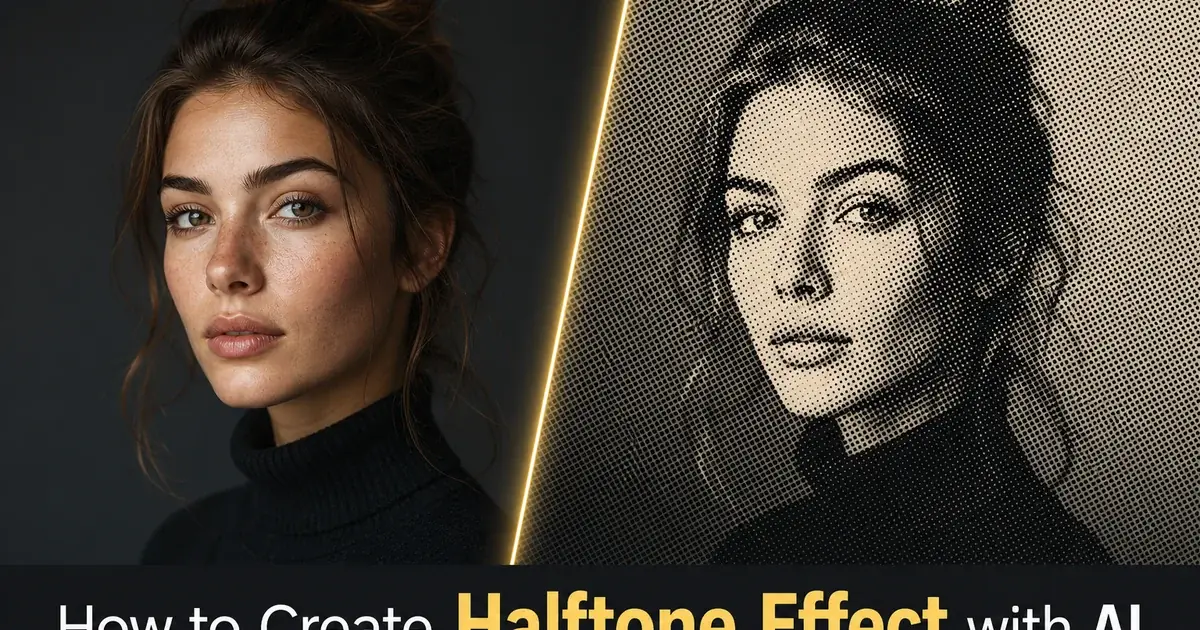
クラシックな白黒の新聞ハーフトーンには、単一チャンネルのモノクロモードでフィルターを適用しましょう。AIは画像をグレースケールに変換し、ドットサイズが階調値に直接対応する単一のドットレイヤーを生成します。これは最もきれいで最も特徴的なハーフトーン美学を生み、エディトリアルデザインやポスターアートに最適です。大胆なグラフィックのシンプルさが目標のInstagram投稿。白地に黒のドットパターンは、スマホの画面から壁掛けプリントまでどんなサイズでも明確に読み取れます。
コミックやポップアートのカラーハーフトーンには、AIがシアン、マゼンタ、イエロー、ブラックの各チャンネル用に別々のドットレイヤーを生成するCMYK分解モードに切り替えましょう。各カラーレイヤーは、本物のオフセット印刷機がそうするように、モアレ干渉パターンを防ぐためにわずかに異なるスクリーン角度を使います。その結果、重なり合う色付きドットを通して元の写真の全色域を捉える、レイヤー化されたカラーハーフトーンが得られます。このモードはポスターデザインやグッズのグラフィックに見事に機能します。最大限の視覚的エネルギーとレトロな印刷の趣を求めるソーシャルメディアコンテンツ。
- AIは画像全体でドットの間隔を適応させます——細部の領域ではより密に、広い階調域ではより粗く。
- 白黒のモノクロモードは、最もきれいな新聞またはエディトリアルのハーフトーン美学を生み出します。
- CMYK分解は、コミックのポップアートの見た目のためにずらした角度でレイヤー化された色付きドットを生成します。
- 適応的なドットサイズ調整は、積極的なハーフトーン密度でも顔の特徴や商品のディテールを保ちます。
ドット密度、色、視覚的重みのカスタマイズ
ハーフトーン効果の創造的な幅は、繊細な写真的質感から大胆な抽象グラフィックにまで及び、主要なコントロールはドット密度です。パターン内の1インチあたりのドット数として測定されます。最大ドットサイズが小さい高いドット密度は、腕を伸ばした距離ではほぼ写真的に見え、ハーフトーンの質感が間近で観察したときにのみ見える効果を生みます。最大ドットサイズが大きい低いドット密度は、個々のドットが構図を支配し、画像がパターンそのものに対して二次的になる、きわめてグラフィックな効果を生みます。
色の操作は、従来のハーフトーン印刷が達成できたものを超える追加の創造的領域を開きます。標準のCMYKプロセスカラーの代わりに、レトロなドット構造を保ちながら効果に完全にモダンな性格を与える、ブランドカラー、ネオンのアクセントトーン、デュオトーンのパレットでハーフトーンパターンを適用できます。鮮やかなシアンのドットでホットピンクの背景に描かれたハーフトーンの肖像は、新聞写真とはまったく似ていませんが、まさに同じ光学原理を使っています。この柔軟性は、AIハーフトーンをマーケティンググラフィック、イベントポスター、アルバムアートワークのための多用途なツールにします。目立つ必要のあるソーシャルメディアコンテンツ。
ドットのパラメーターを選ぶときは、閲覧の状況を考慮しましょう。ソーシャルメディアのサムネイルはスマホの画面で小さいサイズで見られます。中程度のドット密度は、スクロールするフィードの中でもハーフトーンの質感が見えて意図的であることを保証します。大判のプリントやポスターは、閲覧距離が大きく細かいドットが明確に解像するため、はるかに密なドットグリッドを使えます。Tシャツやトートバッグのようなグッズは、シルクスクリーンでよく再現される適度に大きなドットサイズが有利で、ハーフトーンの美学を文字通りのものにします。本物のドットベースのプロセスで印刷され、視覚的な円環を完成させます。
- 高いドット密度は、間近で観察したときにのみ見える繊細な写真的質感を生み出します。
- 低いドット密度は、個々のドットが構図を支配する大胆なグラフィック効果を作り出します。
- カスタムカラーパレットを使えば、ブランドカラーやネオンのアクセントトーンでハーフトーンパターンを適用できます。
- ドットのパラメーターを閲覧の状況に合わせましょう——ソーシャルのサムネイルには小さく、大判プリントには密に、グッズには中程度に。
ハーフトーン画像のエクスポートとプラットフォーム間での使用
ハーフトーン効果が仕上がったら、エクスポートのプロセスは意図する用途の技術的要件に合わせる必要があります。Instagram、Pinterest、ウェブサイトのヒーローバナーのようなデジタルプラットフォームには、プラットフォームが推奨する解像度で高品質のPNGまたはWebPとしてエクスポートしましょう。ハーフトーン効果には、JPEG圧縮がうまく扱えない鋭いドットエッジと高コントラストの境界が含まれます。非可逆アルゴリズムはドットエッジをにじませ、苦労して作り上げたくっきりとしたグラフィック品質を損なうリンギングのアーティファクトを生みます。PNGはウェブとソーシャルでの使用のために、すべてのドットエッジをピクセル単位で完璧に保ちます。
ポスター、チラシ、グッズのような印刷用途には、完全なドットパターンの解像度を保つフォーマットで300DPI以上でエクスポートしましょう。ハーフトーンを布や紙にシルクスクリーン印刷する場合は、可能であればきれいにベクター化したバージョンとして、または正確な出力寸法の高解像度ラスターとしてファイルを提供しましょう。印刷業者に好みのドット密度とファイル形式について相談しましょう。一部のシルクスクリーン業者は、連続階調の画像を受け取り、自分たちの特定の機材や素材に最適化した独自のハーフトーンスクリーニングを適用することを好みます。
最終的なエクスポートをAI Enhanceに通して、エッジのシャープ化とコントラスト改善の最後の仕上げを行いましょう。これにより、エクスポート形式にかかわらずドットパターンが最大限のくっきり感を持つことが保証されます。ソーシャルメディアの投稿には、ドットパターンがプラットフォームの背景色に溶け込まないよう、ハーフトーン画像の周囲に細い白または色付きの枠を追加することを検討しましょう。この縁取りの処理は、偶然ピクセル化した画像ではなくデザインの巧みさを示す、仕上がった意図的な見せ方をハーフトーンに与えます。
- JPEG圧縮が損なう鋭いドットエッジを保つため、デジタルプラットフォーム向けにはPNGまたはWebPとしてエクスポートしましょう。
- 印刷用途では、ドットパターンを完全な出力解像度にした300DPI以上が必要です。
- 最終的なエクスポートをAI Enhanceに通して、シャープ化とコントラスト最適化の最後の仕上げを行いましょう。
- ドットがプラットフォームの背景色に溶け込まないよう、ソーシャルメディアのハーフトーン投稿の周囲に細い枠を追加しましょう。
参考資料
- Halftone Printing: History and Modern Applications — Encyclopaedia Britannica
- A Neural Algorithm of Artistic Style — arXiv
- Digital Halftoning Techniques for Printing and Display — IEEE Signal Processing Magazine