
Editing di miniature TikTok: crea copertine che fermano lo scroll con l'IA
Trasforma uno screenshot video in una copertina TikTok che ferma lo scroll in 5 minuti con l'IA. Scambi di sfondo, testo gancio, le dimensioni di esportazione che TikTok usa davvero, e le mosse di design che fanno la differenza.

Growth Marketing
Indice
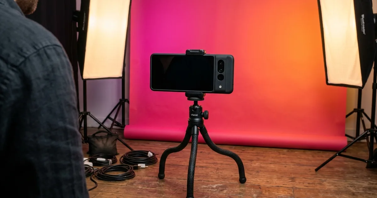
L'algoritmo di TikTok dà a ogni video una piccola prima finestra dove l'immagine di copertina, il gancio su schermo. Il primo mezzo secondo di movimento decidono se gli spettatori scorrono oltre o si fermano. La miniatura che imposti al caricamento. O il fotogramma autogenerato che TikTok sceglie se non lo fai — è una delle poche leve che controlli con certezza. Una copertina debole ti fa perdere visualizzazioni indipendentemente da quanto sia forte il resto del video. La differenza tra una miniatura dimenticabile e una che ferma lo scroll riguarda raramente strumenti di design costosi. Riguarda tre o quattro modifiche IA applicate nell'ordine giusto.
Questa guida copre l'esatto flusso di lavoro di miniature in cui la maggior parte dei creator inciampa per la via lunga: scegli un fotogramma forte, pulisci lo sfondo, passa a un colore ad alto contrasto, affina il soggetto, e sovrapponi un gancio. Il tutto richiede circa cinque minuti per video. Non hai bisogno di Photoshop, non hai bisogno di un designer, e non hai bisogno di riprogettare il tuo canale. Devi solo smettere di lasciare che TikTok scelga un fotogramma per te.
Se carichi in batch contenuti settimanali, lo stesso flusso di lavoro scala: prepara uno stile di miniatura modello una volta, poi applicalo a ogni nuovo video. Le miniature coerenti si accumulano. Le miniature di stile misto si combattono nella griglia del profilo e confondono l'algoritmo su cosa sia realmente il tuo canale.
- Le copertine TikTok si visualizzano in 9:16 nel feed e in 1:1 sulla griglia del profilo — esporta due versioni, non una.
- La rimozione dello sfondo + colore ad alto contrasto è la modifica a più alta leva che puoi fare a una copertina.
- Un gancio sovrapposto di 3-6 parole in sans-serif grassetto con contorno nero si legge a ogni dimensione; i font sottili scompaiono alla scala miniatura.
- Il miglioramento IA dovrebbe essere eseguito una volta — un filtraggio pesante appare inautentico e rende meno.
- Cinque minuti per copertina; uno stile coerente tra i caricamenti si accumula nella griglia del profilo.
Perché le miniature TikTok colpiscono oltre il loro peso
TikTok è una piattaforma video ma funziona su giudizi di immagine fissa. Nella pagina Per Te, gli spettatori vedono una copertina con una piccola indicazione di riproduzione e qualche riga di testo didascalia prima che il video si riproduca automaticamente. Sulla griglia del profilo — che la maggior parte degli spettatori visita prima di decidere di seguire — la copertina è l'unica cosa che vedono. I risultati di ricerca, Discover e i link condivisi mostrano tutti la copertina prima del video stesso. In tutte quelle superfici, la miniatura è l'intero pitch.
I creator sottovalutano sempre questo perché TikTok è venduto come piattaforma incentrata sul video. Il comportamento di riproduzione automatica della piattaforma fa sembrare la copertina un segnaposto. I dati sugli scambi di copertina dicono il contrario: stesso video, copertina migliore, tasso di visualizzazione misurabilmente più alto all'inizio. Il pubblico prende una decisione di stop del pollice in frazioni di secondo. Quella decisione usa l'immagine di copertina come input principale.
La buona notizia: la barra per superare il fotogramma autoselezionato per default da TikTok è bassa. La copertina automatica di TikTok sceglie quasi sempre un fotogramma intermedio goffo con sfocatura di movimento, un mezzo battito di ciglia, o un momento di transizione. Qualsiasi copertina deliberata lo batte. Una copertina deliberata con uno sfondo pulito e un gancio sovrapposto lo batte di molto.
- L'immagine di copertina è l'input principale per la decisione di stop del pollice nel feed e su Discover.
- La griglia del profilo è solo-copertina — la tua griglia è il pitch del tuo canale.
- La copertina automatica di TikTok è in modo affidabile peggiore di qualsiasi deliberata; la barra da superare è bassa.
Scegliere il fotogramma giusto da cui partire
La maggior parte dei flussi di lavoro di miniature fallisce prima che avvenga qualsiasi modifica perché il fotogramma sorgente è sbagliato. Il miglior fotogramma sorgente ha tre proprietà: un soggetto chiaro (un volto, un prodotto, una sola mano), illuminazione luminosa e uniforme sul soggetto. Un'espressione o posa che telegrafa il contenuto del video. Gli scatti d'azione e i fotogrammi a metà battito di ciglia fanno copertine terribili indipendentemente da quanto le modifichi. Gli strumenti IA possono pulire uno sfondo, ma non possono correggere un occhio chiuso o un'espressione a metà formazione.
Scorri il video e fai screenshot di 5-10 fotogrammi candidati. Poi guardali tutti insieme a dimensione miniatura — circa 200×355 pixel nel feed TikTok. Il fotogramma che si legge più chiaro a quella dimensione vince. Più grande non è meglio; distinto a piccola dimensione è ciò che conta. Se non sei sicuro, chiedi a qualcuno che non ha visto il video quale fotogramma guarderebbe.
Se nessun fotogramma del video funziona, scatta una foto di copertina separata prima o dopo aver registrato il video stesso. Una foto fissa pulita di te che tieni l'oggetto di scena, gesticoli verso il gancio, o fai l'espressione della battuta finale supera quasi sempre un fotogramma video estratto. Questo è ciò che la maggior parte dei creator con griglie che sembrano coerenti fanno silenziosamente.
- Scegli fotogrammi con un soggetto chiaro, illuminazione luminosa e uniforme, e un'espressione telegrafica.
- Valuta i fotogrammi candidati a dimensione miniatura (~200×355), non a schermo intero.
- Scatta foto di copertina dedicate quando nessun fotogramma video funziona — questo è il segreto dietro le griglie coerenti.
- Evita la sfocatura d'azione, i fotogrammi a metà battito di ciglia e i momenti di transizione a tutti i costi.
La sequenza di editing IA: pulisci, scambia, affina
L'editing effettivo è tre passaggi e si esegue in circa tre minuti per copertina. Carica il fotogramma scelto su Magic Eraser. Per prima cosa, spazzola le distrazioni di sfondo con lo strumento gomma. Cavi del telefono, altre persone sul retro, disordine della cucina, riflessi dello specchio, qualsiasi cosa che allontani l'occhio dello spettatore dal soggetto. L'IA riempie le regioni pulite con un contesto corrispondente, quindi non devi essere preciso. I tratti larghi funzionano bene.
Secondo, decidi se mantenere lo sfondo pulito o sostituirlo completamente. Per il massimo stop dello scroll, esegui la rimozione dello sfondo per isolare il soggetto come PNG trasparente, poi rilascia il ritaglio su un colore solido saturo o un gradiente ad alto contrasto. Rosa acceso, blu elettrico, verde lime e gradienti magenta-a-arancione tendono a risaltare più degli sfondi neutri su TikTok. All'algoritmo non importa il colore, ma ai riflessi umani di stop del pollice sì. I colori saturi si registrano come 'diversi' contro i post circostanti per lo più neutri del feed.
Terzo, esegui il boost IA una volta. Il passaggio affina gli occhi, bilancia l'esposizione e aumenta leggermente la saturazione del colore. Un passaggio è la regola — i passaggi ripetuti iniziano a sembrare filtrati e la rilevazione di filtri degli spettatori TikTok è molto buona. L'obiettivo è un look naturale rifinito, non uno plastico levigato.
- Strumento gomma prima per le distrazioni di sfondo — i tratti larghi vanno bene.
- Rimozione dello sfondo + colore saturo è la mossa di stop dello scroll; gli sfondi neutri rendono meno.
- Il miglioramento IA si esegue una volta, non tre — le copertine che sembrano filtrate rendono meno.
- Magenta-a-arancione, rosa acceso, lime, blu elettrico — questi superano costantemente i toni smorzati.
Progettare il testo gancio sovrapposto
Il testo sulla miniatura è il secondo elemento più importante dopo il soggetto. Da tre a sei parole è il punto ideale. Abbastanza lungo per telegrafare il gancio, abbastanza corto per leggersi in mezzo secondo a dimensione miniatura. Usa font sans-serif grassetto con alto peso del tratto (Inter Bold, Helvetica Bold, o qualsiasi equivalente nativo della piattaforma). I pesi sottili e leggeri scompaiono quando ridimensionati nel feed.
Colora il testo bianco con un contorno nero di 2-3 pixel. Il contorno si legge in modo deciso contro qualsiasi sfondo e sopravvive a tutta la compressione e al re-rendering a scala miniatura della piattaforma. Il testo giallo con un contorno rosso sottile è la seconda migliore opzione per contenuti in stile gancio ma si legge più aggressivamente. Evita testo grigio, testo senza contorno, e testo in font script elaborati.
Posiziona il testo nel terzo superiore o terzo inferiore del fotogramma così non copre il volto del soggetto. Le sovrapposizioni di didascalia e chip musicale di TikTok stanno sul 20% inferiore della copertina nel feed. Se posizioni il testo gancio nella sezione inferiore, tienilo sopra quella linea dell'80%. Il terzo superiore è il posizionamento più sicuro. Il terzo inferiore è più audace ma rischia di essere parzialmente coperto dal pulsante di riproduzione o dal chip didascalia in alcune superfici.
- 3-6 parole, sans-serif grassetto, bianco con contorno nero.
- Terzo superiore o terzo inferiore — mai centrato sul volto.
- Il chip didascalia di TikTok mangia il 20% inferiore in alcune superfici; tieni il testo sopra quella linea.
- Giallo-con-contorno-rosso è una seconda migliore alternativa per contenuti ad alta energia.
Esportare per il feed e la griglia (sono diversi)
TikTok visualizza la copertina in due diversi rapporti d'aspetto a seconda di dove lo spettatore incontra il video. Nel feed e sulle pagine video a schermo intero, la copertina è 9:16 (1080×1920). Sulla griglia del profilo, la copertina è ritagliata a 1:1 (1080×1080) e centrata attorno al centro del 9:16 originale. La maggior parte dei creator esporta solo la versione 9:16 e lascia che TikTok ritagli. Produce miniature di griglia goffe con il testo gancio tagliato su uno o entrambi i lati.
Esporta due versioni: un 1080×1920 9:16 con il testo gancio posizionato nel terzo superiore o inferiore. Un 1080×1080 1:1 con il soggetto e qualsiasi testo ricomposto per adattarsi al quadrato. Questo sembra lavoro extra per una copertina ma raddoppia la qualità visibile di ogni video nel feed e nella griglia in una volta. Per i creator settimanali, configura un modello. Posizione del testo, sfondo gradiente, font — una volta, e il lavoro per video scende a circa tre minuti.
Salva entrambe le versioni come PNG o come JPEG di alta qualità (90-95%). TikTok ricomprime tutto ciò che carichi, ma partire con una sorgente pulita di alta qualità dà alla piattaforma meno degradazione da aggiungere. Evita la compressione pesante nella fase di caricamento; la compressione propria della piattaforma ti costerà già il 20-30% della tua fedeltà.
- 9:16 (1080×1920) per il feed; 1:1 (1080×1080) per la griglia del profilo — esporta entrambi, non uno.
- TikTok ritaglia automaticamente al centro il 9:16 in 1:1 e produce copertine di griglia goffe — ricomponi manualmente.
- Qualità di caricamento PNG o JPEG 90-95%; TikTok comprime di nuovo, quindi parti pulito.
- Un modello riutilizzabile abbassa il lavoro per video a circa tre minuti.
Costruire un look di griglia coerente
Una griglia dove ogni copertina usa un colore diverso, un font diverso. Un layout diverso si legge come disperso indipendentemente da quanto sia forte ogni singolo video. La prima cosa che un potenziale follower fa dopo aver guardato uno dei tuoi video è controllare il tuo profilo, e la griglia del profilo è solo-copertina. Se la griglia sembra intenzionale — stessa famiglia di palette di sfondo, stessa zona di posizionamento del testo, stesso font — gli spettatori deducono un tema di canale chiaro e convertono in follower a tassi più alti.
Scegli una palette di 2-3 colori e attieniti ad essa attraverso le copertine. Usa lo stesso font e la stessa dimensione del testo per il gancio sovrapposto. Varia il soggetto reale, l'espressione e il contenuto del gancio, ma mantieni il frame visivo costante. Molti dei canali con i più alti tassi di conversione follower-a-visualizzazione fanno esattamente questo. È raramente il design più rumoroso che vince, è il design coerente.
Riscatta le copertine per video più vecchi che non corrispondono al modello attuale se ricevono ancora visualizzazioni. Una griglia coerente vale più dell'uniformità perfetta. Non devi rifare ogni vecchio caricamento, ma le 9-12 copertine più recenti dovrebbero corrispondere perché è ciò che un visitatore del profilo vede per primo.
- Palette di 2-3 colori, stesso font, stessa zona di posizionamento del testo su tutte le copertine.
- Varia il soggetto e il contenuto del gancio; mantieni il frame visivo costante.
- Riscatta le copertine per i 9-12 video più recenti per rendere la griglia visibile coerente.
- Le griglie coerenti superano le griglie di stile misto sul tasso di conversione dei follower.
How to do it
- 1
Screenshot the strongest single frame from your video
Scrub the video to the frame with the clearest face, brightest color, or biggest visual hook. TikTok favors thumbnails where the subject is distinct at small sizes. Pick a frame that reads as one thing in one second.
- 2
Remove background distractions in Magic Eraser
Upload the frame, brush over background clutter. Phone cords, other people, kitchen background, anything that pulls the eye away from the subject. The AI fills the cleaned regions with matching context.
- 3
Replace the background with high-contrast color
For maximum scroll-stop, run background removal and drop the cutout onto a saturated brand color or neon gradient. Hot pink, electric blue, lime green, and high-contrast magenta-to-orange gradients tend to stand out more than neutral backgrounds on TikTok.
- 4
Boost the subject with one pass of AI enhancement
Run AI enhancement once to sharpen the eyes, balance exposure, and pop the colors. Don't over-process — TikTok viewers spot heavy filtering instantly and it reads as inauthentic.
- 5
Add an oversized text overlay with the hook
Add 3-6 words of hook text in a bold sans-serif. Place it on the upper third or lower third of the frame so the face stays unobstructed. White text with a thin black outline reads at every size; thin lightweight fonts disappear at thumbnail scale.
- 6
Export at 1080×1920 for the cover, 1080×1080 for the profile grid
TikTok displays the cover in 9:16 within the feed and 1:1 on the profile grid. Export one 1080×1920 version with the hook text positioned for vertical. One 1080×1080 version with the subject centered for the grid crop.
Fonti
- TikTok Creator Portal — Cover Images — TikTok
- Best Practices for Video Thumbnails — YouTube Help (reference for thumbnail design fundamentals applicable to TikTok)