
Comment Créer un Effet Aquarelle avec l'AI — Magic Eraser
Transformez n'importe quelle photo en peinture aquarelle réaliste grâce au transfert de style par AI. Guide étape par étape couvrant la sélection de la composition, le contrôle de l'intensité, le traitement des bords, la texture du papier et l'exportation pour l'impression ou l'affichage numérique.
SEO & Growth
Vérifié par Magic Eraser Editorial ·
Sommaire
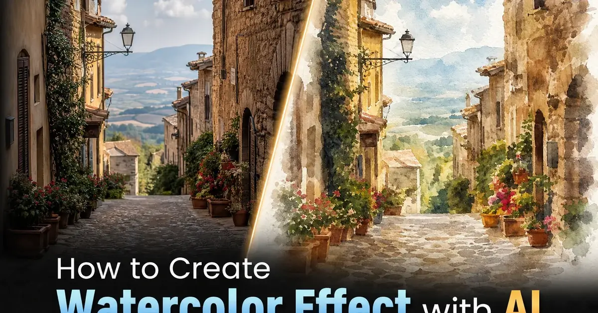
L'aquarelle est l'un des mediums picturaux les plus exigeants techniquement en raison de ses qualités déterminantes. Les lavis transparents, le flux imprévisible des pigments, les bords de couleur qui fondent doucement et la texture visible du papier pressé à froid — émergent d'interactions physiques entre l'eau, le pigment et les fibres de cellulose qui sont très difficiles à contrôler et impossibles à annuler. Un aquarelliste expérimenté passe des années à apprendre à travailler avec le medium plutôt que contre lui, en chronométrant les applications humide-sur-humide pour contrôler les effets de floraison, en gardant le papier blanc comme seule source de lumières et en acceptant les accidents magnifiques qui rendent chaque peinture unique. Recréer cet aspect numérique est un objectif de la recherche en infographie depuis les années 1990, avec des approches allant de la simulation physique des fluides à la génération procédurale de traits, mais l'aquarelle numérique précoce semblait toujours synthétique — trop uniforme, trop prévisible, dépourvue de l'irrégularité organique qui fait la force de l'aquarelle réelle.
L'AI-powered style transfer a fondamentalement changé ce qui est possible. Les réseaux de neurones modernes entraînés sur des milliers de peintures aquarelles réelles ont appris non seulement l'apparence de surface mais aussi la logique structurelle du medium — comment les pigments granulent sur le papier rugueux, comment les lavis s'accumulent sur les bords concaves, comment les zones humides fleurissent dans les zones sèches avec des frontières en forme de chou-fleur, et comment les lavis superposés créent de la profondeur grâce à un mélange de couleurs transparent optiquement différent du mélange de peinture opaque. Le résultat est une conversion aquarelle numérique qui capture le caractère clé du medium plutôt que de simplement flouter les bords et ajouter une superposition de texture papier, comme le faisaient les anciennes approches basées sur des filtres.
Ce guide couvre le flux de travail complet pour transformer des photographies en peintures aquarelles convaincantes à l'aide des outils AI Filter de Magic Eraser. Nous abordons la sélection de la composition, car toutes les photographies ne se traduisent pas bien en aquarelle. Nous couvrons l'étalonnage de l'intensité, car la ligne entre un lavis aquarelle subtil et un désordre surtraité est plus étroite que la plupart des utilisateurs ne le pensent. Nous expliquons les contrôles de traitement des bords et du comportement des pigments qui vous permettent de simuler différentes techniques aquarelles — humide-sur-humide versus humide-sur-sec, pigments transparents versus granulants, papier rugueux versus lisse. Et nous couvrons les paramètres d'exportation pour l'affichage numérique et l'impression d'art — un effet aquarelle magnifique à l'écran peut sembler faux sur papier si la gestion des couleurs n'est pas correctement effectuée.
- La conversion aquarelle par AI utilise le transfert de style neuronal entraîné sur des milliers de peintures réelles pour reproduire le flux des pigments, la granulation, le débordement des bords et la superposition de lavis transparents — pas simplement un flou et une superposition de texture.
- La sélection de la composition est très importante : les images avec un sujet clair, un contraste modéré et des arrière-plans dégagés se convertissent en aquarelle de façon plus convaincante que les photos chargées et riches en détails.
- Le contrôle de l'intensité détermine si le résultat se lit comme un lavis photographique subtil ou une peinture à part entière — soixante-dix pour cent d'intensité est un point de départ fiable pour la plupart des sujets.
- Les contrôles de traitement des bords et de texture du papier vous permettent de simuler des techniques aquarelles spécifiques, notamment le débordement humide-sur-humide, les effets de pinceau sec, la granulation sur papier pressé à froid et les limites de fluide de masquage.
- Les paramètres d'exportation diffèrent pour l'écran et l'impression : sRGB JPEG pour l'affichage numérique, 300 DPI Adobe RGB PNG pour l'impression d'art afin de préserver les transitions chromatiques subtiles qui définissent la qualité de l'aquarelle.
Pourquoi certaines photos donnent de meilleures aquarelles que d'autres
Le facteur le plus important dans une conversion aquarelle convaincante est la structure compositionnelle de la photographie source. La peinture aquarelle simplifie naturellement — le medium n'excelle pas à rendre les détails fins car l'eau et les pigments sont des outils intrinsèquement imprécis. Une photographie d'une seule fleur avec un arrière-plan flou se traduit magnifiquement car la composition possède déjà le type de hiérarchie visuelle que les aquarellistes créent délibérément : un sujet clair avec un environnement simplifié. Une photographie d'un marché de rue bondé avec des centaines de petits objets et une signalisation complexe lutte contre le medium car la nature simplificatrice de l'aquarelle transforme cette complexité en boue visuelle.
La qualité de l'éclairage dans la photographie source influence également fortement le résultat. L'aquarelle est un medium transparent où la lumière provient du papier blanc qui brille à travers de fines couches de pigment — ce qui signifie que les lumières sont l'absence de peinture plutôt que l'ajout de pigment blanc. Les photographies prises sous une lumière douce et directionnelle — heure dorée, lumière du jour nuageuse, lumière de fenêtre orientée nord — ont des transitions tonales progressives que l'AI peut rendre sous forme de lavis lisses et de dégradés de valeurs doux. Les photographies prises sous un soleil de midi agressif avec un contraste extrême entre lumières et ombres produisent des aquarelles qui donnent l'impression que l'AI n'a pas pu décider si elle devait peindre un tableau clair ou sombre — la plage tonale est plus large que ce que l'aquarelle peut représenter naturellement.
La palette de couleurs est la troisième considération clé. Les pigments aquarelle ont une transparence et une luminosité inhérentes qui diffèrent des couleurs photographiques. Les tons terre — ocres, siennes, ombres — et les couleurs botaniques — vert sapin, rose madder, indigo — sont naturels au medium et produisent les résultats les plus convaincants. Les couleurs néon, l'éclairage artificiel très saturé et les photographies étalonnées avec des séparations teal-et-orange extrêmes n'ont pas d'équivalents pigmentaires aquarelle et sembleront teintées artificiellement plutôt que peintes. Si votre photo source a une palette de couleurs naturelle, la conversion semblera intrinsèquement plus crédible.
- Une hiérarchie compositionnelle claire avec un sujet défini et un environnement simplifié se convertit plus efficacement que les scènes chargées et riches en détails.
- Un éclairage directionnel doux avec des transitions tonales progressives produit des lavis lisses, tandis qu'un contraste agressif crée des conflits tonaux que le medium aquarelle ne peut pas résoudre naturellement.
- Les palettes de couleurs naturelles — tons terre, couleurs botaniques — ont des équivalents pigments aquarelle qui semblent authentiques, tandis que les photos néon et fortement étalonnées paraissent teintées artificiellement.
- Les sujets paysagers, floraux, architecturaux et les portraits avec des arrière-plans propres sont les meilleurs candidats pour la conversion aquarelle.
Contrôler l'intensité de l'aquarelle et la superposition des lavis
Le curseur d'intensité dans AI Filter contrôle le degré de transformation de la photographie vers la peinture. Trouver la bonne position est la décision la plus importante de tout le flux de travail. À faible intensité — vingt à quarante pour cent — la photographie conserve la majeure partie de sa structure photographique avec un léger lavis aquarelle superposé, produisant un effet pictural doux qui fonctionne bien pour les albums de mariage, les couvertures de livres — partout où une photo doit sembler artistique sans perdre sa qualité documentaire. Cette plage est indulgente et difficile à mal régler car la fondation photographique fournit une intégrité structurelle.
À intensité moyenne — cinquante à soixante-quinze pour cent — l'image s'engage clairement dans l'esthétique aquarelle. Les bords s'adoucissent significativement, les zones de couleur se consolident en zones de lavis et les détails fins sont remplacés par une suggestion picturale. C'est là que la compréhension de la structure aquarelle par l'AI est la plus importante car l'algorithme doit décider quels détails préserver comme éléments définissants et lesquels dissoudre dans les lavis. Un aquarelliste humain prend ces décisions intuitivement en fonction de l'intention artistique. L'AI les prend en fonction de l'importance des bords, du contraste des couleurs et de la détection du sujet. Les résultats à intensité moyenne sont généralement bons mais bénéficient d'une révision par l'utilisateur et parfois d'un masquage des zones où l'AI a simplifié trop agressivement ou pas assez.
À haute intensité — quatre-vingts à quatre-vingt-quinze pour cent — le résultat est une peinture aquarelle à part entière où l'origine photographique est secondaire par rapport à l'exécution picturale. Les couleurs débordent librement, les bords se dissolvent en floraisons humide-sur-humide et la texture du papier domine la qualité de surface. Cette plage produit les résultats les plus artistiques mais aussi les plus variables — certaines zones de l'image peuvent trop fleurir et perdre toute structure, d'autres peuvent conserver des détails photographiques inattendus qui brisent l'illusion picturale. Les conversions aquarelle à haute intensité bénéficient souvent de deux ou trois passages à des réglages légèrement différents, en sélectionnant la version où les motifs de floraison aléatoires de l'AI fonctionnent le mieux avec la composition spécifique.
- Une intensité de vingt à quarante pour cent produit un lavis subtil sur une base photographique — indulgent et adapté aux albums de mariage et aux couvertures de livres.
- Cinquante à soixante-quinze pour cent est le point idéal où l'image s'engage dans l'esthétique aquarelle tandis que l'AI préserve les détails structurels clés comme éléments définissants.
- Quatre-vingts à quatre-vingt-quinze pour cent produit une exécution pleinement picturale avec des débordements de couleur libres, mais les motifs de floraison variables peuvent nécessiter plusieurs passages pour trouver le meilleur résultat.
- Pour une série d'images aquarelle cohérentes, verrouillez l'intensité à une valeur et utilisez-la sur toutes les photos sources pour maintenir la cohérence visuelle.
Simuler les techniques aquarelles réelles avec les contrôles de bords et de texture
Ce qui distingue une aquarelle numérique convaincante d'un effet filtre bon marché, c'est le traitement des bords et de la texture de surface. L'aquarelle réelle produit au moins quatre types de bords distincts selon l'humidité du papier lors de l'application du pigment. Un bord humide-sur-humide se produit lorsque le pigment rencontre du papier déjà humide et fleurit vers l'extérieur en motifs doux et irréguliers — pensez à la façon dont un coup de pinceau humide déborde dans un lavis de ciel encore humide. Un bord humide-sur-sec se produit lorsque le pigment est appliqué sur du papier sec, produisant une limite assez dure et définie. Un bord de pinceau sec se produit lorsqu'un pinceau presque sec saute sur le papier texturé, ne laissant du pigment que sur le grain relevé — produisant une ligne brisée et griffue. Un bord de soulèvement se produit lorsque le pigment humide est retiré avec un pinceau ou un tissu humide, créant une lumière douce avec des marges irrégulières.
AI Filter de Magic Eraser fournit des contrôles qui correspondent à ces techniques réelles. Le paramètre de douceur des bords contrôle principalement l'équilibre humide-sur-humide versus humide-sur-sec. Des valeurs plus élevées produisent plus de floraison et de débordement, imitant une technique de peinture plus humide. Des valeurs plus basses produisent des limites plus nettes, imitant une technique plus sèche et plus contrôlée. La superposition de texture papier ajoute la surface physique qui fait que l'aquarelle semble ancrée dans un matériau réel plutôt que flottant dans l'espace numérique. Le papier pressé à froid a une texture prononcée et irrégulière qui capture le pigment dans des motifs de grain visibles. Le papier pressé à chaud est plus lisse et permet au pigment de s'écouler plus librement, produisant un aspect plus brillant avec moins de texture visible.
La granulation des pigments est la troisième propriété physique qui distingue l'aquarelle réelle de l'approximation numérique. Certains pigments à base minérale — outremer français, bleu céruléen, ombre brute, sienne brûlée — contiennent des particules grossières qui se déposent dans la texture du papier, produisant un aspect granuleux et tacheté qui ajoute de la profondeur et de l'intérêt visuel aux zones de lavis plat. Le contrôle de granulation dans AI Filter imite cet effet en variant la façon dont la couleur est distribuée uniformément sur les zones texturées. Pour les paysages et les sujets naturels, une granulation modérée ajoute une matérialité convaincante. Pour les sujets architecturaux et les portraits, une granulation plus faible produit des lavis plus propres qui servent mieux les sujets précis.
- L'aquarelle réelle a quatre types de bords — floraison humide-sur-humide, net humide-sur-sec, brisé pinceau sec, et doux par soulèvement — et le paramètre de douceur des bords contrôle l'équilibre entre ces comportements.
- La texture du papier pressé à froid ajoute un grain visible qui capture le pigment, tandis que le papier pressé à chaud permet un écoulement plus lisse — choisissez selon que vous souhaitez un aspect rustique ou raffiné.
- La granulation des pigments simule la façon dont les pigments aquarelle à base minérale se déposent dans la texture du papier, ajoutant une profondeur tachetée aux zones de lavis plat qui empêche le résultat de sembler numériquement uniforme.
- Combiner une douceur de bord modérée avec une texture pressée à froid et une granulation moyenne produit l'effet aquarelle le plus universellement convaincant sur différents types de sujets.
Impression d'art et gestion des couleurs pour les rendus aquarelle
Une aquarelle numérique qui semble magnifique sur un écran rétroéclairé peut paraître terne et plate une fois imprimée sur papier si la gestion des couleurs n'est pas correctement effectuée. L'ironie est que l'impression devrait être l'endroit où un effet aquarelle brille le plus car les aquarelles réelles sont des objets physiques vus sur papier par lumière réfléchie. Le problème fondamental est que les écrans rétroéclairés ont une plage dynamique apparente plus large et une saturation des couleurs plus vive que toute impression par réflexion ne peut atteindre. La luminosité et le punch qui font briller l'aquarelle numérique à l'écran ne peuvent pas se traduire directement sur papier. La solution est l'épreuvage logiciel : prévisualiser l'image telle qu'elle apparaîtra une fois imprimée avec une combinaison spécifique d'imprimante, d'encres et de papier, puis effectuer des ajustements avant d'envoyer le fichier à l'impression.
Le choix du papier pour l'impression d'images à effet aquarelle est d'une importance capitale car le papier est littéralement la moitié de l'oeuvre. Un papier d'art mat comme le Hahnemuhle William Turner ou le Canson Aquarelle possède une surface texturée qui complète la superposition de texture papier de l'aquarelle numérique, créant un effet double couche où le grain physique du papier s'harmonise avec le grain simulé. Les papiers photo brillants ou semi-brillants produisent un décalage visuel étrange car la surface brillante contredit l'esthétique mate et absorbante de l'aquarelle réelle. Les papiers en coton rag mat sont le choix premium, offrant une texture de surface et une gamme de couleurs qui rendent les aquarelles numériques impossibles à distinguer des originales peintes à la main lorsqu'elles sont vues à distance normale.
La résolution et le format de fichier pour l'impression nécessitent plus de spécifications que la plupart des utilisateurs ne le pensent. À 300 DPI, une impression standard de 8x10 pouces nécessite un fichier source de 2400x3000 pixels. Les impressions de galerie plus grandes de 16x20 pouces nécessitent 4800x6000 pixels. Le processus de conversion aquarelle peut adoucir les détails fins, donc commencer avec la photographie source de la plus haute résolution disponible est important — l'AI a plus de données avec lesquelles travailler et produit de meilleurs effets de granulation et de bords en haute résolution. Exportez en TIFF 16 bits ou PNG de haute qualité pour préserver les dégradés de lavis subtils que la compression JPEG 8 bits peut aplatir en bandes visibles, principalement dans les grandes zones de couleur changeant progressivement comme les ciels et les reflets d'eau.
- L'épreuvage logiciel révèle l'apparence de l'aquarelle sur papier avant impression, évitant la déception d'un rendu terne et plat à partir d'un fichier qui semblait vivant à l'écran.
- Les papiers d'art mats avec texture coton rag complètent l'esthétique aquarelle numérique, tandis que les papiers brillants créent un décalage visuel qui compromet l'illusion picturale.
- Exportez à 300 DPI en TIFF 16 bits ou PNG pour préserver les dégradés de lavis subtils — la compression JPEG 8 bits aplatit les transitions chromatiques douces qui définissent la qualité aquarelle.
- Commencez avec la photographie source de la plus haute résolution disponible car l'AI produit de meilleurs effets de granulation, de bords et de détails de lavis lorsqu'elle travaille avec plus de données de pixels.
How to do it
- 1
Select a photograph with strong compositional elements for watercolor conversion
Watercolor effects work best on images with clear subjects, moderate contrast, and uncluttered compositions. Landscape photos with defined horizons, architectural shots with strong geometric lines, and portraits with soft backgrounds all convert convincingly. Avoid images that are very busy or rely on fine detail. Watercolor painting naturally simplifies detail, so photos that already have a clear visual hierarchy translate more naturally. Open your chosen photo in Magic Eraser and review the composition before applying any effects.
- 2
Apply the AI watercolor style filter and adjust intensity
Navigate to AI Filter and select the watercolor painting style preset. The AI analyzes the image content, identifies edges and color regions. Applies a multi-layered change that mimics wet-on-wet watercolor techniques. Start with the default intensity around seventy percent. Provides a clear painterly look while retaining enough photographic structure to keep the subject distinct. Lower intensity around forty to fifty percent produces a subtle wash effect suitable for backgrounds. Higher intensity at eighty-five to ninety-five percent creates a more abstract, traditional watercolor look.
- 3
Refine edge treatment and color bleed behavior
Real watercolor paintings have trait soft edges where pigment bleeds beyond the contour of objects. Hard edges where pigment pools against dry paper or masking fluid boundaries. Use the edge softness control to determine how much color bleeding occurs at object boundaries. For architectural subjects, keep edges moderately defined so buildings retain their structural identity. For florals and landscapes, increase edge softness to let colors bleed into each other naturally. Check areas where high contrast meets. Dark tree trunks against bright sky, for example — and ensure the bleed effect looks like deliberate painting rather than a processing artifact.
- 4
Adjust the paper texture and pigment granulation settings
Watercolor painting on cold-pressed paper produces visible texture where pigment settles into the paper grain, creating granulation that gives the painting depth and tactile quality. Enable the paper texture overlay and choose between fine grain for smoother results or coarse grain for a more traditional handmade look. The granulation setting controls how much pigment clumps in textured areas. Higher granulation mimics earth pigments like raw umber and burnt sienna, while lower granulation mimics modern synthetic pigments that lay flat. Preview at full resolution to verify the texture reads naturally at your intended output size.
- 5
Export in the appropriate format and resolution for your use case
For digital display — social media posts, website headers, digital greeting cards — export as a high-quality JPEG or WebP at your platform's recommended dimensions. For printing on fine art paper or canvas, export as a lossless PNG at 300 DPI or higher and select the sRGB color space for inkjet printers or Adobe RGB if your print lab supports it. If you plan to sell prints or license the image, export at the maximum available resolution. Save your settings as a preset if you plan to create a series of watercolor images with consistent style across multiple photographs.
Sources
- Neural Style Transfer: A Review — arXiv
- Image Style Transfer Using Convolutional Neural Networks — IEEE CVPR
- Watercolor Rendering Techniques in Digital Art — ACM Transactions on Graphics