
Comment Creer un Effet Cuivre de Takaoka avec l'AI : Tutoriel sur la Texture Metalloïde Doki Japonaise
Apprenez a creer des effets de cuivre Takaoka authentiques dans vos photos avec l'AI. Tutoriel pas a pas couvrant les textures de cuivre coule, les patines niiro et rokusho, l'incrustation d'or nunome-zogan. Les traditions metallurgiques sculpturales de la prefecture de Toyama.
SEO & Growth
Vérifié par Magic Eraser Editorial ·
Sommaire
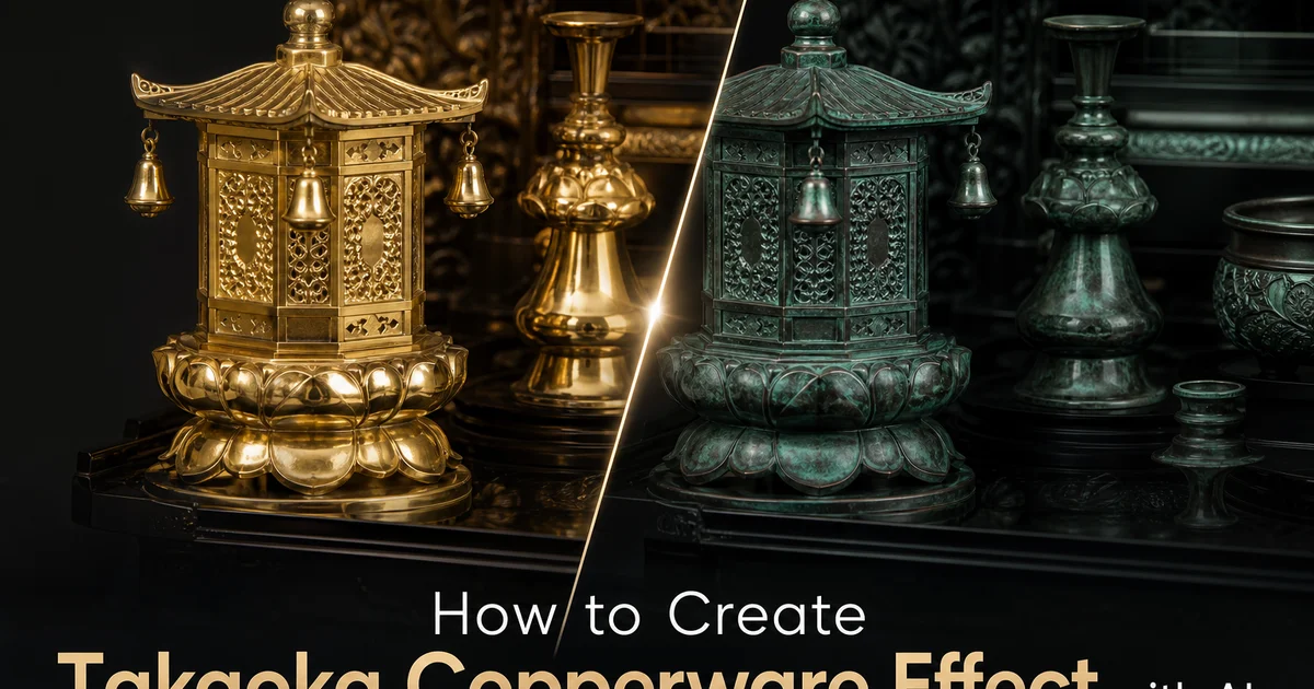
Le Takaoka doki -- la tradition du cuivre de la ville de Takaoka dans la prefecture de Toyama -- est une pierre angulaire de l'artisanat metallique japonais depuis 1611, lorsque le seigneur feodal Maeda Toshinaga invita sept maitres fondeurs d'Osaka a etablir des fonderies dans la nouvelle ville-chateau. Durant plus de quatre siecles, ces fonderies sont passees de la production d'objets utilitaires comme les marmites et outils agricoles a la creation de certaines des plus belles œuvres decoratives en metal du Japon : cloches de temple, accessoires d'autel bouddhiste, vases a fleurs, brule-encens et ustensiles de ceremonie du the. Aujourd'hui, Takaoka produit plus de quatre-vingt-dix pour cent des articles en cuivre et bronze coule du Japon. La tradition doki de la ville a ete designee Artisanat Traditionnel National en 1975.
Ce qui rend le cuivre Takaoka visuellement distinctif est l'interaction entre la texture de coulee, la patine de surface et les techniques d'incrustation decorative affinees au fil des generations. Le processus de coulee lui-meme laisse une surface caracteristique -- subtilement granuleuse grace au moule en sable, avec la precision dimensionnelle issue de siecles d'expertise en modelage. Sur cette surface coulee, les artisans appliquent des traitements chimiques de patine qui produisent une gamme de couleurs impossibles a obtenir avec de la peinture ou du colorant : le brun-noir niiro issu de solutions de sulfure de potassium, le vert-de-gris rokusho issu de composes d'acetate de cuivre, le rouge-cuivre akagane chaud issu de l'oxyde controlee. Ces couleurs de patine ont de la profondeur car elles sont des transformations chimiques de la surface metallique elle-meme, et non des revetements appliques par-dessus.
L'edition photo par AI peut aujourd'hui reproduire les qualites visuelles distinctives du cuivre Takaoka -- le poids et la dimensionalite du metal coule, la profondeur et la variation de couleur des patines chimiques, la precision de l'incrustation decorative nunome-zogan. En analysant la geometrie de surface et le comportement de la lumiere, les filtres AI transforment les surfaces photographiques planes en compositions qui portent la presence materielle du cuivre et du bronze. Ce tutoriel presente le processus de construction d'un effet Takaoka doki, de la texture de coulee au colorimetrie de patine en passant par l'incrustation decorative, produisant des images qui evoquent l'une des traditions metallurgiques les plus durables du Japon.
- Appliquer une texture de surface en cuivre coule qui evoque le metal de moule en sable avec la granularite et le poids du travail de fonderie de Takaoka.
- Construire des palettes de couleurs de patine chimique utilisant le brun-noir niiro, le vert-de-gris rokusho et les tons cuivre rouge akagane chauds, cartographies sur la geometrie de surface.
- Ajouter des motifs d'incrustation d'or et d'argent nunome-zogan qui reposent a fleur de la surface du cuivre plutot que de flotter comme des incrustations planes.
- Creer une cartographie dimensionnelle des reflets qui simule le comportement de la lumiere sur des formes de metal coule tridimensionnelles avec des ciselures en haut-relief.
- Exporter avec une fidelite tonale qui preserve les gradients de patine subtils et les fins details d'incrustation aux formats PNG ou WebP de haute qualite.
Comprendre l'esthetique et les qualites de surface du cuivre Takaoka
L'identite visuelle du cuivre Takaoka commence par le processus de coulee. Contrairement au travail de tôle metallique ou le cuivre est martele ou faconne par rotation, le Takaoka doki est coule dans des moules en sable ou des moules a cire perdue, produisant des formes avec un caractere de surface distinctif. Les surfaces coulees en sable retiennent une micro-texture issue du materiau du moule -- une fine granularite qui disperse la lumiere differemment d'une tôle metallique lisse. Cette texture donne au cuivre coule sa chaleur mate caracteristique, une qualite qui se lit comme de la solidite et du poids meme en photographie. Le moulage a cire perdue, utilise pour les pieces plus complexes, produit des surfaces plus lisses avec des details plus nets tout en conservant la precision dimensionnelle qui distingue le metal coule du metal faconne.
Apres la coulee, les artisans de Takaoka affinent les surfaces par la ciselure et la gravure. Les ciseaux tagane sont utilises pour affuter les bords, approfondir les details en relief et ajouter des motifs decoratifs directement dans la surface coulee. Cette finition a la main cree une hierarchie de surface subtile -- des zones de marques d'outil avec texture directionnelle entrecoupees de zones coulees plus lisses -- qui donne a chaque piece une complexite visuelle depassant sa forme de base. En photographie, cette hierarchie de surface se traduit par une variation tonale a fine echelle : des zones captant la lumiere sous differents angles grace aux marques d'outil entremelees de reflets plus larges provenant de surfaces coulees plus lisses.
L'etape de patine transforme la surface brute du cuivre ou du bronze en les couleurs qui definissent la signature visuelle du cuivre Takaoka. Le processus n'est pas une peinture decorative mais une conversion chimique du metal lui-meme. La patine niiro utilise le sulfure de potassium pour convertir la surface du cuivre en sulfure de cuivre brun-noir, produisant une couleur avec la profondeur et la chaleur du bronze vieilli. La patine rokusho utilise un compose japonais traditionnel d'acetate de cuivre, de sel et de vinaigre de prune pour produire le vert-de-gris bleu-vert que beaucoup associent au cuivre vieilli, comme la peau de la Statue de la Liberte. Ces couleurs chimiques ont une translucidite et une profondeur que la peinture ne peut reproduire car elles font partie integrante de la surface metallique plutot que d'etre une couche par-dessus.
- Les surfaces coulees en sable dispersent la lumiere avec une granularite mate distinctive qui communique poids et solidite -- differente des reflets tranchants de la tôle metallique.
- La ciselure a la main avec les ciseaux tagane cree une hierarchie de surface : des marques d'outil directionnelles entrecoupees de zones coulees plus lisses produisant une variation tonale a fine echelle.
- La patine chimique convertit la surface metallique elle-meme plutot que de la recouvrir, produisant des couleurs avec translucidite et profondeur impossibles a obtenir avec de la peinture.
- L'interaction de la texture de coulee, de la finition a la main et de la couleur chimique cree la complexite visuelle multicouche qui definit le cuivre Takaoka.
Application de la texture de metal coule et colorimetrie de patine avec l'AI
L'etape d'application de texture doit transformer les surfaces photographiques en quelque chose qui se lit comme du metal coule. L'AI analyse la luminosite et la geometrie de surface de l'image source pour appliquer une texture granuleuse qui suit la forme tridimensionnelle implicite. Sur les surfaces convexes et les zones surelevees, la texture de coulee est plus fine et capte plus de lumiere, produisant des reflets plus brillants avec la qualite chaude et dispersee du cuivre coule en sable. Dans les zones concaves et les creux, la texture est plus grossiere et plus sombre, imitant la facon dont la patine s'accumule dans les zones protegees tandis que les surfaces exposees sont polies par la manipulation et l'exposition environnementale. Cette application differentielle de la texture est ce qui fait que l'effet se lit comme du metal dimensionnel plutot que comme une incrustation de texture plane.
La colorimetrie de patine necessite une approche multi-zones car le veritable cuivre Takaoka ne presente jamais une couleur uniforme. Les zones de reflet -- sommets des formes, zones qui recevraient le plus de manipulation ou d'exposition environnementale -- doivent virer vers le rouge-cuivre akagane chaud ou le bronze poli. Les tons moyens doivent prendre le brun-noir niiro qui constitue la patine de base de la plupart des pieces traditionnelles. Les zones d'ombre et les creux profonds doivent montrer soit le noir niiro le plus profond, soit le vert-de-gris rokusho qui se forme dans les zones ou l'humidite s'accumule. Cette cartographie des couleurs suit la physique de la patination reelle : les zones exposees s'oxydent et sont polies, tandis que les zones protegees developpent des couches de patine chimique plus epaisses.
Les zones de transition entre les couleurs de patine sont cruciales pour le realisme. Sur un veritable cuivre, les couleurs de patine ne changent pas brusquement mais se melangent a travers des tons intermediaires ou une reaction chimique cede la place a une autre. L'AI doit produire des transitions graduelles -- l'akagane cuivre se rechauffant en brun-noir niiro, le niiro s'assombrissant en vert rokusho -- avec l'irregularite organique des processus chimiques naturels plutot que les gradients lisses et mecaniques d'une rampe de couleurs numerique. L'introduction de legere aleatoire et de variation dans les zones de transition imite la nature imprevisible de la patine chimique, ou des differences mineures dans la preparation de surface, la temperature et l'humidite produisent des motifs de couleur uniques sur chaque piece.
- La cartographie differentielle de texture applique un grain de coulee plus fin et plus clair sur les reflets convexes et un grain plus grossier et plus sombre dans les creux concaves pour un realisme dimensionnel.
- La colorimetrie de patine multi-zones cartographie le cuivre chaud sur les reflets, le brun-noir niiro sur les tons moyens et le vert-de-gris rokusho sur les ombres et les creux proteges.
- Les zones de transition entre les couleurs de patine doivent se fondre organiquement avec une legere aleatoire, imitant la chimie irreguliere de la patination metallique reelle.
- Le traitement combine de texture et de couleur fait que la composition entiere se lit comme du metal coule tridimensionnel plutot qu'une surface photographique plane avec des filtres.
Ajout d'incrustations nunome-zogan et d'effets de ciselure decorative
Le nunome-zogan est la technique d'incrustation signature de Takaoka, et sa qualite geometrique precise fournit un contraste visuel frappant avec la texture et la couleur organiques du cuivre patine. Dans le processus traditionnel, l'artisan cree de fines rainures entrecroisees dans la surface du cuivre avec un ciseau tagane, formant un micro-reseau qui retient de minces feuilles d'or ou d'argent pressees dans la surface et brunies a ras. Le resultat est une decoration metallique physiquement encastree dans le cuivre -- non pas en relief, non pas une couche separee, mais une partie de la surface elle-meme. En imitant cela numeriquement, les motifs d'or et d'argent doivent apparaitre comme situes dans la texture de la surface du cuivre plutot que flottant au-dessus.
Le vocabulaire visuel de la decoration nunome-zogan puise dans les motifs traditionnels japonais -- chrysanthemes, bambou, pin, grues, dragons, nuages, motifs geometriques comme les vagues seigaiha et les feuilles de chanvre asanoha. Lors de l'application a une photographie, l'AI doit placer les motifs decoratifs le long des lignes de composition et dans les zones de repos visuel plutot que de rivaliser avec le sujet principal. Les lignes d'incrustation doivent etre fines et precises, avec le ton legerement chaud de l'or vu a travers la patine de surface transparente -- non pas un or brillant et pur, mais un or chimiquement integre a son contexte de cuivre par le processus de patine applique apres l'incrustation.
Pour les compositions inspirees de la tradition takanikubori de Takaoka -- la ciselure en haut-relief ou les formes emergent considerablement de la surface -- l'AI peut renforcer les reflets dimensionnels pour suggerer des elements profondement sculptes se detachant du plan d'arriere-plan. Les pieces takanikubori presentent souvent des sujets naturalistes comme des grues, des dragons ou des elements de paysage sculptes en relief quasi tridimensionnel. Imiter cela numeriquement implique d'augmenter le contraste entre lumiere et ombre sur des elements focaux selectionnes tout en maintenant l'arriere-plan plat et patine, creant l'impression visuelle de formes sculpturales s'elevant d'une surface metallique decoree.
- L'or et l'argent nunome-zogan doivent apparaitre encastres dans la texture de surface du cuivre, non pas flottant au-dessus -- correspondant a la facon dont la feuille est physiquement martelee dans les rainures entrecroisees.
- Les motifs traditionnels comme les chrysanthemes, les vagues seigaiha et les grues doivent etre places le long des lignes de composition et des zones de repos visuel.
- L'or d'incrustation doit paraitre chaud et legerement attenue par le processus de patine applique apres l'encastrement, non pas brillant ou metallique pur.
- Les effets de haut-relief takanikubori utilisent un contraste dimensionnel renforce sur les elements focaux par rapport aux arriere-plans patines plats pour suggerer une profondeur sculpturale.
Applications creatives et optimisation de l'exportation
L'effet cuivre Takaoka porte des associations fortes avec l'artisanat patrimonial, le realisme materiel et le raffinement esthetique japonais. Ces associations le rendent particulierement efficace pour l'imagerie de marque de luxe, la photographie de produits artisanaux et les contenus culturels ou le langage visuel du metal et de la patine communique qualite et perennite. Les marques de joaillerie, les entreprises de the, les labels de spiritueux premium et les cabinets d'architecture peuvent utiliser le traitement cuivre pour placer leurs produits dans un contexte de valeurs artisanales traditionnelles. La palette chaude du cuivre et du bronze fonctionne egalement exceptionnellement bien pour les campagnes saisonnieres d'automne et d'hiver, ou les tons riches et profonds s'alignent avec l'ambiance visuelle de la saison.
La qualite dimensionnelle de l'effet cuivre le distingue des traitements par filtre plat dans les contextes de medias sociaux et de marketing numerique. Alors que la plupart des filtres modifient la couleur et le contraste sur un plan plat, le traitement Takaoka cree une surface materielle implicite qui donne aux images une presence physique rare dans le contenu numerique. Cette physicalite attire l'attention dans les contextes de defilement de flux ou les images plates et surexposees se confondent. Un traitement cuivre coherent applique a une serie de contenus -- lancements de produits, contenu en coulisses, collections saisonnieres -- construit une esthetique de marque distincte enracinee dans l'artisanat materiel plutot que dans la tendance numerique.
Les parametres d'exportation doivent preserver a la fois les fins details de texture et les subtils gradients de couleur de patine qui portent l'effet. Le PNG est ideal pour la qualite d'archivage et la preparation impression. Le WebP a qualite 88 ou plus maintient la fidelite des couleurs necessaire aux transitions de patine sans les tailles de fichier des formats sans perte. Pour les applications d'impression, verifiez que les tons vert-de-gris rokusho et brun-noir niiro se convertissent correctement en CMJN, car ces couleurs specifiques derivees du cuivre peuvent fortement varier dans le mapping des gammes chromatiques. Demandez une eprouvette d'impression avant de vous lancer dans de grands tirages, principalement pour les tons vert-de-gris qui se situent en bordure des gammes CMJN typiques.
- Le branding de luxe, les produits artisanaux et les contenus culturels beneficient des associations patrimoniales et artisanales du traitement cuivre.
- La surface dimensionnelle implicite de l'effet cree une presence physique qui se demarque des contenus numeriques plats et surexposes.
- Un traitement cuivre coherent sur des series de contenu construit une esthetique de marque enracinee dans les valeurs de l'artisanat materiel plutot que dans les tendances numeriques ephemeres.
- Verifiez la conversion CMJN des tons vert-de-gris rokusho et brun-noir niiro avant la production d'impression, car ces couleurs derivees du cuivre peuvent varier dans le mapping des gammes chromatiques.
How to do it
- 1
Select a source image with defined surfaces and dimensional forms
Takaoka copperware is characterized by its sculptural three-dimensionality and rich surface patination on cast metal forms. Choose a source photograph with clearly defined surfaces and strong dimensional elements -- product photography, architectural details, sculptural objects, or portraits with dramatic lighting. The ideal source contains areas of both highlight and deep shadow. The copperware effect relies on how light reveals the surface texture and color variation of patinated metal. Images with flat, even lighting or very busy textures will not translate the dimensional quality that defines Takaoka casting.
- 2
Apply the cast copper surface texture using AI Filter
Open the image in AI Filter and select a metallic or bronze preset. The AI transforms smooth photographic surfaces into the characteristic texture of sand-cast copper -- a surface with subtle granularity from the casting mold, interrupted by areas of hand-chasing and engraving where artisans refined the form after casting. Adjust the texture intensity so the cast-metal grain is visible without overwhelming the composition. The goal is a surface that reads as solid cast metal rather than sheet copper or a flat metallic overlay -- the weight and solidity of Takaoka doki comes from the casting process that has defined the craft since the early 1600s.
- 3
Build the characteristic patina color palette
Takaoka copperware is distinguished by its elaborate patination techniques, where chemical treatments produce specific colors on the copper surface. Apply color grading through AI Enhance to shift the palette toward the traditional Takaoka patina range: niiro brownish-black from copper sulfide, rokusho verdigris green from copper acetate. The warm reddish-gold of polished akagane copper. Layer these tones across the image by mapping darker patina to recessed areas and shadows while allowing warmer copper tones to emerge on raised surfaces and highlights, mimicking how patina naturally develops on three-dimensional cast forms.
- 4
Add inlay and decorative detail effects
Many Takaoka copperware pieces feature nunome-zogan inlay -- fine patterns of gold or silver hammered into crosshatched grooves cut in the copper surface. Use AI Filter overlay tools to add fine gold and silver linear patterns that follow the compositional structure of your image. The inlay should appear as thin metallic lines and small geometric or floral motifs embedded flush with the surrounding copper surface, not raised above it. For pieces inspired by the Takaoka tradition of takanikubori high-relief carving, add enhanced dimensional highlights that suggest deeply sculpted forms emerging from the metal surface.
- 5
Export the finished Takaoka copperware image with tonal fidelity
Save in PNG format to preserve the full tonal range of the patina gradients and the fine detail of inlay patterns. The subtle color shifts between copper, bronze-black. Verdigris green require lossless or near-lossless encoding to avoid compression artifacts that flatten the patina variations into uniform color blocks. For web delivery, export as WebP at quality 88 or higher. For print use on product packaging, gallery materials, or exhibition catalogs, export at 300 DPI and verify that the fine nunome-zogan inlay details remain crisp and that the patina color transitions render without visible banding.
Sources
- Takaoka Copperware: Four Centuries of Metalwork Tradition — Takaoka Copperware Cooperative Association
- Traditional Japanese Metal Crafts and Patination Techniques — ISIJ International
- Copper and Bronze in Japanese Decorative Arts — The Metropolitan Museum of Art