
Comment créer un effet de croquis avec l'IA — Magic Eraser
Apprenez à convertir des photos en styles de croquis au crayon et de dessin au trait à l'aide de l'IA. Guide étape par étape couvrant la détection des contours, la hiérarchie des épaisseurs de trait, le hachurage, l'ombrage et la texture du papier pour les portraits, l'architecture et les illustrations de produits.

Product Marketing
Vérifié par Magic Eraser Editorial ·
Sommaire
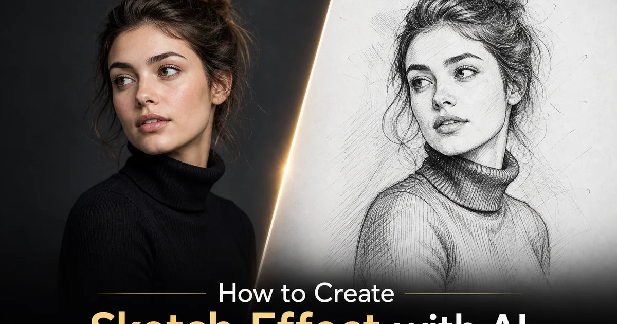
Le croquis au crayon est l'une des formes d'art les plus durables et les plus distinctives de la culture visuelle. Des dessins anatomiques de Léonard de Vinci aux rendus architecturaux en passant par les illustrations judiciaires, le croquis transmet l'information par l'économie. Quelques traits bien placés suggèrent la forme, la profondeur et le caractère qu'une photographie en couleurs rend de manière littérale. Cette économie est précisément ce qui rend l'effet de croquis puissant en tant que transformation photographique : il dépouille les détails littéraux de la photographie et les remplace par l'accentuation sélective de l'oeil de l'artiste, choisissant quels contours renforcer, lesquels suggérer et lesquels omettre complètement.
Convertir une photographie en croquis à l'aide du traitement d'image traditionnel — filtres de détection des contours, ajustements de seuil et extraction de traits — produit des résultats qui ressemblent davantage à des photographies traitées qu'à de véritables croquis. Les traits sont d'épaisseur uniforme, l'ombrage est mécanique. L'impression générale est celle d'un effet de filtre plutôt que d'un dessin. L'écart entre une photo filtrée et un véritable croquis au crayon réside dans les décisions artistiques : un véritable artiste varie l'épaisseur du trait pour montrer l'emphase, utilise la densité de hachure pour indiquer la profondeur des ombres, laisse des espaces blancs pour représenter la lumière et l'air, et sélectionne les détails à inclure en fonction de leur importance compositionnelle plutôt que de leur contraste de contour.
Les effets de croquis par IA comblent cet écart car les réseaux neuronaux entraînés sur de véritables dessins au crayon apprennent ces conventions artistiques. L'IA comprend que les yeux d'un portrait reçoivent un travail de lignes plus détaillé que l'arrière-plan, que les croquis architecturaux mettent l'accent sur les contours structurels plutôt que sur la texture de surface, et que le blanc du papier est aussi important que les marques de crayon sur celui-ci. Ce guide couvre le processus complet de conversion de photographies en croquis au crayon convaincants à l'aide d'AI Filter, du choix des photos sources qui se traduisent bien en art linéaire à l'ajustement du trait, de l'ombrage et des paramètres de papier qui déterminent le caractère visuel du croquis.
- La conversion de croquis par IA analyse les contours à plusieurs échelles et les convertit en traits de crayon d'épaisseur variable qui imitent la façon dont les artistes allouent l'emphase — lourds pour la structure, légers pour la texture.
- Les contrôles de densité de ligne déterminent si le résultat ressemble à un dessin gestuel minimal ou à une illustration technique détaillée, et la densité appropriée dépend du sujet et de l'utilisation prévue.
- L'ombrage au crayon avec hachurage et hachurage croisé ajoute une forme tridimensionnelle, convertissant les dessins au trait plats en représentations volumétriques avec une direction de lumière visible.
- La sélection de la texture du papier détermine si les traits de crayon apparaissent comme des marques rugueuses et granuleuses ou des lignes propres et précises — correspondant aux attentes visuelles pour les dessins artistiques par rapport aux dessins techniques.
- Le choix de la photo source est très important : un fort contraste de contour et une séparation claire sujet-arrière-plan produisent des résultats de croquis considérablement meilleurs que les images douces et riches en dégradés.
Comment l'IA comprend le langage visuel du dessin au crayon
Un croquis au crayon n'est pas une photographie dont on a retiré la couleur et mis en évidence les contours. C'est une représentation d'informations visuelles fondamentalement différente — une représentation qui utilise le trait, le ton et l'espace blanc pour suggérer la forme plutôt que de la reproduire littéralement. Lorsqu'un artiste formé dessine un portrait, il prend des centaines de décisions qui n'ont pas d'équivalent en photographie : quelles rides accentuer et lesquelles omettre, à quel point appuyer le crayon le long de la mâchoire par rapport à la pommette, s'il faut ombrer l'orbite avec un hachurage parallèle ou croisé, combien de papier blanc laisser sur le front pour suggérer la lumière. Ces décisions ne sont pas basées sur des règles — elles émergent de la compréhension de l'artiste de la façon dont les marques de crayon sur le papier sont lues par le système visuel humain.
Les réseaux neuronaux entraînés sur de grandes collections de dessins au crayon apprennent ces conventions implicitement. Le réseau observe que les artistes appliquent toujours des traits plus lourds aux contours structurels qu'aux contours de texture, que l'ombrage dans les zones d'ombre utilise des motifs de marques plus denses que l'ombrage dans les tons moyens, que certains sujets (visages, mains, détails architecturaux) reçoivent une attention plus détaillée que d'autres (arrière-plans, surfaces planes, ciel). Lorsque le réseau traite une photographie, il applique ces conventions apprises pour déterminer où placer les traits lourds, où ajouter de l'ombrage, où suggérer des détails avec des marques légères et où laisser le papier vierge.
La différence de qualité entre la conversion par IA et la détection de contours par filtre est la plus visible sur les visages. Un filtre de détection de contours de Photoshop traite chaque limite de contraste de manière égale. Le contour d'une narine reçoit la même épaisseur de trait que le bord d'un col de chemise. Un effet de croquis par IA entraîné sur des portraits sait que le contour de la narine est compositionnellement important et le dessine avec un trait confiant et pondéré. Le bord du col est un détail d'arrière-plan et reçoit un trait plus léger et plus hésitant, ou est complètement omis. Cette emphase hiérarchique est ce qui rend la sortie de l'IA dessinée plutôt que traitée.
- Le dessin au crayon est un système de représentation fondamentalement différent de la photographie, utilisant l'épaisseur du trait, le hachurage et l'espace blanc pour suggérer la forme plutôt que la reproduire.
- Les réseaux neuronaux apprennent les conventions artistiques à partir de dessins réels : traits plus lourds sur les contours structurels, ombrage plus dense dans les ombres, plus de détails sur les visages et les zones focales.
- La conversion de croquis par IA applique une hiérarchie compositionnelle — les contours importants reçoivent des traits lourds et confiants tandis que les détails d'arrière-plan reçoivent des marques légères ou sont omis.
- L'écart de qualité entre la conversion par IA et celle par filtre est le plus visible sur les visages, où l'emphase hiérarchique des traits sépare les résultats qui semblent dessinés de ceux qui semblent traités.
Choisir des photos sources qui se traduisent bien en croquis
Toutes les photographies ne font pas un bon croquis. Les caractéristiques qui rendent une photographie visuellement frappante — couleurs riches, dégradés de tons lisses, brume d'ambiance, flou de bokeh — sont précisément les éléments qui disparaissent dans une conversion en croquis, car les croquis ne peuvent pas représenter la couleur et ne partagent le ton qu'à travers la densité d'ombrage au crayon. Les photographies qui produisent les meilleurs résultats de croquis sont celles qui ont de fortes propriétés structurelles : des contours nets, des formes définies, un contraste élevé entre le sujet et l'arrière-plan, et des formes géométriques ou organiques intéressantes qui se lisent clairement comme des dessins au trait.
Les portraits fonctionnent mieux lorsque l'éclairage est directionnel. Les visages éclairés de côté ou à la Rembrandt créent des motifs d'ombre forts qui se traduisent par un ombrage dramatique dans le croquis. Un éclairage frontal plat produit une illumination uniforme qui donne au croquis peu de matière tonale avec laquelle travailler, résultant en un dessin plat et lourd en contours qui manque de la tridimensionnalité qui rend les croquis puissants. Les traits du sujet comptent aussi : une structure osseuse forte, des mâchoires définies et des caractéristiques expressives produisent un travail de ligne audacieux et confiant, tandis que des traits mous et arrondis avec un contraste minimal produisent des lignes hésitantes et ambiguës qui manquent d'impact visuel.
L'architecture et les scènes urbaines sont des sujets naturels pour le croquis car les bâtiments sont définis par des contours géométriques qui se traduisent directement en traits de ligne propres. Cependant, les meilleures sources de croquis architecturaux ne sont pas des bâtiments parfaitement isolés mais des structures avec un contexte visuel — végétation environnante, activité piétonne, effets d'ambiance — qui donnent au croquis quelque chose à contraster avec la précision géométrique de l'architecture. Un bâtiment seul produit un dessin technique. Un bâtiment avec un arbre, un réverbère et une personne qui marche produit un croquis d'ambiance avec un intérêt narratif. Le même principe s'applique à tout sujet : le croquis a besoin à la fois d'un point focal et d'un contexte pour créer une hiérarchie visuelle.
- Un fort contraste de contour et des formes définies se traduisent en traits de croquis nets, tandis que la richesse des couleurs et les dégradés de tons — forces de la photographie — disparaissent dans la conversion.
- L'éclairage directionnel sur les portraits crée des motifs d'ombre qui deviennent un ombrage dramatique au crayon, tandis qu'un éclairage plat produit des croquis plats et lourds en contours.
- Les scènes architecturales bénéficient d'un contexte environnemental — végétation, personnes, atmosphère — qui fournit un contraste tonal avec les contours géométriques des bâtiments.
- Les meilleures sources de croquis ont à la fois un point focal et un contexte environnant qui créent la hiérarchie visuelle nécessaire à l'intérêt compositionnel.
Contrôler l'épaisseur du trait et la hiérarchie des lignes
L'épaisseur du trait — l'obscurité et la largeur de chaque marque de crayon — est l'outil expressif principal du dessin au crayon et le paramètre le plus important à contrôler dans la conversion de croquis par IA. Dans un véritable dessin au crayon, l'artiste varie l'épaisseur du trait en appuyant plus ou moins fort sur le crayon, en utilisant une pointe plus fine ou plus émoussée, et en faisant un ou plusieurs passages sur la même ligne. Les traits lourds attirent l'attention et définissent les limites structurelles les plus importantes. Les traits légers suggèrent des détails et des textures secondaires. La répartition de l'épaisseur sur l'ensemble du dessin crée une hiérarchie visuelle qui indique au spectateur où regarder en premier, en deuxième et en troisième.
Les contrôles d'épaisseur de trait d'AI Filter vous permettent d'ajuster cette hiérarchie globalement et régionalement. Le réglage global détermine la plage générale du trait le plus clair au plus foncé. L'augmenter produit un croquis audacieux et à fort contraste adapté à la reproduction en petite taille, tandis que le diminuer produit un croquis délicat et subtil qui récompense un examen attentif. Le réglage régional contrôle la force avec laquelle l'IA différencie les contours structurels des contours de texture. Une différenciation élevée produit un croquis avec une forte emphase focale et un minimum de détails d'arrière-plan, tandis qu'une différenciation faible produit un dessin plus uniformément détaillé où chaque contour reçoit un traitement similaire.
Pour la plupart des sujets, une différenciation élevée produit les résultats les plus proches d'un croquis car elle imite la sélectivité naturelle du dessin humain. Un artiste regardant un visage ne dessine pas chaque pore et détail de texture. Il dessine les yeux, le nez, la bouche, la mâchoire et les cheveux comme des traits définis et suggère tout le reste avec des marques minimales. L'IA reproduit cette sélectivité lorsque la différenciation est élevée : les caractéristiques primaires reçoivent des traits confiants et pondérés tandis que les zones secondaires reçoivent de légères suggestions. Lorsque la différenciation est faible, le résultat ressemble davantage à une illustration technique qu'à un croquis artistique — utile pour les dessins de produits et les plans architecturaux mais moins impressionnant en tant qu'art créatif.
- L'épaisseur du trait est l'outil expressif principal : les traits lourds définissent la structure importante, les traits légers suggèrent les détails secondaires, et la distribution crée une hiérarchie visuelle.
- Les réglages globaux d'épaisseur contrôlent la plage d'obscurité générale — plus audacieux pour la reproduction en petite taille, plus délicat pour les tirages d'art à examiner de près.
- La différenciation régionale contrôle la force avec laquelle l'IA distingue les contours structurels des contours de texture — une différenciation élevée imite la sélectivité artistique.
- Une différenciation élevée produit des résultats de croquis artistiques avec une forte emphase focale, tandis qu'une différenciation faible produit une uniformité d'illustration technique utile pour les dessins de produits et d'architecture.
Techniques d'ombrage et leurs effets visuels
L'ombrage au crayon transforme un dessin au trait plat en une représentation tridimensionnelle en indiquant comment la lumière tombe sur les surfaces. Les trois principales techniques d'ombrage du dessin au crayon traditionnel produisent chacune un caractère visuel distinct, et AI Filter peut toutes les simuler. Le hachurage parallèle — une série de lignes allant dans la même direction — crée un motif d'ombrage directionnel et rythmique qui suggère l'orientation de la surface. La direction des lignes de hachure suit souvent la forme de la surface : lignes horizontales sur un plan horizontal, lignes verticales sur une surface verticale, lignes courbes sur une forme courbe. Cette qualité de suivi de forme fait du hachurage parallèle la technique d'ombrage la plus naturaliste.
Le hachurage croisé — deux couches ou plus de hachurage à différents angles — crée des tons plus foncés par la densité des lignes plutôt que par leur épaisseur. Alors que le hachurage parallèle ne peut être aussi foncé qu'un seul trait de crayon le permet, le hachurage croisé accumule l'obscurité en superposant des traits à des angles de trente, soixante ou quatre-vingt-dix degrés. Le maillage de lignes résultant crée une obscurité texturée visuellement distincte d'une zone remplie de manière solide. Le hachurage croisé est la technique traditionnelle pour les ombres profondes, les ombres portées et les zones où un fort contraste tonal est nécessaire. AI Filter applique sélectivement le hachurage croisé aux régences tonales les plus sombres de l'image, utilisant un hachurage unidirectionnel dans les tons moyens et augmentant le nombre de directions de croisement à mesure que l'ombre s'approfondit.
L'ombrage tonal lisse — le ton mélangé et stable créé en frottant ou en utilisant le côté du crayon — produit le style de croquis le plus photoréaliste mais le moins distinctivement dessiné. L'ombrage lisse minimise les marques de trait visibles en faveur de transitions tonales progressives qui se rapprochent de la tonalité photographique. AI Filter peut produire un ombrage lisse qui imite l'apparence de la poudre de graphite ou du fusain frotté avec un estompe. Ce style fonctionne bien pour les portraits réalistes très détaillés où l'objectif est de minimiser l'apparence des marques individuelles. Il sacrifie la qualité faite à la main qui rend les effets de croquis visuellement distinctifs. Pour la plupart des applications créatives, une combinaison de hachurage pour les zones riches en texture et d'ombrage lisse pour la peau et le ciel produit le meilleur équilibre entre le caractère dessiné et la précision tonale.
- Le hachurage parallèle crée un ombrage directionnel qui suit la forme de la surface — horizontal sur les plans horizontaux, courbe sur les surfaces courbes — produisant l'aspect crayon le plus naturaliste.
- Le hachurage croisé construit des tons foncés en superposant des couches de traits à des angles variés, créant des ombres texturées que l'IA applique sélectivement aux régions les plus sombres de l'image.
- L'ombrage tonal lisse produit des résultats photoréalistes en minimisant les traits visibles mais sacrifie le caractère fait à la main qui rend les effets de croquis distinctifs.
- L'approche créative la plus efficace combine le hachurage dans les zones riches en texture avec l'ombrage lisse pour la peau et le ciel, équilibrant le caractère dessiné et la précision tonale.
Texture du papier et sélection du médium crayon
La surface du papier constitue la moitié de l'identité visuelle d'un dessin au crayon. Un crayon doux sur du papier aquarelle rugueux produit une marque chaude, texturée et expressive où le graphite accroche les fibres surélevées du papier et saute par-dessus les creux, créant une qualité de ligne brisée caractéristique. Le même crayon sur du papier Bristol lisse produit une ligne propre, précise et stable sans interruption de texture. Ces interactions de surface définissent le caractère visuel du dessin autant que le sujet et la composition. Un effet de croquis par IA convaincant doit les simuler.
AI Filter offre des options de texture de papier allant de la finition lisse à la texture aquarelle pressée à froid lourde. La texture interagit avec la simulation de crayon à chaque point. Sur les textures rugueuses, les lignes de hachure montrent un grain visible et des cassures, les transitions d'ombrage montrent la dent du papier, et les lignes de détail fin peuvent apparaître intermittentes lorsque le crayon saute par-dessus les creux de la surface. Sur les textures lisses, chaque ligne est nette et stable, les transitions d'ombrage sont propres et les détails fins sont nets. Le choix doit correspondre au style souhaité : papier rugueux pour les croquis libres et expressifs avec une qualité de journal artistique, papier lisse pour les dessins précis et propres avec une qualité d'illustration technique.
Le réglage du médium crayon ajuste le caractère de la marque indépendamment de la texture du papier. Le graphite dur (gamme 2H à 4H) produit des lignes fines, claires et précises adaptées aux sujets architecturaux et techniques. Le graphite standard (HB à 2B) produit l'aspect classique du dessin au crayon avec une épaisseur de trait modérée et une bonne gamme d'ombrage. Le graphite doux (4B à 8B) produit des lignes épaisses, foncées et expressives avec une riche gamme tonale adaptée aux portraits dramatiques et aux paysages d'ambiance. La simulation de fusain produit les marques les plus foncées et les plus expressives avec la gamme tonale la plus large mais la moins de précision — adaptée aux dessins expressifs grand format où l'atmosphère importe plus que le détail.
- La surface du papier définit la moitié de l'identité visuelle : le papier rugueux crée une texture de ligne brisée chaleureuse tandis que le papier lisse produit des marques continues, propres et précises.
- Les textures de papier rugueux montrent du grain dans les lignes de hachure, de la dent dans les transitions d'ombrage et des marques intermittentes dans les détails fins — véhiculant l'expressivité artistique.
- Le graphite dur produit des lignes fines et précises pour les sujets techniques, le graphite standard donne l'aspect classique du croquis, et le graphite doux crée des marques épaisses et expressives pour un effet dramatique.
- La simulation de fusain offre la gamme tonale la plus large avec le moins de précision, adaptée aux oeuvres expressives grand format où l'atmosphère l'emporte sur la précision des détails.
How to do it
- 1
Choose a photo with strong edge contrast and clear subject outlines for sketch conversion
Pencil sketches share through lines and edges rather than color and tonal gradation. Select photos where the subject has clearly defined outlines that will translate into clean pencil strokes. Portraits with strong jawlines and well-defined features, architecture with geometric edges, objects with distinct silhouettes against contrasting backgrounds. Avoid photos where the subject blends into the background through similar colors or soft gradients. The sketch algorithm relies on edge detection and will produce weak, ambiguous lines where strong edges are missing.
- 2
Apply the AI Filter pencil sketch style to convert photographic detail into line work
Use AI Filter to apply the pencil sketch change. The AI analyzes the image to identify edges at multiple scales. Large structural edges that define the subject silhouette, medium edges that define internal features like eyes and windows, and fine edges that suggest texture and surface detail. It converts these detected edges into simulated pencil strokes with variable weight: heavy dark strokes for the strongest structural edges, medium strokes for secondary features. Light feathery strokes for texture suggestions. This hierarchy of stroke weight mimics how a skilled artist allocates emphasis when drawing.
- 3
Adjust the line density and shading intensity to control the sketch's level of detail
A sketch with too many lines looks busy and mechanical. A sketch with too few lines looks unfinished. The ideal density depends on the subject and the intended use. For a clean, minimal portrait sketch suitable for a logo or icon, reduce the line density to show only the strongest structural edges. The outline of the face, the positions of the eyes and mouth, the major hair masses. For a detailed architectural sketch suitable for wall art, increase the density to include surface textures, material patterns, and fine decorative elements. Use the closest line-detail or sketch-strength option available in your AI sketch workflow; if the preset is fixed, test a cleaner source crop and a more detailed source crop to choose between these extremes.
- 4
Add pencil shading and cross-hatching for three-dimensional form
Pure line drawings appear flat because they convey only the edges of forms without indicating how light falls across surfaces. Pencil shading — the graduated tonal variation that artists apply between outlines — shares volume, depth, and lighting direction. AI Filter includes shading options that simulate pencil pressure variation: light parallel hatching for gentle gradients, dense cross-hatching for deep shadows. Blended tonal regions for smooth curved surfaces. Enable shading for subjects where three-dimensional form matters. Portraits, architecture, product illustrations — and disable it for subjects where flat graphic simplicity is the goal.
- 5
Select the paper texture and pencil character to set the medium's visual authenticity
A pencil sketch looks different on smooth Bristol board than on rough watercolor paper. The paper texture contributes greatly to the perceived realism of the sketch effect. Some AI sketch workflows offer or simulate paper texture options that interact with the pencil strokes. On rough paper textures, the pencil marks show grain and breakup as the graphite catches on the paper surface peaks, while on smooth textures the strokes are clean and steady. Choose rough paper for expressive, artistic sketches and smooth paper for technical, precise drawings. The pencil character setting adjusts the stroke quality between hard graphite lines and soft charcoal marks.
Sources
- Non-Photorealistic Rendering: From Painterly to Pencil Sketch Styles — ACM Transactions on Graphics (SIGGRAPH)
- Learning to Sketch: A Neural Approach to Pencil Drawing Synthesis — arXiv — Computer Vision
- The Art of Pencil Drawing: Techniques, Shading, and Composition — Royal Academy of Arts