
Comment Creer l'Effet Pointillisme avec l'IA et la Retouche Photo — Magic Eraser
Guide etape par etape pour convertir des photos en peintures pointillistes a l'aide de l'IA. Couvre les motifs de points a la Seurat, le melange optique des couleurs, les controles de densite et de taille des points, la selection de palette neo-impressionniste. Amelioration de la distance de visualisation pour une oeuvre divisionniste authentique.

Product Marketing
Vérifié par Magic Eraser Editorial ·
Sommaire
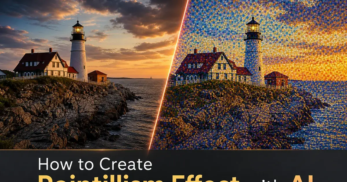
Le pointillisme est apparu en 1886 lorsque Georges Seurat a expose "Un dimanche apres-midi a l'ile de la Grande Jatte", une peinture monumentale composee entierement de petits points de couleur pure appliques selon des motifs precis. La technique etait revolutionnaire car elle rejetait la methode traditionnelle consistant a melanger les pigments sur la palette avant de les appliquer sur la toile. Au lieu de cela, Seurat plaçait des points de couleur spectrale non melangee cote a cote et comptait sur l'oeil du spectateur pour les fusionner optiquement a distance. L'orange n'etait pas melange a partir de pigment rouge et jaune. Il etait cree en plaçant des points rouges a cote de points jaunes si proches que l'oeil perçoit l'orange a quelques pas de distance. Ce melange optique produit une qualite lumineuse et vibrante que les pigments premelanges ne peuvent atteindre car les points de couleur individuels conservent leur intensite chromatique complete plutot que de s'emousser par le melange physique.
Le defi de la creation manuelle d'une oeuvre pointilliste est extraordinaire, meme selon les standards des beaux-arts. Seurat a passe plus de deux ans sur "La Grande Jatte", plaçant des millions de points individuels avec une attention meticuleuse aux relations de couleur et aux gradients de densite. Chaque zone de la peinture exigeait que l'artiste calcule quelles couleurs pures, placees dans quelles proportions et a quel espacement, se melangeraient optiquement pour produire la couleur perçue souhaitee a la distance de visualisation. Les ombres ne necessitaient pas seulement des points plus sombres mais aussi des points de couleur assortis. Les ombres bleues dans un paysage orange ensoleille contiennent des points de bleu, de violet et d'orange correspondant pour creer l'interaction de couleur complexe qui rend les ombres impressionnistes lumineuses plutot que simplement sombres. Cette precision a forte intensite de main-d'oeuvre a limite le pointillisme a un petit nombre de praticiens devoues malgre la beaute des resultats.
L'effet pointillisme alimente par l'IA analyse la couleur, la composition et les relations spatiales de la photo pour generer des motifs de points authentiques qui suivent les principes etablis par Seurat. L'IA determine quelles couleurs spectrales pures doivent etre juxtaposees pour produire la couleur cible de chaque zone par melange optique, calcule la densite de points necessaire pour maintenir la lisibilite du sujet a la distance de visualisation prevue, et varie le placement des points de maniere organique pour refleter le rythme naturel de la brosse peinte a la main. Ce guide explique comment utiliser Magic Eraser pour transformer n'importe quelle photo en oeuvre d'art pointilliste avec des controles de taille de points, de densite, de palette de couleurs, de motif de placement et de traitement de l'arriere-plan.
- Le pointillisme cree la couleur par melange optique. Les points adjacents de couleur spectrale pure se melangent dans l'oeil du spectateur plutot que d'etre premelanges, produisant une vibrance lumineuse que le melange physique ne peut atteindre.
- La densite de points est le controle principal equilibrant les details photographiques et le motif de points visible — une densite plus elevee cree des images plus lisses tandis qu'une densite plus faible produit des compositions abstraites plus graphiques.
- La restriction de palette neo-impressionniste limite les points aux teintes spectrales pures, forçant l'IA a creer des couleurs intermediaires par juxtaposition de points complementaires plutot que par selection de couleur premelangee.
- Le placement organique des points varie la densite en fonction du contenu de l'image, augmentant les points dans les zones detaillees et les reduisant dans les regions uniformes pour imiter le rythme naturel de la brosse pointilliste.
- La distance de visualisation affecte fondamentalement l'art pointilliste — la meme image se lit comme des points colores distincts de pres et comme une photographie lisse et coherente a quelques metres de distance.
Comment l'IA reproduit la science du melange optique des couleurs
Le fondement scientifique du pointillisme repose sur la distinction entre le melange additif et soustractif des couleurs. Lorsque les pigments sont physiquement melanges sur une palette, chaque pigment supplementaire absorbe plus de longueurs d'onde de lumiere, et le melange devient progressivement plus terne. C'est le melange soustractif, et c'est pourquoi melanger toutes les couleurs de peinture ensemble produit du marron boueux plutot que du blanc. Lorsque des points colores sont places cote a cote et vus a une distance suffisante, l'oeil recoit l'intensite complete de la lumiere reflechie par chaque point et les combine neurologiquement. C'est une forme de melange additif qui preserve la luminosite et l'intensite chromatique de chaque couleur individuelle. Seurat a compris ce principe a partir des ecrits de theorie des couleurs de Michel Eugene Chevreul et Ogden Rood. Il l'a exploite systematiquement pour creer des peintures avec une qualite lumineuse et chatoyante que la technique conventionnelle ne pouvait atteindre.
La conversion pointilliste par l'IA reproduit ce principe de melange optique de maniere computationnelle. Pour chaque region de la photographie, l'IA calcule quelle combinaison de points de couleur spectrale pure, places a quelles proportions relatives, produira la couleur perçue cible lorsque les points sont plus petits que le seuil d'acuite visuelle du spectateur a la distance de visualisation prevue. Un teint de peau chaud pourrait etre decompose en points d'orange, de jaune, de rose avec des touches de bleu-violet complementaire pour les zones d'ombre. Un paysage de foret verte devient une tapisserie de points bleus, jaunes et verts dans des proportions variables, avec du jaune-vert plus chaud dans les zones ensoleillees et du bleu-vert plus froid dans les ombres. L'IA maintient les relations mathematiques de couleur qui produisent un melange optique correct. Les proportions de chaque couleur de point sont precisement calculees pour se sommer a la couleur cible dans la perception du spectateur.
La qualite lumineuse qui distingue le pointillisme de la simple pixelisation provient de cette approche de melange optique. Une photographie convertie en une grille de carres colores ou chaque carre est la couleur moyenne de sa region produit des resultats plats et sans vie car chaque carre ne contient qu'une seule couleur a son intensite reduite. La meme photographie convertie en points pointillistes ou chaque region contient plusieurs couleurs pures qui se melangent optiquement pour produire la couleur cible produit des resultats vibrants et lumineux car l'oeil du spectateur recoit une lumiere d'intensite complete de chaque point. Cette difference est tout le fondement esthetique du pointillisme et la raison pour laquelle la technique est restee artistiquement forte pendant plus d'un siecle.
- Le melange soustractif des pigments physiques emousse les couleurs progressivement, tandis que le melange optique des points juxtaposes preserve l'intensite chromatique complete de chaque couleur individuelle.
- L'IA calcule les proportions precises de points de couleur spectrale necessaires pour se melanger optiquement a chaque couleur cible a la distance de visualisation prevue.
- Les tons de peau se decomposent en points d'orange, jaune, rose et bleu-violet complementaire — les verts deviennent des tapisseries de points bleus, jaunes et verts a proportions variables.
- La qualite lumineuse distinguant le pointillisme de la pixelisation provient de multiples points de couleur pure se melangeant optiquement plutot que de regions de couleur moyennee unique.
Controle de la densite et de la taille des points pour differentes intentions artistiques
La densite et la taille des points sont les deux parametres qui affectent le plus a la fois le caractere esthetique et la lisibilite pratique d'une conversion pointilliste. Ces parametres existent dans une tension fondamentale. Une densite de points plus elevee preserve plus de details photographiques et permet a l'image de se resoudre en une scene distincte a des distances de visualisation plus courtes, mais elle rend egalement les points individuels moins visibles et la technique pointilliste moins apparente. Une densite plus faible rend le motif de points bien visible et la technique artistique immediatement evidente, mais elle reduit les details photographiques qui rendent le sujet distinct. Trouver le bon equilibre pour chaque image et chaque usage prevu est la decision creative centrale dans la conversion pointilliste.
Seurat lui-meme travaillait a ce qu'on pourrait appeler une densite moyenne. Ses points sont clairement visibles comme des marques individuelles lorsque l'on se tient pres de ses peintures, mais ils se resolvent en images coherentes avec des figures distinctes, des elements de paysage et une profondeur spatiale a la distance de visualisation normale d'une galerie de trois a six pieds. Cette densite moyenne est generalement le meilleur point de depart pour la conversion photographique car elle produit des resultats qui fonctionnent a la fois comme des motifs de points abstraits a courte distance et des images figuratives a distance. Le reglage de densite par defaut de l'IA vise cet equilibre a la Seurat, plaçant des points assez grands pour etre appreciables un par un a l'ecran tout en etant assez denses pour former une image lisible lorsque le spectateur n'examine pas les points individuellement.
Les reglages de densite extreme servent des objectifs specifiques. Une tres haute densite avec de minuscules points produit des images qui se lisent comme des photographies au flou artistique avec une texture lumineuse subtile. La technique pointilliste est presente mais discreet, visible principalement comme un leger scintillement dans les transitions de couleur plutot que comme un motif de points visible. Ce reglage fonctionne bien pour la photographie de portrait ou la reconnaissabilite du sujet est primordiale et l'effet pointilliste sert d'amelioration esthetique subtile plutot que de changement de style audacieux. Une tres faible densite avec de grands points produit des compositions fortement abstraites ou les points deviennent l'element visuel principal et le sujet photographique sert de cadre compositionnel sous-jacent. Convient a l'art graphique audacieux, au design d'affiches et aux applications decoratives ou le motif lui-meme est le point central.
- Une densite de points plus elevee preserve les details photographiques et la lisibilite mais rend les points individuels moins visibles — une densite plus faible met l'accent sur la technique artistique mais reduit la reconnaissabilite.
- La densite moyenne de Seurat est le point de depart ideal ou les points sont visibles de pres mais se resolvent en images coherentes a distance de visualisation normale.
- Une tres haute densite produit une amelioration subtile de texture lumineuse adaptee aux portraits ou la reconnaissabilite du sujet est la priorite.
- Une tres faible densite cree des compositions abstraites audacieuses ou le motif de points devient l'element visuel principal, adaptees a l'art graphique et au design decoratif.
Strategies de placement des points et leur effet sur la composition
L'agencement spatial des points dans une composition pointilliste porte autant d'informations artistiques que la couleur des points eux-memes. Seurat et ses collegues neo-impressionnistes ne plaçaient pas les points au hasard. Ils suivaient les contours des formes, alignaient les points le long de lignes directionnelles pour suggerer le mouvement et la profondeur, et variaient la densite des points pour creer l'emphase et le recul. La frontiere entre une figure et un arriere-plan etait definie non pas par une ligne tracee mais par un changement de couleur de point et parfois de densite de point, creant des limites aux bords doux qui vibrent d'energie chromatique plutot que les bords durs de la peinture conventionnelle.
Le placement de points par l'IA offre trois strategies principales qui produisent des resultats nettement differents. Le placement en grille dispose les points sur une matrice reguliere, produisant une precision mecanique qui met l'accent sur l'aspect systematique et scientifique du pointillisme. Cette regularite ordonnee cree une qualite semblable a un textile ou l'image a l'apparence d'un tissu tisse ou imprime. Le placement organique utilise des algorithmes conscients du contenu pour varier l'espacement des points en fonction de la structure de l'image. Des points plus denses suivent les contours des caracteristiques importantes, des points plus epars remplissent les zones d'arriere-plan uniformes, et le motif overall a l'irregularite naturelle de la brosse peinte a la main. Le placement aleatoire avec modulation de densite disperse les points sans ordre geometrique tout en maintenant la variation de densite correcte, produisant le resultat le plus pictural qui imite le plus fidelement la qualite spontanee du travail avec un pinceau charge de peinture.
Le traitement de l'arriere-plan affecte grandement la facon dont les points se lisent comme une composition. Les points sur fond blanc simulent l'approche traditionnelle de la peinture sur toile blanche apprtee. La surface blanche apparaissant entre les points ajoute de la luminosite et contribue au melange optique comme element de lumiere neutre. Un fond teinte — creme chaud, gris-bleu froid ou ton de toile naturelle — ajoute une sous-couleur qui unifie toute la composition et reduit la froideur visuelle des points isoles. Un fond sombre cree une esthetique tres differente ou les points colores semblent briller d'une lumiere interne sur le champ sombre, produisant des images qui semblent illuminees de l'interieur plutot que reflechissant la lumiere de la surface. Chaque choix d'arriere-plan change fondamentalement l'ambiance et l'impact visuel du meme motif de points.
- Le placement en grille cree une precision mecanique avec une qualite semblable a un textile, mettant l'accent sur le fondement scientifique systematique du pointillisme.
- Le placement organique varie la densite le long des contours et des caracteristiques, produisant l'irregularite naturelle qui imite le plus fidelement la brosse neo-impressionniste peinte a la main.
- Les fonds blancs ajoutent de la luminosite a travers la toile visible et contribuent a la lumiere neutre dans le melange optique des couleurs entre les points.
- Les fonds sombres creent un effet lumineux dramatique ou les points colores semblent briller d'une lumiere interne, changeant fondamentalement l'ambiance de la composition.
Applications des tirages de galerie aux medias numeriques et au design textile
Les tirages de galerie grand format sont la vitrine la plus naturelle pour les conversions de photos pointillistes car l'effet de distance de visualisation qui definit la technique devient une experience physique pour le spectateur. Un tirage pointilliste de trois pieds sur quatre pieds sur papier d'art revele differents niveaux de l'image a mesure que le spectateur se deplace dans l'espace de la galerie. De l'autre cote de la piece, l'image se lit comme une photographie lumineuse, legerement douce avec une riche saturation des couleurs. A mi-distance, le motif de points devient visible comme une superposition texturale qui ajoute de l'interet visuel et du caractere artistique. A courte distance, les points individuels se revelent comme une tapisserie complexe de couleurs pures. Le spectateur voit que ce qui semblait etre un ciel bleu uniforme est en fait un champ de points bleus, violets, cyan et de touches de points chauds correspondants travaillant ensemble. Cette revelation progressive cree une experience de galerie engageante qui recompense l'inspection minutieuse.
Les applications multimedia numeriques beneficient de la texture visuelle distinctive du pointillisme qui se demarque immediatement meme aux petites tailles d'ecran. Les publications sur les reseaux sociaux avec traitement pointilliste se demarquent dans les flux car la texture de points cree un motif visuel qui n'est ni la photographie standard, ni l'illustration, ni le design graphique. L'effet s'adapte bien des grands ecrans d'ordinateur aux petits ecrans mobiles car le principe de melange optique fonctionne a n'importe quelle taille de visualisation physique. Les points se resolvent simplement a une distance de visualisation apparente differente. Les images hero de sites Web, les en-tetes d'email marketing et les bannieres publicitaires numeriques beneficient tous de la qualite accrocheuse de la conversion pointilliste, principalement pour les marques dans les secteurs de l'art, de la culture, du luxe et du mode de vie ou la sophistication artistique s'aligne sur l'identite de la marque.
Le design textile et de surface represente une application croissante pour l'effet photo pointilliste car le motif de points se traduit naturellement aux methodes de production d'impression sur tissu et d'impression sur surface. Un paysage photographique converti en style pointilliste devient un motif d'impression sur tissu ou les points fonctionnent a la fois comme une image et comme un motif de surface. Les papiers peints, les tissus d'ameublement, les foulards et les designs de carreaux de ceramique beneficient tous de la conversion pointilliste car la structure de motif inherente de la technique cree un interet visuel a chaque echelle de visualisation — se lisant comme une image a distance et comme un motif de pres. La vibrance chromatique des points pointillistes optiquement melanges se traduit particulierement bien a la production textile ou la couleur riche et saturee est une qualite premium a laquelle les consommateurs repondent positivement.
- Les tirages de galerie creent une experience de visualisation progressive — photographie coherente a distance, texture de points visible a mi-distance, tapisserie de couleurs complexe a inspection rapprochee.
- Les medias sociaux et le contenu numerique beneficient de la texture distinctive du pointillisme qui se demarque dans les flux et s'adapte bien des ecrans d'ordinateur aux ecrans mobiles.
- Les applications de design textile et de surface traduisent le motif de points en tissu, papier peint et production de ceramique ou il fonctionne a la fois comme image et comme motif de surface.
- La vibrance chromatique du melange optique se traduit bien en production textile ou la couleur saturee et lumineuse est une qualite premium qui stimule l'attrait consommateur.
How to do it
- 1
Upload the photo and evaluate its composition for pointillist conversion
Open your image in Magic Eraser and assess whether its composition will translate well to a pointillist style. Photographs with strong color contrasts, well-defined shapes. Clear spatial depth convert most successfully because pointillism relies on color contrast rather than line to define form. Landscapes with distinct sky, water, and land masses work excellently, as do portraits with clear lighting that separates the subject from the background. Avoid images where the subject depends on fine linear detail. Handwriting, thin architectural elements, or intricate patterns — because dots cannot render sharp lines without losing the pointillist aesthetic.
- 2
Select the dot density and size parameters for the target aesthetic
Configure the dot density which determines how many dots per unit area the AI places across the image. Higher density with smaller dots produces a more photographic result where the individual dots blend into smooth color at normal viewing distance, closely mimicking the technique of Seurat and Signac where tiny brushstrokes create optical color mixing. Lower density with larger dots produces a more graphic and abstract composition where individual dots remain clearly visible and the image reads as a pattern of colored circles. The dot size parameter works inversely with density. Smaller dots require higher density to maintain image legibility while larger dots can be spaced further apart.
- 3
Configure the color palette and optical mixing behavior
Choose between a full-spectrum palette that uses the complete range of dot colors for maximum photographic accuracy and a restricted Neo-Impressionist palette that limits dots to the spectral hues used by Seurat. Primarily pure spectral colors without pre-mixing. In the restricted palette mode, the AI creates intermediate colors through optical mixing by placing matching colored dots adjacent to each other rather than using a single blended color. Orange areas are rendered through interspersed red and yellow dots, greens through blue and yellow dots. Grays through matching pairs like blue and orange. This optical mixing is the defining trait of true pointillism and produces a luminous quality that pre-mixed colors cannot achieve.
- 4
Adjust dot placement patterns and background treatment
Select between uniform dot placement on a regular grid, organic placement that varies dot spacing based on image content. Random placement with controlled density variation. Organic placement produces the most natural-looking results because it increases dot density in detailed areas like facial features and reduces density in uniform areas like clear skies, mimicking how pointillist painters naturally placed more strokes where more visual information needed to be conveyed. Configure the background treatment — dots can be placed on a white canvas to simulate paper showing between strokes, on a tinted canvas that adds a warm or cool undertone, or on a dark background for a dramatic luminous effect where the colored dots glow against a dark field.
- 5
Export at appropriate resolution for the intended viewing distance
Export the pointillist image at a resolution matched to the intended viewing context. Pointillism is uniquely viewing-distance-dependent — the same image that appears as a field of distinct colored dots at close range resolves into a smooth coherent image when viewed from enough distance. For digital screens viewed at arm's length, export at standard screen resolution where dots are large enough to be one by one visible for aesthetic appreciation. For large prints intended for gallery viewing, export at high resolution so the dots resolve into a cohesive image at the typical three-to-six-foot gallery viewing distance while revealing their individual character when the viewer approaches. Include an optional painted canvas texture overlay for print outputs to simulate the physical surface of an oil painting.
Sources
- Neo-Impressionism and the Science of Color — The Metropolitan Museum of Art
- Computational Pointillism and Stippling Techniques — ACM SIGGRAPH
- Optical Color Mixing in Divisionist Painting — The Art Bulletin