
Comment Creer un Effet de Poterie Mino avec le Retouche Photo IA
Transformez vos photos en effets de ceramique japonaise Mino grace au transfert de style IA. Guide pas a pas couvrant le glaçure blanche Shino, le vert Oribe, le jaune Ki-Seto et le noir Setoguro avec des textures de four authentiques.

Product Marketing
Vérifié par Magic Eraser Editorial ·
Sommaire
- Comment le rendu IA de la poterie Mino capture la realite materielle des ceramiques de the japonaises
- La poterie Shino : l'epaisse glaçure blanche qui a revolutionne la ceramique japonaise
- La poterie Oribe : la glaçure verte audacieuse rencontre la decoration peinte librement
- Applications creatives : design culturel japonais, photographie de produit et visualisation d'art ceramique
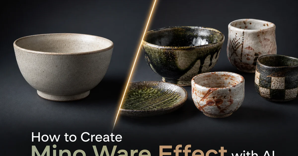
La poterie Mino — produite dans la province de Mino, dans l'actuelle prefecture de Gifu, depuis au moins le septieme siecle — represente l'une des traditions ceramiques les plus importantes artistiquement de l'histoire japonaise. Pendant la periode Momoyama de la fin du seizieme siecle, les fours Mino ont produit les ustensiles de ceremonie du the revolutionnaires qui ont defini l'esthetique wabi-sabi : Shino avec son epaisse glaçure blanche et ses reflets orange chauds, Oribe avec sa glaçure verte audacieuse et ses motifs peints librement, Ki-Seto avec sa subtile glaçure de cendre jaune, Setoguro avec son noir lustre dramatique. Ces quatre sous-styles sont issus des memes fours dans la meme region a la meme epoque. Chacun a developpe une identite visuelle completement distincte qui continue d'influencer l'art ceramique mondial quatre siecles plus tard.
La reproduction numerique de la poterie Mino a principalement ete difficile car chaque sous-style depend de comportements materiels specifiques que les filtres d'image plats ne peuvent pas simuler. La poterie Shino tire son caractere d'une application inhabituellement epaisse de glaçure feldspathique — parfois trois a cinq millimetres d'epaisseur — qui produit une surface avec de petits trous d'epingle dus au gaz piege, une texture molle semblable a un coussin, et des zones de semi-transparence ou la couleur de feu hi-iro orange du corps argileux brille a travers la glaçure blanche. La poterie Oribe combine deux traitements de surface fondamentalement differents sur un seul recipient : une glaçure verte cuivree brillante sur une partie de la surface et une decoration peinte a l'oxyde de fer sur l'argile blanche restante — avec une liberte asymetrique qui defie les principes de conception ceramique conventionnels.
Le transfert de style base sur l'IA resout ces defis en comprenant la poterie Mino a la fois comme une tradition artistique et un systeme materiel. L'IA apprend a partir de milliers de photographies de pieces Mino de qualite musee a quoi ressemble chaque type de glaçure sur une surface ceramique : comment la glaçure feldspathique Shino cree profondeur et semi-transparence, comment le cuivre Oribe developpe son vert specifique sous cuisson de reduction, comment la glaçure de cendre Ki-Seto s'accumule et coule pour creer sa surface pale et beurree, et comment la glaçure de fer Setoguro se fige a mi-coulement lorsque le pot est rapidement retire du four. Ce guide parcourt le processus complet de creation d'effets de poterie Mino en utilisant AI Filter et AI Enhance, couvrant chaque sous-style avec la precision technique que ces ceramiques historiquement importantes meritent.
- L'IA reproduit les comportements materiels distinctifs des quatre sous-styles Mino majeurs : la glaçure feldspathique blanche et epaisse Shino, le vert cuivre Oribe avec peinture a l'oxyde de fer, la glaçure de cendre pale Ki-Seto et le noir lustre Setoguro.
- La simulation de glaçure Shino capture l'epaisseur unique, la texture de trous d'epingle, le retrait et le reflet orange semi-transparent hi-iro qui definissent cette tradition Mino la plus celebree.
- La decoration Oribe combine un glaçage partiel vert cuivre audacieux avec des motifs geometriques et botaniques peints librement a l'oxyde de fer, refletant la liberte esthetique de la periode Momoyama.
- Le rendu de surface tridimensionnel capture la profondeur de la glaçure, la refraction de la lumiere et les micro-textures specifiques de chaque type de glaçure plutot que d'appliquer des superimpositions de couleurs plates.
- AI Enhance accentue les effets d'atmosphere de four — depots de cendre, marques de flamme et le reflet orange chaud sur les surfaces Shino — qui authentifient la simulation comme ceramique cuite au bois traditionnelle.
Comment le rendu IA de la poterie Mino capture la realite materielle des ceramiques de the japonaises
L'approche la plus courante pour les effets ceramiques numeriques applique une superimposition de couleur texturee : blanc pour un aspect porcelaine generique, vert pour un aspect vaguement Oribe, ou un motif de craquelure pour simuler le vieillissement. Ces approches comprennent fondamentalement mal ce qui rend la poterie Mino visuellement distinctive. Un bol de the Shino n'est pas un objet blanc avec une texture. C'est une surface tridimensionnelle ou plusieurs millimetres de glaçure semi-transparente creent une sensation de profondeur, ou des bulles de gaz piegees ont laisse de petits cratères dans la surface, ou la glaçure a retreci et fissure pour exposer le corps argileux en dessous, et ou le contact avec la flamme pendant la cuisson au bois de plusieurs jours a transforme l'argile ferrugineuse en un orange chaud qui brille a travers la glaçure blanche semi-transparente au-dessus.
L'IA modelise ces comportements materiels comme des processus physiques. La glaçure est traitee comme une couche de verre semi-transparent avec une epaisseur mesurable, un indice de refraction et une opacite qui varient selon l'epaisseur d'application. La ou la glaçure est la plus epaisse, elle apparait la plus opaque et blanche. La ou elle s'aminсit — sur les bords, sur les surfaces surelevees, la ou le retrait a ecarte la glaçure — le corps argileux chaud apparait avec une intensite croissante. La couleur de feu hi-iro est generee comme une consequence de l'atmosphere du four sur l'argile ferrugineuse, et non comme une couleur arbitraire appliquee a la surface. Ces simulations physiquement fondees produisent des surfaces qui se lisent comme un materiau ceramique authentique plutot qu'une approximation numerique.
L'IA capture egalement la relation specifique entre la forme et la surface qui caracterise les ustensiles de the Mino. Les potiers Mino de la periode Momoyama ont deliberement embrasse l'asymetrie et le gauchissement — des effets accidentels qui contredisaient les ideaux de perfection technique chinois et coreens qui avaient auparavant domine la ceramique japonaise. Un bol de the Shino pouvait etre deliberement deforme, avec une epaisse glaçure inegale qui s'accumule et coule en motifs imprevisibles. L'IA respecte cette esthetique de l'accident controle en permettant aux effets de glaçure de se developper organiquement sur l'image plutot que de les appliquer uniformement, creant l'aspect de surfaces faconnees par la physique imprevisible de la cuisson au four plutot que par les algorithmes previsibles du traitement numerique.
- Les superimpositions de texture plate ignorent la profondeur tridimensionnelle, la semi-transparence et l'opacite variable qui definissent la glaçure feldspathique Shino epaisse de plusieurs millimetres.
- L'IA modelise la glaçure comme une couche de verre semi-transparente physique ou l'epaisseur determine l'opacite, l'aminсissement des bords revele le corps argileux et le retrait expose le substrat ferrugineux chaud.
- La couleur de feu hi-iro est generee comme consequence de l'atmosphere du four sur l'argile ferrugineuse plutot que d'etre appliquee comme une superimposition de couleur orange arbitraire.
- Les effets de glaçure se developpent organiquement sur l'image, respectant l'esthetique Momoyama de l'accident controle plutot que d'appliquer des motifs algorithmiques uniformes.
La poterie Shino : l'epaisse glaçure blanche qui a revolutionne la ceramique japonaise
La poterie Shino occupe une position unique dans l'histoire ceramique en tant que premiere poterie a glaçure blanche produite au Japon, apparaissant dans les fours Mino a la fin du seizieme siecle. Avant Shino, les potiers japonais cherchant des surfaces blanches devaient compter sur la porcelaine chinoise importee ou appliquer un engobe blanc sous des glaçures de cendre. L'innovation Shino a ete d'utiliser une pierre feldspathique locale reduite en poudre et appliquee comme une glaçure extremement epaisse — beaucoup plus epaisse que toute glaçure japonaise precedente — qui cuisait en un blanc chaud avec une qualite de surface molle, presque de guimauve, completement differente du blanc dur et brilliant de la porcelaine chinoise. Cette douceur, combinee au reflet hi-iro orange et aux formes deliberement imparfaites, s'alignait parfaitement avec l'esthetique wabi-sabi codifiee par des maitres de the comme Sen no Rikyu.
L'IA imite les proprietes optiques specifiques de la glaçure feldspathique Shino. Contrairement aux glaçures transparentes minces qui reposent sur la surface comme une couche de vernis, la glaçure Shino est assez epaisse pour agir comme un milieu translucide. La lumiere entre dans la glaçure, s'y diffracte, et une partie traverse pour illuminer le corps argileux en dessous avant de reflechir. Cette diffraction sous la surface donne a Shino sa lueur chaude caracteristique, principalement dans les zones de hi-iro ou le corps argileux orange agit comme une source de lumiere chaude sous un ecran blanc semi-transparent. L'IA reproduit ce comportement optique avec des parametres de diffraction sous la surface etalonnes sur l'epaisseur et l'opacite de la vraie glaçure feldspathique.
La texture de surface de la poterie Shino est extraordinairement riche. L'epaisse glaçure developpe des trous d'epingle la ou les bulles de gaz du corps argileux ont percole a travers la glaçure fondue et eclate a la surface pendant la cuisson. Dans certaines zones, la glaçure retrecit, se contracte et se separe pour former des ilots de glaçure blanche separe par des chenaux de corps argileux expose. La surface peut aussi montrer la texture de la methode d'application, avec des marques de pinceau ou de trempage preservees dans l'epaisse couche de glaçure. Chacune de ces textures est simulee par l'IA comme une consequence de processus physiques — evolution des gaz, tension superficielle pendant la fusion et mecanique d'application — plutot que comme des motifs decoratifs appliques a la surface.
- Shino a ete la premiere poterie a glaçure blanche du Japon, utilisant une epaisse pierre feldspathique locale cuite en un blanc chaud et mou completement different de la porcelaine chinoise.
- La diffraction de la lumiere sous la surface a travers l'epaisse glaçure semi-transparente cree la lueur chaude caracteristique de Shino, surtout la ou le corps argileux hi-iro orange agit comme source de lumiere chaude.
- Les trous d'epingle des bulles de gaz, le retrait par tension superficielle et les marques d'application preservees resident tous de processus physiques de cuisson que l'IA simule plutot qu'elle ne superimpose.
- Les formes deliberement imparfaites et l'epaisse glaçure inegale s'alignaient sur l'esthetique wabi-sabi codifiee par les maitres de the pendant la periode Momoyama.
La poterie Oribe : la glaçure verte audacieuse rencontre la decoration peinte librement
La poterie Oribe — nommee d'apres le maitre de the et esthete Furuta Oribe — represente le plus creativement audacieux des sous-styles Mino. La ou Shino est subtil et introspectif, Oribe est audacieux et extraverti, combinant une brillante glaçure verte cuivree avec une decoration exuberante peinte a l'oxyde de fer dans des motifs allant des grilles geometriques et hachures aux esquisses botaniques et compositions abstraites. La caracteristique la plus distinctive d'Oribe est son asymetrie deliberee. La glaçure verte n'est appliquee que sur une partie du recipient, souvent selon une division diagonale irreguliere, la surface restante etant laissee blanche et decoree de motifs peints a l'oxyde de fer. Ce traitement demi-glace cree un contraste visuel dramatique entre le vert sature brillant et la surface blanche mate decoree.
L'IA imite la chimie specifique de la glaçure de cuivre Oribe, qui atteint sa couleur verte par cuisson de reduction. L'oxyde de cuivre dans la glaçure est chimiquement reduit par l'atmosphere du four pauvre en oxygene pour produire le vert profond caracteristique. Le vert varie du vert foret profond dans les applications epaisses au vert emeraude la ou la glaçure est plus mince, avec des taches occasionnelles de rouge ou de brun la ou l'oxydation localisee a empeche la reduction complete. La limite ou la glaçure verte rencontre la surface blanche non glacee est irreguliere et legerement surlevee la ou le bord epais de la glaçure a forme un bourrelet pendant la fusion. Ces details materiels specifiques distinguent l'esthetique authentique d'Oribe d'une simple superimposition de couleur verte.
La decoration peinte sur la poterie Oribe possede une liberte graphique remarquable pour des ceramiques de toute epoque. La peinture a l'oxyde de fer etait appliquee avec des traits de pinceau audacieux et confiants utilisant des pinceaux en bambou. Les motifs montrent une energie spontanee qui suggere une execution rapide avec un minimum de planification prealable. Des motifs geometriques — lignes paralleles, grilles et hachures — coexistent avec des formes vegetales librement esquissees, des fragments architecturaux et des formes abstraites sur le meme recipient. L'IA imite a la fois la qualite du pinceau de l'oxyde de fer sur l'argile brute — legerement rugueuse et granuleuse par rapport a l'encre sur papier — et la liberte compositionnelle qui definit le vocabulaire decoratif Oribe.
- Oribe combine un glaçage partiel vert cuivre brillant avec une decoration peinte a l'oxyde de fer dans des compositions deliberement asymetriques exprimant l'audace creative de la periode Momoyama.
- La couleur vert cuivre resulte de la chimie de cuisson de reduction, variant du vert foret profond dans les zones epaisses au vert emeraude dans les sections minces avec des taches d'oxydation occasionnelles.
- La limite glaçure-blanc forme un bourrelet irregulier legerement surleve la ou l'epaisse glaçure fondue a cesse de couler, un detail materiel qui distingue le comportement ceramique authentique.
- Les coups de pinceau a l'oxyde de fer sur l'argile brute ont une qualite legerement rugueuse et granuleuse distincte de l'encre sur papier, avec la liberte compositionnelle spontanee qui definit la decoration Oribe.
Applications creatives : design culturel japonais, photographie de produit et visualisation d'art ceramique
Les designers et specialistes du marketing travaillant avec des themes culturels japonais utilisent les transformations de poterie Mino pour creer des images qui portent le poids de quatre siecles d'histoire ceramique. Une photographie culinaire rendue avec une texture de glaçure Shino evoque immediatement le monde raffine de la ceremonie du the japonaise. Une image de produit recevant le traitement graphique audacieux d'Oribe connecte le produit a l'audace esthetique de la periode Momoyama. Ces transformations fonctionnent parce que les sous-styles Mino ont des identites visuelles fortes et distinctes qui declenchent des associations culturelles specifiques : Shino pour la simplicite wabi-sabi raffinee, Oribe pour l'audace creative, Ki-Seto pour l'elegance subtile et discrete, Setoguro pour l'impact minimal dramatique.
Les artistes ceramistes modernes utilisent les simulations de poterie Mino comme outils de conception et de visualisation. Previsualiser comment differentes traditions de glaçure Mino apparaiteraient sur une nouvelle forme permet aux artistes d'explorer les options de traitement de surface avant de s'engager sur des recettes de glaçure et des programmes de cuisson specifiques. Ceci est particulierement precieux pour les cuissons au bois anagama et noborigama ou chaque cycle de cuisson prend trois a cinq jours d'alimentation constante et represente un investissement majeur en bois, main-d'oeuvre et usure du four. Visualiser les resultats avant la cuisson permet une prise de decision plus confiante concernant le choix du corps argileux, la methode d'application de la glaçure et la strategie de placement dans le four.
Les musees et institutions culturelles utilisent les effets de poterie Mino pour des materiaux educatifs qui aident les publics a comprendre les caracteristiques visuelles de differentes traditions ceramiques. Des expositions interactives qui transforment les photographies telechargees par les visiteurs en differents sous-styles Mino montrent comment chaque tradition aborde la surface, la couleur et la decoration. Ces applications educatives rendent les distinctions esthetiques sophistiquees entre Shino, Oribe, Ki-Seto et Setoguro accessibles a des publics qui n'ont pas necessairement de connaissances prealables sur la ceramique japonaise, construisant une appreciation culturelle par l'engagement visuel direct plutot que par la seule description textuelle.
- Chaque sous-style Mino porte des associations culturelles distinctes — Shino pour la simplicite wabi-sabi, Oribe pour l'audace creative, Ki-Seto pour l'elegance subtile, Setoguro pour l'impact dramatique.
- Les artistes ceramistes previsualisent les resultats de glaçure avant de s'engager dans des cuissons au bois couteuses de plusieurs jours, informant les decisions sur le corps argileux, la methode d'application et le placement dans le four.
- Les musees creent des experiences educatives interactives ou les visiteurs transforment leurs propres photographies en differentes traditions Mino, construisant une appreciation culturelle par l'engagement visuel.
- La photographie culinaire et de produit dans le style poterie Mino cree un contexte culturel immediat qui connecte l'imagerie commerciale a des siecles de tradition esthetique de la ceremonie du the japonaise.
How to do it
- 1
Upload your photo and evaluate its suitability for Mino ware ceramic transformation
Open your image in AI Filter and assess how well the composition maps to the visual language of Mino ware ceramics. Mino ware encompasses several distinct sub-styles. Shino, Oribe, Ki-Seto, and Setoguro — each with its own glaze character, decorative vocabulary, and aesthetic philosophy rooted in the wabi-sabi sensibility of Japanese tea ceremony. Images with organic textures, warm tonal ranges. Compositions that embrace asymmetry and imperfection translate most naturally into the Mino ceramic aesthetic.
- 2
Select a Mino ware sub-style and configure glaze and decoration parameters
Choose from presets mimicking the major Mino traditions. Shino with its thick milky-white feldspathic glaze and orange hi-iro fire color, Oribe with its bold copper-green glaze and iron-oxide painted geometric designs, Ki-Seto with its pale yellow ash glaze and copper-green tanpan accents, or Setoguro with its lustrous jet-black iron glaze pulled from the kiln at peak temperature. Each preset configures glaze chemistry, surface behavior, and decorative painting style to match the specific sub-tradition.
- 3
Adjust glaze thickness, surface texture, and painted decoration characteristics
Fine-tune the glaze simulation to control thickness, opacity, and surface behavior specific to the selected Mino style. Shino glaze is applied very thickly, producing a surface with tiny pinholes from trapped gas bubbles and a crawling texture where the thick glaze pulls apart during firing. Oribe decoration uses bold iron-oxide brushwork with trait graphic freedom. Geometric grids, cross-hatching, botanical sketches, and abstract patterns applied with confident spontaneous strokes. Adjust these parameters to control the balance between glaze texture and painted decoration.
- 4
Use AI Enhance to sharpen kiln effects, glaze depth, and surface micro-texture
Run AI Enhance to refine the three-dimensional quality of the ceramic surface. Sharpen the depth where glaze has pooled thickly in Shino pieces, the metallic luster of Setoguro surfaces. The crisp edges where Oribe green glaze meets the white unglazed clay body. The boost accentuates kiln atmosphere marks. Ash deposits, flame paths, and the prized hi-iro orange flashing on Shino surfaces where flame contact turned the iron-bearing clay a warm orange through the semi-transparent white glaze.
- 5
Export and compare against museum examples of historical Mino ware
Save the completed image at full resolution and compare with photographs of designated National Treasure and Important Cultural Property Mino ware pieces at the MOA Museum of Art, Tokugawa Art Museum, and Tokyo National Museum. Verify that glaze behavior is physically plausible for the selected sub-style, that painted decoration respects the design vocabulary of the tradition. That surface textures match the material traits of Mino ceramics rather than appearing as flat digital overlays.
Sources
- Mino Ware and the Japanese Tea Ceremony Aesthetic — Gifu Prefectural Museum of Art
- Shino, Oribe, and Mino: The Rise of Mino Ceramics — The Metropolitan Museum of Art
- AI-Driven Style Transfer for Traditional Ceramic Aesthetics — arXiv — Computer Vision and Pattern Recognition