
Comment Creer un Effet Porcelaine de Kutani avec l'IA : Tutoriel sur l'Email de Suralimentation Japonais
Apprenez a creer des effets authentiques de porcelaine Kutani dans vos photos grace a l'IA. Tutoriel pas a pas couvrant la palette cinq couleurs gosai-de, l'email de suralimentation audacieux et la tradition du pinceau expressif des ceramiques de la prefecture d'Ishikawa.
SEO & Growth
Vérifié par Magic Eraser Editorial ·
Sommaire
- Comprendre l'esthetique de la porcelaine de Kutani et le systeme de couleurs gosai-de
- Appliquer le traitement de surface d'email Kutani et le mappage des couleurs
- Calibrage chromatique pour les tons specifiques des glaSure Kutani
- Applications creatives et optimisation d'exportation pour les effets de porcelaine Kutani
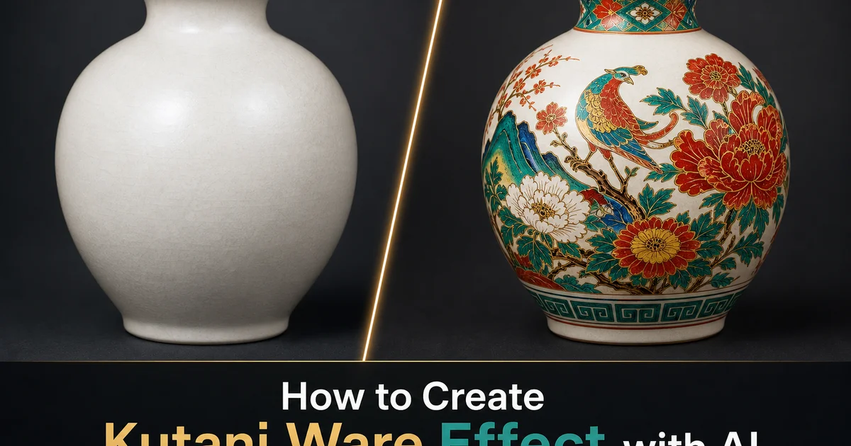
La porcelaine de Kutani est l'une des traditions ceramiques les plus spectaculaires du Japon, nee au milieu du XVIIe siecle dans ce qui est aujourd'hui le sud de la prefecture d'Ishikawa, sur la cote de la mer du Japon. Contrairement a la retenue raffinee des ceramiques d'Arita ou de Kyoto, la porcelaine de Kutani se definit par des emaux de suralimentation audacieux et satures qui recouvrent integralement la surface du vase de couleurs intenses. Vert emeraude profond, jaune miel chaud, violet aubergine, bleu marine et rouge fer appliques en larges plages confiantes sur un trait de pinceau expressif. Le nom de cette tradition vient du village de Kutani dans le domaine de Daishoji, ou les premiers fours furent installes vers 1655. La palette dramatique et la couverture generause de la surface ont fait de ce style l'une des formes les plus internationalement reconnues de la ceramique decorative japonaise.
Le fondement technique de la porcelaine de Kutani reside dans le gosai-de — le systeme d'email de suralimentation a cinq couleurs qui le distingue de toutes les autres traditions porcelaines japonaises. Chaque couleur est un compose de verre broye melange a des pigments d'oxyde metallique, peint sur la surface porcelaine deja cuite et emaillee, puis recuite a environ 800 degres Celsius pour fusionner l'email avec la glaSure. Les couleurs ont des proprietes materielles specifiques : le vert est translucide, permettant au dessin sous-jacent de transparaitre. Le jaune est plus opaque mais avec une chaleur lumineuse semblable au miel. Le violet va du violet transparent a l'aubergine dense. Le bleu marine est profond et legerement granuleux. Et le rouge fonctionne a la fois comme champ de couleur et comme medium de dessin lineaire qui structure l'ensemble de la composition. L'interaction entre ces cinq couleurs — leur transparence, leur densite et la maniere dont elles interagissent aux frontieres — est la signature visuelle de la porcelaine de Kutani.
Les outils de retouche photo par IA peuvent desormais appliquer l'esthetique distinctive de Kutani a des photographies ordinaires, transformant les images en compositions qui evoquent les surfaces d'email audacieuses, le trait de pinceau expressif et la palette cinq couleurs saturee de cette celebre tradition ceramique japonaise. L'IA segmente l'image source en zones de composition et les mappe au systeme de couleurs gosai-de, convertit les bords photographiques en dessin lineaire fluide qui structure la decoration Kutani, et applique la qualite de surface legerement relevee et brillante de l'email de suralimentation qui donne a la veritable porcelaine de Kutani sa richesse tactile. Le resultat fait le pont entre la photographie et l'une des formes d'art decoratif les plus intenses du Japon.
- Transformez des photographies en compositions de porcelaine Kutani avec des champs d'email de suralimentation audacieux dans la palette traditionnelle gosai-de a cinq couleurs.
- Appliquez le vert emeraude profond, le jaune chaud, le violet riche, le bleu marine et le rouge fer qui definissent la couverture de surface saturee de la porcelaine de Kutani.
- Convertissez les bords photographiques en trait de pinceau expressif qui structure les champs d'email colore — le dessin squelettique visible a travers les couches d'email translucides.
- Obtenez la qualite de surface legerement relevee et brillante de l'email de suralimentation — pigment epais fondu sur la glaSure creant un relief visible et une densite de couleur intense.
- Exportez avec une haute fidelite chromatique pour preserver la chaleur et la saturation specifiques de chaque couleur d'email Kutani en PNG ou WebP a qualite 90+.
Comprendre l'esthetique de la porcelaine de Kutani et le systeme de couleurs gosai-de
La puissance visuelle de la porcelaine de Kutani decoule d'une philosophie de conception fondamentalement differente de la plupart des ceramiques japonaises. La ou la porcelaine d'Arita celebre l'espace blanc et le trait retenu, ou la ceramique Oribe embrasse l'asymetrie et l'imperfection wabi-sabi, la porcelaine de Kutani remplit la surface de couleur et d'energie. Les premieres oeuvres — ko-Kutani ou "vieux Kutani" des annees 1650 a 1710 — couvrent entierement de grands plats et assiettes de decoration emaillee, representant souvent des paysages, des oiseaux parmi les fleurs ou des champs de motifs geometriques qui ne laissent presque aucun blanc visible. Cette approche horror vacui, rare dans la ceramique japonaise, donne a la porcelaine de Kutani une intensite qui la rapproche davantage des traditions decoratives chinoises et d'Asie centrale que de l'esthetique japonaise retenue que la plupart des Occidentaux associent a la ceramique japonaise.
Chacune des cinq couleurs de Kutani possede des proprietes optiques specifiques que l'IA doit reproduire pour un effet authentique. Le vert (ao) est un email a base de cuivre qui cuit en un emeraude profond, legerement bleute, avec une translucidite notable. Applique sur des traits de pinceau fonces, les lignes restent visibles a travers le vert comme des objets vus a travers un verre teinte. Le jaune (ki) est un email a base d'antimoine ou de fer qui cuit en un ton opaque et chaud de miel avec une excellente couverture. Le violet (murasaki) varie du violet transparent en couche fine a l'aubergine dense en couche epaisse. Son interaction avec le corps blanc sous-jacent ou le dessin fonce cree la plage visuelle la plus large de toutes les couleurs Kutani. Le bleu marine (kon) est un email profond a base de cobalt, legerement granuleux en texture, utilise avec parcimonie pour les zones d'accent. Le rouge (aka) joue un double role — comme champ de couleur, il fournit des zones focales chaudes, et comme medium de dessin, il cree la structure lineaire qui organise toutes les autres couleurs.
Le dessin au pinceau qui sous-tend la decoration Kutani est peint au pigment a base de fer ou de manganese avant l'application des emaux colores. Il fonctionne comme le squelette structurel de l'ensemble du design. Le style de dessin est caracteristiquement audacieux et fluide — les lignes varient considerablement en largeur, les courbes sont executees avec une confiance calligraphique, et il y a une spontaneite energetique qui distingue le dessin Kutani de la precision meticuleuse de la peinture d'Arita ou de Nabeshima. Dans l'effet numerique, cela signifie convertir les bords photographiques en traits de pinceau avec une variation reelle de largeur et une texture de pinceau visible — la qualite d'une main se deplacant avec vitesse et assurance plutot qu'avec hesitation prudente.
- La porcelaine de Kutani remplit les surfaces de couleur plutot que de celebrer l'espace blanc — l'approche horror vacui cree une intensite rare dans les traditions ceramiques japonaises.
- L'email vert (ao) est translucide, laissant transparaitre le dessin sous-jacent ; le jaune (ki) est opaque et chaud ; le violet va du violet transparent a l'aubergine dense.
- Le bleu marine (kon) apparait comme une couleur d'accent profonde legerement granuleuse, tandis que le rouge (aka) sert a la fois de champ de couleur et de medium de dessin lineaire structurant la composition.
- Le dessin au pinceau sous-jacent est audacieux et fluide avec une variation dramatique de largeur — energie calligraphique et confiance spontanee, non pas precision meticuleuse.
Appliquer le traitement de surface d'email Kutani et le mappage des couleurs
L'etape de transformation de surface convertit la texture photographique en la qualite relevee et brillante de l'email de suralimentation sur porcelaine. Contrairement a la decoration sous glaSure qui se trouve dans ou sous la glaSure, les emaux de suralimentation sont appliques sur la surface emaillee deja cuite, creant une couche physiquement relevee avec sa propre reflectivite distincte. Dans la veritable porcelaine de Kutani, on peut sentir la transition de la glaSure lisse a la surface d'email legerement relevee du bout du doigt. Chaque couleur a une hauteur et une texture legerement differentes selon sa composition et l'epaisseur d'application. L'IA imite cette qualite relevee par une modulation subtile des lumieres et des ombres aux frontieres des couleurs — la ou le vert rencontre le jaune, ou la ou l'email rencontre la porcelaine exposee, il devrait y avoir une ombre de bord microscopique qui evoque la dimension physique de la couche d'email.
Le mappage des couleurs traduit la structure tonale de la photographie source dans le systeme cinq couleurs de Kutani. Les zones sombres de l'image deviennent les champs d'email les plus intensement colores — verts profonds pour les paysages, violets denses pour les ombres. Les tons moyens se mappent aux couleurs modereement saturees — champs jaunes chauds, accents bleu marine. Les zones claires peuvent rester comme corps de porcelaline expose ou recevoir le traitement de couleur le plus leger. L'IA preserve la structure compositionnelle de l'image originale tout en remplacant completement son langage chromatique par la palette Kutani — le resultat est a la fois distinctement derive de la photographie source et completement transforme dans le vocabulaire visuel de la decoration en email de suralimentation.
Le traitement des frontieres entre champs de couleurs adjacents est critique pour un effet Kutani authentique. Dans la veritable porcelaine de Kutani, le dessin de contour au pinceau separe les couleurs d'email adjacentes, fonctionnant comme les plombs dans le vitrail qui separent les panneaux de verre colore. La ou deux couleurs d'email se rencontrent sans ligne intermediaire, elles peuvent legerement se chevaucher ou laisser un mince espace montrant le corps de porcelaine blanche — deux effets qui contribuent a la qualite artisanale de la decoration. L'IA devrait produire des frontieres de champ de couleur propres mais non mecaniquement precises, avec le dessin de contour fonce visible aux transitions et des micro-espaces ou chevauchements occasionnels qui evoquent l'application humaine plutot que la precision numerique.
- L'email de suralimentation est physiquement releve au-dessus de la surface de la glaSure — l'IA simule cela par modulation des lumieres et ombres aux frontieres des champs de couleur.
- Les zones sombres de l'image se mappent en champs d'email intensement colores ; les tons moyens en saturation moderee ; les zones claires peuvent rester en porcelaine exposee.
- Les contours au pinceau separent les champs de couleur adjacents comme les plombs dans le vitrail — une structure lineaire visible organise les zones d'email colorees.
- Les frontieres doivent etre propres mais non mecaniquement precises, avec des micro-espaces et de legers chevauchements qui communiquent la qualite de l'application artisanale.
Calibrage chromatique pour les tons specifiques des glaSure Kutani
Le vert de la porcelaine de Kutani n'est pas un vert generique mais un ton d'email au cuivre specifique qui cuit en un emeraude profond, legerement froid, avec une translucidite vitreuse qui est le trait visuel le plus distinctif de cette tradition. A pleine epaisseur d'application, le vert est assez dense pour obscurcir le corps blanc mais assez transparent pour reveler le dessin au pinceau fonce en dessous. En application plus fine, le vert devient un ton jade lumineux ou le corps blanc transparait et rechauffe la couleur de l'interieur. Dans l'effet numerique, les zones vertes devraient montrer cette variation d'epaisseur — plus denses dans les zones basses ou l'email s'est accumule et plus fines sur les surfaces elevees et pres des bords ou le pinceau du peintre a depose moins de matiere.
Le jaune de la porcelaine de Kutani possede une chaleur distinctive qui le distingue des jaunes froids des traditions ceramiques chinoises ou europeennes. C'est un email opaque qui cuit en un ton chaud et mielle — plus proche de l'ambre que du citron — avec une excellente couverture de surface qui cache completement le dessin au pinceau sous-jacent dans les zones de pleine application. Cette opacite signifie que le jaune fonctionne differemment du vert dans la composition : les zones vertes revelent le dessin et maintiennent la complexite visuelle, tandis que les zones jaunes creent des champs reposants de couleur uniforme et chaude qui offrent un repos visuel au milieu des motifs charges des autres couleurs. Le jaune numerique devrait maintenir cette chaleur et cette opacite, servant d'intervalles calmes au sein des zones plus actives de vert, violet et rouge.
Le violet de la porcelaine de Kutani montre la plage tonale la plus large de toutes les couleurs de la palette, allant d'un violet transparent delicat en application fine sur le corps de porcelaine blanche a un aubergine dense et opaque en couche epaisse. Cette etendue fait du violet la couleur la plus expressive du systeme Kutani — un seul champ violet peut contenir des gradations du lavande pale au prune profond au sein d'une meme zone, creant profondeur et mouvement que ni le vert toujours translucide ni le jaune toujours opaque ne peuvent atteindre. Dans les chefs-d'oeuvre historiques ko-Kutani, les champs violets fonctionnent souvent comme le centre emotionnel de la composition, attirant l'oeil par leur complexite tonale. L'effet numerique devrait exploiter cette plage tonale plutot que d'appliquer le violet a une densite uniforme unique.
- Le vert Kutani est un email au cuivre emeraude avec une translucidite vitreuse — variation d'epaisseur du dense dans les zones accumulees au jade lumineux sur les bords fins.
- Le jaune est un email opaque, chaud et mielle — ambre plutot que citron — creant des champs reposants qui contrastent avec la complexite visuelle des zones vertes translucides.
- Le violet couvre la plus large plage tonale du violet delicat a l'aubergine dense au sein d'un meme champ, creant profondeur et mouvement comme centre expressif de la composition.
- Le caractere optique specifique de chaque couleur — transparence, opacite, chaleur, granularite — doit etre calibre individuellement pour obtenir un systeme chromatique Kutani authentique.
Applications creatives et optimisation d'exportation pour les effets de porcelaine Kutani
L'effet porcelaine de Kutani sert les projets de marque, de contenu editorial et culturel qui beneficient d'images audacieuses, saturees et energetiquement decoratives. Les marques de restauration et d'hotellerie specialisees dans la cuisine japonaise peuvent referencer directement la tradition de vaisselle — la porcelaine de Kutani reste l'un des types de ceramique de table japonaise les plus recherches, et son esthetique audacieuse se traduit puissamment dans la photographie de menu, les visuels de design d'interieur et les supports d'identite de marque. Les createurs de mode et de textile travaillant avec une esthetique maximaliste ou riche en motifs trouvent le traitement Kutani particulierement efficace car l'approche horror vacui et le systeme cinq couleurs de cette tradition creent des compositions visuellement denses, richement stratifiees qui s'alignent avec les sensibilites de design orientees motif.
Pour le contenu des medias sociaux, l'effet porcelaine de Kutani cree une signature visuelle immediatement reconnaissable qui se demarque dans les flux charges de contenu. La saturation intense des couleurs et la decoration remplissant la surface produisent des vignettes avec un poids visuel exceptionnel — meme en petite taille, les champs denses de cinq couleurs et le trait de pinceau expressif sont distincts et forts. Les series de contenu qui cyclent a travers differentes accentuations chromatiques de Kutani — a dominance verte, a dominance jaune, a dominance violette — peuvent maintenir une coherence visuelle tout en variant le ton et l'humeur d'un post a l'autre. L'effet s'associe egalement bien avec la typographie — le fort dessin lineaire et les frontieres de champ de couleur definies creent des espaces naturels pour la superposition de texte qui s'integre avec le traitement decoratif plutot que de lutter contre lui.
Les parametres d'exportation pour les effets de porcelaine Kutani doivent gerer la saturation extreme des couleurs et les details denses de surface sans introduire d'artefacts de compression qui aplatissent les distinctions entre champs d'email. Le PNG preserve les relations chromatiques exactes pour l'impression et l'archivage. Le WebP a qualite 90 ou plus maintient la saturation et les effets de frontiere subtils entre les couleurs d'email adjacentes. Les champs verts denses sont les plus susceptibles au banding de compression car ils contiennent a la fois la couleur d'email verte et le dessin au pinceau fonce transparaissant a travers la couche translucide — cette information visuelle a deux couches necessite une qualite de conservation plus elevee que ne le feraient de simples champs de couleurs plates. Pour l'impression a 300 DPI, verifiez que les cinq couleurs se reproduisent avec leur chaleur et densite appropriees et que la translucidite du vert se lit correctement dans le support de sortie.
- Les marques d'hotellerie et de restauration japonaises referencent directement la tradition de vaisselle Kutani a travers des images de ceramique audacieuses et saturees dans le branding et la photographie de menu.
- Les champs denses de cinq couleurs et le trait de pinceau expressif creent des vignettes avec un poids visuel exceptionnel — reconnaissables et convaincants meme en petite taille sur les medias sociaux.
- Le fort dessin lineaire et les frontieres de champ de couleur definies creent des espaces naturels pour la superposition de texte qui s'integre avec le traitement decoratif.
- Les champs verts denses avec dessin au pinceau sous-jacent visible necessitent du WebP qualite 90+ pour preserver l'effet de translucidite a deux couches sans banding de compression.
How to do it
- 1
Choose a source image with strong compositional forms and rich tonal variation
Kutani ware is defined by bold, area-filling overglaze enamel decoration in five dominant colors. Green, yellow, purple, navy blue, and red — applied over expressive brushwork outlines. Select a source photograph with clearly defined shapes and meaningful tonal contrast: landscapes with distinct foreground and background planes, botanical subjects with layered petal structures, portraits with strong features, or still-life arrangements with overlapping forms. Images with a good range of light and dark values translate well into the intense color-field approach of Kutani painting. The AI maps tonal regions to distinct enamel color zones.
- 2
Apply the overglaze enamel surface treatment using AI Filter
Open your image in AI Filter and select a ceramic enamel surface preset. The AI transforms the image surface to replicate the slightly raised, glossy quality of overglaze enamels. Thick pigment layers fused onto the glaze surface at around 800 degrees Celsius that create visible relief and a rich, saturated color density unlike any other decorative ceramic technique. Adjust the enamel thickness parameter to control how strongly the overglaze character dominates. The key distinction of Kutani ware is coverage: unlike the restrained white-space aesthetics of Arita or Nabeshima porcelain, Kutani decoration often fills the entire surface with color, leaving very little exposed porcelain body visible.
- 3
Map tonal regions to the five Kutani colors using the gosai-de palette
Apply the traditional Kutani gosai-de (five-color) palette by mapping image regions to green, yellow, purple, navy blue, and red enamel fields. The AI segments the source image into compositional zones based on form and tone, assigning each zone a Kutani color. Green often fills the largest background areas with a deep, translucent emerald tone. Yellow covers secondary fields with a warm, honey-toned opacity. Purple and navy blue define mid-ground elements and transitional zones. Red appears in focal details and outlines, providing the linear structure that organizes the color fields. Adjust the color assignment until the five-color balance feels bold but harmonious — Kutani aesthetics favor intensity over subtlety.
- 4
Refine the brushwork outlines and enamel color depth for authenticity
Use AI Enhance to strengthen the black or dark-brown line drawing that underlies all Kutani overglaze decoration. In traditional Kutani production, the painter first draws the entire design in iron-based pigment before applying the colored enamels. This linear skeleton remains visible through the translucent enamel layers, giving the decoration its structure and energy. Ensure the brushwork lines vary in width. Thicker at points of emphasis, tapering at line endings — and that the enamel colors sit on top of these lines with slight translucency, allowing the drawing to show through rather than being buried under opaque color.
- 5
Export the finished Kutani ware image with rich color fidelity
Save in PNG format to preserve the saturated enamel colors and the subtle transparency differences between color layers. Kutani ware's identity depends on the specific density and warmth of each of the five colors. The green must be deep emerald rather than lime, the yellow warm rather than lemon, the purple rich rather than lavender. For web use, WebP at quality 90 or higher maintains the color saturation that defines the Kutani aesthetic. For print applications such as ceramic studio portfolios or gallery materials, export at 300 DPI and verify that the dense enamel colors reproduce without banding, mainly in the large green and yellow fields where smooth gradation is key.
Sources
- Kutani Ware: A Tradition of Bold Overglaze Enameling from Ishikawa Prefecture — Ishikawa Prefecture Tourism and Culture Portal
- Kutani Porcelain and the Five Colors of Japanese Overglaze Enamel — The Metropolitan Museum of Art
- Overglaze Enamel Chemistry in Japanese Porcelain: Gosai-de Color Systems — Journal of the American Ceramic Society