
Comment creer un effet de trame avec l'IA : motifs de points style BD pour photos — Magic Eraser
Apprenez a creer des effets de points de trame sur des photos avec des outils IA. Transformez portraits et photos de produits en impressions style BD ou journaux vintage avec motifs, couleurs et densite reglables.

Product Marketing
Vérifié par Magic Eraser Editorial ·
Sommaire
- Comment fonctionne l'impression en demi-teinte et pourquoi elle a un aspect distinctif
- Preparer votre photo pour les meilleurs resultats de trame
- Appliquer des effets de trame avec AI Filter
- Personnalisation de la densite des points, de la couleur et du poids visuel
- Exporter et utiliser des images en demi-teinte sur differentes plateformes
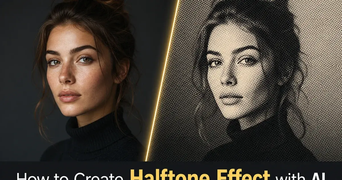
Le halftone est l'un des effets visuels les plus caractéristiques du design graphique. Ses racines remontent à plus d'un siècle, aux débuts de l'impression mécanique. La technique consiste à décomposer les tons continus d'une photographie en motifs de points de tailles variables. De gros points pour les zones sombres, de petits points pour les hautes lumières, et l'absence de points pour le blanc pur. Vu à distance normale, l'œil fond ces points en dégradés lisses. De près, le motif de points devient lui-même la texture visuelle. C'est le même principe qui a donné aux bandes dessinées, aux photos de journaux et au pop art leur aspect imprimé si reconnaissable.
Créer manuellement un effet halftone convaincant exige de solides connaissances techniques sur les angles de trame, la fréquence des points et la séparation des couleurs. Dans les flux d'impression traditionnels, un technicien prépresse convertissait les images en tons continus en trames halftone à des densités précises de lignes par pouce, en gérant soigneusement les moirés et l'engraissement des points sur les canaux CMYK. Les outils numériques ont simplifié une partie de ce travail, mais la plupart des éditeurs photo exigent encore de configurer manuellement les angles et les fréquences de trame. Cela produit des résultats irréguliers sans expertise.
Les outils halftone propulsés par l'IA gèrent automatiquement la complexité technique tout en vous laissant le contrôle créatif du rendu visuel. L'IA analyse la plage tonale de votre image, identifie les contours et les sujets. Elle génère des motifs de points qui préservent les détails dans les zones importantes tout en créant un impact graphique fort dans les régions tonales plus larges. Ce guide détaille le flux de travail complet pour créer des effets halftone adaptés aux visuels pour réseaux sociaux, aux affiches, au merchandising et aux projets d'art numérique.
- Les filtres halftone IA analysent la plage tonale et les détails des contours pour générer des motifs de points qui préservent la netteté du sujet.
- Le halftone noir et blanc classique imite l'impression de journaux d'antan avec une matrice de points monochrome.
- La séparation des couleurs CMYK crée des effets pop art de bande dessinée avec des motifs de points colorés superposés.
- Les réglages de densité et de taille des points vous permettent de doser entre texture subtile et impact graphique audacieux.
- L'effet fonctionne sur les portraits, les photos de produits, la photographie de rue et les compositions typographiques.
Comment fonctionne l'impression en demi-teinte et pourquoi elle a un aspect distinctif
Le procédé halftone a été inventé dans les années 1880 pour résoudre un problème fondamental de l'impression mécanique : les presses pouvaient appliquer ou non de l'encre. Elles ne pouvaient pas faire varier la quantité d'encre en chaque point de la page. Les photographies en tons continus contiennent des milliers de transitions tonales graduelles qu'un procédé binaire encre-ou-pas-d'encre ne peut reproduire directement. La trame halftone a résolu cela en convertissant ces dégradés en un motif de points où la taille de chaque point correspond à l'obscurité du ton d'origine à cet endroit. Les gros points couvrent plus de papier d'encre et paraissent plus sombres, les petits points laissent plus de blanc et paraissent plus clairs.
Cette contrainte mécanique est devenue une signature esthétique. Les bandes dessinées, les journaux, les affiches sérigraphiées et le pop art ont tous hérité du motif de points halftone comme élément d'identité visuelle. Roy Lichtenstein a bâti toute une carrière en faisant du point halftone lui-même le sujet d'œuvres d'art, agrandissant les points de bande dessinée à la taille d'une toile. Le motif de points Ben-Day est devenu synonyme de narration visuelle audacieuse et graphique. Aujourd'hui encore, des décennies après que l'impression numérique a éliminé le besoin technique des trames halftone, le motif de points reste l'un des effets stylistiques les plus populaires du design graphique.
Comprendre la mécanique vous aide à créer de meilleurs effets halftone avec les outils IA. Quand vous savez que la taille des points contrôle la luminosité perçue et que l'espacement des points détermine le poids visuel de la texture, vous faites des choix créatifs plus intentionnels. Une grille de points serrée avec une petite taille maximale produit un halftone subtil et photoréaliste. Une grille lâche avec de gros points crée un impact graphique audacieux et abstrait. L'IA gère la conversion technique, mais la direction créative — quel degré graphique, quelle couleur, quelle taille de points — reste votre décision.
- Le halftone a été inventé dans les années 1880 pour reproduire des photographies sur des presses binaires encre-ou-pas-d'encre.
- La taille des points contrôle la luminosité perçue — les gros points paraissent plus sombres, les petits plus clairs.
- L'esthétique halftone est devenue une signature des bandes dessinées, du pop art et du design d'affiches sérigraphiées.
- Comprendre la densité et l'espacement des points vous aide à orienter l'IA vers le rendu visuel souhaité.
Preparer votre photo pour les meilleurs resultats de trame
Toutes les photographies ne se convertissent pas bien en halftone. Le travail de préparation avant d'appliquer l'effet fait une grande différence sur la qualité finale. L'image de départ idéale présente un fort contraste entre zones claires et sombres, des contours bien définis autour du sujet principal. Des arrière-plans assez propres sans bruit visuel excessif. Les portraits avec un éclairage latéral dramatique, les photos de produits sur surfaces nettes. Les scènes de rue aux formes architecturales marquées se convertissent toutes exceptionnellement bien, car les points halftone disposent d'une information tonale claire à exploiter.
Avant d'appliquer le filtre halftone, utilisez Magic Eraser pour nettoyer les éléments indésirables qui deviendraient du bruit visuel dans le motif de points. Un petit déchet sur un trottoir, à peine perceptible sur la photo d'origine, devient un amas inexpliqué de gros points dans la version halftone. Les superpositions de texte, les filigranes, les reflets d'objectif et le désordre d'arrière-plan produisent tous des artefacts de points déroutants. Prenez trente secondes pour effacer ces distractions et vous obtiendrez un rendu halftone bien plus propre, où le motif de points se lit clairement comme un effet de design intentionnel plutôt qu'un chaos visuel.
Envisagez de passer votre image dans AI Enhance avant d'appliquer le halftone pour optimiser la base tonale. Augmenter légèrement le contraste garantit que les ombres produisent de gros points satisfaisants tandis que les hautes lumières restent propres et ouvertes. Corriger la balance des couleurs évite les teintes indésirables dans les séparations halftone colorées. Accentuer les détails des contours aide l'IA à générer des motifs de points qui suivent précisément les contours du sujet plutôt que de déborder. Ces étapes préparatoires prennent moins d'une minute et améliorent grandement la qualité de la conversion halftone.
- Choisissez des images au fort contraste, aux contours définis et aux arrière-plans propres pour une clarté de motif optimale.
- Supprimez le désordre d'arrière-plan avec Magic Eraser avant la conversion pour éviter les artefacts de points déroutants.
- Augmentez légèrement le contraste avec AI Enhance pour que les ombres produisent de gros points et les hautes lumières restent ouvertes.
- Accentuez les contours avant d'appliquer le halftone pour que les motifs de points suivent précisément les contours du sujet.
Appliquer des effets de trame avec AI Filter
La conversion halftone d'AI Filter fonctionne en analysant chaque région de votre image pour sa luminosité, ses détails de contour et son contenu chromatique, puis en générant un motif de points adapté à chaque zone. Dans les zones de détail fin comme les traits du visage ou les textures de produits, l'IA utilise un espacement de points plus serré pour préserver les formes distinctes. Dans les zones tonales plus larges comme les arrière-plans et les vêtements, elle utilise une grille plus lâche qui crée un impact graphique plus marqué. Cette approche adaptative produit des effets halftone qui paraissent intentionnels et conçus plutôt que mécaniquement uniformes.
Pour un halftone de journal classique en noir et blanc, appliquez le filtre en mode monochrome à canal unique. L'IA convertit votre image en niveaux de gris et génère une seule couche de points où la taille des points correspond directement à la valeur tonale. Cela produit l'esthétique halftone la plus propre et la plus nette, parfaite pour le design éditorial, l'art d'affiche. Les publications Instagram où la simplicité graphique audacieuse est l'objectif. Le motif de points noirs sur blanc se lit clairement à toute taille, d'un écran de téléphone à un tirage mural.
Pour un halftone couleur de bande dessinée ou pop art, passez en mode séparation CMYK où l'IA génère des couches de points distinctes pour les canaux cyan, magenta, jaune et noir. Chaque couche de couleur utilise un angle de trame légèrement différent pour éviter les motifs de moiré, exactement comme le ferait une vraie presse offset. Le résultat est un halftone couleur superposé qui capture toute la gamme chromatique de votre photo d'origine grâce à des points colorés qui se chevauchent. Ce mode fonctionne à merveille pour les affiches, les visuels de merchandising. Le contenu pour réseaux sociaux qui exige un maximum d'énergie visuelle et de caractère rétro.
- L'IA adapte l'espacement des points sur l'image — plus serré dans les zones de détail, plus lâche dans les régions tonales larges.
- Le mode monochrome noir et blanc produit l'esthétique halftone de journal ou éditoriale la plus propre.
- La séparation CMYK génère des points colorés superposés à des angles décalés pour un look pop art de bande dessinée.
- Le dimensionnement adaptatif des points préserve les traits du visage et les détails du produit même à des densités halftone agressives.
Personnalisation de la densite des points, de la couleur et du poids visuel
La gamme créative des effets halftone s'étend de la texture photographique subtile au graphisme abstrait audacieux, et le contrôle principal est la densité des points. Mesurée par le nombre de points par pouce dans le motif. Une densité élevée avec de petites tailles maximales de points produit un effet presque photographique à bout de bras, la texture halftone n'étant visible que de près. Une faible densité avec de grandes tailles maximales produit un effet très graphique où les points individuels dominent la composition et l'image devient secondaire par rapport au motif lui-même.
La manipulation des couleurs ouvre un territoire créatif supplémentaire au-delà de ce que l'impression halftone traditionnelle pouvait atteindre. Au lieu des couleurs CMYK standard, vous pouvez appliquer des motifs halftone dans vos couleurs de marque, des tons néon ou des palettes bichromes qui donnent à l'effet un caractère totalement moderne tout en conservant la structure de points rétro. Un portrait halftone rendu en points cyan vif sur fond rose vif ne ressemble en rien à une photo de journal mais utilise exactement le même principe optique. Cette flexibilité fait du halftone IA un outil polyvalent pour les visuels marketing, les affiches d'événements, les pochettes d'album. Le contenu pour réseaux sociaux qui doit se démarquer.
Tenez compte du contexte de visualisation lorsque vous choisissez vos paramètres de points. Les vignettes pour réseaux sociaux sont vues en petit format sur des écrans de téléphone. Une densité de points moyenne garantit que la texture halftone est visible et intentionnelle, même dans un fil défilant. Les tirages et affiches grand format peuvent utiliser des grilles de points bien plus serrées, car la distance de visualisation est plus grande et les points fins se résolvent clairement. Les articles de merchandising comme les t-shirts et les sacs profitent d'une taille de points modérément grande qui se reproduit bien en sérigraphie, rendant l'esthétique halftone littérale. Imprimée par un véritable procédé à base de points, bouclant la boucle visuelle.
- Une densité de points élevée produit une texture photographique subtile, visible uniquement de près.
- Une faible densité de points crée un impact graphique audacieux où les points individuels dominent la composition.
- Des palettes de couleurs personnalisées vous permettent d'appliquer des motifs halftone dans vos couleurs de marque ou des tons néon.
- Adaptez les paramètres de points au contexte — petit pour les vignettes sociales, serré pour les grands tirages, moyen pour le merchandising.
Exporter et utiliser des images en demi-teinte sur differentes plateformes
Une fois votre effet halftone finalisé, le processus d'export doit correspondre aux besoins techniques de votre usage prévu. Pour les plateformes numériques comme Instagram, Pinterest et les bannières de site web, exportez en PNG ou WebP de haute qualité à la résolution recommandée par la plateforme. Les effets halftone contiennent des bords de points nets et des limites très contrastées que la compression JPEG gère mal. L'algorithme avec perte étale les bords des points et introduit des artefacts de rebond qui détruisent la qualité graphique nette que vous avez cherché à créer. Le PNG préserve chaque bord de point au pixel près pour un usage web et social.
Pour les applications d'impression comme les affiches, les flyers et le merchandising, exportez à trois cents DPI ou plus dans un format qui préserve toute la résolution du motif de points. Si votre halftone est destiné à la sérigraphie sur tissu ou papier, fournissez le fichier sous forme de version vectorisée propre si possible, ou en raster haute résolution aux dimensions exactes de sortie. Discutez avec votre imprimeur de sa densité de points et de son format de fichier préférés. Certains sérigraphes préfèrent recevoir l'image en tons continus et appliquer leur propre tramage halftone optimisé pour leur équipement et leur support spécifiques.
Passez votre export final dans AI Enhance pour un dernier accentuage des contours et une amélioration du contraste. Cela garantit une netteté maximale du motif de points, quel que soit le format d'export. Pour les publications sur réseaux sociaux, envisagez d'ajouter une fine bordure blanche ou colorée autour de l'image halftone afin que le motif de points ne se fonde pas dans la couleur de fond de la plateforme. Ce traitement d'encadrement donne au halftone un rendu fini et intentionnel qui signale un vrai travail de design plutôt qu'une image accidentellement pixellisée.
- Exportez pour les plateformes numériques en PNG ou WebP afin de préserver les bords de points nets que la compression JPEG détruit.
- Les applications d'impression exigent trois cents DPI ou plus avec le motif de points à pleine résolution de sortie.
- Passez l'export final dans AI Enhance pour un dernier accentuage et une optimisation du contraste.
- Ajoutez une fine bordure autour des publications halftone sur réseaux sociaux pour que les points ne se fondent pas dans les couleurs de fond.
How to do it
- 1
Select a photo with strong contrast and clear subjects
Choose a portrait, street scene, or product shot with well-defined shapes and strong tonal contrast between light and dark areas. Halftone effects work best when there are clear edges and distinct shadows. Avoid flat or evenly lit images where the dot pattern has nothing to emphasize.
- 2
Clean up the image before applying the effect
Use Magic Eraser to remove any unwanted background elements, text overlays, or clutter that would muddy the halftone pattern. A cleaner starting image produces crisper dot patterns with better visual impact.
- 3
Apply the halftone dot filter with AI
Use AI Filter to apply a halftone effect that converts smooth tonal gradients into patterns of varying dot sizes. Larger dots represent darker areas and smaller dots represent highlights, mimicking the mechanical printing process used in newspapers and comic books since the late 1800s.
- 4
Adjust dot density and color settings
Fine-tune the halftone output by adjusting dot size, spacing, and color channels. For a classic newspaper look, use black dots on white. For a comic book pop art feel, try CMYK separation with colored dots. For a modern design twist, experiment with single-color overlays on bold background tones.
- 5
Enhance and export for your target platform
Run the final halftone image through AI Enhance to sharpen dot edges and optimize contrast. Export at the resolution right for your use case. High DPI for print posters and merchandise, optimized web resolution for social media posts and digital graphics.
Sources
- Halftone Printing: History and Modern Applications — Encyclopaedia Britannica
- A Neural Algorithm of Artistic Style — arXiv
- Digital Halftoning Techniques for Printing and Display — IEEE Signal Processing Magazine