
Comment Creer un Effet Duotone avec AI — Magic Eraser
Creez des effets de couleur duotone frappants sur vos photos grace au mappage tonal AI. Guide etape par etape couvrant la selection des paires de couleurs, les applications de marque, l'amelioration des reseaux sociaux et le traitement par lots pour les campagnes.

Product Marketing
Vérifié par Magic Eraser Editorial ·
Sommaire
- Theorie des couleurs pour les paires duotone efficaces
- Comment le mappage tonal AI preserve la profondeur et la dimension
- Duotone pour les reseaux sociaux et les campagnes de marketing numerique
- Variations duotone avancees : tritone, gradient maps et split-tone
- Considerations d'impression et gestion de l'espace colorimetrique pour le duotone
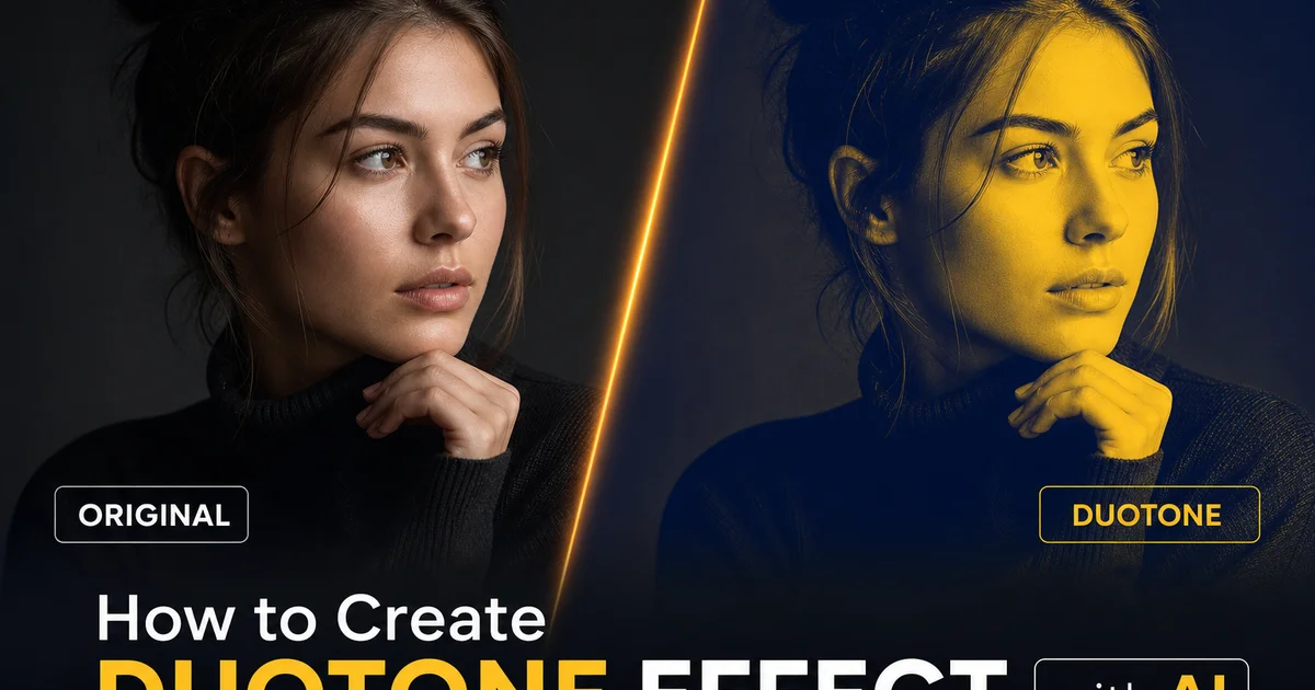
L'effet duotone — remplacer tout le spectre chromatique d'une photographie par seulement deux couleurs mappees sur la gamme tonale — est un pilier du design graphique depuis l'ere de l'impression lithographique. Il a connu une resurgence massive dans le branding numerique au cours de la derniere decennie. Spotify a popularise l'esthetique duotone moderne avec ses images d'artistes audacieuses utilisant des paires de couleurs vives et contrastantes. Depuis lors, la technique est devenue un traitement visuel incontournable pour les entreprises technologiques, les marques musicales, les labels de mode et les campagnes sur les reseaux sociaux qui souhaitent creer un impact visuel immediat et puissant. L'effet fonctionne car la simplification extreme des couleurs attire l'attention, cree une reconnaissance instantanee de la marque grace a l'utilisation coherente des couleurs, et transforme des photographies ordinaires en elements de design graphique qui s'integrent parfaitement a la typographie et a la mise en page.
Creer des effets duotone convaincants dans le passe necessitait des competences intermediaires a avancees dans Photoshop ou des outils similaires. Le processus impliquait la conversion de l'image en niveaux de gris, la creation d'un gradient map avec les deux couleurs choisies, l'ajustement de la distribution tonale pour maintenir les details et la profondeur, et le reglage fin du resultat pour qu'il ne ressemble pas a une simple superposition de couleurs. Les filtres duotone en un clic disponibles dans les applications grand public produisent souvent des resultats plats et boueux car ils appliquent un lavis de couleur uniforme plutot qu'un veritable mappage tonal. L'image semble teintee plutot que conçue, perdant la profondeur et la dimension qui font la force d'un travail duotone expert.
Les outils duotone alimentes par AI comblent cet ecart de qualite en analysant la structure tonale de chaque image et en appliquant un mappage intelligent des couleurs qui preserve la profondeur tridimensionnelle, maintient les details de texture et repartit les deux couleurs sur la gamme dynamique d'une maniere qui semble intentionnelle plutot qu'accidentelle. AI Filter comprend que la peau doit conserver une variation tonale meme dans une palette bicolore, que les surfaces architecturales doivent maintenir leur texture et leurs indices de profondeur, et que la transition entre la couleur d'ombre et la couleur de lumiere doit suivre la direction naturelle de la lumiere dans la scene. Ce guide couvre le flux de travail complet pour creer des effets duotone experts avec AI Filter, de la strategie de selection des couleurs au traitement par lots pour des campagnes multi-images coherentes.
- Le mappage tonal AI preserve la profondeur tridimensionnelle et les details de texture que les filtres de superposition simples aplatissent, produisant des resultats duotone qui semblent conçus plutot que teintes.
- Les paires de couleurs complementaires comme bleu-orange et violet-jaune creent une energie visuelle maximale, tandis que les paires analogues comme bleu-violet produisent des resultats sophistiques et harmonieux.
- Le point d'equilibre tonal controle ou la couleur d'ombre cede la place a la couleur de lumiere — un decalage de cinq a dix pour cent cree des differences d'ambiance notables.
- Les applications de marque doivent utiliser la couleur principale de la marque comme ton d'ombre et un accent plus clair comme lumiere, construisant une reconnaissance visuelle sur tous les supports de campagne duotone.
- AI Filter prend en charge le traitement par lots pour appliquer des parametres duotone identiques a des ensembles de photos entiers, garantissant une coherence visuelle dans toutes les campagnes multi-images.
Theorie des couleurs pour les paires duotone efficaces
Le choix des deux couleurs determine tout dans le resultat duotone : son ambiance, son niveau d'energie, ses associations de marque et son efficacite sur differents supports. Les paires de couleurs complementaires, situees opposees sur le cercle chromatique, produisent le contraste visuel et l'energie les plus eleves. Le bleu et l'orange est la paire duotone complementaire la plus populaire car elle exploite le contraste chaud-froid auquel l'œil humain est le plus sensible, creant des images qui semblent a la fois chaudes et froides, energetiques et equilibrees. Le violet et le jaune creent une combinaison royale et accrocheuse. Le teal et le corail produisent une sensation fraiche et moderne principalement associee aux marques technologiques et lifestyle. Ces paires a fort contraste fonctionnent bien pour les reseaux sociaux, le marketing evenementiel, et tout contexte ou l'objectif est d'arreter le defilement du spectateur.
Les paires de couleurs analogues utilisent des couleurs adjacentes sur le cercle chromatique, produisant des resultats harmonieux a faible contraste qui semblent coherents et sophistiques plutot qu'energetiques. Le bleu fonce et le violet creent une esthetique sombre et club de nuit. Le rouge fonce et l'orange chaud evoquent la chaleur, la passion et l'intensite. Le vert foret et le teal suggerent la nature, la durabilite et le calme. Ces paires fonctionnent bien pour les applications de marque ou la sophistication et la coherence importent plus que l'energie captant l'attention. Les marques de luxe, les services financiers, la sante et les services experts preferent souvent les palettes duotone analogues car elles communiquent la stabilite et le gout plutot que l'excitation.
Pour les applications specifiques a une marque, commencez par votre couleur de marque principale comme ton d'ombre car elle occupe une plus grande surface visuelle dans l'image typique et domine donc l'impression colorielle du spectateur. Votre couleur de lumiere doit etre plus claire et complementer la couleur d'ombre sans lui faire concurrence. Une couleur d'accent de votre palette de marque, une teinte plus claire de la couleur principale, ou un neutre chaud comme le creme ou l'or fonctionnent bien. Testez votre paire choisie contre la typographie et les elements de design de votre marque pour vous assurer que l'imagerie duotone s'integre aux actifs visuels existants plutot que de s'y opposer. Le selecteur de couleur personnalise d'AI Filter accepte les valeurs hex exactes, vous permettant de correspondre precisement a vos directives de marque plutot que d'approximer a partir de palettes predefinies.
- Les paires complementaires comme bleu-orange et violet-jaune creent un contraste visuel et une energie maximaux, ideales pour les reseaux sociaux et le marketing evenementiel qui doivent arreter le defilement.
- Les paires analogues comme bleu-violet et vert-teal produisent des resultats sophistiques et harmonieux preferes par les marques de luxe, financieres et de services professionnels.
- Utilisez votre couleur de marque principale comme ton d'ombre car elle occupe une plus grande surface visuelle et domine l'impression colorielle du spectateur sur l'image.
- AI Filter accepte les valeurs hex exactes pour l'appariement personnalise des couleurs, garantissant que l'imagerie duotone s'aligne precisement avec les directives de marque et les actifs visuels existants.
Comment le mappage tonal AI preserve la profondeur et la dimension
La difference critique entre le duotone expert et le duotone amateur est de savoir si l'image bicolore conserve la qualite tridimensionnelle de la photographie originale. Dans un duotone bien execute, un portrait montre encore les contours du visage, un batiment montre encore la profondeur entre ses colonnes et sa facade, un paysage montre encore la separation entre le premier plan, le plan intermediaire et l'horizon. Dans un duotone mal execute, ces indices de profondeur disparaissent et l'image ressemble a un graphique plat et posterise avec deux couleurs et aucune information spatiale. Le maintien de la profondeur malgre l'utilisation de seulement deux couleurs est ce qui separe l'esthetique Spotify d'un filtre de reseau social bon marche.
Le mappage tonal AI atteint ce maintien de la profondeur en analysant la structure de luminance de l'image originale avant d'appliquer tout changement de couleur. L'AI identifie les relations tonales cles qui communiquent la profondeur : l'assombrissement progressif sur la surface courbee d'un visage, les motifs d'ombre qui revelent la forme architecturale, la perspective atmospherique qui separe les plans du paysage — et garantit que ces relations survivent au processus de mappage des couleurs. Plutot que d'appliquer un simple gradient lineaire de la couleur d'ombre a la couleur de lumiere, l'AI faconne la courbe tonale pour preserver les rapports de contraste qui communiquent la forme tridimensionnelle, compressant parfois la gamme tonale dans les zones moins importantes pour donner plus d'espace tonal aux zones ou l'information de profondeur est concentree.
Les tons de peau presentent un defi specifique dans le duotone car les visages sont le premier endroit ou le spectateur regarde. Tout aplatissement de la structure faciale est immediatement noticeable. AI Filter gere cela en detectant les visages dans l'image et en appliquant une courbe tonale modifiee aux regions de peau qui preserve les variations subtiles de luminance sur l'arete du nez, les pommettes, la machoire et le front qui communiquent la structure faciale. Sans ce traitement de reconnaissance faciale, les portraits duotone ressemblent souvent a des graphiques plats plutot qu'a des photographies de vraies personnes. La difference est subtile lorsqu'on l'examine pixel par pixel mais dramatique dans l'impression generale. Les images duotone avec reconnaissance faciale ressemblent a un travail de design expert tandis que les images duotone plates semblent avoir ete traitees avec un filtre de telephone basique.
- Le duotone professionnel conserve les indices de profondeur tridimensionnelle — contours faciaux, ombres architecturales, plans de paysage — que les filtres bon marche aplatissent en graphiques posterises.
- L'AI analyse la structure de luminance avant le mappage des couleurs et faconne la courbe tonale pour preserver les rapports de contraste qui communiquent la profondeur et la forme spatiale.
- La detection faciale applique une courbe tonale modifiee aux regions de peau, preservant les variations subtiles de luminance sur les traits du visage qui rendent les portraits tridimensionnels.
- La gamme tonale est compressee dans les zones moins importantes pour donner plus d'espace aux regions ou l'information de profondeur est concentree, maintenant l'impression d'une vraie photographie.
Duotone pour les reseaux sociaux et les campagnes de marketing numerique
Les reseaux sociaux sont la ou l'imagerie duotone a le plus grand impact car l'effet cree une coherence visuelle immediate dans un flux de contenu tout en differenciant les images de votre marque des photographies en couleur complete qui dominent la plupart des fils d'actualite. Lorsqu'un utilisateur fait defiler son fil Instagram ou LinkedIn, une image duotone se demarque precisement parce qu'elle ne ressemble pas a une photographie ordinaire. La simplification des couleurs attire l'œil et signale que ce contenu a ete intentionnellement conçu plutot que poste de maniere informelle. Pour les marques menant des campagnes multi-publications, appliquer la meme paire de couleurs duotone a chaque image de la serie cree un fil visuel qui lie la campagne ensemble meme lorsque les publications individuelles apparaissent a plusieurs jours d'intervalle dans le fil de l'abonne.
Les carrousels et Stories Instagram beneficient principalement du duotone car la palette de couleurs coherente cree une experience de visualisation unifiee lorsque l'utilisateur fait glisser plusieurs images. Un carrousel de dix diapositives ou chaque photo utilise le meme traitement duotone violet-et-or semble etre un affichage unifie. Les memes dix photos en couleur complete pourraient sembler etre une collection decousue. Les images d'en-tete Twitter et LinkedIn et les bannières d'evenements sont une autre application a fort impact. L'effet duotone rend la superposition de texte tres lisible car la palette de couleurs limitee ne concurrence pas la typographie comme le font les photographies chargées en couleur complete. Pour les images hero d'email marketing, le duotone reduit la taille du fichier car les informations de couleur limitees se compressent plus efficacement, ameliorant les temps de chargement sur les connexions mobiles lentes.
La coherence des campagnes est l'avantage operationnel du traitement par lots AI pour le duotone. Plutot que de traiter manuellement chaque photo en esperant que l'appariement des couleurs reste coherent entre differentes images et differentes sessions d'edition, AI Filter applique un mappage des couleurs mathematiquement identique a chaque image d'un lot. La couleur d'ombre est exactement la meme valeur hex, la couleur de lumiere est exactement la meme valeur hex, la courbe de distribution tonale est identique sur toutes les images. Cela garantit que lorsque les images de la campagne apparaissent ensemble sur une page de destination, dans un diaporama ou dans une brochure imprimee, la coherence des couleurs est parfaite plutot qu'approximative. Pour les marques qui investissent des ressources importantes dans l'identite visuelle, cette precision compte.
- L'imagerie duotone se demarque dans les flux sociaux car la simplification des couleurs signale un design intentionnel, differenciant le contenu de marque des photographies en couleur complete et banales.
- Les campagnes multi-publications avec des paires de couleurs duotone coherentes creent des fils visuels qui lient le contenu ensemble meme lorsque les publications apparaissent a plusieurs jours d'intervalle.
- Les palettes de couleurs limitees rendent la superposition de texte tres lisible et se compressent plus efficacement pour l'email marketing, ameliorant les temps de chargement sur les connexions mobiles lentes.
- Le traitement par lots AI applique un mappage des couleurs mathematiquement identique a des ensembles de photos entiers, garantissant une coherence visuelle parfaite pour les pages de destination, les presentations et les supports imprimes.
Variations duotone avancees : tritone, gradient maps et split-tone
Alors que le duotone classique utilise exactement deux couleurs, plusieurs techniques connexes etendent le concept pour une plus grande flexibilite creative. Le tritone ajoute une troisieme couleur aux tons moyens, permettant un rendu tonal plus nuance tout en maintenant la simplicite graphique du design a palette limitee. Une approche tritone courante utilise une couleur d'ombre foncee, une couleur de ton moyen vibrante et une couleur de lumiere brillante. Par exemple, bleu marine fonce dans les ombres, bleu electrique dans les tons moyens et blanc chaud dans les lumieres. La couleur de ton moyen supplementaire donne a l'image plus de profondeur qu'un vrai duotone tout en maintenant l'aspect conçu et coherent avec la marque qui rend l'imagerie a palette limitee efficace pour le marketing.
Les variations de gradient map permettent a la transition de couleur de suivre une courbe personnalisee plutot qu'un mappage lineaire ombre-a-lumiere. Dans un duotone lineaire, la transition de couleur de l'ombre a la lumiere suit une ligne droite. Le gris cinquante pour cent recoit un melange egal des deux couleurs. Un gradient map personnalise peut decaler le point de transition, creer plusieurs transitions ou ajouter des arrets de couleur intermediaires qui creent un rendu tonal plus complexe. AI Filter prend en charge le mode gradient map pour les utilisateurs qui souhaitent un controle plus fin sur la distribution des couleurs. Ceci est particulierement utile lorsque le mappage lineaire par defaut rend les tons moyens boueux ou lorsque les deux couleurs choisies doivent se meler d'une maniere specifique pour maintenir la lisibilite.
Le split-tone est la variation la plus subtile, appliquant une couleur uniquement aux ombres et une autre uniquement aux lumieres tout en laissant les tons moyens en niveaux de gris naturels ou legerement teintes. Cela produit des images qui conservent davantage de leur caractere photographique original tout en ayant un traitement colore distinctif. Le split-tone est populaire en photographie de portrait et de mariage car il ajoute une ambiance : des lumieres chaudes et des ombres fraîches evoquent l'heure doree par exemple — sans le changement complet de couleur d'un duotone integral. AI Filter propose des presets split-tone qui appliquent une coloration des ombres et des lumieres a des intensites controlees, vous permettant de choisir exactement l'influence coloree desiree a chaque extreme tonal.
- Le tritone ajoute une troisieme couleur aux tons moyens, offrant plus de profondeur qu'un vrai duotone tout en maintenant la simplicite graphique de l'imagerie de marque a palette limitee.
- Les gradient maps personnalises decalent le point de transition entre les couleurs ou ajoutent des arrets intermediaires, resolvant le melange boueux des tons moyens que le mappage lineaire ombre-a-lumiere cree parfois.
- Le split-tone applique la couleur uniquement aux ombres et aux lumieres, laissant les tons moyens en niveaux de gris pour un traitement d'ambiance subtil qui conserve plus de caractere photographique qu'un duotone integral.
- AI Filter prend en charge les trois variations avec des presets et des controles personnalises, permettant aux professionnels creatifs de choisir exactement l'intensite et le style qui conviennent a leur projet.
Considerations d'impression et gestion de l'espace colorimetrique pour le duotone
L'imagerie duotone est nee dans la production d'impression, ou l'utilisation de deux couleurs d'encre au lieu du processus quadrichromique CMYK reduisait les couts d'impression tout en ajoutant plus de richesse tonale que l'impression monochrome. Comprendre cet heritage d'impression est important pour les designers modernes car les images duotone creees numeriquement dans l'espace colorimetrique RGB se decalent souvent de maniere noticeable lors de la conversion en CMYK pour la production d'impression. Les bleus numeriques vifs deviennent ternes, les violets brillants se decalent vers le bleu ou le magenta, et les teals satures perdent leur vitalite. Si vos images duotone seront imprimees, convertissez toujours en CMYK et examinez le resultat avant d'envoyer a l'impression. Le decalage de l'ecran au papier peut grandement changer l'ambiance de votre duotone.
Pour les projets qui couvrent a la fois les applications numeriques et imprimees — une campagne de marque comprenant les reseaux sociaux, un site Web et des brochures imprimees — creez deux versions de votre paire de couleurs duotone. La version numerique utilise vos couleurs hex de marque exactes en RGB pour l'affichage a l'ecran. La version imprimee utilise des equivalents CMYK qui ont ete ajustes pour produire la correspondance visuelle la plus proche de la version numerique une fois imprimee. Ceux-ci sont rarement les conversions CMYK directes des valeurs RGB. Ils necessitent generalement un reglage manuel de quelques points de pourcentage dans un ou plusieurs canaux CMYK pour compenser les differences de gamut entre la sortie ecran et l'impression. AI Filter exporte en RGB et en CMYK avec des profils definis par l'utilisateur, rendant ce flux de travail multi-supports simple.
Le papier affecte également le rendu final du duotone. Le papier couche glacé produit des résultats duotone plus saturés et vifs avec des transitions tonales nettes. Le papier non couché mat absorbe plus d'encre et produit des résultats plus doux et plus ternes avec un gain de point légèrement plus large qui peut troubler la transition des tons moyens entre vos deux couleurs. Les papiers texturés ajoutent une dimension physique au duotone mais peuvent introduire des motifs de trame visibles dans les zones de dégradé. Pour les applications d'impression premium, demandez une épreuve de presse sur votre papier réel avant de vous engager dans un tirage complet. Ajustez la courbe tonale du duotone si la transition des tons moyens semble boueuse ou si la saturation des couleurs est plus faible que prévu sur le support choisi.
- La conversion RGB vers CMYK decale les couleurs duotone de manière noticeable — les bleus numériques vifs deviennent ternes et les teals saturés perdent leur vitalité, vérifiez donc toujours les épreuves CMYK avant l'impression.
- Les campagnes multi-supports doivent maintenir des paires de couleurs duotone RGB et CMYK séparées, avec les valeurs CMYK ajustées manuellement pour correspondre à l'apparence visuelle de la version numérique sur presse.
- Le papier couché produit des résultats duotone saturés et nets tandis que le papier non couché absorbe plus d'encre, créant des tons plus doux qui peuvent troubler la transition de couleur des tons moyens.
- Demandez une épreuve de presse sur votre papier réel pour les applications premium et ajustez la courbe tonale si le mélange des tons moyens ou la saturation ne correspondent pas à l'aperçu écran.
How to do it
- 1
Select a photo with strong tonal contrast and clear subject separation
Duotone effects map two colors across the tonal range of a photograph. One color replacing the shadows and another replacing the highlights, with the midtones receiving a blend of both. This means the effect works best on photos that already have strong contrast between light and dark areas. The two chosen colors need distinct tonal zones to occupy. Portraits with defined lighting, architecture with strong shadow patterns, landscapes with bright skies against dark ground. Product photos with clean backgrounds all produce excellent duotone results. Low-contrast, flat images tend to muddy the two colors together because there is not enough tonal separation to give each color its own visual space.
- 2
Choose a complementary or brand-aligned color pair
The two colors you select define the entire mood and visual impact of the duotone result. Matching color pairs — blue and orange, purple and yellow, teal and coral — create high-energy, visually striking images because the colors sit on opposite sides of the color wheel and create maximum contrast. Analogous pairs — blue and purple, orange and red, green and teal — produce harmonious, sophisticated results that feel cohesive rather than vibrant. For brand applications, use your primary brand color as the shadow tone and a lighter matching or accent color as the highlight tone. AI Filter provides preset color pairings optimized for different moods as well as a custom picker for exact brand color matching.
- 3
Apply the AI duotone mapping with intelligent tonal distribution
Upload your photo to AI Filter and select the duotone effect mode. Unlike simple color overlay tools that apply a flat tint, AI Filter performs intelligent tonal mapping that preserves the depth and dimension of the original photograph. The AI analyzes the image's tonal structure and distributes the two colors across the full dynamic range. Pure shadow color in the darkest areas, pure highlight color in the brightest, and a calculated blend through the midtones that maintains the impression of three-dimensional form. Skin tones, fabric textures, and architectural details remain visible as tonal variations within the two-color palette rather than being flattened into solid color blocks.
- 4
Adjust the tonal balance point between your two colors
The balance point determines where in the tonal range the transition from the shadow color to the highlight color occurs. Shifting the balance point toward the highlights means the shadow color dominates more of the image, creating a darker, moodier result. Shifting it toward the shadows means the highlight color takes over more of the midtones, producing a lighter, airier look. For most duotone applications, a slightly shadow-biased balance works best because the shadow color often carries the brand identity and the viewer reads the highlight color as accent illumination. Experiment with small adjustments — five to ten percent shifts in the balance point produce noticeable differences in the overall mood.
- 5
Export at the correct resolution and format for your intended platform
Duotone images are commonly used across multiple marketing channels, and each has different needs. Social media posts and website headers need RGB color space at seventy-two DPI. Print materials need CMYK conversion at three hundred DPI. Some duotone color combinations shift noticeably during the RGB-to-CMYK conversion, so always check a print proof. Email marketing images should be compressed to under two hundred kilobytes for fast loading. For consistency across a campaign, process the entire photo batch with the same color pair and balance settings to ensure that every image in the series shares the same visual language. AI Filter supports batch processing to apply identical duotone settings across multiple images at once.
Sources
- The Art of Duotone: From Print to Digital Design — Smashing Magazine
- Color Theory and Two-Tone Design in Modern Branding — Interaction Design Foundation
- AI-Powered Color Grading and Tonal Mapping Techniques — arXiv