
AI Create style
KI-Generator für Typografie-Bilder
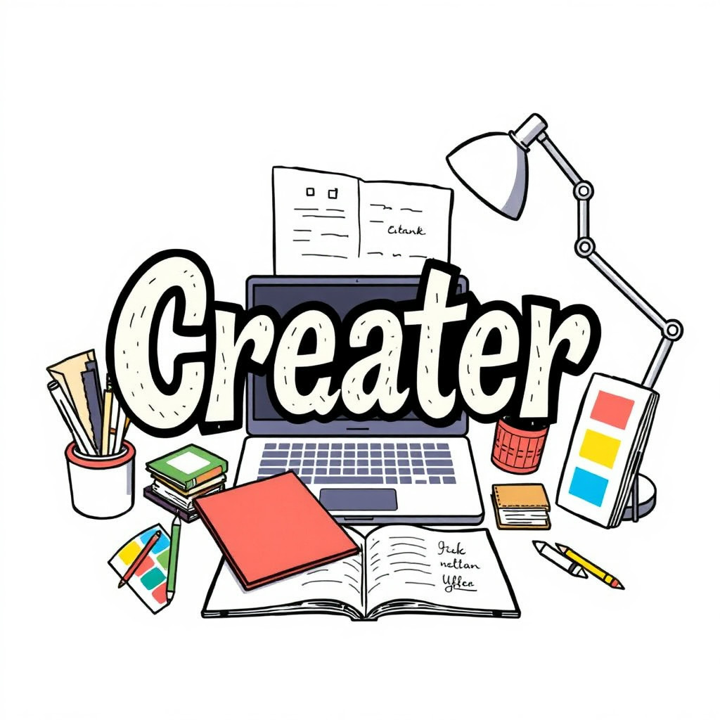
Erstelle typografiebetonte Bildkonzepte, bei denen Buchstabenformen, Layoutrhythmus und grafische Komposition das Motiv bestimmen. Nutze sie für Poster, Zitatgrafiken, Albumideen, Merch und Kampagnen und füge den exakten finalen Text anschließend im Editor ein.
Use case
Poster- und Coverkonzepte mit Schrift als Hauptmotiv.
Use case
Zitatgrafiken und Social Posts mit ausdrucksstarkem Lettering.
Use case
Visuelle Richtungen für Merch, Events und Kampagnen.
Visual direction preview
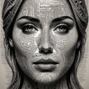
Use the style thumbnail as the creative target
The preview gives users a concrete reference for color, texture, edge detail, and mood before they open the generator. Pair it with the prompt starters below to keep the page useful instead of only decorative.
Generated examples
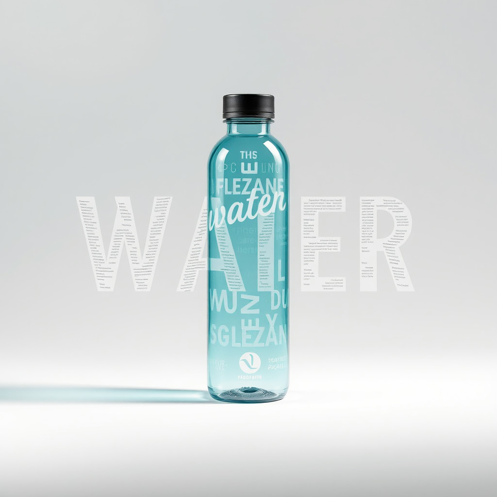
See the typografie style in real outputs
These examples were generated through the Magic Eraser AI Create API with the typografie style selected.
Prompt workflow
How to get a stronger typografie result
Beginne mit einem kurzen Wort oder einer Botschaft und lege Schriftstil, Palette, Hintergrund und Komposition fest.
Erzeuge Varianten und vergleiche Buchstabenformen, Hierarchie, Kontrast und Freiraum.
Wähle die beste Komposition und ersetze generierte Schrift vor der Veröffentlichung durch exakten, editierbaren Text.
Prompt starters
- “Typografie-Posterkonzept für das Wort FOCUS, fette rote Sans-Serif-Buchstaben, weißer Hintergrund, dezenter Schatten”
- “Editoriales Typografie-Layout über Sommerreisen, geschichtete Papierbuchstaben, leuchtende Farbflächen”
- “Chrom-Typografie für ein Musikposter, dunkler Hintergrund, reflektierende Buchstaben, dramatisches Licht”
Style tips
- Behandle generierte Buchstaben als Gestaltungselement, nicht als fehlerfreien finalen Text.
- Kurze Wörter und einfache Kompositionen halten die Richtung klar.
- Füge Namen, Daten, Preise und Logos nach der Generierung separat hinzu.
Output planning checklist
- Decide the final placement before prompting: square post, vertical story, product insert, poster, thumbnail, or wide banner.
- Keep one primary subject and one visual mood so the typografie style has a clear job.
- Describe the background as simple, detailed, bright, dark, studio, outdoor, or textured instead of leaving it open-ended.
- Generate variations first, then edit the selected image for crop, cleanup, and export size.
When to choose this style
Choose typografie when the image needs a clear creative direction before production: an ad concept, a social visual, a character idea, a packaging mood, or a fast design draft. Choose another style if the final asset must look like a camera photo, preserve exact product color, or include precise typography.
For commercial work, treat the generated image as a starting point. Review details, remove distracting artifacts, add exact text separately, and export the final size from the editor.
FAQ
Can I edit the generated image?
Yes. Generate the image, then continue with cleanup, crop, background, and export tools in Magic Eraser.
Should I include exact text?
Use AI Create for the visual direction. Add exact text later with editable design tools for cleaner spelling and layout.
Is this style selected automatically?
The CTA opens AI Create with the typografie style parameter, and the app falls back safely if the option changes.