
AI Create style
Generator gambar tipografi AI
Buat konsep visual yang berpusat pada tipografi, dengan bentuk huruf, ritme tata letak, dan komposisi grafis sebagai pengarah gambar. Gunakan untuk arahan poster, grafis kutipan, album, merchandise, dan kampanye, lalu tambahkan teks akhir yang tepat di editor.
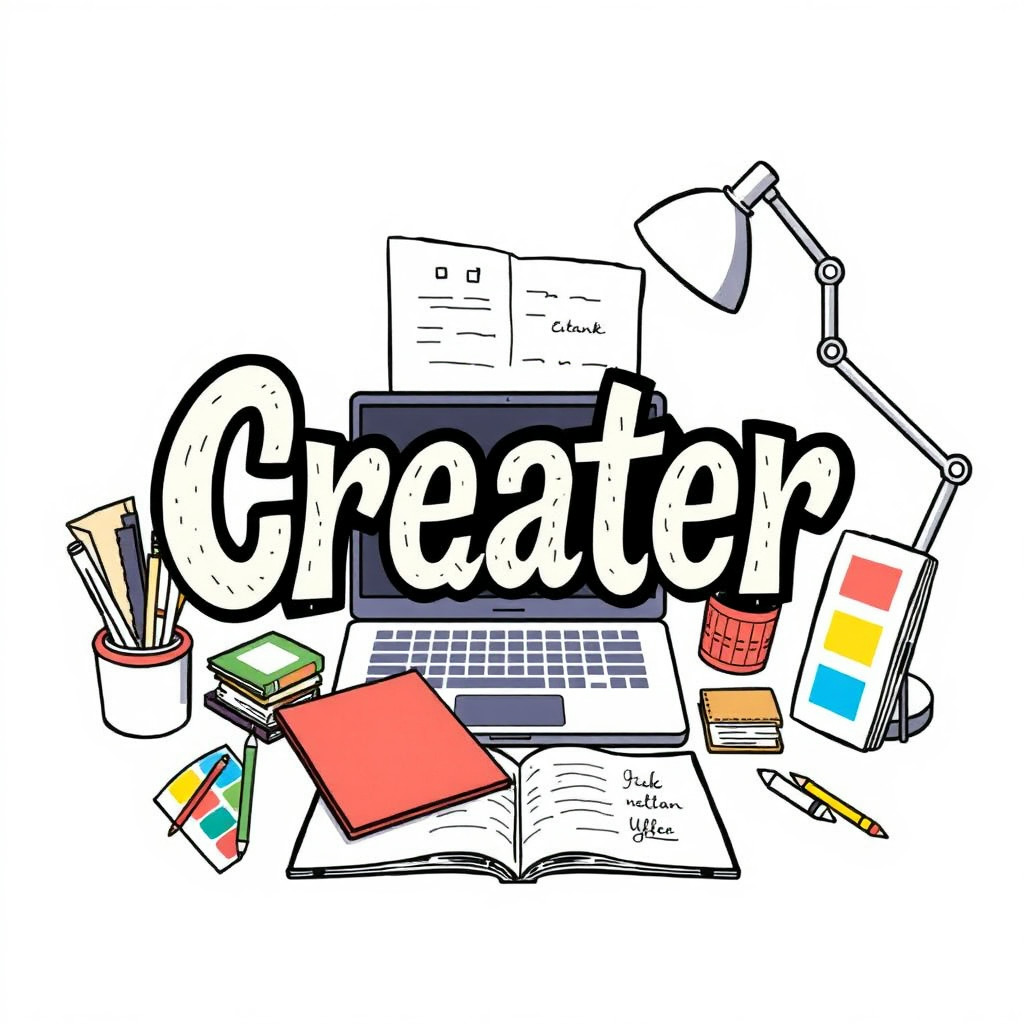
Use case
Konsep poster dan sampul dengan huruf sebagai fokus utama.
Use case
Grafis kutipan dan posting media sosial dengan lettering ekspresif.
Use case
Arah visual untuk merchandise, acara, dan kampanye.
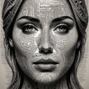
Visual direction preview
Use the style thumbnail as the creative target
The preview gives users a concrete reference for color, texture, edge detail, and mood before they open the generator. Pair it with the prompt starters below to keep the page useful instead of only decorative.
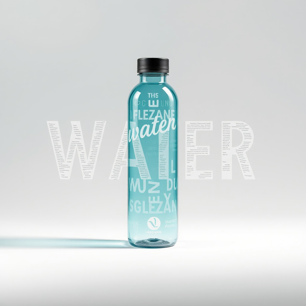
Generated examples
See the tipografi style in real outputs
These examples were generated through the Magic Eraser AI Create API with the tipografi style selected.
Prompt workflow
How to get a stronger tipografi result
Mulai dengan kata atau pesan singkat, lalu tentukan gaya huruf, palet, latar, dan komposisi.
Buat beberapa variasi dan bandingkan bentuk huruf, hierarki visual, kontras, dan ruang kosong.
Pilih komposisi terbaik, lalu ganti huruf hasil generasi dengan teks yang tepat dan dapat diedit sebelum diterbitkan.
Prompt starters
- “Konsep poster tipografi untuk kata FOCUS, huruf sans-serif merah tebal, latar putih bersih, bayangan halus”
- “Tata letak tipografi editorial tentang perjalanan musim panas, huruf kertas berlapis, blok warna cerah”
- “Konsep tipografi krom untuk poster acara musik, latar gelap, huruf reflektif, cahaya dramatis”
Style tips
- Perlakukan huruf hasil generasi sebagai elemen visual, bukan teks akhir yang akurat.
- Gunakan kata singkat dan komposisi sederhana agar arah desain tetap jelas.
- Tambahkan nama, tanggal, harga, dan logo yang tepat secara terpisah setelah generasi.
Output planning checklist
- Decide the final placement before prompting: square post, vertical story, product insert, poster, thumbnail, or wide banner.
- Keep one primary subject and one visual mood so the tipografi style has a clear job.
- Describe the background as simple, detailed, bright, dark, studio, outdoor, or textured instead of leaving it open-ended.
- Generate variations first, then edit the selected image for crop, cleanup, and export size.
When to choose this style
Choose tipografi when the image needs a clear creative direction before production: an ad concept, a social visual, a character idea, a packaging mood, or a fast design draft. Choose another style if the final asset must look like a camera photo, preserve exact product color, or include precise typography.
For commercial work, treat the generated image as a starting point. Review details, remove distracting artifacts, add exact text separately, and export the final size from the editor.
FAQ
Can I edit the generated image?
Yes. Generate the image, then continue with cleanup, crop, background, and export tools in Magic Eraser.
Should I include exact text?
Use AI Create for the visual direction. Add exact text later with editable design tools for cleaner spelling and layout.
Is this style selected automatically?
The CTA opens AI Create with the tipografi style parameter, and the app falls back safely if the option changes.