
Como Criar um Efeito Cerâmica Otani com IA: Tutorial de Textura de Cerâmica Japonesa em Grande Escala
Aprenda a criar efeitos autênticos de cerâmica Otani em fotos usando IA. Tutorial passo a passo abordando o esmalte namako de pepino-do-mar, esmaltes marrom-ferro e a tradição monumental de grês de Tokushima, Shikoku.
SEO & Growth
Revisado por Magic Eraser Editorial ·
Índice
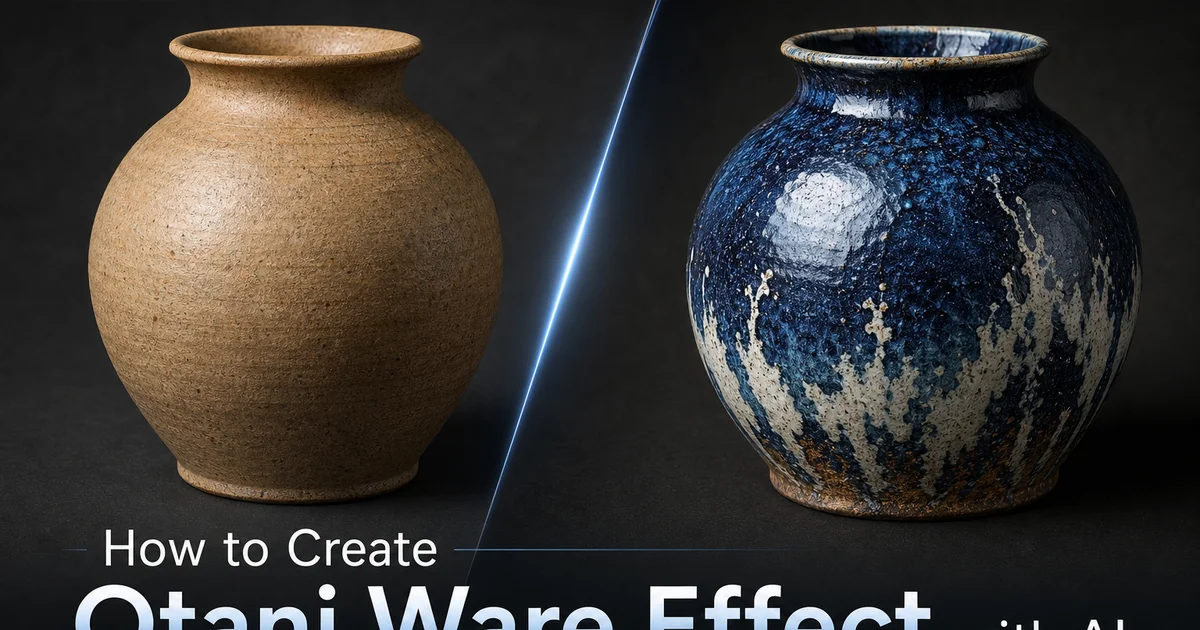
A cerâmica Otani é uma tradição cerâmica sediada no distrito de Otani em Naruto, Província de Tokushima, na ilha de Shikoku, especializada na produção de grês em grande escala desde o final do século XVIII, quando o senhor feudal local estabeleceu fornos para produzir potes de armazenamento de anil para a próspera indústria de tingimento de anil da região. A Província de Awa — o nome histórico de Tokushima — era a maior produtora japonesa de corante anil. Os enormes tanques de cerâmica necessários para fermentar folhas de anil exigiam uma tradição cerâmica capaz de produzir vasos em uma escala que poucos outros fornos japoneses tentavam. Esta origem industrial deu à cerâmica Otani sua característica definidora: tamanho imenso. Enquanto a maioria das tradições cerâmicas japonesas se concentra em louças de mesa, utensílios para cerimônia do chá ou objetos decorativos de dimensões modestas, os oleiros Otani produziam rotineiramente vasos com mais de um metro de altura que exigiam duas ou mais pessoas para serem levantados.
A identidade visual da cerâmica Otani é dominada por seus esmaltes dramáticos, principalmente o icônico namako-yu. Literalmente esmalte de pepino-do-mar — que produz um impressionante azul mosqueado que vai do cobalto profundo ao turquesa brilhante, dependendo da espessura do esmalte, da temperatura de queima e do teor de ferro do corpo de argila subjacente. Nas grandes superfícies verticais dos vasos Otani, o esmalte namako desenvolve efeitos visuais dramáticos à medida que a gravidade puxa o esmalte fundido para baixo durante a queima. Acumulações espessas em superfícies horizontais, escorrimentos finos descendo pelas paredes verticais e a transição gradual do azul opaco onde o esmalte é espesso ao turquesa translúcido onde se adelgaça, revelando a argila marrom e quente subjacente. O esmalte de ferro em tons ricos de vermelho-acastanhado a chocolate é aplicado junto ao azul, criando ousadas composições bicolores onde os esmaltes contrastantes se encontram em linhas de demarcação dramáticas que enfatizam a forma monumental do vaso.
As ferramentas de edição de fotos com IA podem reproduzir a estética da cerâmica Otani em imagens digitais, aplicando a sensação de escala monumental, o dramático azul namako e os esmaltes marrom-ferro. A qualidade de superfície de grês pesado da celebrada tradição cerâmica de grande formato de Tokushima. O efeito é ousado e dramático em vez de sutil. Funciona introduzindo fortes contrastes de cor azul-marrom, texturas superficiais pesadas sugerindo paredes espessas de grês e o característico movimento do esmalte que se desenvolve quando o vidro fundido flui por altas superfícies verticais sob a gravidade. O resultado evoca a impressionante presença física de vasos cerâmicos feitos para uso industrial em uma escala que transforma cerâmica funcional em peças arquitetônicas de destaque.
- Aplique a textura do corpo de grês pesado Otani — espessa, densa e estruturalmente robusta, comunicando o peso físico de vasos que excedem um metro de altura.
- Adicione efeitos de esmalte namako de pepino-do-mar — azul mosqueado de cobalto a turquesa com variação orgânica de acumulações espessas, escorrimentos gravitacionais e translucidez nas bordas finas.
- Inclua o esmalte marrom-ferro (tetsu-yu) em tons ricos de vermelho-acastanhado a chocolate, criando ousados contrastes bicolores em linhas de demarcação dramáticas com o esmalte azul.
- Enfatize a escala monumental através de escorrimentos espessos de esmalte, gotejamentos gravitacionais e a qualidade superficial robusta do grês de produção em grande escala em comparação com a louça refinada.
- Exporte em PNG ou WebP com qualidade 87+ para preservar a intensidade do azul namako — os azuis cobalto são sensíveis à compressão e mudam significativamente no mapeamento de gama CMYK para impressão.
Compreendendo a cerâmica Otani e sua herança cerâmica em escala industrial
A escala da produção cerâmica Otani não é meramente grande, mas genuinamente monumental pelos padrões cerâmicos. Os tradicionais vasos grandes — ookame (grandes potes) usados para fermentação de anil, armazenamento de água e produção de missô — eram formados usando uma técnica chamada nerokuro, onde dois oleiros trabalham simultaneamente em lados opostos de uma roda massiva, construindo as paredes do vaso por enrolamento e torneamento em estágios ao longo de vários dias, enquanto cada seção seca parcialmente antes que a próxima seja adicionada acima dela. Um único pote Otani grande poderia exigir uma semana de trabalho intermitente de modelagem, com o oleiro retornando cada dia para adicionar outra seção ao vaso em crescimento. Este método de construção produz linhas de junção horizontal visíveis na superfície externa. Marcas estruturais que os oleiros Otani não tentam disfarçar, mas aceitam como parte da estética produtiva, e ao longo das quais os esmaltes se acumulam para criar faixas horizontais características.
A queima da cerâmica Otani em grande escala exigia a construção de enormes noborigama (fornos ascendentes) construídos nas colinas do distrito de Otani, alguns se estendendo por mais de cinquenta metros de comprimento com múltiplas câmaras de altura crescente. Estes fornos ascendentes exploravam a tiragem natural criada pelo calor subindo através das câmaras ascendentes para atingir as altas temperaturas de grês necessárias para vitrificar as espessas paredes de argila dos grandes vasos. O processo de queima durava vários dias e consumia enormes quantidades de lenha, e o calor intenso e sustentado dentro das câmaras do forno produzia condições variáveis — flutuações entre oxidação e redução, variação localizada de temperatura e depósitos de cinzas de madeira — que influenciavam os efeitos do esmalte em cada peça. A posição dentro do forno determinava se o azul namako queimava para cobalto ou turquesa, se os esmaltes de ferro tornavam-se avermelhados ou chocolate e quanto o esmalte escorria nas superfícies verticais.
O declínio da indústria do anil no final do século XIX e início do século XX forçou os oleiros Otani a adaptar suas habilidades monumentais a novos mercados. A tradição migrou de vasos de armazenamento industrial para grandes vasos de jardim, elementos cerâmicos arquitetônicos, vasos decorativos e peças de destaque para espaços públicos e comerciais. Aplicações onde a escala impressionante e os esmaltes dramáticos da cerâmica Otani encontraram públicos apreciativos além dos agricultores de anil que haviam sido os clientes originais. Esta adaptação preservou a identidade central da tradição — produção em grande escala, esmaltes ousados, construção robusta — enquanto a redirecionava para mercados estéticos e arquitetônicos que valorizavam o drama visual que os fabricantes de cerâmica industrial haviam originalmente desenvolvido para fins puramente funcionais.
- A técnica de formação nerokuro constrói vasos monumentais em estágios ao longo de vários dias. Linhas de junção horizontal visíveis tornam-se características de design ao longo das quais os esmaltes se acumulam para criar faixas características.
- Fornos ascendentes com mais de cinquenta metros queimavam vasos por dias — a posição no forno determinava se o azul namako queimava para cobalto ou turquesa e quão dramaticamente os esmaltes escorriam nas superfícies verticais.
- O declínio da indústria do anil forçou a adaptação de potes de armazenamento industrial para vasos de jardim, cerâmicas arquitetônicas e peças decorativas de destaque — preservando a identidade de escala monumental.
- A identidade central de Otani — produção em grande escala, esmaltes ousados, construção robusta — permaneceu constante mesmo enquanto os mercados mudavam do uso industrial funcional para aplicações arquitetônicas e estéticas.
Aplicando efeitos de esmalte azul namako e esmalte marrom-ferro com IA
O efeito do esmalte namako é a assinatura visual de Otani e requer simulação digital cuidadosa porque o azul não é uniforme, mas elaboradamente mosqueado e dependente da profundidade. Na cerâmica Otani real, o esmalte namako adquire seu caráter mosqueado através da separação de fases dentro do vidro fundido durante a queima. Os componentes do esmalte separam-se em regiões ricas em ferro e pobres em ferro a nível molecular, criando padrões orgânicos semelhantes a nuvens de azul mais claro e mais escuro que lembram a pele texturizada de um pepino-do-mar. Onde o esmalte é mais espesso (em áreas horizontais acumuladas e reentrâncias internas), o azul é profundo e opaco, aproximando-se do cobalto. Onde se adelgaça (em superfícies verticais onde a gravidade puxou o esmalte para baixo, na borda, nas extremidades), o azul torna-se turquesa translúcido. Nos extremos mais finos, o marrom quente da argila subjacente brilha através da fina película azul.
O esmalte de ferro na cerâmica Otani serve tanto como tratamento de superfície independente quanto como parceiro de contraste dramático para o azul namako. Aplicado em pinceladas espessas e ousadas ou derramado sobre porções do vaso, o esmalte de ferro queima numa gama que vai do vermelho-acastanhado quente (onde mais fino e mais oxidado) ao chocolate-preto profundo (onde espesso e mais reduzido). A linha de encontro entre o azul namako e o marrom-ferro é uma das características visualmente mais marcantes da cerâmica Otani. Uma demarcação nítida onde duas cores muito diferentes compartilham uma única superfície, frequentemente com uma estreita zona de transição onde os esmaltes se sobrepõem e criam tons intermediários de oliva ou verde-escuro. A IA deve posicionar esta linha de demarcação ao longo de uma forte divisão composicional na imagem de origem, usando o contraste azul-marrom para reforçar a estrutura visual natural da imagem.
O comportamento do esmalte nas grandes superfícies verticais Otani cria efeitos visuais únicos da cerâmica de grande formato. A tração gravitacional sobre o esmalte fundido durante a queima é proporcional à altura da superfície vertical, e num vaso de um metro de altura, o esmalte no topo pode ser substancialmente mais fino do que o esmalte acumulado na base. Criando um gradiente vertical do turquesa fino no ombro ao cobalto espesso no pé. Linhas de escorrimento e marcas de gotejamento onde fluxos individuais de esmalte escorreram para baixo criam ousadas listras verticais dentro do campo mosqueado geral. Estes efeitos gravitacionais do esmalte devem ser mapeados no eixo vertical da imagem de origem, com a IA criando tons azuis mais claros e finos nas porções superiores e tons azuis progressivamente mais profundos e espessos em direção à base, reforçando a sensação de peso físico e força gravitacional que define a estética monumental Otani.
- O azul namako adquire seu caráter mosqueado através da separação de fases em escala molecular — padrões de nuvens de cobalto mais profundo em áreas espessas transitando para turquesa translúcido onde o esmalte adelgaça.
- O esmalte marrom-ferro varia do vermelho-acastanhado quente ao chocolate-preto, criando linhas de demarcação dramáticas onde encontra o azul namako — frequentemente com zonas de transição oliva ou verde-escuro.
- Gradientes gravitacionais do esmalte em altas superfícies verticais criam turquesa fino nos ombros transitando para cobalto espesso nas bases, com linhas de escorrimento vertical como ousadas listras de acento.
- A linha de demarcação azul-marrom deve reforçar a estrutura composicional da imagem de origem — o contraste visual mais forte colocado ao longo da divisão composicional mais forte.
Correção de cor para a paleta monumental Otani
A paleta de cores Otani é mais ousada e de maior contraste do que a maioria das tradições cerâmicas japonesas que tendem a tons de terra suaves e variação sutil de esmalte. O azul namako em seu desenvolvimento máximo é um cobalto vívido que não estaria fora de lugar numa pintura de azulejo de Delft ou numa tradição cerâmica mediterrânea. Um azul com verdadeiro impacto visual que exige atenção. Combinado com o vermelho-acastanhado quente do esmalte de ferro e o marrom-claro do corpo de argila exposto, isto cria uma paleta de três tons com genuíno drama cromático. A correção de cor para o efeito Otani significa abraçar esta ousadia em vez de suavizá-la. Empurrar o azul para a saturação total de cobalto nas áreas de esmalte espesso, permitir que o marrom-ferro desenvolva seu calor avermelhado e manter contraste claro entre os três tons principais.
Dentro do campo azul namako, a variação interna — do cobalto através do azul médio ao turquesa até o marrom-através-do-azul das áreas mais finas — cria uma paleta secundária de tons frios que a IA deve reproduzir com atenção cuidadosa aos gradientes naturais da espessura do esmalte. A transição do espesso ao fino deve parecer orgânica e contínua em vez de escalonada ou em faixas, seguindo o comportamento fluido do vidro fundido fluindo através de uma superfície. O padrão mosqueado de separação de fases dentro do campo azul adiciona uma variação textural que opera numa escala diferente do gradiente de espessura. Pequenas manchas de nuvens de azul mais claro e mais escuro sobrepostas ao gradiente em grande escala do cobalto espesso ao turquesa fino. Ambas as escalas de variação devem estar presentes para que o efeito namako seja lido como autêntico em vez de como uma simples sobreposição de cor azul.
O corpo de argila exposto, visível em anéis de pé não esmaltados, no topo das bordas onde o esmalte foi removido antes da queima e em qualquer área de adelgaçamento extremo do esmalte, fornece a âncora neutra quente que fundamenta os dramáticos esmaltes azul e marrom. Este tom de argila — um camurça quente a marrom médio dependendo das condições de queima — é o equivalente visual de uma moldura ou cartão de montagem, separando e definindo as áreas esmaltadas enquanto lembra ao observador o substrato material sob a superfície do esmalte. No efeito Otani digital, este tom de argila deve aparecer em áreas da imagem que representam bordas, limites e margens estruturais, criando espaço de respiro visual entre os intensos campos azul e marrom que impede a paleta dramática de se tornar avassaladora.
- A paleta Otani é mais ousada que a cerâmica japonesa típica — azul cobalto vívido, vermelho-acastanhado ferro quente e corpo de argila camurça criam genuíno drama cromático em vez de tons de terra suaves.
- A variação do azul namako do cobalto ao turquesa opera em duas escalas — grandes gradientes de espessura do esmalte e mosqueado de separação de fases em pequena escala semelhante a nuvens sobreposto no interior.
- As transições do espesso ao fino devem parecer orgânicas e contínuas como vidro fundido fluindo — transições escalonadas ou em faixas são lidas como falsas em vez de comportamento natural do esmalte.
- O corpo de argila exposto nas bordas e limites fornece espaço de respiro neutro quente que separa e fundamenta as intensas áreas esmaltadas azul e marrom.
Aplicações criativas e exportação para a estética cerâmica monumental
O caráter ousado e dramático do efeito cerâmica Otani torna-o especialmente adequado para aplicações onde o impacto visual em grande escala importa. Visualização arquitetônica, projeto de jardins e paisagismo, branding para hotelaria e restauração e qualquer contexto de design onde a impressão de presença monumental agregue valor. O vívido azul namako é arquitetonicamente marcante de uma forma que referências cerâmicas mais suaves não conseguem alcançar, tornando imagens tratadas com Otani eficazes para inspiração em azulejos e materiais de superfície, projeto de piscinas e elementos aquáticos e a estética do jardim japonês onde grandes vasos cerâmicos servem como pontos focais que ancoram a paisagem natural. O contraste azul-marrom cria uma dinâmica quente-fria que funciona através das estações, com o azul lendo como refrescante em contextos de verão e o marrom-ferro fornecendo calor em aplicações de outono e inverno.
Para branding e marketing no setor casa e jardim, o efeito Otani comunica escala, qualidade e aquele tipo de confiança decorativa ousada que distingue produtos premium de concorrentes cautelosos de tons neutros. Uma marca de vasos de jardim, um fabricante de azulejos ou uma empresa de cerâmicas arquitetônicas pode usar a estética Otani para sinalizar imediatamente uma identidade de produto vibrante, substancial e enraizada numa herança artesanal genuína. O azul namako é também comercialmente distintivo — ocupa uma posição única entre o familiar cobalto da porcelana chinesa azul-e-branca e o turquesa das tradições mediterrânea e do Oriente Médio, oferecendo um azul reconhecidamente diferente e culturalmente específico ao contexto artesanal japonês.
A exportação para efeitos de cerâmica Otani deve focar na fidelidade do azul namako, que é tanto o elemento visualmente mais importante quanto o mais tecnicamente exigente para preservar através de formatos de saída. PNG é fortemente recomendado para arquivos mestre porque a compressão sem perdas preserva o gradiente azul completo sem introduzir os artefatos de bandeamento que a compressão com perdas cria em canais azuis. WebP com qualidade 87 ou superior é aceitável para entrega web, embora a compressão do canal azul deva ser verificada no tamanho de exibição real. Para impressão, o mapeamento de gama CMYK frequentemente dessatura azuis vívidos. O cobalto namako pode cair parcialmente fora da gama CMYK imprimível, exigindo soft-proofing cuidadosa e possivelmente uma tinta azul spot suplementar para reprodução precisa em materiais impressos de alta qualidade.
- Aplicações arquitetônicas, paisagísticas e de hotelaria beneficiam do drama monumental Otani — o vívido azul namako cria impacto visual que referências cerâmicas suaves não conseguem alcançar.
- Branding para casa, jardim e cerâmicas arquitetônicas ganha ousada confiança decorativa e especificidade cultural — o azul namako é distintamente japonês e comercialmente memorável.
- PNG é fortemente recomendado para arquivos mestre — a compressão com perdas do canal azul cria artefatos de bandeamento que degradam o gradiente crítico do esmalte namako.
- A impressão CMYK pode dessaturar azuis cobalto vívidos — faça soft-proofing cuidadosa e considere tinta azul spot suplementar para reprodução precisa do namako em materiais impressos premium.
How to do it
- 1
Select a source image with bold scale and strong architectural or landscape presence
Otani ware is famous for its monumental scale. The tradition specializes in enormous vessels including water jars exceeding one meter in height, massive planters, and colossal storage vessels produced on an industrial scale for centuries in Tokushima Prefecture on the island of Shikoku. Choose source photographs with a strong sense of scale, physical presence, and architectural weight. Landscape panoramas, architectural exteriors, large interior spaces, garden scenes, or industrial subjects. Images with bold composition and a grounded, substantial feel translate the Otani aesthetic most well because the tradition is at its core about the impressive scale and solid features of large ceramic forms rather than the intimate delicacy of smaller wares.
- 2
Apply the heavy stoneware body texture and monumental surface quality using AI Filter
Open the image in AI Filter and select a heavy stoneware or industrial ceramic texture preset. Otani ware has a thick, dense stoneware body made from local Awa clay. A robust material capable of withstanding the structural stresses of forming, drying, and firing vessels that may stand over a meter tall and weigh hundreds of kilograms. The AI applies a substantial, weighty texture. Thicker and more massive than typical tableware pottery, with the surface quality of clay shaped by both wheel and hand-building techniques at industrial scale. The texture should share physical weight and structural solidity, with the slight roughness of production stoneware rather than the refined smoothness of small-scale studio pottery.
- 3
Add the characteristic Otani glaze effects — namako blue and iron brown
Otani ware is distinguished by its bold, dramatic glazes, mainly the iconic namako-yu (sea cucumber glaze) that fires to a striking cobalt-to-turquoise blue with the mottled, organic texture of its namesake marine animal's skin. Apply AI Filter glaze effects that layer rich cobalt blue with warmer turquoise and green tones, allowing the glaze to pool, run. Mottle in ways that create the dramatic surface movement trait of namako glaze on large surfaces. Where the blue glaze thins at edges and vertical surfaces, it transitions to lighter turquoise and reveals the warm brown of the iron-bearing clay body beneath. Add areas of iron glaze (tetsu-yu) in rich reddish-brown to dark chocolate, often applied alongside the blue glaze to create bold two-tone color contrasts.
- 4
Refine the monumental scale feel and dramatic glaze interaction details
Use AI Enhance to emphasize the visual elements that share the monumental scale of Otani ware. The bold contrast between namako blue and iron brown glazes meeting in dramatic demarcation lines, the thick glaze runs and drips that develop on tall vertical surfaces where gravity pulls the molten glaze downward during firing, and the robust surface qualities that distinguish large-scale production pottery from refined tableware. Add the trait glaze crawling and crazing that occurs when thick glaze coatings on large surfaces cool and contract, creating fine networks of cracks that catch the light and add surface texture. The overall impression should be of impressive scale, dramatic color. The confident, practiced craftsmanship of potters working at an industrial scale within a centuries-old tradition.
- 5
Export the finished Otani ware image preserving the dramatic glaze colors
Save in PNG format to preserve the full range of the namako blue glaze. From deep cobalt in thick pooled areas through turquoise at medium thickness to the warm clay body showing through at thin edges. For web use, WebP at quality 87 or higher maintains the blue-brown color contrast and the mottled glaze texture. The critical export consideration for Otani ware effects is keeping the vivid blue tones that define the namako glaze. Blues are notoriously difficult in JPEG compression, and aggressive compression can introduce visible banding in the blue channel. For print applications like garden center catalogs, architectural material references, or Japanese craft publications, export at 300 DPI and verify that the CMYK conversion preserves the namako blue's intensity, as cobalt blues can shift greatly in the RGB-to-CMYK gamut mapping.
Fontes
- Otani Ware: The Large-Scale Pottery Tradition of Tokushima Prefecture — Tokushima Prefectural Government — Traditional Crafts Division
- Indigo and Iron: The Material Culture of Awa Province Ceramic Production — Journal of the American Ceramic Society
- Climbing Kiln Traditions and Large-Format Stoneware in Shikoku Ceramics — Tokyo National Museum