
Como Criar um Efeito Neon Glow com IA — Magic Eraser
Adicione efeitos realistas de luz neon e brilho a qualquer fotografia usando IA. Guia completo abordando seleção de cores, intensidade do brilho, simulação de dispersão de luz e exportação para aplicações digitais e impressas.

Product Marketing
Revisado por Magic Eraser Editorial ·
Índice
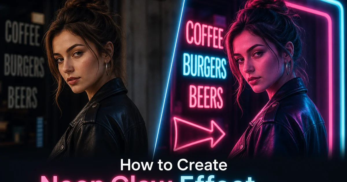
A luz neon tem uma qualidade visual que nenhuma outra fonte de luz replica. Os tubos de descarga de gás que iluminam vitrines, lanchonetes e ruas de cidades desde os anos 1920 produzem um brilho característico: um núcleo branco superexposto cercado por um halo colorido que se espalha na escuridão circundante, projetando luz colorida em cada superfície próxima. Esse brilho se tornou uma das marcas estéticas mais distintas na fotografia, cinema e arte digital, associado à vida noturna urbana, retrofuturismo, estética cyberpunk e à atmosfera peculiar das cidades após o anoitecer. A fotografia neon real exige estar no lugar certo na hora certa com as condições certas: escuridão ao redor, pavimento molhado para reflexos e letreiros de neon funcionando — cada vez mais raros à medida que substituições por LED tomam conta.
Recriar digitalmente efeitos de brilho neon tem sido, no passado, complexo e demorado. No Photoshop, um efeito neon convincente requer várias camadas: uma camada de forma central com preenchimento branco ou quase branco, uma camada de brilho interno com cor saturada, uma camada de brilho externo com raio maior e opacidade menor, uma camada de bloom separada criada duplicando e aplicando desfoque gaussiano ao brilho, e camadas de dispersão de luz ambiental que pintam iluminação colorida nas superfícies que seriam atingidas pela luz. Acertar a curva de decaimento — a taxa na qual o brilho diminui com a distância da fonte — requer ajustes manuais nos modos de mesclagem e curvas de opacidade. Um único elemento de texto neon pode levar de vinte a trinta minutos para ser construído de forma convincente. Adicionar interação ambiental dobra o tempo.
Os efeitos de brilho neon com IA comprimem todo esse fluxo de trabalho em alguns ajustes. A IA entende a física das fontes de luz emissivas: como a luz decai com a distância seguindo uma relação de lei do inverso do quadrado, como reflete de forma diferente em superfícies foscas versus brilhantes, como interage com neblina e umidade ambiente para criar bloom, e como se mistura com outras fontes de luz na cena. Este guia aborda o processo completo de adicionar brilho neon a fotografias, desde a seleção das imagens de origem certas até a calibração de cor e intensidade, passando pela dispersão crítica de luz ambiental que separa uma sobreposição plana de brilho de um efeito de iluminação neon convincente.
- O brilho neon com IA imita a física real dos tubos de descarga de gás: núcleo branco superexposto, halo colorido com decaimento de lei do inverso do quadrado e dispersão de luz ambiental em superfícies próximas — em uma única aplicação de filtro.
- Fotografias escuras ou em low-key fornecem o contraste necessário para um brilho neon convincente — quanto mais profundas as sombras ao redor, mais vívido e realista o efeito aparece.
- A dispersão de luz ambiental é o que separa um efeito neon convincente de uma sobreposição plana de cor — a iluminação colorida em paredes, pele, pavimento molhado e objetos vende a ilusão de uma fonte de luz real.
- A seleção de cor neon deve corresponder à temperatura de cor da cena — azuis e cianos frios para ambientes modernos, rosas e âmbares quentes para atmosferas retrô ou vintage.
- A saída de impressão CMYK não consegue reproduzir toda a gama vívida das cores neon na tela — compense com aumento de contraste entre brilho e fundo para materiais impressos.
A física do brilho neon e por que ele tem essa aparência
Entender por que o brilho neon tem sua qualidade visual característica ajuda você a criar recriações digitais mais convincentes. Um tubo de neon contém gás de baixa pressão — neônio para vermelho-alaranjado, argônio com mercúrio para azul, combinações com revestimentos de fósforo para outras cores — através do qual uma corrente elétrica passa. Os átomos de gás excitados emitem fótons em comprimentos de onda específicos, produzindo luz altamente saturada com uma pureza espectral que fontes de amplo espectro como lâmpadas incandescentes e LEDs não conseguem igualar. Essa pureza espectral é a razão pela qual as cores neon parecem tão vívidas e pela qual cenas iluminadas por neon têm uma qualidade de cor que parece diferente de cenas iluminadas por qualquer outra fonte.
A estrutura do brilho de um tubo de neon tem três zonas distintas. O núcleo do tubo aparece branco ou quase branco porque a intensidade da luz naquele ponto superexpõe qualquer sensor fotográfico ou sobrecarrega as células cônicas do olho, empurrando todos os três canais de cor ao máximo. Imediatamente ao redor do núcleo está um halo saturado onde a verdadeira cor do tubo é visível — esta é a zona onde a intensidade da luz caiu abaixo da superexposição, mas permanece brilhante o suficiente para se registrar como cor vívida. Além do halo, o brilho continua a desaparecer seguindo uma relação aproximadamente de inverso do quadrado com a distância, tornando-se uma lavagem suave e colorida que tinge as superfícies próximas. As condições atmosféricas afetam muito esta terceira zona: umidade no ar, neblina, chuva e até fumaça de cigarro dispersam a luz e expandem o bloom do brilho, e é por isso que o neon parece mais espetacular em noites úmidas e nebulosas.
Quando a luz de uma fonte neon atinge uma superfície, a interação depende do material da superfície. Superfícies brilhantes — pavimento molhado, pintura de carro, metal polido, vidro — produzem reflexões especulares que concentram a cor neon em pontos e listras brilhantes, criando a estética característica do neon refletido na chuva. Superfícies foscas — paredes de tijolo, concreto, roupas, pele — produzem reflexões difusas que espalham a luz colorida uniformemente pela superfície, criando uma lavagem colorida sem pontos brilhantes. Entender esses tipos de interação ajuda você a avaliar se a dispersão de luz ambiental da IA parece fisicamente plausível. Se você vir reflexos coloridos concentrados no que deveria ser uma parede fosca, o efeito precisa de ajuste.
- Tubos de neon emitem luz espectralmente pura em comprimentos de onda específicos, produzindo saturação de cor que fontes LED e incandescentes de amplo espectro não conseguem igualar.
- O brilho tem três zonas: um núcleo branco superexposto, um halo colorido saturado e uma lavagem suave de decaimento que tinge superfícies próximas seguindo declínio de brilho de lei do inverso do quadrado.
- Umidade atmosférica, neblina e partículas dispersam a luz neon e expandem o bloom — condições úmidas e nebulosas produzem a fotografia neon mais dramática.
- Superfícies brilhantes produzem reflexões especulares concentradas enquanto superfícies foscas produzem lavagem de cor difusa — a IA deve respeitar essa distinção ao aplicar dispersão ambiental.
Escolhendo fotos de origem e preparando fundos escuros
A eficácia de um efeito de brilho neon depende mais da fotografia de origem do que de qualquer configuração no próprio filtro. O brilho neon é definido pelo contraste: luz emissiva brilhante contra fundo escuro — e se a foto de origem não tem áreas escuras, o brilho não tem nada contra o que contrastar e parece uma tonalidade plana de cor em vez de uma fonte de luz. As fotos de origem ideais para efeitos neon são cenas noturnas, interiores mal iluminados, paisagens urbanas ao crepúsculo onde o céu ficou azul escuro, retratos com roupas e fundos escuros. Qualquer imagem onde pelo menos sessenta a setenta por cento do quadro esteja em sombra ou escuridão.
Ao trabalhar com uma foto que tem o assunto certo mas as condições de iluminação erradas — um retrato diurno, um interior bem iluminado — você pode criar uma base compatível com neon escurecendo a imagem e modificando o fundo. Use o Background Eraser para substituir fundos brilhantes por um gradiente escuro. Depois use o AI Enhance para reduzir a exposição geral em um a dois pontos, trazendo a imagem para a faixa low-key onde o brilho neon será lido como luminoso. Preserve algum detalhe ambiente na cena em vez de ir para o preto puro: uma sugestão de arquitetura urbana, móveis de interior ou características da paisagem nas sombras dá ao brilho neon superfícies para interagir e ancora a fonte de luz em um cenário físico.
A posição do assunto em relação à fonte neon pretendida é importante para a credibilidade da dispersão de luz. Se você planeja adicionar brilho neon ao lado esquerdo do quadro, o assunto deve ter o lado esquerdo ligeiramente mais iluminado ou estar posicionado em um ângulo onde a iluminação do lado esquerdo faça sentido. Se a foto existente tem o assunto iluminado pela direita mas você adiciona brilho neon à esquerda, o conflito de iluminação parecerá fisicamente errado mesmo que o espectador não consiga articular o porquê. Pense na direção da luz antes de colocar elementos neon e escolha fotos de origem onde a iluminação existente seja compatível com o posicionamento pretendido do brilho.
- O brilho neon requer pelo menos sessenta a setenta por cento do quadro em sombra ou escuridão para o contraste que faz o efeito ser lido como luz luminosa.
- O Background Eraser e a redução de exposição podem converter fotos brilhantes em bases compatíveis com neon — preserve algum detalhe de sombra ambiente para interação ambiental.
- A direção da luz na foto de origem deve ser compatível com o posicionamento do neon — adicionar brilho pela esquerda quando o assunto está iluminado pela direita cria um conflito fisicamente implausível.
- Ruas noturnas, interiores mal iluminados, paisagens urbanas ao crepúsculo e retratos com fundo escuro são os candidatos naturais mais fortes para efeitos de brilho neon.
Seleção de cores e a psicologia das paletas neon
A seleção de cor neon não é puramente estética: carrega associações emocionais e culturais que influenciam como o espectador percebe a imagem. Rosa choque e magenta evocam vida noturna, romance, energia e um certo perigo glamoroso associado a distritos de entretenimento urbano iluminados por neon. Azul elétrico e ciano parecem tecnológicos, limpos, futuristas — fortemente associados à estética cyberpunk e à linguagem visual da ficção científica. Verde neon carrega associações com computação retrô, estética Matrix, letreiros de farmácia — tem uma qualidade ligeiramente sinistra em alta intensidade. Âmbar quente e laranja parecem nostálgicos, acolhedores e vintage, evocando letreiros clássicos de lanchonetes e a estética americana dos anos 1950. Roxo neon fica entre a energia do rosa e a frieza do azul, conferindo uma qualidade etérea e onírica. Escolher a cor certa é escolher o tom emocional da imagem final.
A harmonia da temperatura de cor entre o brilho neon e a iluminação existente da cena afeta muito a credibilidade. Cores neon frias — azul, ciano, roxo — parecem mais naturais quando a cena ambiente tem um tom quente correspondente ou um tom frio neutro. Um brilho neon azul em uma cena iluminada por luz interna quente de tungstênio cria um contraste dramático de cor que se lê como duas fontes de luz concorrentes — é fisicamente autêntico e visualmente forte. Rosa choque em uma cena já tingida de rosa por luzes de rua de vapor de sódio pode parecer monocromático e sem graça. Os efeitos neon mais bem-sucedidos geralmente introduzem uma cor que corresponde ou é distintamente diferente da temperatura de cor da cena existente.
Para efeitos neon multicoloridos — usando duas ou três cores neon na mesma imagem — as cores devem ser análogas no círculo cromático para um brilho harmonioso ou complementares para máximo impacto visual. Rosa e ciano é a combinação cyberpunk clássica, ao mesmo tempo quente e fria. Azul e laranja cria uma divisão de alto contraste que é naturalmente forte porque espelha a relação entre fogo e céu. Evite combinar mais de três cores neon em uma única imagem porque cada cor extra aumenta a complexidade visual e a cena começa a parecer uma boate em vez de uma composição propositalmente projetada.
- Rosa choque evoca vida noturna e energia, azul elétrico parece futurista e limpo, verde tem associações retrô-tech, âmbar quente soa nostálgico e acolhedor.
- A cor neon deve contrastar ou complementar a temperatura de iluminação existente da cena — introduzir uma cor distintamente diferente cria o efeito mais convincente e fisicamente autêntico.
- Combinações de cores neon análogas produzem brilho harmonioso enquanto pares complementares — rosa e ciano, azul e laranja — criam impacto visual de alto contraste.
- Limite o neon multicolorido a no máximo três cores para manter a intenção composicional em vez de criar ruído visual avassalador.
Dispersão de luz ambiental: o detalhe que define o realismo
A diferença mais importante entre um efeito neon convincente e uma sobreposição de brilho barata é a dispersão de luz ambiental: a iluminação colorida que a fonte neon projeta em tudo ao seu redor. A luz real não existe isoladamente. Um letreiro de neon na fachada de um edifício colore a calçada abaixo dele, a parede de tijolos atrás, o carro estacionado ao lado e os rostos das pessoas que passam por ele. Se o seu brilho neon flutua na imagem sem afetar nada ao redor, o cérebro do espectador o registra como decorativo em vez de real. O efeito parece um adesivo colocado sobre a fotografia, não luz que existe dentro da cena.
A iluminação ambiental com IA do Magic Eraser analisa a geometria da cena: identifica superfícies, estima sua distância da fonte de brilho, determina seu ângulo em relação à direção da luz e avalia suas propriedades de material para aplicar as reflexões especulares ou difusas corretas. Um rosto próximo à fonte neon recebe forte iluminação colorida no lado próximo com um rápido decaimento para iluminação ambiente no lado distante, criando o visual clássico de retrato meio-iluminado. Uma rua molhada reflete a cor neon em listras alongadas que seguem a perspectiva do pavimento em direção ao espectador. Uma parede áspera de tijolos recebe uma lavagem de cor difusa e suave que desvanece com a distância. Cada interação de superfície é calculada com base na compreensão da IA de como a luz se comporta fisicamente.
A intensidade da dispersão de luz ambiental deve ser calibrada cuidadosamente. Pouca dispersão e o neon parece desconectado da cena. Dispersão demais e a cena parece lavada com um filtro colorido em vez de iluminada por uma fonte específica. A referência de calibração chave é o tom de pele. Se a imagem inclui uma pessoa perto da fonte neon, a dispersão colorida em sua pele deve estar claramente visível mas não deve sobrepujar a cor natural da pele. Você deve ser capaz de ver que a pele é rosa, quente, escura ou clara através da tonalidade neon, não apenas ver a cor neon pintada sobre uma superfície sem características. Comece com intensidade moderada e reduza em vez de aumentar. Dispersão demais é um erro mais comum do que dispersão de menos.
- A dispersão de luz ambiental é o indicador crítico de realismo — brilho neon sem interação com superfícies é lido como sobreposição decorativa, não como fonte de luz dentro da cena.
- A IA calcula a dispersão com base na distância da superfície, ângulo e propriedades do material — reflexões especulares em superfícies brilhantes, lavagem difusa em superfícies foscas.
- Calibre a intensidade da dispersão usando o tom de pele como referência — a tonalidade neon deve ser visível mas não deve sobrepujar a cor natural da pele por baixo.
- Intensidade moderada com redução cuidadosa é a abordagem mais segura — dispersão demais é um erro mais comum do que dispersão de menos e faz a imagem parecer filtrada por cor em vez de iluminada por neon.
Aplicações criativas e combinação do neon com outros efeitos
Os efeitos de brilho neon vão além da simples adição de luz em uma variedade de aplicações criativas. A sobreposição de texto neon coloca letras ou palavras brilhantes em uma cena como se fossem letreiros físicos de neon, útil para citações em redes sociais, anúncios de eventos e conteúdo de marca. A IA renderiza o texto com a espessura correta do tubo, decaimento do brilho e interação com a superfície, incluindo sombras projetadas pela estrutura do tubo de vidro e a dispersão de luz colorida que o texto projeta nas superfícies circundantes. Para máxima credibilidade, posicione o texto neon em uma superfície que possa plausivelmente suportar um letreiro: uma parede, uma janela, acima de uma porta — em vez de flutuando no espaço vazio.
Combinar brilho neon com outros efeitos de IA produz combinações criativas que seriam complexas de alcançar manualmente. Um efeito neon sobreposto a uma foto que foi convertida para uma base de preto e branco de alto contraste cria um pop de cor seletiva onde a única cor na imagem vem do brilho neon e sua dispersão ambiental. Esta técnica é eficaz para retratos dramáticos e cenas urbanas. Adicionar brilho neon a uma foto que foi processada com o efeito de grão de filme vintage cria uma estética retrofuturista que mescla imperfeição analógica com precisão digital do neon. Uma sobreposição de chuva ou gotas de água combinada com brilho neon cria o visual clássico de rua encharcada de chuva e neon sem exigir chuva real durante a sessão de fotos.
Para aplicações de redes sociais e marketing, os efeitos de brilho neon têm altas taxas de engajamento porque as cores vívidas e o alto contraste atraem imediatamente a atenção em um feed de rolagem. Imagens tratadas com neon sempre superam opções com iluminação plana para captura de atenção, principalmente em interfaces de modo escuro onde o brilho se destaca enormemente contra o fundo preto da interface do usuário. Fotos de produto com brilho neon de acento vendem a associação do produto com vida noturna, energia e estilo de vida premium sem exigir um cenário de sessão de fotos realmente iluminado por neon. Promoções de eventos com efeitos de texto neon parecem energéticas e premium. A chave é a moderação: um elemento neon bem posicionado é mais eficaz do que cobrir a imagem inteira com brilho.
- A sobreposição de texto neon renderiza letras brilhantes com espessura de tubo, decaimento e interação com superfície — posicione em superfícies plausíveis como paredes ou janelas para credibilidade.
- Combinar brilho neon com conversão para preto e branco cria pop de cor seletiva onde a única cor na imagem vem da fonte neon e sua dispersão.
- Imagens tratadas com neon têm alto engajamento em interfaces de redes sociais em modo escuro onde o brilho vívido se destaca dramaticamente contra fundos pretos da interface.
- Moderação é fundamental — um elemento neon bem posicionado captura mais atenção e é visualmente mais eficaz do que cobrir a imagem inteira com efeitos de brilho.
How to do it
- 1
Choose a photograph with a dark or low-key background for maximum glow contrast
Neon glow effects depend on contrast between bright emissive elements and dark surroundings to look convincing. Select a photo with a naturally dark background. Nighttime street scenes, dimly lit interiors, portraits with dark backdrops, or twilight cityscapes. If your source photo has a bright background, consider using Background Eraser to replace it with a dark gradient before applying glow effects. The deeper the shadows surrounding the glow source, the more vivid and realistic the neon effect will appear.
- 2
Apply the neon glow filter and select your primary color
Open AI Filter and select the neon glow effect preset. Choose your primary neon color — classic options include hot pink, electric blue, cyan, purple, green. Warm amber that mimics vintage neon signage. The AI identifies edges, contours, and structural elements in the image and applies the glow along these features. Adjust the glow width to control how far the light bleeds from the source element. Narrow width creates a tight, precise tube-light look, while wide width creates an mood ambient glow that illuminates surrounding surfaces.
- 3
Adjust glow intensity and light falloff behavior
The intensity slider controls the brightness of the glow core. The brightest point at the center of each neon element. At lower intensity, the glow appears as subtle colored lighting on existing scene elements. At higher intensity, the glow core overexposes to near-white with color visible only in the falloff halo. Real neon tubes have an overexposed white core with color in the surrounding glow. Higher intensity often looks more physically accurate. The falloff curve controls how quickly the glow diminishes with distance from the source. Steep falloff creates a tight, focused glow, while gradual falloff creates a wide mood haze.
- 4
Add colored light spill onto nearby surfaces for realism
The most convincing neon effects include light spill. The colored illumination that neon tubes cast on nearby walls, floors, skin, and objects. Enable the environmental lighting option, which analyzes the scene geometry and applies colored light to surfaces that would be illuminated by the neon source based on distance and angle. For portraits, this means colored light on the subject's skin and clothing on the side facing the neon element. For street scenes, this means colored reflections on wet pavement, car surfaces, and building facades. Adjust the spill intensity so it looks like ambient light rather than color overlay.
- 5
Fine-tune and export with appropriate color space for the display context
Review the full image for areas where the glow effect interacts poorly with existing scene elements. Overlapping with bright areas where glow is invisible, or extending into regions where it looks out of place. Use selective masking to remove glow from specific areas while keeping it elsewhere. Export in sRGB for web and social media. For printed materials, convert to CMYK and expect the most vivid neon colors to desaturate since CMYK cannot reproduce the full brightness range of on-screen neon. Adjust the design to compensate with increased contrast between the glow area and the dark background.
Fontes
- Real-Time Rendering of Neon and Glowing Tubes — ACM SIGGRAPH
- Bloom and Light Streak Effects in Modern Rendering Pipelines — NVIDIA GPU Gems
- Color Psychology in Digital Design and Photography — Interaction Design Foundation