
Como Criar um Efeito de Cerâmica Koishiwara com IA: Tutorial de Decoração de Cerâmica Folclórica Japonesa
Aprenda a criar efeitos autênticos de cerâmica Koishiwara em fotos usando IA. Tutorial passo a passo abordando padrões de chattering tobi-kanna, marcas de pincel hakeme e decoração com engobe da celebrada tradição de cerâmica folclórica de Fukuoka.

SEO & Growth
Revisado por Magic Eraser Editorial ·
Índice
- Compreendendo a cerâmica Koishiwara e seu vocabulário decorativo para design digital
- Aplicando padrões de chattering tobi-kanna e marcas de pincel hakeme com IA
- Graduação de cores para a paleta de esmalte de cinza de palha e ferro
- Aplicações criativas e exportação para estética rítmica de cerâmica folclórica
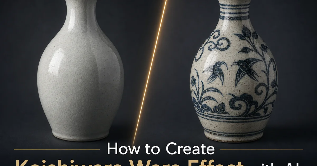
Koishiwara é uma pequena vila de cerâmica nas montanhas da Prefeitura de Fukuoka, na ilha de Kyushu, que produz cerâmica folclórica distinta desde o final do século XVII, quando oleiros da península coreana estabeleceram fornos na área sob o patrocínio do senhor feudal local. A vila ganhou reconhecimento internacional quando Bernard Leach, o oleiro inglês e cofundador do movimento de cerâmica de estúdio, visitou-a em 1954 e elogiou a cerâmica Koishiwara como um dos melhores exemplos da tradição viva de artesanato folclórico do Japão. Um endosso que ajudou a catalisar o ressurgimento do interesse pela cerâmica folclórica japonesa que continua até hoje. Koishiwara foi designada Artesanato Tradicional do Japão pelo governo nacional. As cerca de cinquenta olarias ativas da vila continuam a produzir louça funcional usando técnicas transmitidas entre gerações por mais de três séculos.
O que torna a cerâmica Koishiwara imediatamente distinta é sua decoração de superfície ousada e rítmica. A técnica característica é o tobi-kanna — literalmente plaina voadora ou saltitante — onde uma lâmina metálica flexível é pressionada contra a superfície de uma peça recém-revestida de engobe enquanto ela gira no torno, fazendo com que a lâmina vibre e salte pela superfície, cortando o engobe branco para revelar o corpo de grés escuro abaixo em fileiras regulares de marcas em forma de crescente. O efeito é hipnótico — centenas de pequenas marcas precisas dispostas em faixas rítmicas ao redor do vaso, cada uma moldada pela frequência de ressalto natural da ferramenta interagindo com a velocidade de rotação do torno. Outras técnicas decorativas incluem hakeme (pinceladas ousadas de engobe branco), kushime (padrões desenhados a pente através do engobe) e nagashi-kake (decoração com engobe derramado ou trailado), todas compartilhando o princípio de criar padrão através da interação entre engobe branco e corpo de argila escura.
Ferramentas de edição de fotos com IA podem aplicar a estética da cerâmica Koishiwara a imagens digitais, reproduzindo os ritmos decorativos ousados, o contraste engobe-sobre-grés e a paleta quente de cerâmica folclórica em fotografias. A IA imita a superfície de camada dupla de engobe claro sobre argila escura, aplica os padrões característicos de chattering e marcas de pincel que definem o vocabulário decorativo Koishiwara e ajusta a paleta para o intervalo quente marrom-creme-âmbar dos tradicionais esmaltes de cinza de palha e ferro. O resultado captura a qualidade energética e rítmica que torna a cerâmica Koishiwara tão visualmente marcante. A evidência de mãos habilidosas trabalhando rápida e confiantemente dentro de uma tradição refinada ao longo de séculos de produção diária.
- Aplique a superfície de camada dupla da Koishiwara — engobe branco-creme sobre corpo de grés escuro contendo ferro, criando contraste através da subtração decorativa.
- Adicione padrões de ferramenta de chattering tobi-kanna — fileiras de cortes em forma de crescente revelando argila escura através do engobe claro com o ritmo orgânico de uma lâmina saltitante.
- Inclua marcas ousadas de pincel hakeme e padrões desenhados a pente kushime como texturas decorativas complementares junto com a técnica de chattering característica.
- Desloque a paleta para marrom-creme-âmbar quente com esmaltes semitransparentes de cinza de palha e ferro acumulando-se nos cortes decorativos para enfatizar a profundidade tátil.
- Exporte em PNG ou WebP com qualidade 85+ preservando a legibilidade individual dos crescentes tobi-kanna em vez de permitir que a compressão funda as marcas em textura indiferenciada.
Compreendendo a cerâmica Koishiwara e seu vocabulário decorativo para design digital
As técnicas decorativas da cerâmica Koishiwara compartilham um princípio comum que as distingue da maioria das tradições de decoração cerâmica mundialmente. Elas criam padrão removendo material em vez de adicioná-lo. Onde a cerâmica pintada adiciona pigmento a uma superfície e a decoração aplicada adiciona elementos de argila como alças ou relevos, as técnicas primárias da Koishiwara funcionam todas cortando, raspando ou deslocando uma camada superficial (o engobe branco) para revelar o material contrastante abaixo (o corpo de grés escuro). Esta abordagem subtrativa confere à decoração Koishiwara sua característica direção e energia. Cada marca é uma ação única e irreversível que não pode ser corrigida ou refinada após o fato, e esta irreversibilidade comunica a confiança e habilidade do artesão de uma forma que a decoração aditiva e construída não consegue.
O tobi-kanna, a técnica de chattering característica, produz seu efeito através de uma perda controlada de controle. O oleiro segura a lâmina metálica flexível num ângulo e pressão específicos contra a peça rotativa, e a frequência de ressonância natural da lâmina determina o espaçamento e ritmo das marcas. O oleiro controla o posicionamento geral e a densidade do padrão, mas não o espaçamento individual das marcas, que emerge da interação física entre flexibilidade da lâmina, resistência da superfície, pressão aplicada e velocidade do torno. Esta qualidade semiautomática confere ao tobi-kanna seu carácter visual único. Mais regular que o desenho à mão livre mas mais orgânico que a estampagem mecânica, ocupando um terreno produtivo intermediário que parece tanto controlado quanto espontâneo.
O sistema de contraste engobe-e-corpo cria uma paleta limitada mas eficaz de dois tons que os oleiros Koishiwara exploram com notável variedade apesar da aparente restrição. Variando a espessura da aplicação do engobe, a profundidade e densidade das marcas de ferramentas, a largura e gesto das pinceladas e a fluidez do engobe derramado, os oleiros Koishiwara criam uma enorme gama de efeitos visuais a partir de apenas dois materiais — engobe claro e argila escura. Para design digital, compreender este sistema de dois tons é fundamental porque o efeito Koishiwara não se trata de aplicar um tratamento multicolorido complexo, mas de criar interesse textural rítmico através da interação de apenas dois valores contrastantes. Claro e escuro, superfície e profundidade, revestimento e corpo.
- A decoração Koishiwara é subtrativa — cortando o engobe claro para revelar a argila escura, cada marca irreversível e comunicando a confiança e habilidade do artesão.
- O chattering tobi-kanna ocupa um terreno intermediário entre o manual e o mecânico — a ressonância natural da lâmina cria ritmo orgânico que o oleiro guia mas não controla totalmente.
- O sistema de dois tons engobe-corpo cria enorme variedade visual a partir de apenas dois materiais contrastantes através da variação na espessura do engobe, densidade das marcas de ferramenta e gesto decorativo.
- Efeitos Koishiwara digitais devem enfatizar o contraste rítmico de dois valores em vez de cor complexa — a interação entre superfície clara e profundidade escura é o princípio visual essencial.
Aplicando padrões de chattering tobi-kanna e marcas de pincel hakeme com IA
A aplicação do padrão tobi-kanna requer que a IA gere marcas repetitivas que seguem uma lógica geométrica específica. As marcas são dispostas em faixas que envolvem o eixo rotacional da forma original da peça, com cada faixa contendo dezenas de cortes individuais em forma de crescente em espaçamento regular mas não perfeitamente uniforme. A IA mapeia este padrão rotacional na imagem de origem analisando a composição em busca do fluxo direcional dominante e aplicando as marcas de chattering ao longo de curvas que seguem o movimento visual natural da imagem. Numa fotografia de paisagem, as marcas podem seguir o horizonte e as linhas de contorno. Num retrato, seguem a curvatura do rosto e do corpo. O segredo é manter o ritmo ligeiramente irregular — marcas que são maioritariamente uniformes mas com a ocasional compressão, expansão ou ligeiro desalinhamento que resulta da dinâmica física de uma ferramenta de chattering.
As marcas de pincel hakeme fornecem uma escala decorativa e energia contrastantes juntamente com o chattering preciso de pequena escala. Onde o tobi-kanna cria textura rítmica de granulação fina a partir de muitas marcas pequenas, o hakeme cria textura gestual ampla e arrebatadora a partir de poucas pinceladas grandes de um pincel grosso carregado com engobe branco. O pincel — antigamente feito de palha de arroz atada — deixa estrias paralelas características à medida que os fios individuais de palha arrastam através do engobe, criando uma textura estriada dentro de cada pincelada ampla. A IA aplica efeitos hakeme como elementos gestuais mais amplos que complementam o detalhe fino do tobi-kanna, frequentemente em áreas da imagem que beneficiam de textura em maior escala — fundos abertos, áreas tonais amplas e zonas onde o padrão fino de chattering se perderia na escala de visualização.
A interação entre tobi-kanna e hakeme — precisão rítmica fina juntamente com energia gestual ousada — cria a tensão visual dinâmica que torna a cerâmica Koishiwara tão marcante. Nenhuma técnica define a tradição isoladamente. É a sua combinação num único vaso, por vezes com a adição de linhas kushime (desenhadas a pente) e traços nagashi-kake (engobe derramado), que cria o vocabulário decorativo completo da Koishiwara. A IA deve aplicar estas técnicas em zonas que respondem à composição da imagem de origem, usando chattering fino para áreas de detalhe e complexidade, marcas de pincel ousadas para áreas de abertura e movimento, e técnicas transicionais para as zonas entre elas, criando um programa decorativo variado e ritmicamente interessante em toda a imagem em vez de monotonamente uniforme.
- As marcas tobi-kanna seguem geometria rotacional mapeada para o fluxo direcional da imagem — ritmo maioritariamente uniforme com ligeiras irregularidades da dinâmica física da ferramenta de chattering.
- As pinceladas hakeme usam textura de pincel grosso de palha de arroz — estriações paralelas amplas que fornecem contraste gestual ousado aos padrões finos de chattering.
- A combinação de chattering fino e pinceladas ousadas cria tensão dinâmica — nenhum sozinho define a Koishiwara; é a sua interação entre zonas de detalhe e abertura que o faz.
- Linhas kushime de pente e engobe derramado nagashi-kake adicionam texturas transitórias entre as zonas primárias de tobi-kanna e hakeme para ritmo decorativo variado em toda a imagem.
Graduação de cores para a paleta de esmalte de cinza de palha e ferro
Os esmaltes tradicionais da Koishiwara são feitos de materiais locais — cinza de palha dos arrozais ao redor da vila, cinza de madeira das queimas do forno e minerais contendo ferro de depósitos próximos — e produzem uma paleta quente e limitada de tons âmbar, marrom e oliva que complementam sem sobrecarregar a decoração de engobe subjacente. O esmalte primário é um esmalte de cinza de palha (wara-bai yu) que queima num âmbar-dourado quente com semitransparência que permite que o contraste entre engobe branco e argila escura da decoração apareça claramente através da camada de esmalte. O esmalte de ferro (tetsu-yu) aparece como um marrom escuro rico a preto, frequentemente aplicado em combinação com o esmalte âmbar para criar quebras de cor estilo tenmoku onde os dois esmaltes se sobrepõem. Um esmalte claro ou de cinza pálida pode ser usado sobre áreas não decoradas para mostrar a superfície de engobe branco em todo o seu brilho.
A graduação de cores para um efeito Koishiwara deve estabelecer o tom âmbar-dourado do esmalte de cinza de palha como a sobreposição quente dominante em toda a imagem, deslocando a temperatura geral da cor para o extremo quente enquanto mantém o contraste creme-escuro da decoração de engobe subjacente. O efeito do esmalte deve ser semitransparente — visível como uma lavagem de cor quente e brilho suave mas não tão opaco que obscureça o padrão decorativo subjacente. Nas áreas mais escuras onde o corpo de grés aparece através dos cortes tobi-kanna, o esmalte deve aprofundar-se para um marrom rico que se lê como esmalte de ferro acumulado nas reentrâncias. Nas áreas mais claras onde permanece a espessura total do engobe branco, o esmalte deve aparecer como um âmbar quente suave que enriquece o creme sem amarelar excessivamente.
O clima tonal geral de uma imagem tratada com efeito Koishiwara deve sentir-se quente, energético e artesanal sem ser rústico no sentido primitivo que alguma cerâmica folclórica evoca. A cerâmica Koishiwara é cerâmica folclórica feita com alto padrão. A decoração é ousada mas habilidosa, as formas são simples mas bem proporcionadas e os esmaltes são tradicionais mas cuidadosamente aplicados. O contraste tonal entre engobe e corpo deve ser nítido o suficiente para tornar os padrões decorativos claramente legíveis, o âmbar quente do esmalte deve ser rico mas não pesado. A impressão geral deve ser de confiança e energia artesanal dentro de uma tradição folclórica refinada, em vez da precisão cuidadosa da cerâmica de belas-artes ou da espontaneidade solta do trabalho amador.
- O esmalte de cinza de palha queima em âmbar-dourado quente com semitransparência — a sobreposição de cor dominante que não deve obscurecer o contraste da decoração de engobe subjacente.
- O esmalte de ferro aprofunda-se para marrom-escuro a preto nas reentrâncias onde o corpo escuro aparece através dos cortes tobi-kanna, fornecendo profundidade tonal ao padrão decorativo.
- A sobreposição de esmalte âmbar enriquece áreas de engobe creme com calor suave enquanto mantém o contraste creme-escuro essencial para a legibilidade do padrão.
- O clima geral é quente e energético mas não primitivamente rústico — decoração ousada e habilidosa, formas bem proporcionadas e esmaltes tradicionais cuidadosamente aplicados.
Aplicações criativas e exportação para estética rítmica de cerâmica folclórica
A qualidade rítmica e energética da decoração Koishiwara torna-a principalmente eficaz para aplicações de design onde se deseja movimento visual e textura. Branding para música e eventos, referências de moda e design têxtil, fotografia de comida e estilo de vida, e qualquer contexto onde o sentido de energia artesanal e tradição acrescente valor. O padrão de chattering tobi-kanna, com sua regularidade hipnótica e variação orgânica, funciona como uma textura decorativa que é instantaneamente reconhecível como artesanal e culturalmente específica sem exigir conhecimento de cerâmica japonesa para ser apreciada. Branding de restaurantes para culinária japonesa ou pan-asiática, embalagens para produtos alimentícios artesanais e design editorial para publicações de artesanato e estilo de vida beneficiam-se da energia visual e realismo material que o efeito Koishiwara proporciona.
Para criadores de conteúdo que trabalham com temas culturais japoneses, o efeito Koishiwara oferece uma alternativa distinta às tradições cerâmicas japonesas mais comumente referenciadas. Enquanto Kintsugi (reparação a ouro), Raku (cerimônia do chá) e Arita (porcelana pintada) são amplamente conhecidas e por vezes excessivamente referenciadas em contextos de design ocidentais, a Koishiwara representa uma tradição menos familiar mas igualmente autêntica, com forte identidade visual e rica história cultural. A ousadia dos padrões decorativos e a paleta quente e acessível fazem com que imagens tratadas com efeito Koishiwara se destaquem da estética minimalista ou wabi-sabi típica que designers ocidentais frequentemente adotam ao referenciar a cultura japonesa, oferecendo uma linguagem visual mais energética e celebratória enraizada nas tradições artesanais da zona rural de Kyushu.
As configurações de exportação para efeitos Koishiwara devem focar-se na preservação do detalhe fino do padrão decorativo, principalmente as marcas individuais em crescente do chattering tobi-kanna que definem a identidade visual da tradição. O formato PNG preserva este detalhe com total fidelidade. WebP com qualidade 85 ou superior mantém a legibilidade individual das marcas para a maioria das aplicações web. Compressão agressiva ou redução significativa de escala devem ser evitadas porque o impacto visual do padrão de chattering depende da capacidade do espectador de perceber as marcas individuais dentro da textura rítmica geral. Assim que as marcas se fundem num tom cinza indiferenciado, o carácter fundamental da Koishiwara perde-se. Para aplicações de impressão, a paleta quente âmbar-marrom e a gama tonal moderada reproduzem-se de forma fiável em diferentes tecnologias de impressão. Os padrões decorativos ousados permanecem eficazes mesmo em tamanhos de reprodução bastante reduzidos.
- Padrões de chattering rítmicos adequam-se a branding musical, referências de moda, fotografia de comida e contextos de estilo de vida onde energia artesanal e autenticidade artesanal acrescentam valor.
- Koishiwara oferece uma alternativa distinta às cerâmicas japonesas super-referenciadas como Kintsugi e Raku — mais ousada, mais energética e enraizada nas tradições artesanais da zona rural de Kyushu.
- PNG preserva o detalhe completo do tobi-kanna; WebP com 85+ mantém a legibilidade individual das marcas; compressão agressiva destrói a granularidade rítmica essencial ao carácter Koishiwara.
- A paleta quente âmbar-marrom e os padrões decorativos ousados reproduzem-se de forma fiável em diferentes tecnologias de impressão e permanecem eficazes mesmo em tamanhos de reprodução reduzidos.
How to do it
- 1
Choose a source image with strong rhythmic elements and earthy natural tones
Koishiwara ware is defined by its bold, rhythmic surface decoration. Repeating patterns created by chattering tools, combs, and brushes applied to wet slip while the pot turns on the wheel. Select source photographs with strong visual rhythm. Agricultural fields with furrow patterns, architectural surfaces with repeating elements, textile textures, flowing water, wind-swept landscapes, or any image with directional movement and organic repetition. The Koishiwara aesthetic celebrates the energetic marks of rapid, skilled making. Images with dynamic composition and a sense of movement translate the decorative vocabulary better than static, symmetrical subjects.
- 2
Apply the Koishiwara stoneware body and slip ground using AI Filter
Open the image in AI Filter and select a folk stoneware texture preset with a slip-coated surface. Koishiwara pottery starts with a dark iron-bearing stoneware body that is then coated with white or cream-colored slip (liquid clay) before decoration. The AI applies a dual-layer texture effect. The warm brown of the underlying stoneware visible where slip is thin or has been cut through, and the cream-white of the slip coating as the primary surface. This two-tone ground is key because Koishiwara's signature decoration techniques work by revealing the dark body through the light slip layer, creating contrast through subtraction rather than addition.
- 3
Add tobi-kanna chattering tool decoration patterns
Koishiwara's most distinct decorative technique is tobi-kanna. A chattering or skipping plane that bounces rhythmically across the slip surface as the pot rotates on the wheel, creating regular rows of small crescent-shaped cuts that reveal the dark clay body beneath the light slip. Use AI Filter to apply this distinctive chattering pattern. Rows of repeating crescents or chevrons that follow the rotational geometry of a wheel-thrown pot, each mark uniform in shape but varying slightly in depth and spacing as the tool's natural bounce creates the organic rhythm that distinguishes hand-applied tobi-kanna from mechanical stamping. Add hakeme (brush mark) effects where broad, bold brush strokes of slip create sweeping gestural texture complementing the precise chattering.
- 4
Refine the folk pottery color palette and glaze character
Use AI Enhance to adjust the color balance toward Koishiwara's characteristic palette. The warm cream of the slip surface, the dark brown of the stoneware body visible through decorative cuts, and the amber-to-brown tones of the traditional straw ash and iron glazes that are applied over the decoration. Koishiwara glazes are often semi-transparent, allowing the slip decoration to show clearly through the glaze layer while adding a warm amber tone and gentle sheen. Reduce color saturation outside the brown-cream-amber range and add the soft gloss of a stoneware glaze that pools slightly in the decorative cuts, emphasizing the tactile depth of the tobi-kanna and hakeme patterns.
- 5
Export the finished Koishiwara ware image preserving the decorative rhythm
Save in PNG format to preserve the full contrast between the cream slip surface and the dark stoneware body revealed through decorative cuts. For web use, WebP at quality 85 or higher maintains the rhythmic texture detail. The critical export consideration for Koishiwara effects is keeping the repeating pattern detail of tobi-kanna decoration. The small crescent marks must remain one by one legible rather than merging into an undifferentiated texture, which means avoiding aggressive compression or downscaling that would blur the pattern's characteristic rhythmic granularity. For print applications like craft market materials, pottery studio branding, or Japanese folk art publications, export at 300 DPI to maintain the decorative precision that distinguishes Koishiwara's tooled surfaces.
Fontes
- Koishiwara Ware: The Living Tradition of Tobi-kanna and Hakeme Decoration — Koishiwara Pottery Village, Fukuoka Prefecture
- Bernard Leach and the Mingei Rediscovery of Kyushu Folk Ceramics — Japan Folk Crafts Museum
- Slip Decoration Techniques in East Asian Folk Pottery Traditions — Journal of the American Ceramic Society