
Como criar efeito ASCII art com IA — Magic Eraser
Crie um efeito ASCII art com IA. Guia passo a passo: mapeamento de brilho para densidade de caracteres, design de conjunto de caracteres, resolucao de grade e aplicacoes de design retro a arte impressa.
SEO & Growth
Revisado por Magic Eraser Editorial ·
Índice
- Como a IA mapeia o brilho fotografico para a densidade visual de caracteres
- Design do conjunto de caracteres e a rampa tonal do espaco a densidade total
- Resolucao de grade, selecao de fonte e a relacao entre tamanho de caracteres e detalhe da imagem
- Aplicacoes do design retro e cultura de desenvolvedores a arte impressa e midias sociais
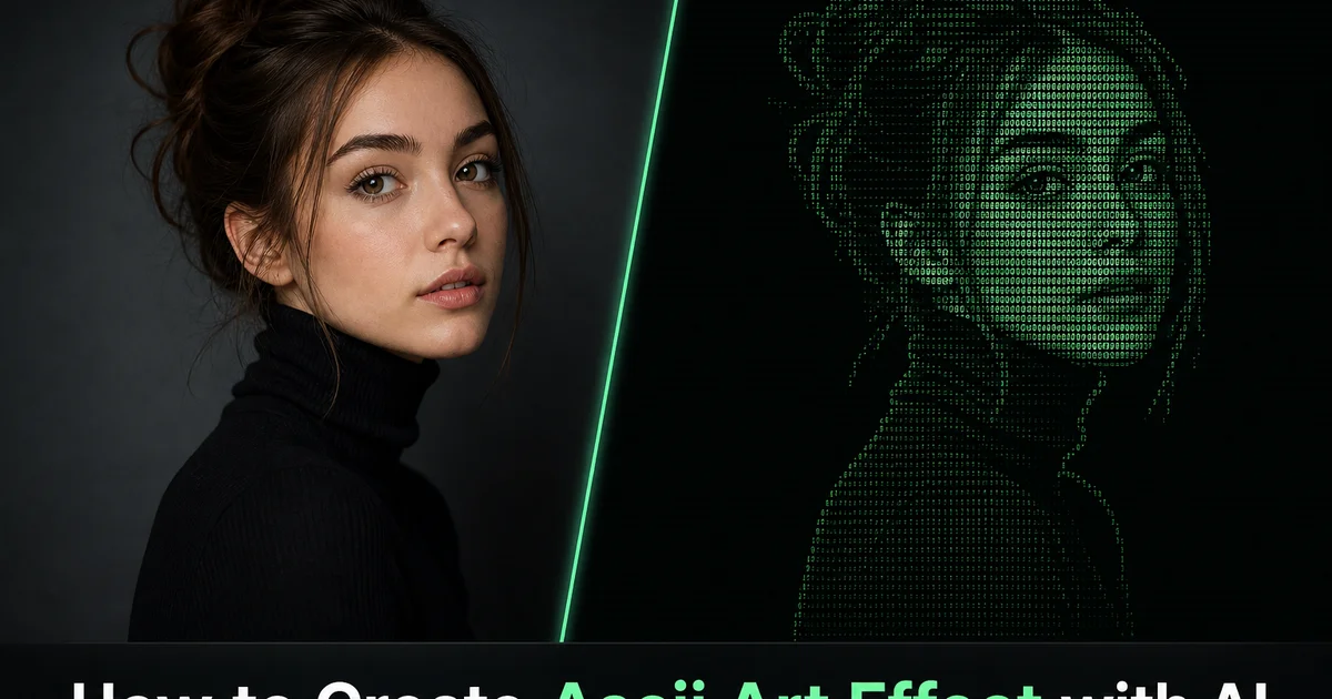
A ASCII art e uma das formas mais antigas de expressao visual digital, nascida da restricao dos primeiros sistemas de computacao, capazes de exibir caracteres de texto mas nao graficos. Nas decadas de 1960 e 1970, programadores e artistas descobriram que, selecionando e dispondo com cuidado os caracteres padrao do teclado. Letras, numeros, sinais de pontuacao e simbolos — conseguiam criar imagens nitidas em impressoras de linha e terminais somente de texto. A tecnica explora o fato de que caracteres diferentes ocupam quantidades diferentes de espaco visual dentro de sua celula da grade: um ponto fica quase vazio, dois-pontos preenchem um pouco mais, uma cerquilha preenche bem mais. Um M maiusculo ou uma arroba preenche quase toda a celula. Ao mapear o brilho da imagem para a densidade dos caracteres, uma fotografia pode ser aproximada como uma grade de caracteres digitados que se resolve em uma imagem nitida quando vista a uma distancia em que os caracteres individuais se mesclam em regioes tonais.
A estetica da ASCII art evoluiu de uma solucao pratica para limitacoes tecnicas a um estilo visual celebrado, de profunda ressonancia cultural. Ela evoca os primordios da internet, os sistemas de quadros de avisos (BBS), a cultura hacker, a demoscene. A epoca em que a computacao exigia engenhosidade e restricao em vez de capacidade grafica ilimitada. A reducao visual deliberada — de milhoes de cores e tom continuo a um punhado de caracteres monoespacados — cria uma imagem ao mesmo tempo crua e sofisticada, legivel de imediato a distancia, mas que revela sua construcao como texto digitado a um exame mais proximo. Essa tensao entre reconhecimento e desconstrucao e o que confere a ASCII art seu duradouro apelo criativo.
A conversao ASCII com IA analisa o conteudo da fotografia para gerar mapeamentos de caracteres otimizados que produzem imagens nitidas na resolucao limitada de uma grade de caracteres. A IA determina a selecao ideal de caracteres para cada celula da grade ao fazer corresponder o brilho local e a estrutura de bordas da fotografia ao padrao de densidade visual dos caracteres disponiveis, produzindo resultados que captam mais detalhe do que um mapeamento ingenuo de brilho para caractere. Este guia mostra como usar o Magic Eraser para transformar qualquer fotografia em ASCII art com controles para selecao do conjunto de caracteres, mapeamento de densidade, resolucao da grade, escolha de fonte, modo de cor. Exportacao dupla tanto como imagem renderizada quanto como texto simples copiavel.
- A ASCII art mapeia o brilho da imagem para a densidade visual dos caracteres — de pontos quase vazios a densas cerquilhas e arrobas — criando imagens a partir de texto digitado.
- A selecao do conjunto de caracteres determina a faixa tonal disponivel: conjuntos estendidos com dezenas de caracteres oferecem gradacao fina, conjuntos minimos de tres a cinco caracteres produzem resultados graficos marcantes.
- A resolucao da grade equilibra detalhe e legibilidade — sessenta caracteres de largura para exibicao social compacta, duzentos e quarenta caracteres para impressoes de poster detalhadas.
- O modo ASCII colorido preserva a reconhecibilidade do tema ao adicionar informacao de matiz alem da densidade, enquanto o monocromatico entrega a autentica estetica do terminal de computacao retro.
- A exportacao dupla como imagem renderizada e texto simples copiavel preserva a obra tanto para a exibicao visual quanto para o formato de texto puro que define o meio.
Como a IA mapeia o brilho fotografico para a densidade visual de caracteres
A operacao fundamental da conversao em ASCII art e mapear o tom fotografico continuo para a densidade visual discreta dos caracteres digitados. Cada caractere de uma fonte monoespacada ocupa uma celula retangular identica. A quantidade de tinta ou de pixels acesos dentro dessa celula varia muito de um caractere para outro. Um ponto ocupa talvez cinco por cento da area de sua celula. Um i minusculo ocupa talvez quinze por cento. Um d minusculo cerca de quarenta por cento. Um M ou W maiusculo setenta por cento ou mais. Ao dividir a fotografia em uma grade de regioes que correspondem as dimensoes das celulas dos caracteres e medir o brilho medio de cada regiao, o conversor seleciona o caractere cuja densidade visual mais se aproxima desse brilho. Regioes escuras recebem caracteres densos, regioes claras recebem caracteres esparsos, e a imagem emerge da variacao de densidade ao longo da grade.
O mapeamento ingenuo de brilho para densidade produz resultados nitidos, mas perde uma dimensao importante: a forma do caractere. Uma barra e uma contrabarra tem densidade geral semelhante, mas seu peso visual e distribuido de modo diferente. A barra concentra a densidade ao longo de uma diagonal de baixo-esquerda para cima-direita, enquanto a contrabarra a concentra ao longo da diagonal oposta. A IA explora esses padroes de densidade direcionais ao fazer corresponder nao apenas a densidade total de cada caractere a regiao da imagem, mas tambem a distribuicao espacial da densidade dentro da celula. Para regioes da imagem que contem uma borda diagonal, a IA seleciona o caractere cujo padrao de densidade interno segue mais de perto essa direcao de borda, produzindo uma ASCII art em que as bordas sao renderizadas com caracteres que de fato tracam a direcao da borda, em vez de apenas corresponder ao brilho medio.
Essa selecao de caracteres consciente da estrutura e o que separa a ASCII art gerada por IA da saida de simples scripts de conversao. Nas regioes de degrade suave da imagem, a selecao de caracteres segue um mapeamento de densidade puro porque nao ha informacao estrutural a codificar. Nas regioes que contem bordas, cantos ou caracteristicas direcionais, a IA seleciona caracteres que codificam tanto o brilho quanto a estrutura do conteudo local da imagem. O resultado e uma ASCII art que se resolve em uma imagem mais detalhada e nitida, em qualquer resolucao de grade dada, do que uma conversao baseada apenas em densidade consegue alcancar. Sobretudo para temas com caracteristicas geometricas marcantes, como arquitetura, veiculos e retratos, em que a direcao das bordas carrega informacao visual de grande importancia.
- A densidade visual de cada caractere — a porcentagem de sua celula preenchida com tinta — determina sua posicao na rampa de mapeamento de brilho para caractere.
- A selecao consciente da estrutura faz corresponder o padrao de densidade direcional dentro de cada caractere as bordas locais da imagem, e nao apenas ao brilho medio.
- Barras, contrabarras, barras verticais e tracos sao selecionados para tracar as direcoes de borda detectadas, produzindo uma renderizacao estrutural mais nitida.
- A ASCII art gerada por IA capta mais detalhe, em qualquer resolucao de grade dada, do que simples scripts de conversao baseados apenas em densidade.
Design do conjunto de caracteres e a rampa tonal do espaco a densidade total
O conjunto de caracteres — a sequencia ordenada de caracteres do mais claro ao mais escuro — e a paleta da ASCII art. Seu projeto tem um efeito profundo sobre a qualidade visual e o carater da saida. Uma rampa de densidade padrao de dez caracteres poderia ser: espaco, ponto, virgula, dois-pontos, ponto e virgula, ponto de exclamacao, cerquilha, e comercial, arroba, M maiusculo. Cada degrau da rampa acrescenta cerca de dez por cento a mais de densidade visual na celula, fornecendo dez niveis tonais discretos para aproximar os duzentos e cinquenta e seis niveis de brilho de uma fotografia em escala de cinza. A uniformidade perceptiva dos degraus importa. Se o salto de densidade entre caracteres adjacentes for desigual, a imagem resultante mostra artefatos de bandas onde os degrades suaves da fotografia se mapeiam em degraus visiveis na renderizacao dos caracteres.
Conjuntos de caracteres estendidos usam toda a faixa ASCII imprimivel — cerca de noventa e cinco caracteres — para oferecer uma gradacao tonal mais fina. Com noventa e cinco niveis em vez de dez, os degraus tonais sao menores e os degrades parecem mais suaves. O custo e que o texto resultante usa caracteres que os espectadores podem nao processar de imediato como uma escolha de densidade deliberada. Um q minusculo e um g minusculo tem densidades semelhantes, mas nao identicas, e usar ambos na rampa acrescenta precisao tonal, mas pode introduzir inconsistencia visual, pois as formas dos caracteres sao complexas o bastante para atrair a atencao para si mesmas em vez de se dissolver no padrao tonal geral. As melhores rampas estendidas sao cuidadosamente selecionadas para incluir apenas caracteres cujas formas contribuem para uma progressao de densidade suave sem criar textura visual indesejada.
Conjuntos de caracteres minimos — de tres a cinco caracteres — sacrificam a suavidade tonal em favor da forca grafica. Um conjunto de tres caracteres de espaco, ponto e cerquilha produz uma imagem com apenas tres niveis tonais: branco, cinza claro e escuro. O resultado e uma renderizacao de alto contraste, posterizada, que perde informacao tonal sutil, mas ganha impacto visual e legibilidade imediata. Esse estilo funciona bem em tamanhos de exibicao pequenos e para temas com silhuetas marcantes, em que a renderizacao simplificada se le como um grafico marcante em vez de uma fotografia degradada. A escolha entre conjuntos de caracteres estendidos e minimos e uma decisao artistica que depende do tema, do tamanho de exibicao pretendido. Conforme o objetivo seja a fidelidade fotografica ou o impacto grafico.
- Uma rampa padrao de dez caracteres fornece dez niveis tonais discretos — cada degrau acrescenta cerca de dez por cento de densidade visual.
- Conjuntos estendidos de noventa e cinco caracteres oferecem gradacao mais fina, mas exigem selecao cuidadosa para evitar artefatos distrativos da forma dos glifos.
- A uniformidade perceptiva dos degraus de densidade evita artefatos de bandas nas regioes de degrade suave da imagem.
- Conjuntos minimos de tres a cinco caracteres sacrificam a suavidade tonal em favor de um impacto grafico marcante e de alta legibilidade em tamanhos pequenos.
Resolucao de grade, selecao de fonte e a relacao entre tamanho de caracteres e detalhe da imagem
A resolucao de grade de uma renderizacao em ASCII art. Quantos caracteres de largura e de altura tem a saida — determina diretamente o detalhe espacial que a imagem pode conter e o tamanho de exibicao minimo no qual a imagem e legivel. Cada celula de caractere representa um ponto de amostragem da fotografia original. Uma renderizacao de sessenta caracteres de largura amostra a largura da imagem em sessenta pontos. Nos tamanhos de fonte de tela tipicos, isso produz uma imagem de cerca de quatrocentos pixels de largura que capta a forma geral e as caracteristicas principais do tema, mas nao consegue reproduzir o detalhe fino. Uma renderizacao de duzentos e quarenta caracteres de largura amostra com o quadruplo da resolucao, captando caracteristicas secundarias, nuances de borda. Informacao estrutural sutil, mas exige uma largura de exibicao de cerca de mil e seiscentos pixels para que os caracteres individuais permanecam legiveis.
A proporcao dos caracteres individuais na fonte monoespacada escolhida afeta as proporcoes gerais da imagem renderizada. A maioria das fontes monoespacadas tem caracteres mais altos do que largos — uma proporcao altura-largura de aproximadamente dois para um. Sem compensacao, esse alongamento vertical faria a renderizacao ASCII parecer duas vezes mais alta do que as proporcoes da fotografia original. A IA compensa ajustando o espacamento da grade para corresponder a proporcao da fonte ou dobrando a amostragem horizontal em relacao a vertical. A imagem renderizada mantem as proporcoes corretas do tema original, independentemente de qual fonte monoespacada seja escolhida para a exibicao.
A escolha da fonte afeta a textura visual da imagem renderizada porque diferentes tipografias monoespacadas renderizam os mesmos caracteres com designs de glifos, espessuras de traco e espacamentos diferentes. A Courier produz uma textura solta, ao estilo de maquina de escrever, com tracos finos e espacamento generoso que cria uma sensacao de computacao vintage. As Consolas e Menlo produzem texturas mais compactas e modernas com tracos um pouco mais espessos que preenchem mais de cada celula. A IBM Plex Mono produz formas de caractere limpas e modernas com geometria distintiva. A escolha da fonte e ao mesmo tempo uma decisao estetica e funcional. Fontes de tracos mais espessos produzem imagens no geral mais densas, que parecem mais escuras e ricas em contraste, enquanto fontes de tracos mais finos produzem imagens mais claras que preservam mais faixa tonal nos caracteres de densidade media.
- A largura da grade determina diretamente o detalhe espacial — sessenta caracteres para exibicao social compacta, duzentos e quarenta para impressoes de grande formato detalhadas.
- A compensacao da proporcao dos caracteres evita o alongamento vertical que a maioria das fontes monoespacadas imporia as proporcoes da imagem.
- A Courier cria uma textura de maquina de escrever vintage, as Consolas e Menlo oferecem densidade moderna, e a IBM Plex Mono proporciona geometria contemporanea limpa.
- Fontes de tracos mais espessos produzem imagens mais densas e de maior contraste, enquanto fontes de tracos mais finos preservam mais faixa tonal de meios-tons.
Aplicacoes do design retro e cultura de desenvolvedores a arte impressa e midias sociais
A ASCII art ocupa uma posicao unica na cultura visual porque e ao mesmo tempo uma tecnica de design e um signo cultural. Suas associacoes com os primordios da computacao, a interface de linha de comando, a cultura hacker. A estetica da internet pre-web lhe confere uma credibilidade retro que ressoa com o publico das comunidades de tecnologia, jogos, musica e arte digital. Uma foto de produto renderizada em ASCII art transmite que a marca compreende a cultura da computacao e participa dela. Um cartaz de evento renderizado em ASCII evoca a estetica underground das comunidades digitais da era BBS. Um retrato renderizado em ASCII faz a ponte entre o calor analogico do tema e a restricao digital do meio, criando uma imagem que comenta a relacao entre identidade humana e representacao digital.
As comunidades de desenvolvedores e de tecnologia tem uma conexao sobretudo profunda com a ASCII art porque ela existe de forma nativa em seu ambiente de trabalho. O terminal de texto e o editor de codigo. ASCII art em comentarios de codigo, arquivos README, banners de inicializacao de terminal. A saida das ferramentas de linha de comando e uma tradicao de longa data que sinaliza personalidade tecnica e orgulho do oficio. A ASCII art gerada por IA a partir de fotografias pessoais da aos desenvolvedores retratos personalizados para seus perfis no GitHub, elementos visuais distintivos para a documentacao de seus projetos. Arte de terminal personalizada que transforma a utilitaria linha de comando em um espaco que reflete sua identidade. O formato de exportacao em texto simples garante que essa arte seja renderizada corretamente em qualquer ambiente monoespacado sem exigir capacidade de exibicao de imagens.
As aplicacoes de impressao exploram a tensao visual entre a origem digital da ASCII art e a exibicao em papel fisico. Impressoes de grande formato em que cada caractere e legivel um a um recompensam a inspecao de perto. Os espectadores se divertem ao descobrir que a imagem e construida inteiramente a partir de caracteres digitados, e esse momento de descoberta cria engajamento e conversa que as impressoes fotograficas convencionais nao geram. A paleta monocromatica da ASCII art classica funciona bem no design de interiores minimalista, e a forte qualidade grafica das renderizacoes ASCII de alto contraste se traduz bem em aplicacoes de produtos licenciados. Camisetas, posteres, sacolas de tecido e adesivos — onde o visual marcante se le com clareza nas pequenas escalas e distancias de visualizacao tipicas de itens vestidos e carregados.
- A ASCII art sinaliza fluencia na cultura da computacao — suas associacoes com os primordios da internet, os sistemas BBS e a estetica hacker carregam credibilidade retro.
- Os desenvolvedores usam retratos ASCII em perfis do GitHub, arquivos README e banners de terminal como expressoes de personalidade tecnica e orgulho do oficio.
- As impressoes de grande formato criam um momento de engajamento quando os espectadores descobrem que a imagem e construida inteiramente a partir de caracteres digitados.
- As renderizacoes ASCII de alto contraste se traduzem com eficacia em produtos licenciados — camisetas, posteres e adesivos — onde graficos marcantes se leem com clareza em pequenas escalas.
How to do it
- 1
Upload the photo and assess its suitability for ASCII conversion
Open your image in Magic Eraser and evaluate whether the subject has enough contrast and distinct form to survive conversion to character-based rendering. ASCII art shares through the visual density of typed characters rather than steady tone. Photographs with strong contrast between subject and background, clear silhouettes, and bold features convert best. Portraits with dramatic lighting, high-contrast architecture, bold graphic objects, and simple compositions with clear focal points all produce excellent results. Avoid images with subtle tonal gradation, low contrast, or complex scenes with many overlapping elements. These become illegible when reduced to the coarse grid of ASCII characters.
- 2
Select the character set and configure density mapping parameters
Choose the character set that determines which ASCII characters represent different brightness levels. The standard density ramp runs from space (lightest) through periods, colons, dashes, equals signs, plus signs, hashtags. At-signs or a capital M represent the darkest tones, with each character selected for the amount of ink it places in its grid cell. Extended character sets include the full printable ASCII range for finer tonal gradation, or you can restrict the set to a minimal palette of three to five characters for a more graphic, poster-like result. Adjust the density mapping curve to control how aggressively mid-tones are pushed toward light or dark characters. A linear mapping preserves the original tonal distribution while a high-contrast curve produces bolder, more graphic output.
- 3
Set the character grid resolution and font parameters
Configure the output grid dimensions, which determine how many characters wide and tall the ASCII rendering will be. Higher resolution grids use more characters and reproduce finer detail but require larger display sizes to be legible. A sixty-character width produces a compact result suitable for social media and inline display. A one-hundred-and-twenty-character width captures moderate detail and works well for standard screen viewing. A two-hundred-and-forty-character width reproduces fine detail and works best for large prints or poster display. Select the monospace font — Courier, Consolas, Menlo, or IBM Plex Mono — that determines the visual texture of the character grid, as each font's glyph design subtly affects the perceived density and texture of the rendered image.
- 4
Apply color mode or maintain classic monochrome rendering
Choose between classic monochrome ASCII art. Often light characters on a dark background mimicking a terminal display — or colored ASCII where each character inherits the hue of the corresponding image region while density still maps to brightness. Monochrome produces the most authentic retro-computing aesthetic and is immediately recognizable as ASCII art. Colored mode preserves subject recognizability at lower resolutions because color provides an extra channel of information beyond density alone. A hybrid option uses a monochrome character grid with subtle color tinting that suggests the original palette without overwhelming the text-art character of the rendering.
- 5
Export the ASCII art as image or copyable text
Export in two formats: a rendered image where the characters are typeset in the selected monospace font at the target resolution, suitable for printing, social media, and web display. And a plain text file containing the raw ASCII characters that can be pasted into any text editor, terminal, code comment, email signature, or README file. The image export preserves exact character spacing, font rendering, and optional color at the intended display size. The text export preserves the art in its purest, most portable form. A block of characters that renders correctly in any monospace font setting and carries the distinct charm of art that exists as nothing more than typed text.
Fontes
- A Brief History of ASCII Art and Text-Based Graphics — Carnegie Mellon University
- Image-to-ASCII Conversion: Perceptual Density Mapping and Character Selection — ACM Transactions on Graphics
- The Cultural Significance of Text Art in Computing History — Computer History Museum